3 shiny new CSS properties for you to try today
Get on board with the latest CSS trends and features.
CSS is one of the most important tools of any web designer. It adds the design styling to pages, but it has become far more important than that. Having the ability to add animations to pages and provide feedback on interactions is central to creating a compelling user experience.
CSS now performs many tasks that previously needed JavaScript, such as off-screen menus, drop-downs, lightboxes, accordians and parallax scrolling. This makes your site more performant. Read on for three cutting-edge properties you can start investigating today.
Want to explore further? Have a go at recreating these cool CSS animation examples. Or, if all this sounds too complex, use a website builder. Remember, however complex your site, you'll need to get your web hosting right (and picking the perfect cloud storage will help, too).
01. Design for display cutouts

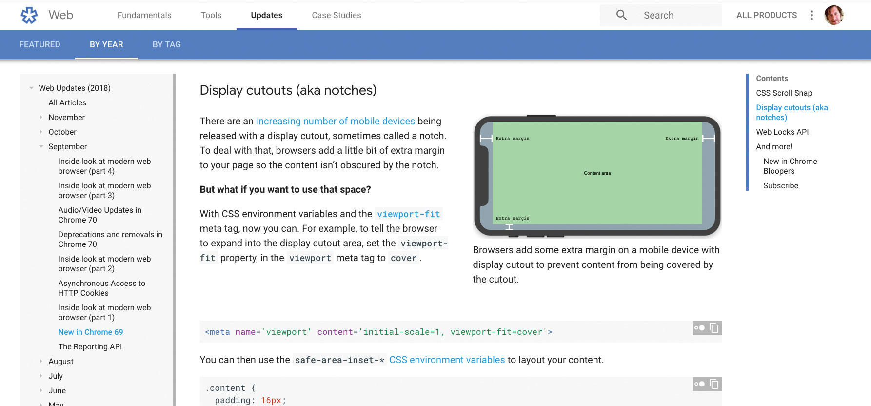
The advent of phones with 'cutout' sections or 'notches' on the display has meant that web designers have to think about how to design for those pages. Currently, web browsers on these devices add an extra margin to accommodate these cutouts. Web designers often like to use the full screen, and now there is a way to do that, with Chrome leading the way.
Add this meta tag to the document:
<meta name='viewport' content='initial-scale=1, viewport-fit=cover'> Then use the CSS safe environment variables to lay out your content:
.content {
  padding: 16px;
  padding-left: env(safe-area-inset-left);
  padding-right: env(safe-area-inset-right);
}
Now you just have to test your design in landscape and portrait on the device. Read more about designing for display cutouts here, or watch the video below.
02. CSS clip path
The CSS clip path is one of those properties that has really helped push visual effects. Originally this was CSS clip and is used to clip out part of the element. There are a number of ways to use this, including inset, which would inset the element by however many pixels on each side:
clip-path: inset(10px 20px 30px 40px);There is also polygon, which would enable multiple points to be added so some more obscure shapes can be made. Circle and ellipse are fairly straightforward, but it’s also possible to reference a path from an SVG image:
clip-path: url(path.svg#c1);
clip-path: polygon(5% 5%, 100% 0%, 100% 75%, 75% 75%, 75% 100%, 50% 75%, 0% 75%);
clip-path: circle(30px at 35px 35px);
clip-path: ellipse(65px 30px at 125px 40px);
03. CSS conic gradients

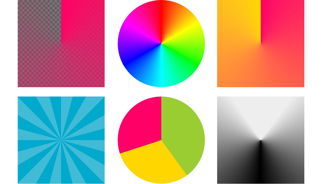
The conic gradient is very similar to a radial gradient. However, you can’t create a colour wheel in radial gradient, whereas you can with a conical gradient. Where radial gradients radiate between points, the conical moves around a circle and blends between colours.
At first you may think this isn’t really anything special, but with a little creativity to add stops in the right places, there are some great results that can be achieved. At present this can only be achieved using a polyfill. Check out this guide by Lea Verou.
This article was originally published in creative web design magazine Web Designer. Buy issue 282 or subscribe.
Read more:

Thank you for reading 5 articles this month* Join now for unlimited access
Enjoy your first month for just £1 / $1 / €1
*Read 5 free articles per month without a subscription

Join now for unlimited access
Try first month for just £1 / $1 / €1
Get the Creative Bloq Newsletter
Daily design news, reviews, how-tos and more, as picked by the editors.

Web Designer is the premier magazine for aspiring online creatives and industry professionals. The monthly title offers cutting-edge practical projects spanning XHTML, CSS, Flash and WordPress as well as hosting features and interviews with the web community’s most influential people. Each issue also has a dedicated Industry section covering news and views from the trade, website showcases featuring the finest design talent and a free CD of valuable resources.
