20 things every mobile developer should know
Developing for mobile requires specific design considerations. These can vary greatly from what you're used to and it's easy to trip up, so here are a few of the things developer Paulo Fierro would like to have been told long ago
So you want to develop for mobile? Maybe you want to chase those long foretold millions that await you in an app store or maybe you are just looking for a new challenge. Whatever the case may be there are specific things to consider when it comes to the design of your app and I'm not talking code-wise.
Before you get started you need to figure out what problem you're trying to solve. Who will be using your app? Where will they be? How will they be using it? If they are engaged in an activity at the same time how does this affect your app?
When you have the answers to these questions write them down. Stick them to a wall. If you face a tough decision come back to these notes and they will guide you in the right direction.
1. Choose your platform
Choosing what platform to target depends on what you're building and who your users are. The platform with the highest reach is the web. If you want to sell your app, then you probably want to get it on an app store. If you require access to the Camera or other device specific APIs, then you can go the native route or use a wrapper like AIR/PhoneGap/Titanium.
There is no correct answer. The platform you choose depends on many things so go back to those notes and see what they tell you.
2. You're not going to get rich
Many people compare the current App Store climate to the Californian gold rush in the late 1840s. Just as it was back then, it's hit and miss – mostly miss. I wouldn't recommend getting into the app game just to make money, you're more likely to strike it rich by heading over to your nearest casino and putting a few thousand quid down on black.
But we've all heard of the huge success stories that get blown up in the media. My favourite story is Canadian developer Matt Rix who spent months working in the evenings on a game that eventually surpassed Angry Birds on the top 10 list, no mean feat. That game is Trainyard and he writes about it here openly, even sharing numbers.
Get the Creative Bloq Newsletter
Daily design news, reviews, how-tos and more, as picked by the editors.
Two months ago Flurry, an analytics company, blogged that there are now over 500,000 apps in the Apple App Store and about 350,000 on the Android Market.
Getting noticed is not going to be easy.
3. Read the HIG
The Human Interface Guidelines or HIG is a document that exists for any platform you are developing for. It tells you how to create a User Interface that feels at home on the device you're targeting. Each platform is different and you should embrace these nuances.
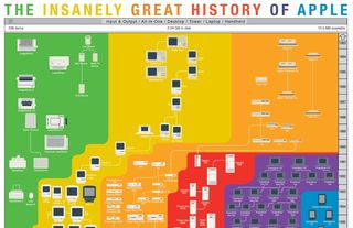
For example, iOS users are used to having a back button at the top left corner. On Android, most models have a dedicated hardware back button so having another in the app is unnecessary clutter.
On the BlackBerry PlayBook, users expect settings and options to show up when you swipe down from the top bezel. Reusing these types of known behaviours are not necessarily things users will thank you for but they will scream at you if you don't.
So read the HIG and get to know the concepts but remember that these are simply guidelines, not rules, and definitely not some sort of checklist.
4. Put fun in functionality
Just because you're building a Utility app doesn't mean it has to be boring. For the Flash on the Beach conference guide we built in 2009 we used the standard set of iOS components but designed them to look and feel completely different. We wanted to give the app a certain character but at the same time not alienate users. This was less common back then and the result was an award at Gulltaggen.
My favourite camera app on the iPhone, Camera+ has buttons and titles that look like the generic ones but are styled with a lovely custom font.
Tweetbot, my favourite Twitter client mixes the subtle use of shadows and gradients to make custom alert boxes that fit with the rest of the app's design and make the whole thing look beautiful. That is attention to detail.
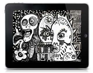
In his book Tapworthy, Josh Clark refers to this kind of thing as 'tap-worthiness'. I prefer the term 'lickability' and it's this attention that makes me want to lick my phone.
So we can follow the guidelines and still have some fun. And this kind of thing is much easier to do now using the new Appearance APIs available in iOS5.
5. Challenge convention
The most obvious example of this is 'pull to refresh'. You probably know exactly what I'm talking about. Introduced to the world in Tweetie 2 by Loren Brichter this design concept has since spread like wildfire and across to other mobile OS's.
The idea is simple. You pull a list to a certain point and when you release it something happens, eg reloading of data, like say your Twitter stream. Although not immediately obvious at first, once you get it, it's genius and is a perfect example of 'surprise and delight'.
Today we can find 'pull to refresh' in Gowalla, Facebook, Google+, Tweetbot, foursquare, oink, Fribi – and the list goes on and on.
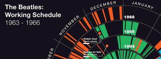
Another popular paradigm is raising a button in the middle of the bottom toolbar. Oink, foursquare, Fribi and many others do this to bring attention to the main point of the app.
6. Behaviour is different
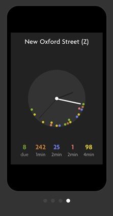
When developing for mobile, you have the attention of your users for approximately 30 seconds, maybe a minute. Your app should be designed in a way we can glance at it and go. Forget a complicated interface, just give us the details, right?
Well, yes. And no. Sometimes I'm on the couch, watching something on TV with my tablet on my lap and have all the time in the world. Or sat in the bathroom bored out of my mind. Stats say its not just me!
So where will your users be? What will they be doing? Design accordingly.
7. Content should be different
Simple is good and simple does not mean dumb – we need to focus on the core function of our app and write efficient copy. Relevant copy.
And micro-copy is really hard to write. Super hard.
8. My finger is fat
My finger has an addiction to bacon and as such it needs a hit area of minimum 44 pixels. Anything less and it's going to be really hard to tap. We made this mistake in the FOTB 2010 app.
The back button is 10 pixels tall but had a massive hit area to make it easy to tap. The problem? It was nearly impossible to see. Avoid!
9. Resolution independence
If you are going to build an app for various devices chances are your assets will need to scale. Scaling images up to fit on a tablet won't look great.
The easiest way to do this is ask your designer to create the artwork in vector format from the beginning. That way when you need an icon that's 512x512 for iTunes it's not going to be a problem.
10. Design a beautiful icon
That old adage holds true. You only have one chance to make a first impression and your icon sets the stage for your entire app.
We have a blank canvas on which to make something great. Use this opportunity to solve your problem in a functional and beautiful way.
When executed correctly, the idea that this device does anything else other than my specific application is lost. Forgotten.
I love that.
So let's take the time and sweat the details. Last year, for Flash on the Beach, we built FOTB.me, our first attempt at building a web app targeting only mobile devices.
When the site is added to the home screen on iOS, you have the ability to set a custom icon and splash screen. So we took this opportunity to create a variety of them. One for older iPhones, one for retina displays, and one for each orientation on the iPad.

Granted, this will be seen by very few people. But if they notice, hopefully it will surprise them and possibly make them smile. And if so, then that's awesome.
11. My phone is my identity
The reason all this matters is because my phone tells you a lot about me.

You can see that I have way too many apps installed, but they are all neatly categorised in different folders yet my desk is a mess. And what does that say about me? I have no idea.
The bottom line is there's no way I'm going to infect my beautiful home screen with an ugly icon – because what would that say about me?
12. Don't make me RTFM
Please! Think of the children.
If you think people don't, read the manual for desktop software. This goes double, triple even for mobile apps.
When the iPad came out, there was a magazine app (not to be named here) that used tons of gestures for navigation. At first I thought, cool! This is some Minority Report type stuff, interesting.
A week later I had no idea how to use it. The help screen was also hidden away, so the only option was reinstalling it. Not a great experience.
If you are planning to use some crazy, gesture-based navigation we can't stop you. But if you must: please keep the help screen close by and most importantly make it worth our time.
13. Don't pretend
I'm not a fan of web apps that mimic the look and feel of native apps. There are several sets of UI frameworks out there that try their best to look like native controls. The problem occurs when they end up on the App Store.
These web apps inherently run slower, but the level of expectation is the same as other apps due to their look and feel and the fact that they were downloaded from a store. They are making an implicit promise and can't deliver.
I would avoid it.
14. Your idea is not original
Nas said it best back in 2001,
"No idea is original, there is nothing new under the sun. It's never what you do, but how it's done."
"No Idea's Original", Nas
The bitter truth is that ideas are a dime a dozen, execution is everything. A well-designed product at the right time and a little luck can go far.
15. Build for you
This way you're guaranteed at least one happy user. But more importantly if you're building for yourself, you know exactly what it is you want solved and how to best scratch that particular itch.
16. Listen to your users
If you're lucky, at some point your users will be paying your rent, so having a way to communicate with them is important. Using a service like GetSatisfaction allows users to have a conversation with you, whether it be reporting bugs or requesting features. The key here is that it's done in public and the communication is transparent.
Twitter works too but can be a lot more work and you may end up repeating yourself a good deal.
Now just because we're listening to users and they sometimes have great ideas, this is not design by committee. You don't have to do everything they tell you, trust your own instinct.
17. Stalk your users
Analytics is super important. They allow us to learn from user behaviour and can let you see how they flow through your app.
For FOTB.me we used Google Analytics and were primarily targeting Android, iPhone, iPad and PlayBook. I was using Twitter to track what people were saying and saw this:
At first I thought, crap! How many people does this affect? Checking Google Analytics I saw that there were only four people affected out of 4,241 unique visitors. As unfortunate as that is, it's 0.09 per cent – we can tolerate that. Of course you may not have that luxury.
A few hours later came this:
We saw that this affected 20 users - 0.5 per cent. Again, unfortunate, but we can live with that.
The point is, without stats we would have no idea how big or small the problem was. Having them there made sleeping at night a little bit easier.
18. Prototype!
It's a great tool for illustrating your idea for others and also to explore technical feasibility. We tend to write spikes, small sets of functionality to test possible techniques to solving a problem. Whatever you do, get your prototype on the device. Nothing beats testing on the device itself, even if it means a series of images you can swipe through.
There are many tools that will let you create tappable prototypes such as Prototypes, Balsamiq and FieldTest. You can even use Keynote.
Whatever you choose, get it on a device and show a friend over a beer to get their feedback. But once you're done, throw the prototype away.
I mean it, throw it away! This takes discipline, but know that any code you write – once it makes it into production – will never die.
You write prototypes fast, in whatever way works. Hack it up! But you do not want to spend the next few years supporting that code. Throw it away.
19. Get started
Move on your idea, because it's time to get it out there. It's hard but also exciting and ideas are no good stuck in your head. Get them into the world!
It's very easy to get paralysed about doing everything perfect from the start, and you're not going to do it perfect, but we owe it to ourselves to try.
20. We can make the world a better place
It's a lofty goal but bear with me. As designers and developers we have the power to create something that can affect not only our lives, but the lives of others.
And if we can make life just a little bit easier, a little bit simpler and at the same time fix a problem, then we've done something good.
Something we can be proud of.

Thank you for reading 5 articles this month* Join now for unlimited access
Enjoy your first month for just £1 / $1 / €1
*Read 5 free articles per month without a subscription

Join now for unlimited access
Try first month for just £1 / $1 / €1
The Creative Bloq team is made up of a group of design fans, and has changed and evolved since Creative Bloq began back in 2012. The current website team consists of eight full-time members of staff: Editor Georgia Coggan, Deputy Editor Rosie Hilder, Ecommerce Editor Beren Neale, Senior News Editor Daniel Piper, Editor, Digital Art and 3D Ian Dean, Tech Reviews Editor Erlingur Einarsson and Ecommerce Writer Beth Nicholls and Staff Writer Natalie Fear, as well as a roster of freelancers from around the world. The 3D World and ImagineFX magazine teams also pitch in, ensuring that content from 3D World and ImagineFX is represented on Creative Bloq.
