10 mouth-watering restaurant menu fonts
Font choice is a crucial part of menu design; here are some typographical treats to tantalise the taste buds.
Whether you're designing for a high-end restaurant or a cheap and cheerful fast food joint, the menu is a crucial part of the puzzle. And it that needs to work in two ways – it must reflect the restaurant's style and personality, and of course it also has to communicate its range of dishes.
This means you need to get your choice of fonts for a menu design absolutely right, hitting the perfect mix of style and legibility. One font alone is unlikely to be enough, but by putting together two or three from this list you'll be able to create beautiful menus that'll delight all manner of diners. Want more? Try our list of free script fonts.
Delicious display fonts
Used sparingly for the restaurant's name or for section headings, a striking display font is just the ticket for giving diners the right impression. Whether it's a swish script font or a punchy slab serif, it's a quick way to let people know what sort of establishment they're in.
01. Rigatoni
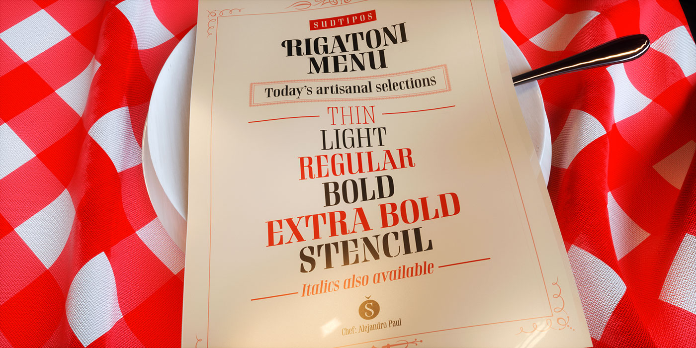
Designed by Ale Paul for Sudtipos, Rigatoni is an exceptionally readable Didone display family in five weights with italics and a stencil version, designed specifically for restaurants, menus, and food packaging.
02. Giaza Pro

A stylish, multilingual typeface with 650 characters and 190 swashes as well as a variety of Art Deco glyphs, Giaza Pro is a fashion-conscious font with plenty of indulgent features, making it the ideal accompaniment to a fine dining experience.
03. Timberline
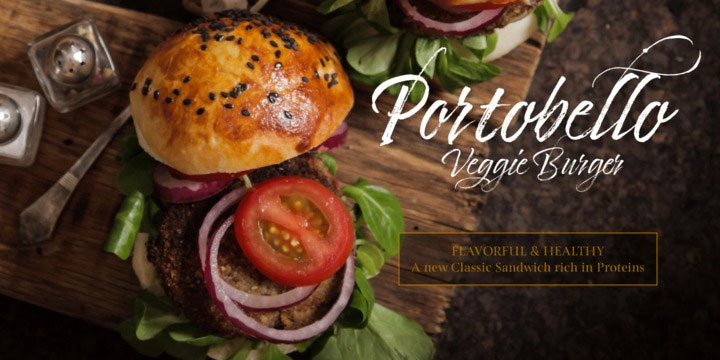
A characterful, handwritten font with textured lines and graceful strokes, Timberline would fit well in any number of eating establishments, from hip burger joints to bright and breezy vegetarian cafes.
04. Thirsty Soft

Ideal for coffee shops or ice cream parlours, Thirsty Soft is a rounder and warmer version of Thirsty Script, adding extra vintage appeal and friendliness, and letting customers know that they're in the right place for a chilled-out snack.
05. Dealers
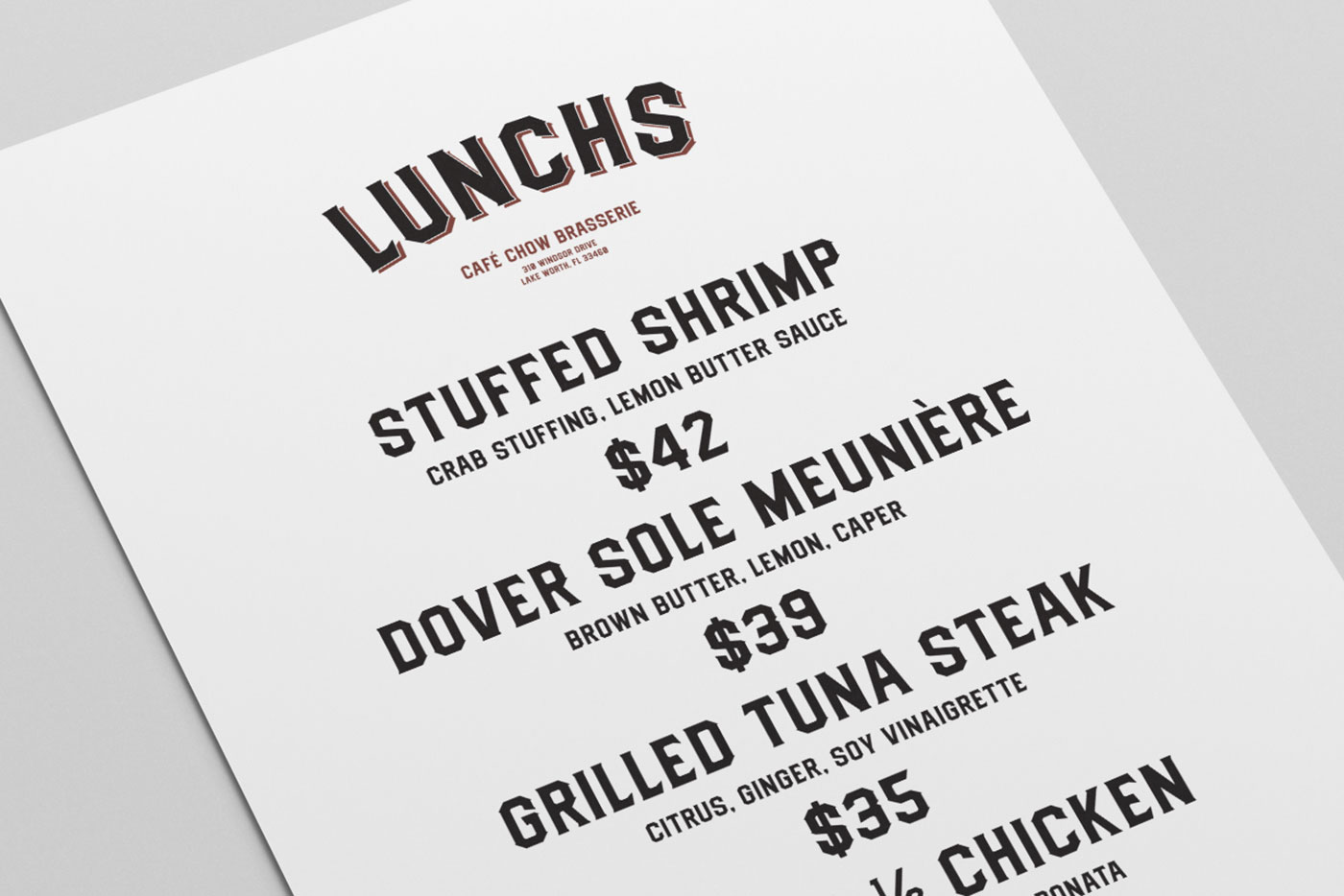
Inspired by retro signage, Dealers is an all-caps, lightly condensed font designed to invoke feelings of classic authenticity and nostalgia. Use it to sell a no-nonsense, hearty bill of fare: fish and chips, steak and burgers. Sorted.
Subtle serifs
A classic serif font tells diners that this is a place selling refined, complex food, possibly at a higher price than the average high street joint; use these to let people know that they'll be getting quality fare, or simply to signal a retro atmosphere.
06. Didot
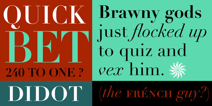
Originally designed in 1783 then revived by Linotype in 1992, Didot is elegant and chic with wonderfully delicate lines, making it sit well with complex dishes created with an eye for detail.
07. Baskerville

Classic and sophisticated, but not too fancy for more casual diners, Baskerville's a great go-to font with plenty of applications. It'll work just as well in a fine dining establishment as it will in a lower-end cocktail joint that's going for a retro feel.
08. Plantin

Based on 16th century type, Plantin is a solid and robust serif that was the basis for the general layout of Times New Roman, and makes an excellent choice if you want a classic without plumping for the obvious serif.
Refreshing sans serifs
For modern or minimal establishments where the food does the talking, a clean and simple sans serif is the way to go. It's nice and readable, making it ideal for dish descriptions, and it's approachable too, helping you put your customers at ease.
09. Open Sans
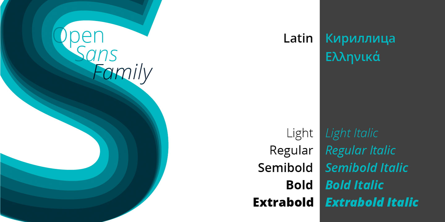
Designed by Steve Matteson of Ascender Corp, Google Fonts' Open Sans is a neutral yet friendly font that's all about the legibility; on a menu it'll say that this is a welcoming place, offering elegant, quality dishes.
10. Helvetica
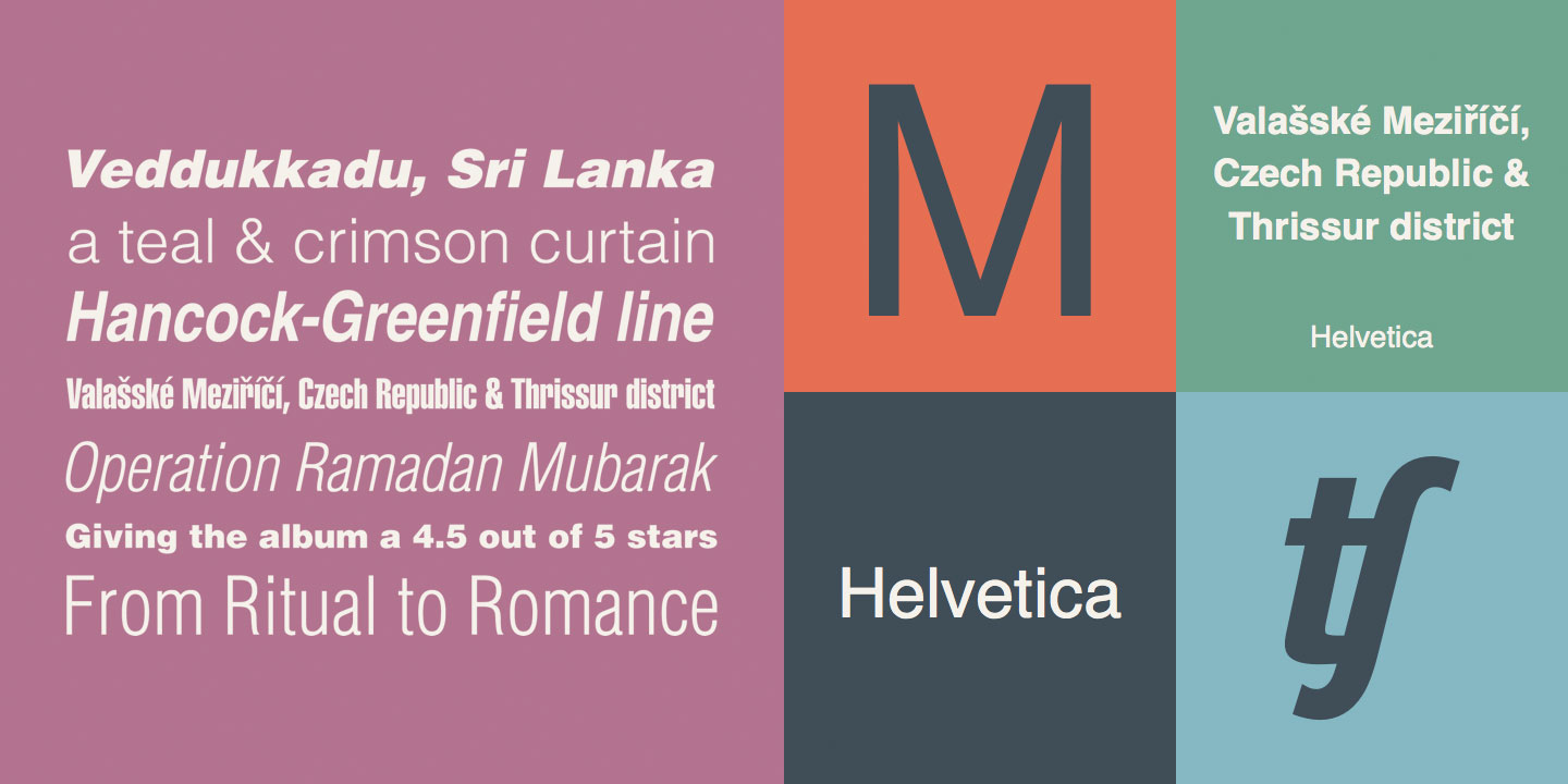
Finally, it's hard to go wrong with Helvetica. Beautifully minimal and neutral, it's an unobtrusive font that lets any menu speak for itself, while if you want to make a bit more of an impact it'll play nicely with any of the above serifs and display fonts.
Related articles:

Thank you for reading 5 articles this month* Join now for unlimited access
Enjoy your first month for just £1 / $1 / €1
*Read 5 free articles per month without a subscription

Join now for unlimited access
Try first month for just £1 / $1 / €1
Get the Creative Bloq Newsletter
Daily design news, reviews, how-tos and more, as picked by the editors.
Jim McCauley is a writer, performer and cat-wrangler who started writing professionally way back in 1995 on PC Format magazine, and has been covering technology-related subjects ever since, whether it's hardware, software or videogames. A chance call in 2005 led to Jim taking charge of Computer Arts' website and developing an interest in the world of graphic design, and eventually led to a move over to the freshly-launched Creative Bloq in 2012. Jim now works as a freelance writer for sites including Creative Bloq, T3 and PetsRadar, specialising in design, technology, wellness and cats, while doing the occasional pantomime and street performance in Bath and designing posters for a local drama group on the side.
