10 killer examples of illustrated ad campaigns
Be inspired by world-class illustration work for top brands.
From Black Pencil-winning animated campaigns such as Honda Grrr, to a string of iconic illustrated posters over the decades for the likes of Coca-Cola and Guinness, illustration and advertising have long been happy bedfellows.
Whether it's creating fantastical worlds, grabbing attention with on-trend styles or conveying abstract ideas, illustration can be a fantastic communication tool for advertisers. Read on for 10 stand-out illustrated ad campaigns, created for household-name brands in recent years...
01. Five Go On A Great Western Adventure
Picking up a D&AD Graphite Pencil in 2018, this beautifully animated campaign by adam&eveDDB follows Enid Blyton's Famous Five on an adventure through the countryside. It was directed by award-winning animator Pete Candeland.
Designed to reignite people’s love of rail travel, the TV spot for Great Western Railway (GWR) follows the dynamic gang through the stunning scenery of the South West and Wales. After they are accidentally separated from Timmy the dog, the children encounter their canine pal at different points of their train journey before finally being reunited at the end.
The campaign shows how effective it can be to tap into nostalgia, and follows in the wake of Pentagram's high-profile rebrand of GWR, which returned the train operator to its roots after many years operating as First Great Western.
02. Adidas: Here to Create
Iris London commissioned psychedelic illustrator Stevie Gee and left-field animator Nicos Livesey to create this animation for Adidas campaign, Here To Create. Gee also applied his brushstroke style to the print campaign.
Winner of the Advertising category at the World Illustration Awards 2018, the spot is a distinctive blend of live footage and animation. It features legendary football stars including Messi, Pogba, Firmino and Suárez.
03. Amnesty International: Teresa's Story
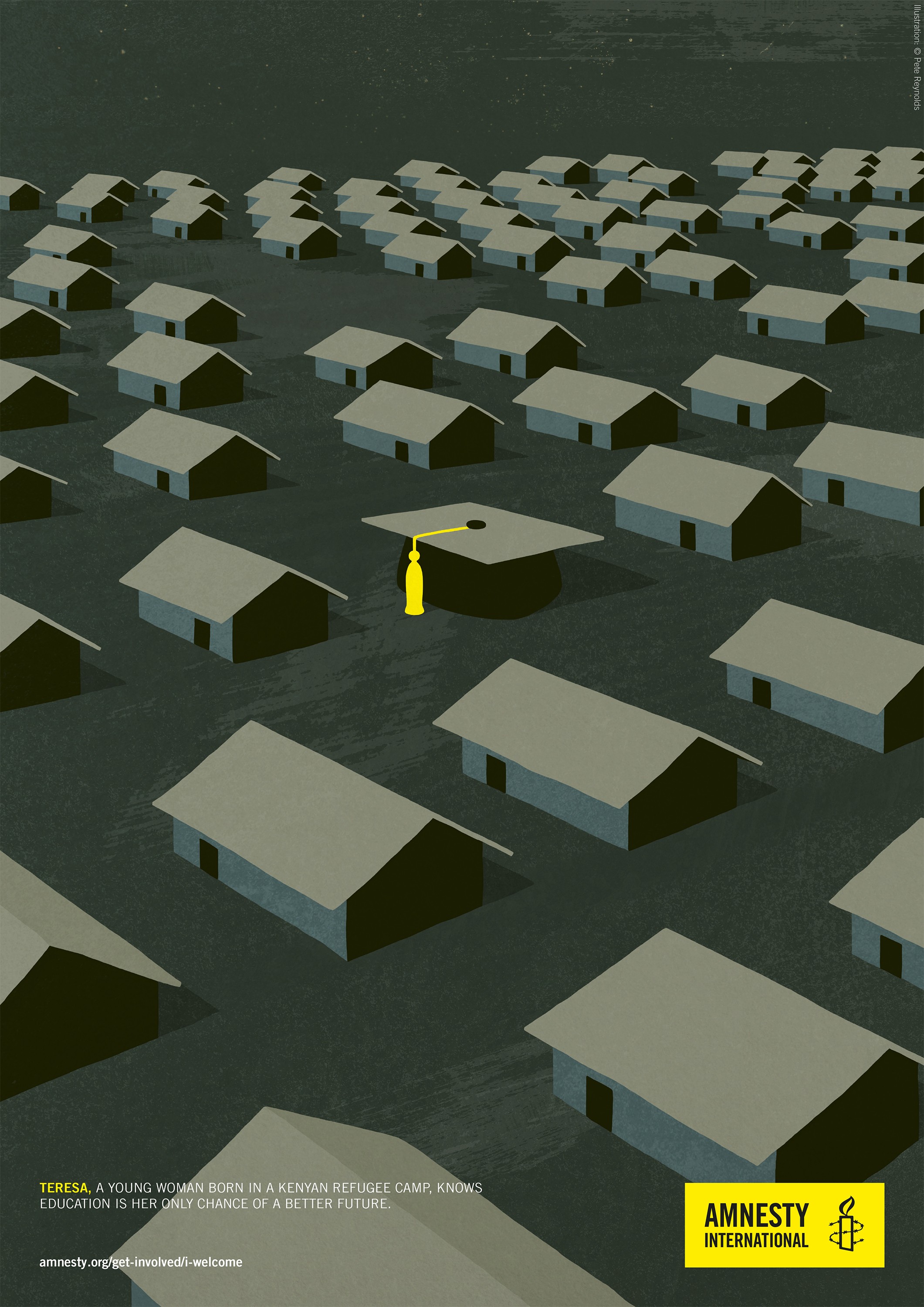
For Amnesty International, illustrator Pete Reynolds was tasked with telling the story of refugees, drawing on various real-life testimonies from different countries and situations. Part of his brief was to be engaging and emotive, but not so hard-hitting that people were turned off from the campaign.
Compared to the gritty photography that similar campaigns have pursued in the past, the choice to go for illustration provided a softer, more accessible angle reminiscent of simple, graphic Amnesty posters of the past.
One of two illustrations distributed on postcards at Amnesty's Give A Home concert series – for which musicians performed in over 300 people's homes – the above depicts the story of a 21-year-old woman born and bred in a Kenyan refugee camp, who believes education will be her saviour.
04. iPhone people talking Pixel 2

Google Creative Lab's collaboration with Anyways Creative puts a fresh spin on phone advertising, using animation to put a more human face on a field filled with shiny gadget porn.
Nine dyed-in-the-wool iPhone users were given one of Google’s Pixel 2 phones to play with, and interviewed about their experiences in short 'vox-pop' format. The recordings were then given to nine different animators to bring to life.
Using a format loosely similar model to Aardman's much-loved Creature Comforts spots for Heat Electric in the early 1990s, the campaign picked up a Wood Pencil at this year's D&AD Awards.
05. TfL Safety Posters
Transport for London has a rich and deep heritage in graphic design, ranging from the Roundel logo, to Harry Beck's iconic London Underground map, to the instantly recognisable Johnston typeface.
This reputation stretches to illustration too, and the archives are overflowing with stunning posters, from Art Deco masterpieces to modern-day trend-setting styles by the likes of mcbess.
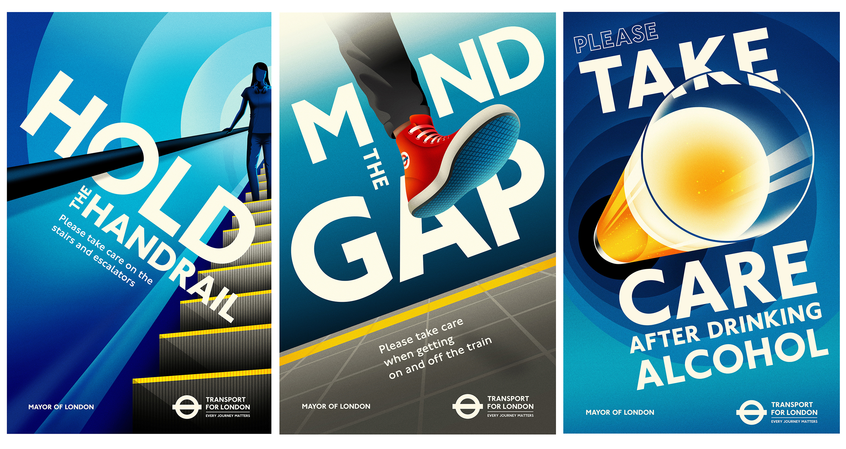
Design and illustration studio La Boca recently contributed these stylish safety posters to TfL's collection, bringing such messages as 'hold the handrail', 'mind the gap' and 'take care after drinking alcohol' to the network. Bright, bold and simple, they grab attention effortlessly.
06. Fanta Mashup
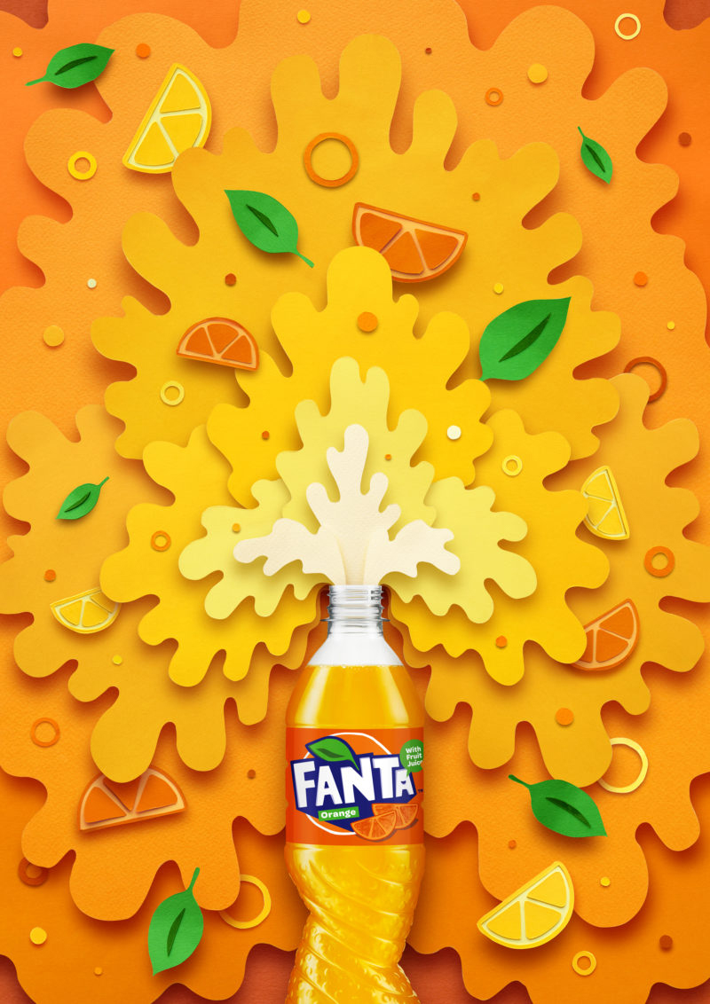
As part of its global rebrand, Fanta teamed up with a range of illustrators to create artworks inspired by the new cut-out graphic style, as defined by London-based agency Koto, which headed up the rebrand.
The paper-cut nature of the new logo suited illustrator Owen Gildersleeve's style perfectly. With a bottle as the hero, his design conveys the theme of 'refreshment' with spray gushing out of the top. The multi-level paper-cut design is graded from white to dark orange, segments of fruit scattered throughout.
07. Alvogen posters
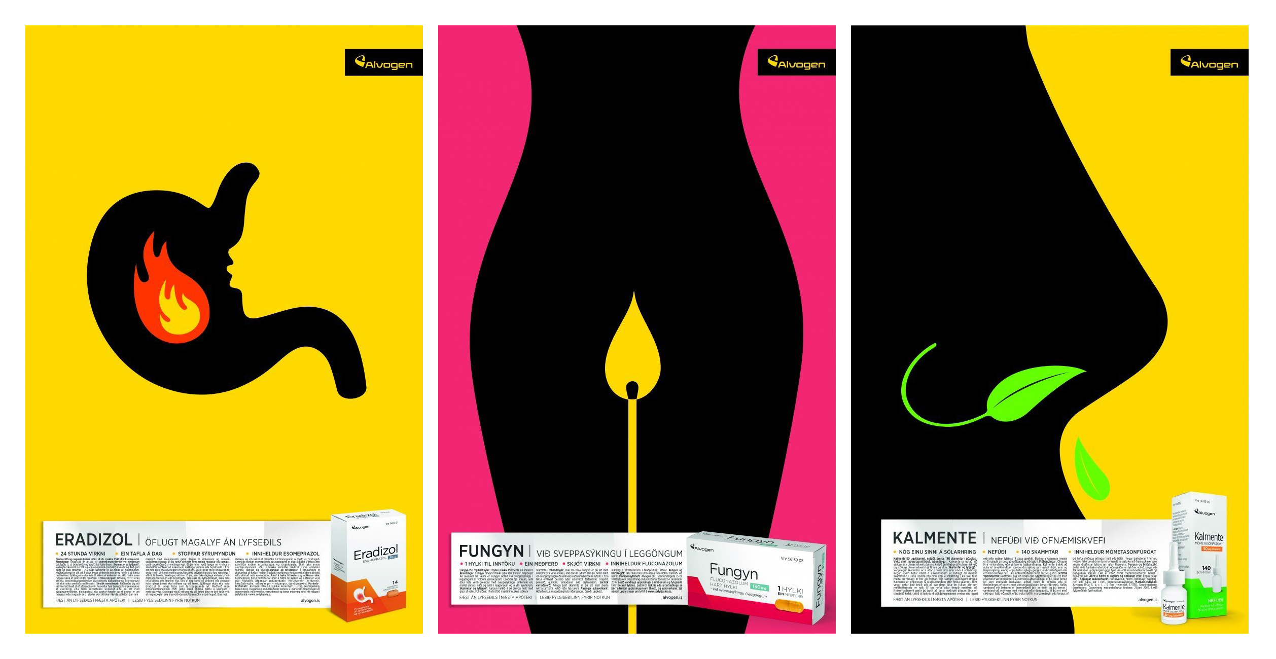
Winner of a Brand Impact Award 2017 in the Pharmaceuticals and Toiletries categories, Kontor Reykjavik's beautiful series of posters for Alovogen – expertly illustrated by Noma Bar – are a stand-out example of how illustration can convey potentially challenging subject matter.
Strict Icelandic legal restrictions meant that the posters were not permitted to describe the effect of the medicines they were promoting. Noma Bar was tasked with packing all that meaning into his characteristically simple, witty negative-space style – and did so in style.
08. 7UP: Feels Good To Be You This Christmas
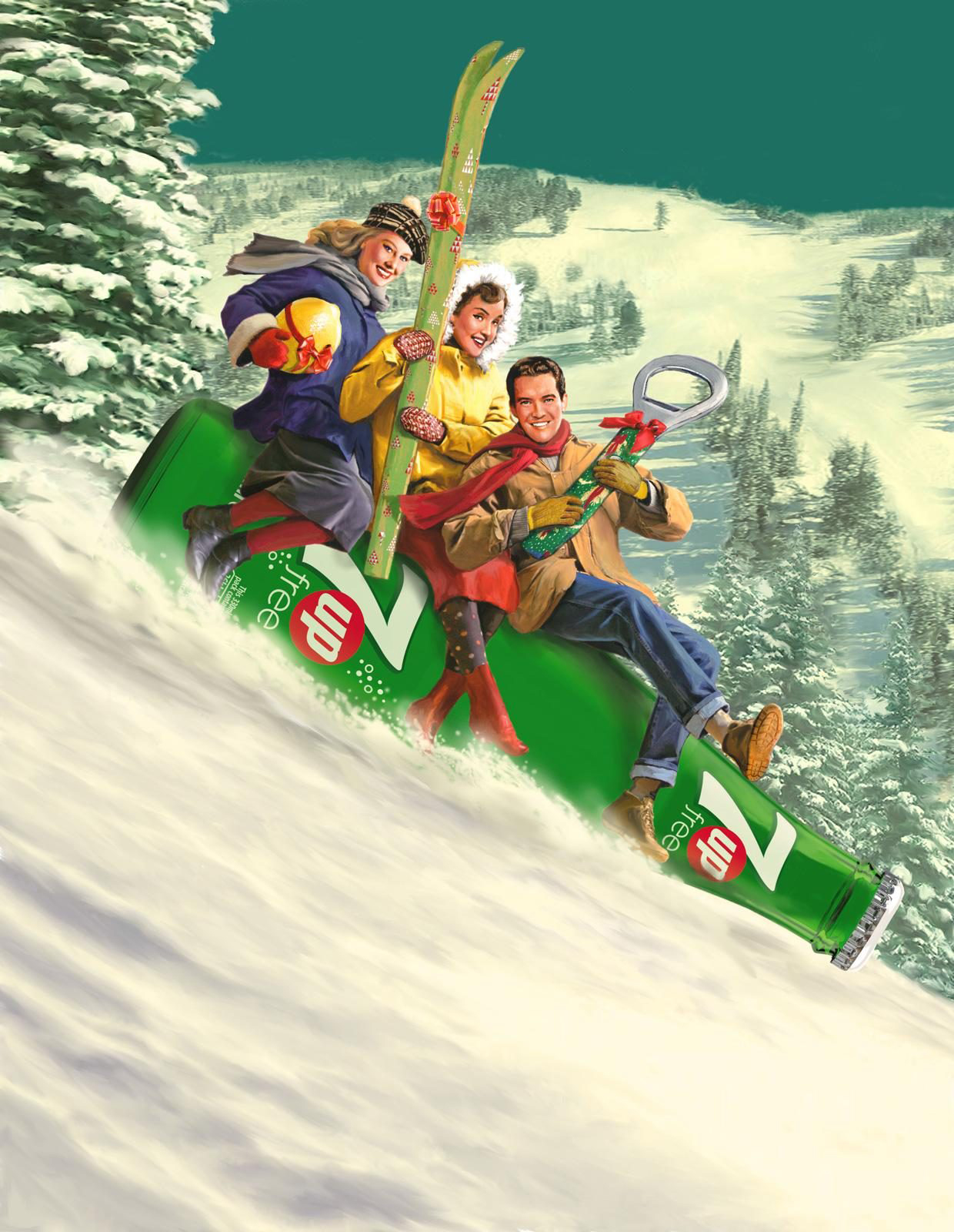
In 2015, Bruce Emmett was commissioned by Havas to create illustrators for 7UP's Feels Good To Be You This Christmas campaign. This incorporated posters, printed advertising and billboard applications.
His brief was to capture the bygone feel of seasonal joy and comfort through vintage yet photorealistic images, which evoked the advertising art typical of the 1940s and 50 – drawing on the brand heritage of 7UP in the process.
09. IKEA: Apartmentology
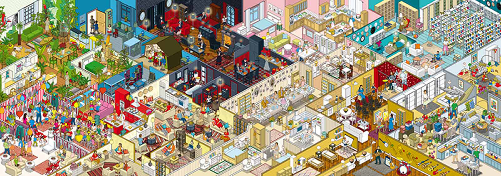
As part of a cross-media campaign for IKEA in Russia, Rod Hunt applied his highly detailed isometric style to a large illustration. Entitled Kvartirovedenie—which loosely translates as 'Apartmentology' – it depicts 10 different families within interlocking apartments.
Commissioned by Instinct BBDO, the illustrations were also used in a book and online game. The campaign demonstrates how effective illustration can be to create impossible worlds – demonstrating a whole range of different IKEA furniture solutions in one highly detailed piece.
10. WWF: Poachers
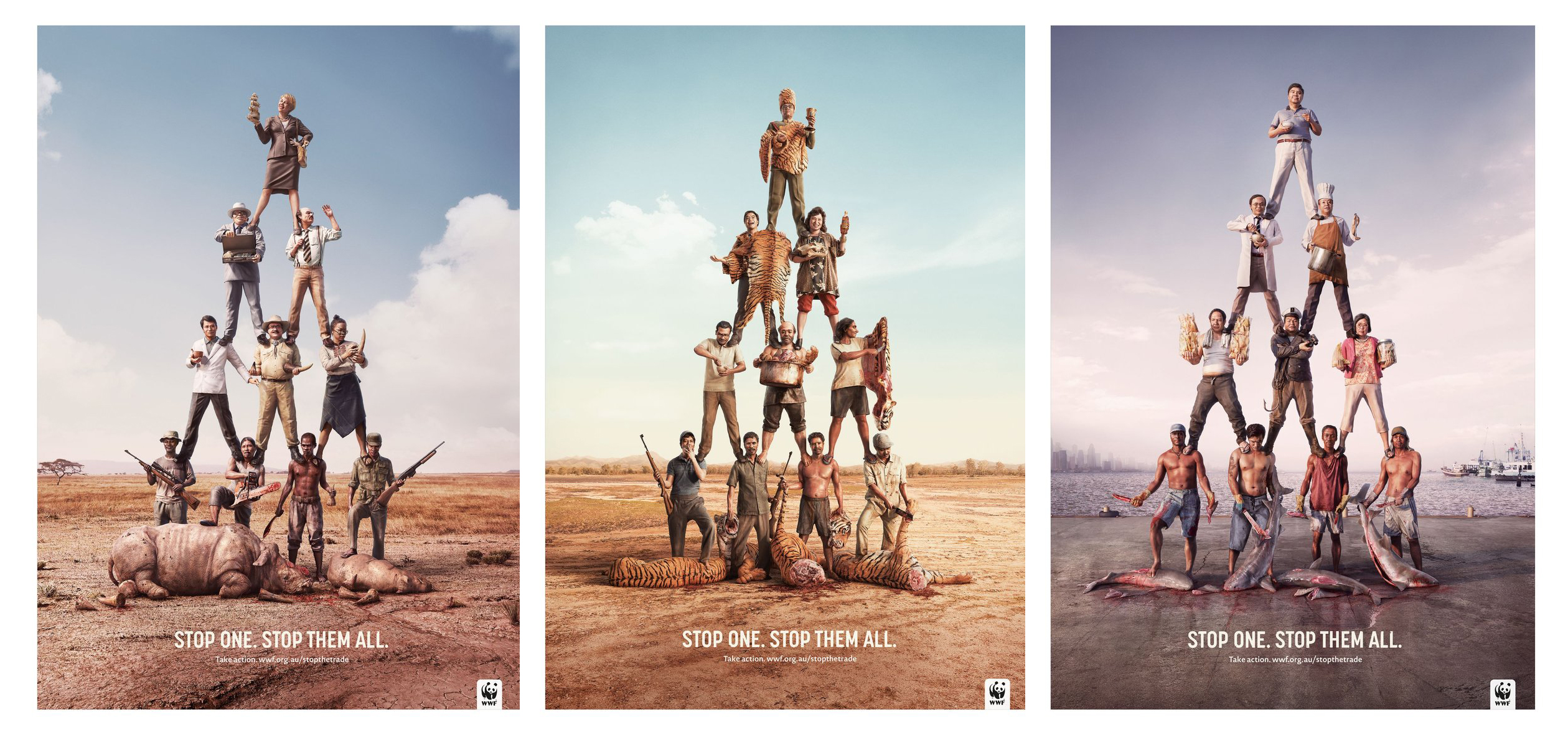
Another D&AD Graphite Pencil winner, this time in 2015, Leo Burnett Sydney's highly memorable illustrated campaign for WWF highlights the depth, complexity and fragility of the illegal animal trade. The concept at the core is to give individuals the sense that they have the power to help bring down the networks involved.
Three illustrators were commissioned for the campaign: John-Henry Pajak, Surachai Puthikulangkura and Supachai U-Rairat. Using a realistic – but not photorealistic – 3D style, they created a series of 'poachers pyramids', which stacked representatives at different levels of the illegal animal trade precariously on each other’s shoulders. The characters have a videogame-like feel, to help emphasise that toppling the pyramid is very much possible.
Related articles:

Thank you for reading 5 articles this month* Join now for unlimited access
Enjoy your first month for just £1 / $1 / €1
*Read 5 free articles per month without a subscription

Join now for unlimited access
Try first month for just £1 / $1 / €1
Get the Creative Bloq Newsletter
Daily design news, reviews, how-tos and more, as picked by the editors.

Nick has worked with world-class agencies including Wolff Olins, Taxi Studio and Vault49 on brand storytelling, tone of voice and verbal strategy for global brands such as Virgin, TikTok, and Bite Back 2030. Nick launched the Brand Impact Awards in 2013 while editor of Computer Arts, and remains chair of judges. He's written for Creative Bloq on design and branding matters since the site's launch.
