10 iconic examples of Memphis design
How this major design trend is reviving the bold colours and geometric patterns of the 1980s.
Described by one critic as "a shotgun wedding between Bauhaus and Fisher-Price", the Memphis design aesthetic embodies the 1980s in so many ways: colourful, kitsch and garish. In recent years it's come back into fashion in a big way, so what can we learn from this major design trend?
Simple geometric shapes; flat colours combined in bold, contrasting palettes; stylised graphic patterns defined by black-and-white stripes and abstract squiggles – these are the ingredients of Memphis-inspired design, fuelled by influences from earlier movements such as Pop Art and Art Deco.
How the Memphis Group began
The Memphis Group was a collaborative design group founded by Italian designer Ettore Sottsass, with its roots in furniture design – it made its influential debut at the Milan furniture fair in 1981. But it was relatively short-lived as an actual collective, closing down after just six years.
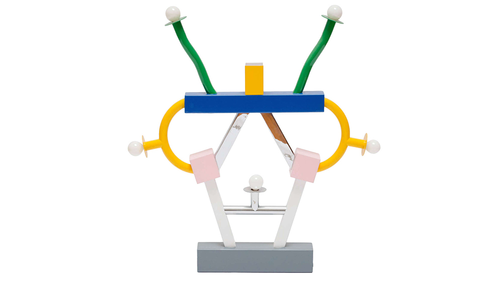
Memphis Group products were never intended to be timeless, or to have mainstream appeal. They were a statement; a protest against the neutral, understated and functional Modernism that preceded them. Here was a passionate movement driven by form, not function – designed to provoke an emotional response.
Not all those responses were positive. Memphis Group products were much-derided by critics at the time for being ugly, expensive and impractical. Many assumed the movement was a brief flash in the pan. Few would have predicted its ultimate cultural impact, or the revival of the aesthetic three decades on.
The modern Memphis design trend
After the collective shut down, many of its members continued practicing individually. Sottsass himself was a successful postmodernist architect, and it was only after his death in 2007 that interest in the Memphis design aesthetic was re-awakened in a big way.
The trend has been accelerating ever since. Many of the examples featured below are from the last five years, and some of them see original Memphis Group members returning to form.
Contemporary creatives are also putting a fresh spin on the Memphis design aesthetic, such as London-based French designer Camille Walala, who graduated from the University of Brighton in 2009.
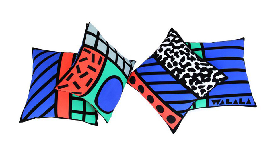
While the patterns and shapes are familiar, in the modern revival bold primary colours are supplemented by mellow teals and soft pinks, blended with greys as well as the trademark stark black-and-white. Refined production methods and more high-end materials have also increased the quality of the products themselves – but the retro appeal and rebellious spirit remains strong.
Read on to discover 10 standout examples of the Memphis design aesthetic...
01. Ettore Sottsass' Carlton
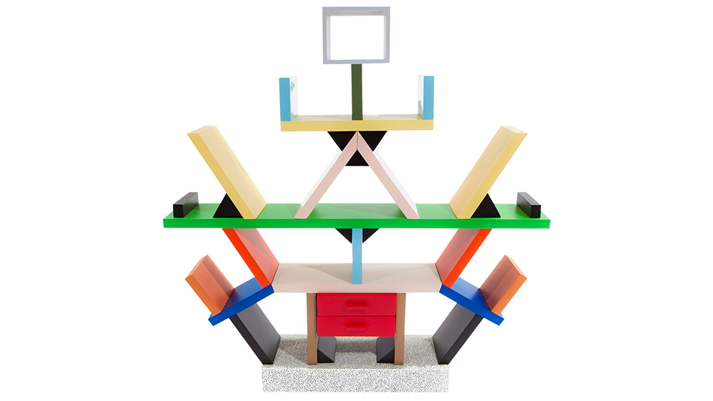
The original Memphis Group created a wide range of bizarre creations that won celebrity fans from Karl Lagerfeld to David Bowie. The Ashoka lamp is one of them – but arguably the most iconic of all, and therefore the perfect start to this list, is Ettore Sottsass' Carlton.
Built from sections of laminated MDF, the Carlton could be seen as a bookcase, a room divider or a dresser – or all three – but like many of the Memphis Group's creations, it seems equally comfortable as a modern art installation.
Designed in 1981, it can be found in design museums around the world, and in fact it's still available for purchase from the Memphis Group website – for the princely sum of €13,200.40 (around $16,154 or £11,636).
Even if you could afford one, you'd need a substantial living room to house it, as the Carlton is enormous – almost two metres square. It's also the perfect checklist for the Memphis style: a bold colour palette, strong, stark lines, and a geometric structure: its various partitions, voids and shelves are based around a system of equilateral triangles.
02. The original 1995 Apple Watch
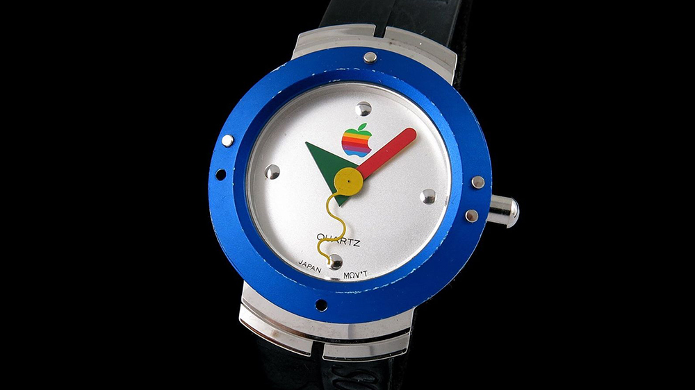
Most people would argue the Apple Watch was released in 2015, and they'd be right. But the high-end glossy touchscreen smart watch wasn't technically Apple's first attempt: 20 years earlier, it had a Memphis-inspired predecessor.
Part of a marketing drive, the quartz-faced, analogue timepiece was never actually sold as a standalone item, but offered as a freebie if you upgraded to Mac System 7.5.
Long before the modern-day Memphis revival, this watch kept the aesthetic alive in the mid-90s with a bold, simple design based on geometric shapes, bold primary colours, and a delightfully playful squiggle for a second-hand.
03. Christian Dior's 2011 fall collection

After Sottsass' death, interest in the Memphis style began to grow. It influenced high fashion houses Missoni, Karl Lagerfeld and Christian Dior, and the latter's 2011 collection helped kick-start the modern movement in earnest.
Bold, graphic black-and-white stripes and crazy-paving-style graphics; vibrant contrasting palettes, and patterns defined by simple shapes and squiggles; and pure, chunky geometric shapes worn as headgear combined to make the catwalk show a must-have checklist of Memphis inspiration.
And once Katy Perry donned one of the collection's utterly unmissable outfits at the MTV Video Music Awards later that year, there was no going back: Memphis was firmly on the world's radar.
04. Nathalie Du Pasquier's Tapigri rug
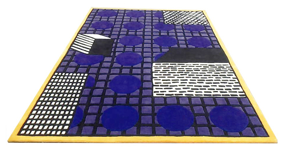
Two years after Christian Dior wowed the fashion world, Memphis-inspired patterns and designs were everywhere at Milan Design Week 2013. Original Memphis Group member Nathalie Du Pasquier applied her distinctive graphic patterns to a rug produced by La Chance, revealed at the show.
Like a visual crib-sheet of Memphis motifs, Du Pasquier's Tapigri rug features simple 3D silhouettes of cubes, decorated by rough monochrome patterns, on a background of overlapping dark blue squares and circles – with a bright primary-yellow trim. The same design is also available in black, white and grey for a more Art Deco vibe.
05. Nathalie Du Pasquier's American Apparel 2014 collection
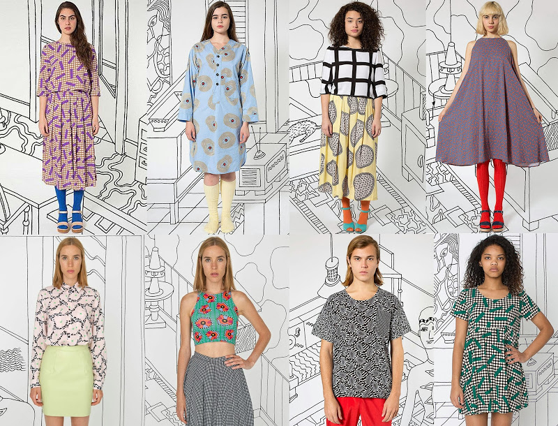
The following year, Nathalie Du Pasquier took Memphis firmly into the mainstream when she collaborated with American Apparel on an extensive Memphis-inspired clothing range. Also in 2014, Sofia Coppola confessed to W magazine that she'd been obsessed with Memphis since childhood.
Featuring her trademark pared-back geometric shapes and colourful, graphic prints, Du Pasquier's 43-piece American Apparel collection – commissioned by creative director Iris Alonzo – spanned womenswear, menswear and accessories.
Her range included monochrome grid patterns at varying scales, overlaid by squiggly shapes and textured circular motifs, with the classic Memphis primary colours softened in a muted palette of lemon yellow, teal, lilac and soft pink.
06. Camille Walala's Dream Come True Building
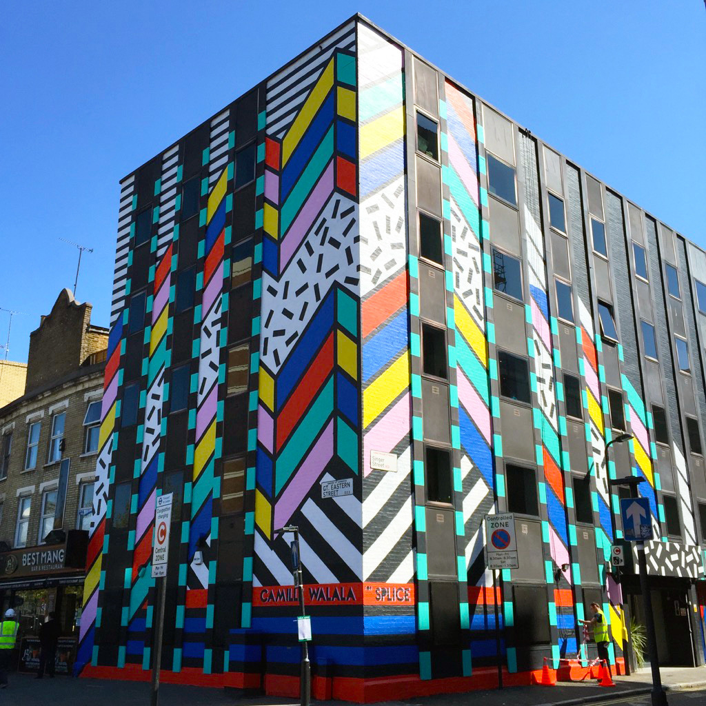
By 2015, the baton had passed to a new generation of Memphis-inspired designers. One of the foremost modern proponents of the style, 2009 graduate Camille Walala brought the spirit of the Memphis Group to the heart of Shoreditch by emblazoning her unmistakable style onto a five-storey building on Great Eastern Street: the Dream Come True Building.
Now an East London icon, the mural features many of the key components of the Memphis style: black-and-white stripes and speckled patterns; thick, bold black linework; simple geometric shapes and a vibrant colour palette that sits teal and lilac alongside the primary-colour staples.
Later that year, Walala also took over Islington-based design store Aria with an extensive new range of Memphis-style products as part of London Design Week – encompassing furniture, ceramics, prints, shelving and more. Teal and soft pink featured prominently in the installation, as well as panels of monochrome grids and stripes.
07. Kartell's flagship store tribute
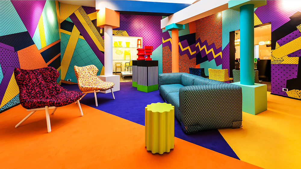
Italian furniture and homewares brand Kartell staged its own tribute to the Memphis design aesthetic in 2015 by finally releasing a range of products that Ettore Sottsass – then in his late 80s – had originally designed for it in 2004.
Innovations in materials and production methods in that intervening decade finally made some of Sottsass' more ambitious visions possible, and the range totally dominated the Kartell store, which was decorated with sharp zigzags, triangles, dots, speckles and criss-cross patterns in bold shades of orange, teal, yellow and magenta – a modern twist on the Memphis vibe.
08. Alessandro Mendini's Supreme skateboards
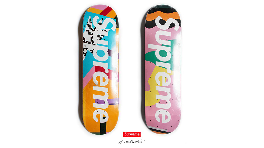
Nathalie Du Pasquier wasn't the only original Memphis Group member to enjoy a resurgence as part of the modern Memphis movement. In 2016, her fellow collaborator Alessandro Mendini was commissioned by streetwear brand Supreme to design a set of skateboards in the Memphis style.
It put the Memphis movement on something of a design pedestal, as previous Supreme collaborations from the world of design included Peter Saville’s album art for Joy Division, Roy Lichtenstein’s pop art comics, and Damien Hirst’s signature dotilism.
Best known for his radical furniture design and striking, brightly-coloured architecture, Mendini's skate deck designs put a modern twist on the Memphis style, overlaying abstract shapes, squiggles and lines and adding a splash of cyan to the well-established combo of pale pink, teal and orange.
09. Auction of David Bowie's Memphis collection
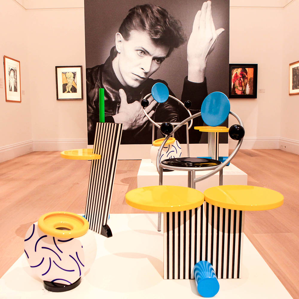
2016 was a year seemingly cursed by high-profile celebrity deaths, including the inimitable David Bowie – who, it transpired, was a hugely prolific collector of Memphis Group artefacts, having accumulated over 400 of them since meeting Sottsass during his heyday in the 1980s.
Bowie's extensive art collection was auctioned at Sotheby’s over three days, raising £1.4 million.
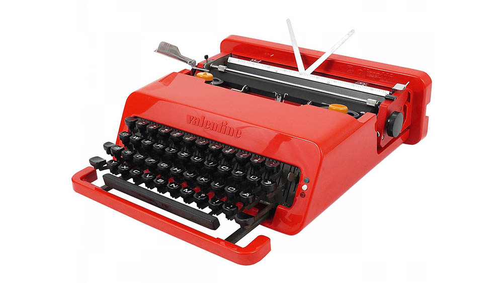
One highlight was a lipstick-red Valentine typewriter by Sottsass – estimated at £300-500, sold for £47,500 – as well as an iconic Casablanca Sideboard from the original 1981 Memphis Group exhibition.
Boosted by Bowie's untouchable star status, this auction further cemented Memphis Group design in general, and Sottsass in particular, in the public consciousness.
10. Garage Italia Customs' Memphis-inspired BMWs

Which brings us to 2017, and after a journey that started as a relatively brief experimental movement within furniture design, the Memphis design trend has weaved its way through haute couture fashion, textiles and mainstream apparel into murals, homewares, streetwear and pattern design.
Where next? A giant corporate superbrand, of course. BMW wanted a piece of the action, and brought in Garage Italia Customs to give two of its cars – an i3 and an i8 – Memphis Group makeovers just in time for Milan Design Week. The resulting paint jobs featured a patchwork of bright colours and bold patterns, continued inside the vehicle with patterned textiles.
Designed under the guidance of original Memphis Group member Michele de Lucchi, the paintwork comes complete with trademark monochrome stripes and grid pattern, the well-established yellow, teal and orange colour palette, and distinctive Memphis-style geometric shapes that are carefully adapted to the contours of the vehicle.
You might also like these:

Thank you for reading 5 articles this month* Join now for unlimited access
Enjoy your first month for just £1 / $1 / €1
*Read 5 free articles per month without a subscription

Join now for unlimited access
Try first month for just £1 / $1 / €1
Get the Creative Bloq Newsletter
Daily design news, reviews, how-tos and more, as picked by the editors.

Nick has worked with world-class agencies including Wolff Olins, Taxi Studio and Vault49 on brand storytelling, tone of voice and verbal strategy for global brands such as Virgin, TikTok, and Bite Back 2030. Nick launched the Brand Impact Awards in 2013 while editor of Computer Arts, and remains chair of judges. He's written for Creative Bloq on design and branding matters since the site's launch.
