10 extraordinary examples of typography poster designs
We take a look at the inspiring fonts that made these typographic posters shine.
Typography can make or break a poster. No matter how perfect the imagery, if the type isn't conveyed in the right way, the design has failed – which is why choice of typography in poster design is so important.
Whether you're designing gig or movie poster, a product advert or digital campaign, these examples of typography posters are sure to inspire you.
01. Solo: A Star Wars Story
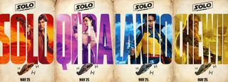
Before they caused controversy, these posters for the forthcoming standalone Han Solo movie caught the world's attention with their inventive yet nostalgic typography design. Placing the character illustrations within the typography itself is a great way to grab the eye, while also making the type more than just a way to convey the title. Keeping the Solo stamp at the top of each poster is a clever way to keep the branding present, too.
02. NRMAL
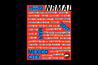
NRMAL is an annual music festival taking place in Mexico City. Keeping the brand typography running throughout the poster designs strengthens the identity, and these examples show how you can do that while also being playful and creative.
The zine-like, cut-and-paste placement of the type, along with the festival name in the right-hand corner, makes these typography posters a great example of clean, consistent design, while still staying true to the youthful and edgy style of the festival.
03. OKJA
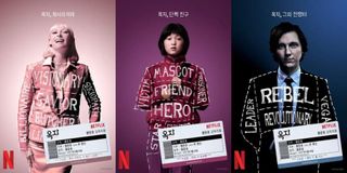
More and more movies are going direct to Netflix these days, so it’s important to get the advertising on point to attract new viewers. Last year’s Okja tells the tale of a young woman and her quest to prevent her giant pig from heading to the slaughter house. These clever typography posters describe the film’s three main characters using cuts of meat – just like a butcher would. The chalk-like effect on the type also harks back to butcher boards.
04. Alzheimers
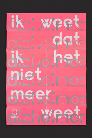
A poster campaign for a charity needs to be eye-catching, but it also needs to send a strong message of the charity’s aims. These powerful typography-led posters for the Dutch Alzheimer Foundation were created by Studio Dumbar and provide a striking, heartbreaking visual of what Alzheimer's disease can do to the brain. The disease often causes small brain lesions and this is transported to the typography design, with spots causing the type to become less clear. It’s a powerful choice.
05. Mogwai
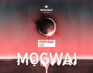
Mogwai is a relatively well-known band that made it onto our best album artwork list. They're known for their artistic output, so it’s not surprising to find them here. Designed by Afonso de Lima, the water-inspired typography is an innovative, playful way to promote the gig, making for a unique yet attractive typography poster.
06. Get Out
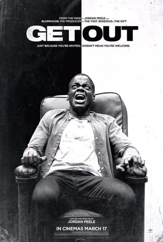
Get Out was undoubtedly one of the biggest films of 2017, going on to win a number of awards, and the praise of fans and critics alike. As a movie focusing on race relations, the typography design on this particular poster offers a clever indicator of its themes and tongue-in-cheek yet serious approach to the subject.
07. Axfood
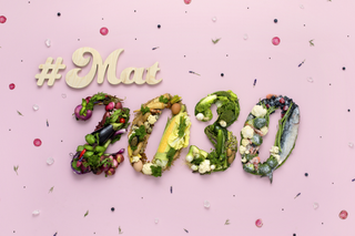
This Snask project for Axfood caught our eye because the typography is created entirely out of food. The colour-coded style on each letter makes the whole word stand out, while the type design at the top keeps a clean-cut feel. Another stellar project from some of the most playful designers around.
08. Sydlexia
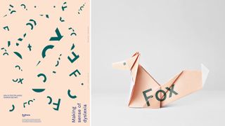
Much like the Alzheimer Foundation posters created by Studio Dumbar, these typographic posters aim to highlight the difficulties that come with living with dyslexia. Created by BBDO Dubai, type and origami is used to present the problems people with dyslexia face, with words broken and rearranged.
By unfolding the original word, type then appears scrambled, making for a powerful message that's translated through innovative type design and layout. The logo placed at the bottom, with its optimistic outlook, ensures the posters also provide a positive solution.
09. Isle of Dogs
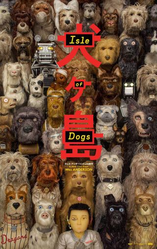
When it comes to Wes Anderson, you can always rely on a quirky, innovative product. For his latest movie, Isle of Dogs, the posters compliment the film’s setting in a futuristic Japan. It could be difficult to make the typography stand out with all the main characters staring directly at the viewer, but thanks to a bold colour choice and using not one but two languages, the title of the film is as prominent as can be. Anderson is a keen user of yellow and red in all his movies, so it’s not surprising to find the Japanese and English versions of the title presented in these shades.
10. American Express
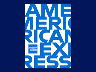
Designed by Pentagram’s Abbott Miller, the new visual identity for American Express brings in some bold new type. It marks the first update to the company’s design in 37 years – and the poster brings the font to the forefront. Keeping to the brand's iconic blue and white colour schemes, the poster design pushes the brand name to new heights.
Related articles:

Thank you for reading 5 articles this month* Join now for unlimited access
Enjoy your first month for just £1 / $1 / €1
*Read 5 free articles per month without a subscription

Join now for unlimited access
Try first month for just £1 / $1 / €1
Get the Creative Bloq Newsletter
Daily design news, reviews, how-tos and more, as picked by the editors.
Sammy Maine was a founding member of the Creative Bloq team way back in the early 2010s, working as a Commissioning Editor. Her interests cover graphic design in music and film, illustration and animation. Since departing, Sammy has written for The Guardian, VICE, The Independent & Metro, and currently co-edits the quarterly music journal Gold Flake Paint.
