10 beautiful illustrator portfolios and why they work
These inspiring sites feature great work and present them in a beautiful way.
If you’re working as an illustrator, it’s not absolutely vital to have a bespoke portfolio website: services like Behance, DeviantArt and Cargo Collective are a good, quick and easy way of sharing your work online.
But it certainly will help your chances of getting quality, well paid commissions… as long as it’s done right, of course. So in this post, we round up some of the best examples of portfolio websites for professional illustrators, to inspire you and maybe give you some ideas for your own.
If there’s a portfolio you feel we’ve missed out, then please go ahead and share it in the comments below!
01. LA Johnson
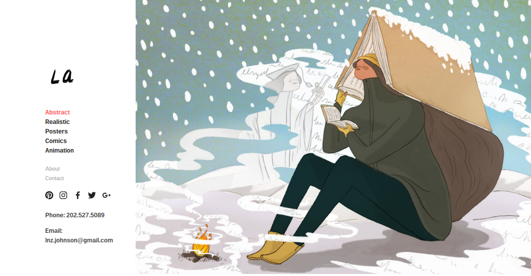
Based in Washington DC, LA Johnson is an illustrator, art director and visual journalist at NPR. She loves to illustrate people and nature, and her portfolio does a job at showcasing her distinctive style across a range of work; both abstract and realistic, and covering posters, comics and animation.
The discipline of only featuring five images on the homepage pays off well, making you yearn for more. And the site as a whole makes great use of whitespace to let the images breathe, while the caption information for each is informative without being overwhelming.
02. Justin Maller
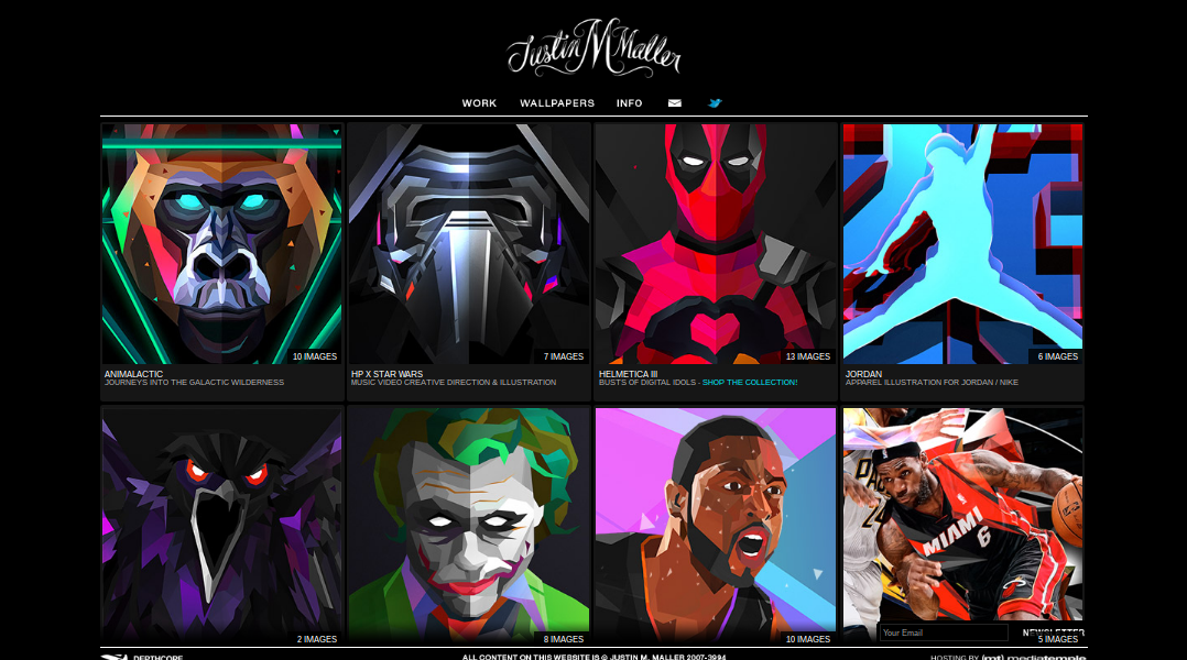
Justin Maller is an Australian freelance illustrator and art director based in Brooklyn, who’s also creative director of The Depthcore Collective, an international modern art collective. His beautiful illustration style, based on low-poly graphics, has won him clients including Verizon, Nike, Jordan, ESPN and Coca Cola.
Not only does his portfolio site showcase his work in dramatic and easy-to-navigate fashion, but enables Maller to give something back too; hi-res versions of his personal artwork are available to download for free and use as wallpapers.
03. Malika Fauvre
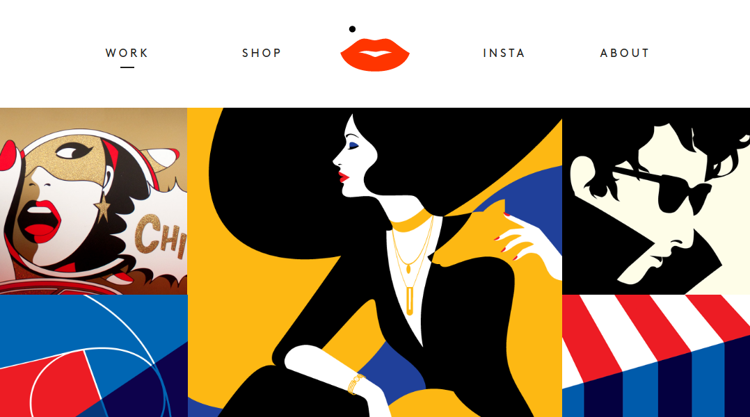
Malika Favre is a French illustrator based in London whose bold, minimal style is often described as Pop Art meets OpArt, and whose clients include The New Yorker, Vogue, BAFTA, Sephora and Penguin Books. She uses a bold and minimal approach on her site, too, presenting her work as one big beautiful collage (plus a few animated GIFs to keep things interesting). We’re not sure how many illustrators could pull this very original approach off, but with Favre’s very distinctive style, it works brilliantly.
04. Gabriel Moreno
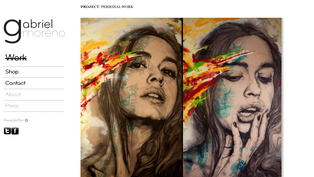
Based in Madrid, Gabriel Moreno is best known for his work as illustrator in the advertising industry. In the last few years, though, he’s also been developing his personal art, featuring flowing and precise fine black lines, overlaid with shocks of colour accenting. Both are presented beautifully in the main ‘Work’ section of his portfolio site.
A kind of very sophisticated version of a Tumblr blog, the continuously scrolling page never ceases to disappoint, throwing up stunning illustration after stunning illustration. And rather than tiny thumbnails, the work is reproduced in a size and resolution that enables you to fully appreciate the artistry and intricate detail.
05. Ping Zhu
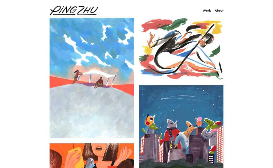
Ping Zhu is an illustrator working out of the Pencil Factory in Brooklyn whose clients include The New York Times, New Yorker, GAP, Heineken and American Express. Her portfolio site presents her work in a thin vertical grid, with large amounts of whitespace on either side; it’s an unusual approach, but one that suits her style perfectly. Click through on some pieces and you’ll see an in-progress rough that’s then overlaid with the finished work; another quirky but successful viewing device that helps raise this portfolio site above the norm.
06. Steve Simpson
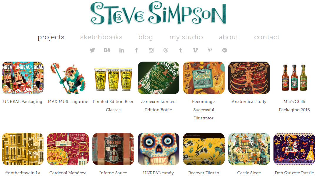
An award-winning illustrator from Manchester, UK, now based in Dublin, Steve Simpson is renowned for his hand lettered packaging design, whimsical characters and illustrated barcodes. The range of work on show in the ‘Projects’ section of his site is immense, but a clever grid-based design and careful curation of images means it still manages to avoid looking cluttered. Click through and you get a huge amount of detail on how each project was created, along with a ton of visual assets and in-progress images.
07. Loish
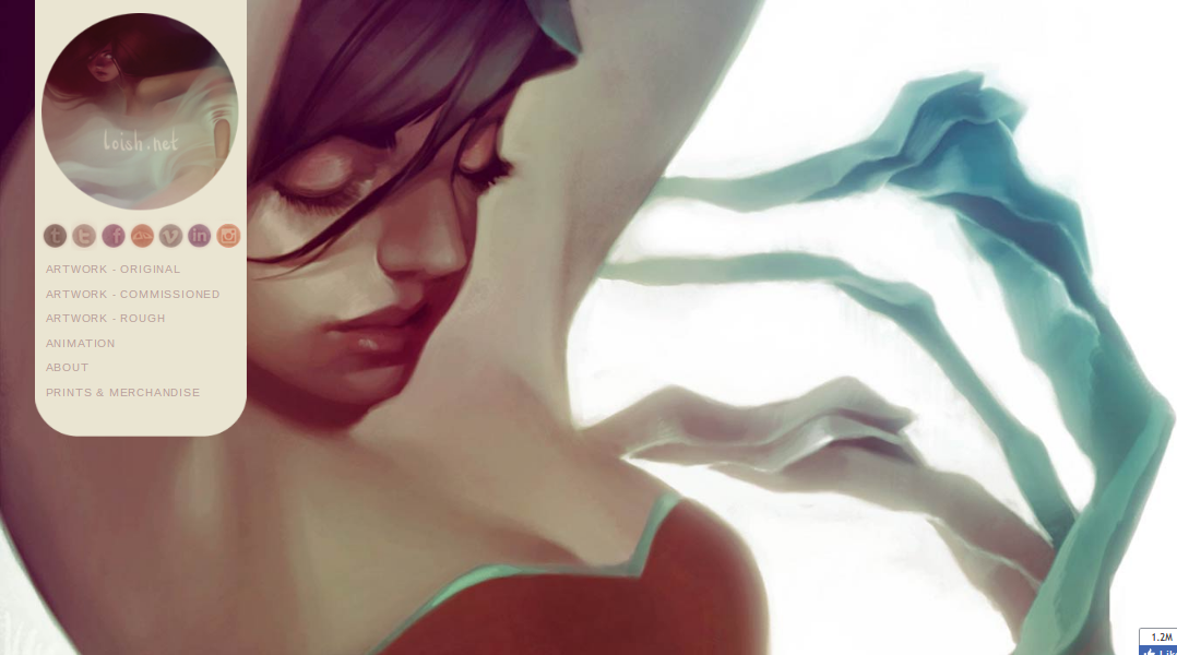
A freelance animator and illustrator from the Netherlands with more than a million Facebook followers, Loish’s sensual and evocative portraits of young women are truly breathtaking. And on this packed portfolio site, she shares a generous amount of her personal and commercial work; not just the finished pieces, but roughs as well. Admittedly, there’s little in the way of text beyond the title descriptions, but this is very much artwork that speaks for itself.
08. Luis Toledo
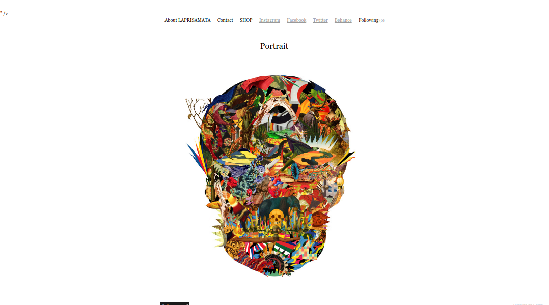
Artist and creative director is an artist and creative director based in Madrid, who’s known for his colourful and hyper-detailed digital collages. In most ways, his portfolio site’s grid-based approach is pretty standard, but what jumps out for us is the dramatic focus on a single image on the homepage, set in a snowfield of whitespace to add drama. The option to generate a fullscreen version of each image, so you can fully examine all its depth and detail, is pretty darned cool too.
09. Becky Simpson
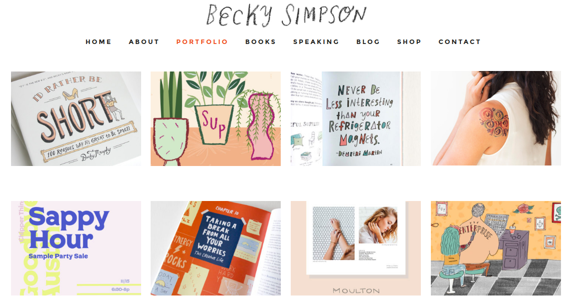
Born and raised in Iowa and now based in Nashville, Tennessee, illustrator Becky Simpson is best known for her hit book ‘I’d Rather Be Short: 100 Reasons Why it’s Great to be Small’. The portfolio section of her site shows the wide range of projects she’s been involved with since then, from tattoo designs to editorial illustrations to her latest release, ‘The Roommate Book’. There’s nothing massively original in the design of her portfolio, but as with her books, it excudes a restrained efficiency and simplicity that makes it a joy to peruse (and which is actually much harder to pull off that you might think).
10. Nate Kitch
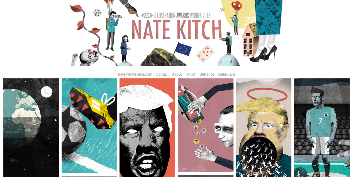
Nate Kitch is an award-winning UK illustrator who works using a mix of pattern, collage, mark-making, photos and textures, and whose clients include Tate, Wired, The Guardian and New Scientist. On his portfolio homepage, he uses a grid of tall vertical rectangles to present his work in a dramatic and effective fashion; click through and you get the opportunity to zoom in to each piece in great detail.

Thank you for reading 5 articles this month* Join now for unlimited access
Enjoy your first month for just £1 / $1 / €1
*Read 5 free articles per month without a subscription

Join now for unlimited access
Try first month for just £1 / $1 / €1
Get the Creative Bloq Newsletter
Daily design news, reviews, how-tos and more, as picked by the editors.

Tom May is an award-winning journalist and editor specialising in design, photography and technology. Author of the Amazon #1 bestseller Great TED Talks: Creativity, published by Pavilion Books, Tom was previously editor of Professional Photography magazine, associate editor at Creative Bloq, and deputy editor at net magazine. Today, he is a regular contributor to Creative Bloq and its sister sites Digital Camera World, T3.com and Tech Radar. He also writes for Creative Boom and works on content marketing projects.
