10 beautiful examples of illustrated websites
Stunning examples of how illustration can make your homepage sing.
Photography isn't the only way to represent your brand on your homepage. Illustration is much underused on websites, and yet it can be the perfect way to pull your content together in a way that’s both unique and alluring.
In this post, we’ve brought together some of our favourite examples of illustration on the web. If you’ve spotted one we haven’t included, please let us know in the comments below!
01. Denise Chandler
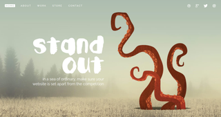
A freelance web designer living in Utah, Denise Chandler believes that in ‘a sea of ordinary’, your website needs to stand apart from the competition. And she’s applied the same logic to her own one-page website, which harnesses this rather fabulous, animated illustration of octopus tentacles to add some unexpected visual interest and showcase her creative personality.
02. Pitch Tents
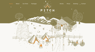
Pitch is a London-based provider of beautiful and spacious bell tents that provide a luxurious camping experience (aka ‘glamping’) to locations across the UK. To sell the proposition visually, its website features a number of quirky yet sophisticated illustrations, conveying both a high-end sensibility and a spirit of fun.
03. Stuff and Nonsense
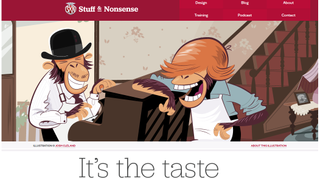
Hiring a web design agency can be an intimidating prospect for many clients. So the homepage Stuff & Nonsense, a leading studio based in Flintshire, north Wales, lures you in with a nice touch of illustrative nostalgia. In case you’re not British (or are too young to remember), this illustration by Josh Cleland alludes to the classic PG Tips tea commercials, which ran on ITV from the 1950s to the early 2000s.
04. Dou Dou Blues
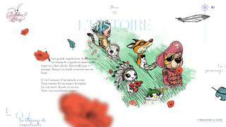
Doudou Blues is a Christmas story for children, featuring the adventures of characters from a well-known French song. The thoughtfully art-directed website for the project is quite charming, taking Scott Pennor’s beautiful illustrations and combining them with a children's book-style layout and gorgeous typography to create an alluring aesthetic that’s far more than the sum of its parts.
05. Ice and Sky
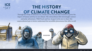
When you encounter the vast, empty wilderness of Antarctica, the last unspoiled continent, a sense of childlike wonder is entirely appropriate. And so educational website Ice & Sky, which retraces the footsteps of Claude Lorius, a farseeing climate specialist, does well to employ a series of illustrations reminiscent of adventure comic books such as Tintin. Inspiring work by French design agency Source on behalf of non-profit organisation Association Wild-Touch.
06. Pottermore
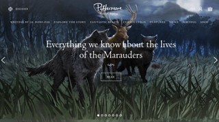
Although material from the films surrounds the Harry Potter brand these days, it began its life as a series of books. So it’s appropriate that children’s book-style illustrations play a major role in JK Rowling’s Pottermore website, which promotes her latest projects, including Fantastic Beasts and Where to Find Them and the Cursed Child stage play.
Along with these official illustrations, Rowling has also been known to slip her own artwork onto the site, as this post reveals.
07. Seussville
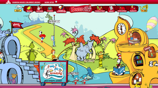
Generation after generation of children have fallen in love with the anarchic and surreal Dr Seuss books, and it’s not hard to see why. Their sense of joyous, wild abandonment translates well to the official website, with the bright and colourful cartoons of the late Theodor Seuss Geisel bringing the games, printable activities and character guides it contains to magical life.
08. Till Krüss
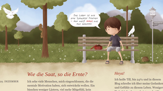
Till Krüss is a senior web developer with 17 years of experience, who loves the web, dancing, power-lifting and hugging trees. Based in Nelson, British Columbia, he harnesses a wistful, child-like illustration to give a unique look to his German-language blog, in which he shares his thoughts and feelings about life.
09. Pigeon and Pigeonette
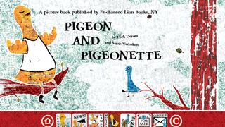
Pigeon and Pigeonette is a picture book from New York publisher Enchanted Lion, about the friendship that develops between a large blind pigeon and a little pigeon whose wings are too small to carry her. The distinctive drawing style of its writer and illustrator, Sarah Verroken, is integral to the visual appeal of its associated website, and make you feel like you’re really turning pages when you go from section to section.
10. The Many Faces of John Cusack
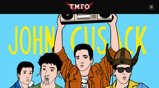
OK, this one’s quite silly, but we still love it. The creation of Paravel, a three-man web design shop in Austin, Texas, ‘The Many Faces of John Cusack’ is a fun infographic post written by Reagan Ray, Trent Walton and Dave Rupert based on their love for the 1980s Brat Pack actor. Ray’s evocative illustrations tie it all together nicely, and if you enjoy this, there are more ‘Many Faces of’ posts by Paravel here.

Thank you for reading 5 articles this month* Join now for unlimited access
Enjoy your first month for just £1 / $1 / €1
*Read 5 free articles per month without a subscription

Join now for unlimited access
Try first month for just £1 / $1 / €1
Get the Creative Bloq Newsletter
Daily design news, reviews, how-tos and more, as picked by the editors.
Tom May is an award-winning journalist and editor specialising in design, photography and technology. Author of the Amazon #1 bestseller Great TED Talks: Creativity, published by Pavilion Books, Tom was previously editor of Professional Photography magazine, associate editor at Creative Bloq, and deputy editor at net magazine. Today, he is a regular contributor to Creative Bloq and its sister sites Digital Camera World, T3.com and Tech Radar. He also writes for Creative Boom and works on content marketing projects.
