Create the perfect infographic in 3 steps
Information designer Tiffany Farrant-Gonzalez explains how to turn data into accessible visual narratives for clients.

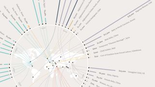
Data visualisations, charts and infographics are tools to help make data accessible and understandable – like this one, The Human Cost, which takes a look at the price of a human life across history.
It's important to choose a method of presentation that's accurate, clear and informative. So how do you do that? Well you can start by choosing one of the best infographics tools and then following these three steps for creating the perfect infographic...
01. Get to know your data

Before you get started thinking about how you want to present your data, you need to get to know it first. Have a play with filter tables, spreadsheet columns and basic chart types to begin answering questions like:
- How much data do you have to work with?
- Can the data be categorised in anyway?
- Can the data be organised chronologically?
- Are there any outliers?
02. Let the data tell its story...

...Rather than finding data to support a pre-determined message. Putting the blinkers on and and only finding evidence to support your predefined message or narrative is a sure-fire way to completely mislead your audience (even if you have good intentions).
Infographics should be about finding the meaning within a set of data, and not about picking and choosing the data that simply supports your message or claim.
03. Choose the right visual for the job

You shouldn't sacrifice clarity in order to make something look "cool". The challenge is to strike a balance between creating something engaging and creating something helpful.
If a bar chart is the clearest way of presenting your particular dataset, don't be scared to use a bar chart.
Words and illustrations: Tiffany Farrant-Gonzalez
Tiffany currently works as a freelance information designer, turning data into visual narratives for a wide variety of clients.
The full version of this article first appeared inside net magazine issue 272, a Google Analytics special on sale now.
- Liked this? Try these...
- Free vector pack for creating infographics
- 6 tips for creating powerful data visualisations
- Download the best free fonts

Thank you for reading 5 articles this month* Join now for unlimited access
Enjoy your first month for just £1 / $1 / €1
*Read 5 free articles per month without a subscription

Join now for unlimited access
Try first month for just £1 / $1 / €1
Get the Creative Bloq Newsletter
Daily design news, reviews, how-tos and more, as picked by the editors.
The Creative Bloq team is made up of a group of design fans, and has changed and evolved since Creative Bloq began back in 2012. The current website team consists of eight full-time members of staff: Editor Georgia Coggan, Deputy Editor Rosie Hilder, Ecommerce Editor Beren Neale, Senior News Editor Daniel Piper, Editor, Digital Art and 3D Ian Dean, Tech Reviews Editor Erlingur Einarsson and Ecommerce Writer Beth Nicholls and Staff Writer Natalie Fear, as well as a roster of freelancers from around the world. The 3D World and ImagineFX magazine teams also pitch in, ensuring that content from 3D World and ImagineFX is represented on Creative Bloq.
