Pro tips for creating interactive infographics
The future of data visualisation lies in interactivity. Here's how to create a truly stunning interactive infographic.
Infographics are everywhere on the web, and they're increasingly interactive. On this page I've gathered together examples of the best infographics with interactive functionality, and looked at what makes them great. On page two you'll find some handy resources and libraries to help you build your own (or take a look at our roundup of top infographics tools).
If you're creating a new website to house your infographics, you'll need a website builder and top web hosting. Want to store your creations securely? Try these cloud storage options. Or, read on to find out how you can create a design that truly engages with your audience.
01. Understand the psychology
Before you start to make your interactive infographic, it's worth considering why you're making it interactive.
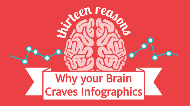
As the brilliant infographic Why Your Brain Craves Infographics explains, people are visually wired. We're all far more likely to be willing to read, understand, and remember a presentation that includes engaging visuals. But while visuals are arguably the most essential learning tool, they can only go so far.
There is also the vital component of kinetic learning, by which people are better able to retain information through a physical activity. So it makes a lot of sense that adding interactivity to the already potent field of data visualisation should make an infographic even more memorable and effective.
This combination of visual and kinetic approaches is what makes interactive infographics the data visualisations of the future. Of course, some infographic topics simply don't encourage the use of any interactive elements – but many others are vastly improved by them. Interactivity can help to make sense of the information, give control to the user, and capture the imagination in ways that a static graphic simply can't.
02. Add spice with scrolling effects
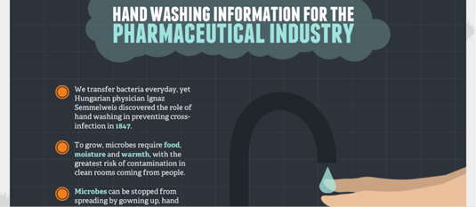
One of the most popular types of interactivity requires just a little scrolling from its users, which usually triggers animations and transitions. It creates the same need for completion as a jack-in-the-box; users feel compelled to finish what they've started.
Get the Creative Bloq Newsletter
Daily design news, reviews, how-tos and more, as picked by the editors.
It's a great technique for drawing viewers into a story and making them feel more engaged without overtaxing any limits of interest. The handwashing infographic above uses both subtle and flashy animations to make the journey through a rather dry topic as fun as possible.
Scrolling can also be used in really simple ways, with simple narratives. For example take a look at this iPod capacity visualisation. The content is incredibly basic, but the scrolling factor does an excellent job of communicating the point.
03. Paginate for easy digestion
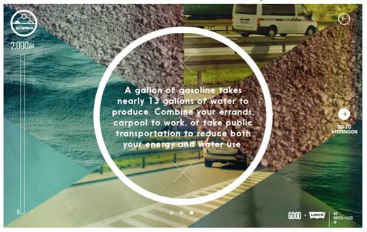
Your Daily Dose of Water has users click through pages rather than scroll, and shows how some concepts work better with this multi-page approach.
Elements on each page are interactive beyond the simple movement between topics, so clicking onto a new page more ensures the user has time to fully digest one portion before moving on to the next.
04. Let users highlight certain areas

Some of the best infographics are the ones that take an unwieldy amount of data and distill it into a single, manageable graphic. But these visualisations often still take some patience and perseverance to understand. Interactive highlighting of different portions can help minimise initial confusion, which is essential for attracting and retaining the average easily-distracted web user.
The infographic about IRS tax returns above, How Much Goes Unclaimed Every Year, could have displayed the number of individuals and amounts of unclaimed money per state in one large chart, but featuring each one individually makes it much less confusing.
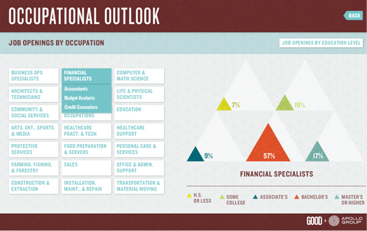
Occupational Outlook (above) which displays percentages of job openings by both occupation and education level, has a similar presentation. But this infographic includes so much information that it was necessarily split it into several different pages.
However, the rollover functionality is the same across all pages, which makes the information feel like it's all of a piece. If you don't have the time or resources to build something quite as robust, you can often supplement with a few well placed animations.
In a much more simple way, this business guide to intangible assets utilises scrolling animations to add pizazz to its otherwise mundane charts and graphs, helping to keep the user's attention throughout the page.
05. Hide some information
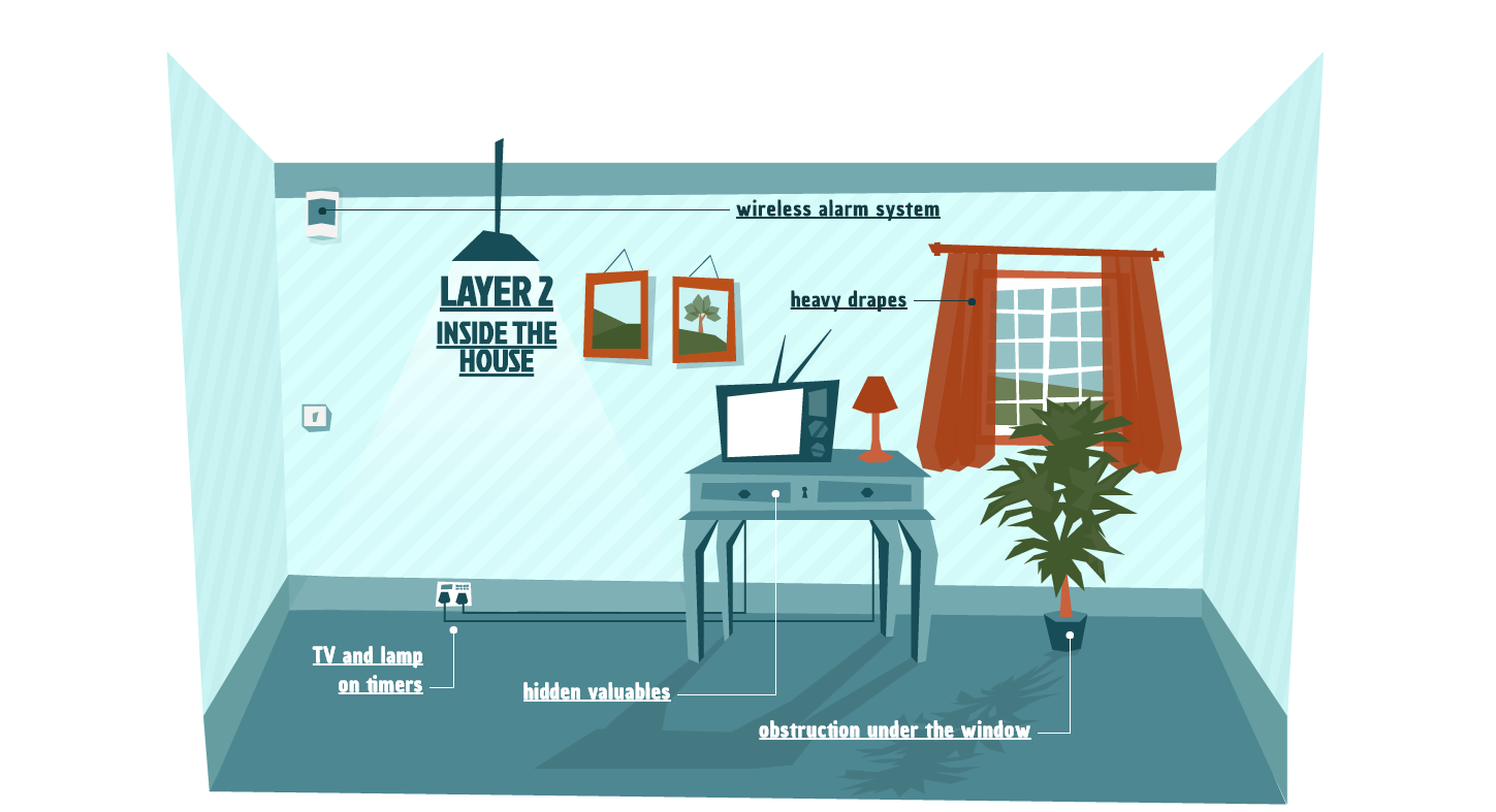
Another great way to get users to actively participate in the infographic experience is to have clicks or rollovers that offer more information. Not only does this encourage the user's sense of curiosity and exploration, it also allows them to skip over minor topics that are not of interest to them, without discouraging them from continuing on with the rest of the infographic.
On the more complex end of examples is the SimpliSafe guide to home security (shown above). There's a lot more than just clickable links in this journey through the different layers of home defence, but their inclusion makes for a richer learning experience.
06. User participation is compelling
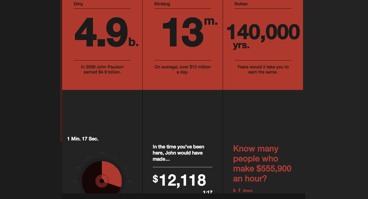
You vs John Paulson shows an example of the type of infographic that populates its information based on the user's particular data entries. By entering your annual salary, you get a comparison with the amount of money that foreign trader John Paulson makes in a matter of minutes (along with a few other examples, just to drive to point home).
Because this type of interactivity only works for a minority of topics, it's less common than the others on this list. However, it's probably also the most compelling, not only because it invites the most user participation, but also because it uses personalised information.
Next page: Resources to help you bring your infographics to life

Thank you for reading 5 articles this month* Join now for unlimited access
Enjoy your first month for just £1 / $1 / €1
*Read 5 free articles per month without a subscription

Join now for unlimited access
Try first month for just £1 / $1 / €1
- 1
- 2
Current page: Impressive interactive infographics to inspire you
Next Page Helpful resources for making infographics
The Creative Bloq team is made up of a group of design fans, and has changed and evolved since Creative Bloq began back in 2012. The current website team consists of eight full-time members of staff: Editor Georgia Coggan, Deputy Editor Rosie Hilder, Ecommerce Editor Beren Neale, Senior News Editor Daniel Piper, Editor, Digital Art and 3D Ian Dean, Tech Reviews Editor Erlingur Einarsson, Ecommerce Writer Beth Nicholls and Staff Writer Natalie Fear, as well as a roster of freelancers from around the world. The ImagineFX magazine team also pitch in, ensuring that content from leading digital art publication ImagineFX is represented on Creative Bloq.
