20 free data visualisation tools
Brian Suda presents 20 tools and educational resources for cleaning up data and creating brilliant visualisations
In this article, I want to focus on tips and tools that are free and easily accessible. There are loads of great paid tools out there, and I use many of them. But it is hard to expect someone just getting into this field to pay for expensive software without actually knowing what they are getting into. This article looks to expand the list to even more tools and resources you can use to help you get started creating beautiful data visualisations for the web and print.
From data journalism, where you are scrubbing and combining datasets, to ornately designed infographic style posters, you need to understand the tools and your audience to succeed. This article will point you in the right directions to both improve your skills as well as open your eyes to new resources.
Cleaning up
Anyone who works with data sets will tell you that a big portion of your time is spent cleaning it up into a usable format! A typical data clean-up job might be to convert a messy excel file into the right column order, reformatting numeric values and expanding or contracting acronyms. "UK" and "U.K." and "United Kingdom" are all the same value represented different ways. "Cleaning" data so the information is consistent helps the workflow in later tools.
Over the years a more and more tools have been created to help ease the pain. If you are going to get into this field, the only way to keep your sanity is to know what tools are out there to help clean-up your data. There is nothing worse than spending your time copying and pasting from a PDF into a database. Here are a few tools to help you work smarter, not harder.
Data Wrangler
Data Wrangler is a web-based tool in which you paste in your messy data set and it works with you through a few steps for ways to clean the data so you can download it in a nicer format and work with it in the tools you're comfortable with. The data vis team at Stanford is really on the ball with new techniques to extract data.
Open Refine
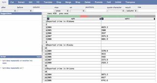
Open Refine is the re-branding of Google Refine. Much like Data Wrangler, Open Refine helps clean your data into a usable format, but the difference is that it runs locally on your computer rather than online. If you are concerned with keeping your data secure, Open Refine might be the solution for you.
Both of these tools not only clean-up messy data, but have some smarts to let you know when it thinks a data point might be wrong. A missing comma, period or units symbol might add or subtract three zeros from an amount. For instance, 100,000 and 100K are the same value, represented differently. These outliers are flagged for you to look into further.
The tools also try to help with common acronyms like merging NASA and N.A.S.A. together. These are massive time-savers when you are trying to analyse the results.
Tabula
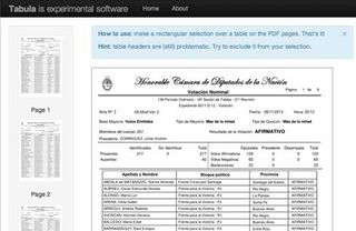
Tabula is a new project geared to help you extract CSV data from ugly PDFs. Tabula has a simple interface where you simply select the area that you want to extract data from and it returns a preview and a CSV file. It is as simple as that! There is an amazing demo to show off what it can do, but ultimately you need to get it running on your own servers to process your own documents.
As more and more governmental organisations are forced to release their data, they reluctantly do so as PDFs. PDFs are far from accessible documents for machines, so the maturity and number of tools to extract data from PDFs is also growing. There are huge opportunities to become an expert in just data cleaning techniques. This is just one of many fields that didn't even exist a few years ago, now it is a highly desirable skill to have.
D3
In the previous article, I mentioned D3 as a tool for chart generation. It is on the more complex side if you want simple charts and graphs, but there are a few additional libraries that build on D3 to make things easier.
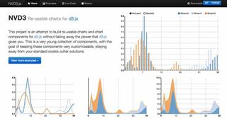
NVD3
NVD3 is a library meant for reuse. The project takes all the power of D3 and distills them down into common chart types. I really like this idea because it gives you constrains and prevents you from running wild with different designs, while at the same time making the code much easier and more approachable if you are just getting started in data visualisation.
Get the Creative Bloq Newsletter
Daily design news, reviews, how-tos and more, as picked by the editors.
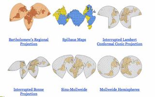
D3 Maps
If cartography is your thing, this is a beautiful map generation tool built for D3. I'm not sure when you'll need to create a 'Wiechel Projection' map, but if you ever do, this is the tool for you! This makes it very easy to create maps for use in a project where the story benefits from using a non-standard map library for directions.
Tools
Here is a list of general chart creation tools, some more open and adjustable than others. All of these provide value to the raw data and can be used as a source of inspiration as well as tools that you could possibly use in your workflow and design.
Wolfram Alpha
Wolfram Alpha isn't a search engine, it is a knowledge engine. For just about any piece of data, WolframAlpha can plot it. Asking it questions like "Next Full Moon" and it returns basic visualisations. When you ask it about your Facebook account it returns plenty of interesting charts, graphs and other data about your connections and interests. While this isn't a general purpose tool, it is an excellent example of taking a large data set and representing it in different ways. More here on the Wolfram Alpha blog.
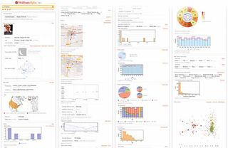
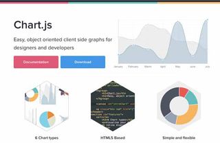
Chart.js
Chart.js is a beautiful open-source charting library for designers and developers. With a a few lines of JavaScript code you can render a chart inside a <canvas> element. This means that it needs a bit of help with IE8 and below, but nothing an IE shiv can't handle. Chart.js covers the basic chart types very well and only adds 20KB to your page size to do it.
If you are looking for a replacement for your current charts and graphs, this might be the answer.
Processing.js
If you have heard of Processing, you probably know the strange and awesome animation and interactive power it has! You probably know that it exported Java-based applets for the web. Now, you get all the craziness of Processing, but in JavaScript.
This opens the door to some amazing interactive data visualisations. The minified version weighs in at over 200KB, but for a fully functional animation tool and physics engine, it could be a lot worse!
Paper.js
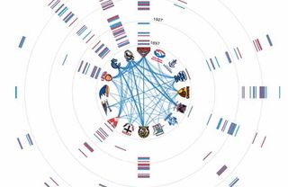
For years the best way to script any of the Adobe suite software was http://scriptographer.org. Now that has moved onto the web with Paper.js. While Processing.js has been around for a few years, Paper.js is the new kid on the block. It's worth keeping an eye on this library. While new, it's pedigree is very strong. From just browsing the examples, I'm sure you can think of a few projects where this would have been useful.
JpGraph
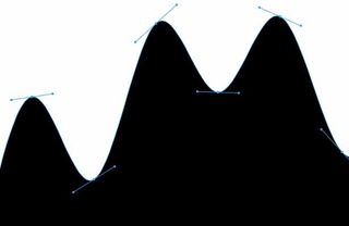
With the imminent closing of Google Static Charts, there was a gap in the market for static graph generation. While fancy interactive charts are great, when people want to copy and paste them into their slide deck presentations, a vector SVG graph is near impossible. Luckily the canvas element allows for the ability to export a flat image format, and there is always screen capture. But why not start with static graphics when appropriate anyway? JpGraph is a great replacement for Google Static Charts. Written in PHP and self-hosted, with a liberal license, this is a great addition to your toolbox to create data visualisations.
Circos
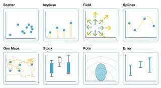
With the imminent closing of Google Static Charts, there was a gap in the market for static graph generation. While fancy interactive charts are great, when people want to copy and paste them into their slide deck presentations, a vector SVG graph is near impossible. Luckily the canvas element allows for the ability to export a flat image format, and there is always screen capture. But why not start with static graphics when appropriate anyway? JpGraph is a great replacement for Google Static Charts. Written in PHP and self-hosted, with a liberal license, this is a great addition to your toolbox to create data visualisations.
Mapping
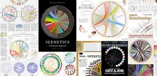
In the last article, I talked about various tools to use a map as a visualisation tool. Most of these focused on the map as location information, but there are many more ways a map can be used to represent data. These are a few tools that use maps, but aren't directly about the location-ness of a map.
Open Heat Map
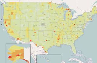
Heat maps are those magically drawn areas showing how often an event occurs in the area. This could be attributes like temperature, price or event density. To show these heat maps has always required loads of mathematical knowledge and the ability to render your own map tiles and add them to existing maps. Open Heat Map removes all these challenges by simply taking a spreadsheet document and then doing the mathematics and rendering the heat map tiles for you. It is a great way to show-off your data visualisation skills with minimal effort.
Color Brewer
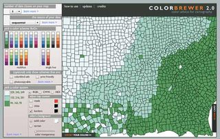
As you get into creating data visualisation using maps, you'll inevitably end-up going to that rabbit hole of choosing colours. Selecting the right colour palette is difficult for several reasons. You need to keep in mind the reader and how they will be consuming the data. Choosing colours that work in print, on black and white devices, on an LCD screen, are acceptable for people with low vision or colour blindness or simply with enough contrast for everyone to be able to distinguish a difference can be difficult to do right! Color Brewer helps by allowing you to select some parameters specific to your project then offering a series of pre-made colour palettes that meet the criteria.
Timelines
A great way to visualise event data is on a timeline. It helps you identify what events happened when and for what duration. From scheduling to investigative journalism, visually seeing a records of the events on a timeline is helpful. There are a few tools out there to create scrollable and zoomable timelines with ease.
Timeline
This is an MIT SIMILE project. It's been around for a while and is very robust. It accepts JSON and XML as input and plots all types of events from just about any time format. From dinosaurs to daily planners, this is an easy visualisation to get up and running. Timeline is fully customisable, which makes for fun triple-stacked time lines that are all interconnected and scroll as each is swiped individually.
Here is Today
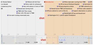
Timelines can be used to show vast scales and differences in time. Here is Today is a great example of an interactive timeline which continues to zoom out to give relative times all based on today. It seems simple, but is an example of several good aspects of data visualisation design. It is interactive, which allows the reader to continue at their own pace, but it is also only showing the relative information at each step. It compares today with a month, then a year, then century, etc. It isn't overwhelming the reader with all the data at once, or forcing the person to choose only one interpretation.

Timeflow
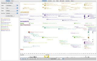
Timeflow allows you to create time-based diagrams easily and quickly. Designed for journalists, it allows for a variety of different ways to visualise the data and help you understand any underlying trends. The project hasn't been touched in a few years, but it is still available for anyone willing to give it a try.
Learning more
Beyond the tools, it's always good to keep up with what is happening in the world of data visualisations. The best way I've found to do this is to both look forward and look back. There are hundreds of years of design choices that have been refined over and over again. As we get to new mediums such as the web and new devices of varying sizes, many of the design principals still remain true. That said, you need to be on your toes to keep abreast of what is coming down the tubes on the internet as well as all the new research and findings. These are a few excellent resources to continue learning about data visualisations and designing with data.
Data Stories
Data Stories isn't a tool that you can install and work with on a daily basis. It's a podcast which highlights some of the best experts in the field discussing their workflows, tools and projects. If you are serious about data visualisations, then you need to be keeping up with the industry. There is no better way than to learn directly from the experts.
Data Journalism
Stanford has positioned itself as one of the hubs for data journalism. They have great tools like Data Wrangler and many others you can browse at http://vis.stanford.edu. Beyond that, they have courses and videos dedicated to Data Journalism. You can watch the film online at http://datajournalism.stanford.edu and see how many of the tools, uses-cases and workflows are implemented in real-world situations.

Teaching to See
Inge Druckrey is one of the most well respected designers. Over the last 40 years she has taught graphic design to some of the greatest designers today. Most recently, she has made a short film called "Teaching to See". If you are serious about designing with data, then you should sit back and learn.

Practice makes perfect
As you become more and more immersed in large data sets, you'll need to understand much more than just visual display. You need to understand the tools to help you clean-up the data, prune the data to a smaller segment and understand what the reader needs to know. From that, you can begin to use these different tools to create a visual representation of the data. This might be circles, maps or other charts and graphs. It will take practice, which is why I also included plenty of resources that are not tools. If you are serious about data visualisations, you need to keep on top of what is happening in the industry, watch conference videos, listen to related podcasts and interviews as well as keep reading everything you can about data visualisations from the best practitioners. Videos from the Eyeo Festival are a great place to start watching and learning about who's who in this field.
As you implement many of these tools for your own projects, it is important for you to share your knowledge. This is a growing field and you have the opportunity to be an expert in some niche part of it. Take the opportunity and explain to others how you achieved your results and learned from your mistakes.
Brian is a software developer and author of A Practical Guide to Designing with Data (Five Simple Steps).

Thank you for reading 5 articles this month* Join now for unlimited access
Enjoy your first month for just £1 / $1 / €1
*Read 5 free articles per month without a subscription

Join now for unlimited access
Try first month for just £1 / $1 / €1
The Creative Bloq team is made up of a group of design fans, and has changed and evolved since Creative Bloq began back in 2012. The current website team consists of eight full-time members of staff: Editor Georgia Coggan, Deputy Editor Rosie Hilder, Ecommerce Editor Beren Neale, Senior News Editor Daniel Piper, Editor, Digital Art and 3D Ian Dean, Tech Reviews Editor Erlingur Einarsson and Ecommerce Writer Beth Nicholls and Staff Writer Natalie Fear, as well as a roster of freelancers from around the world. The 3D World and ImagineFX magazine teams also pitch in, ensuring that content from 3D World and ImagineFX is represented on Creative Bloq.


