Create layouts faster in InDesign
Tips for using object selection and frame editing with InDesign’s easy-to-use Gap tool and Live Corner Effects.
- Software: InDesign CS5-CC
- Project time: 1 hour
- Skills: Scale and resize different gaps between objects, use Live Corner Effects, quickly edit layouts without leaving the spread
Since InDesign CS5, you’ve been able to distribute layout elements, resize gaps and customise frame corners faster using the interactive Gap tool and Live Corner Effects.
These intuitive features enable you to manipulate objects without having to leave the spread or constantly switch tools – shaving valuable seconds off repetitive tasks.
01. Use the typography setting
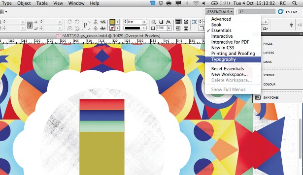
To get started, first switch your screen workspace to the Typography setting under Workspace or through the drop-down menu. Typography is a good option when you’re working with magazine layouts because it gives you all of the tools you need, enabling you to work very efficiently.
02. Create a grid
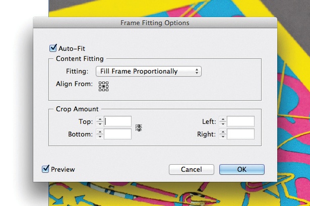
Let’s start by creating a grid of frames within your layout. Before dropping your images into each one, select all the frames and hit Object>Fitting>Frame Fitting Options. Set Fitting to Fill Frame Proportionately and set Align From in the centre by clicking on the centre square. Finally, select Auto-Fit, which will enable your images to scale to fit the frame automatically. This will come in handy when you start changing the size of the frames. Now click OK and go back to your layout.
03. Load in images
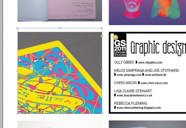
It’s time to load your images into the grid of frames you’ve created. Click on File and choose Place. Select all the images you’d like to bring into the layout and hit Open. This will load the images into a brush and you’ll simply need to click on each frame to load them.
04. Reposition your images
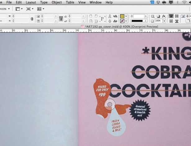
When hovering over an image you’ll notice the content indicator – a transparent circle in the middle of the picture. If you place your mouse in the centre of the circle, the cursor will change to a hand symbol. This enables you to reposition images easily by clicking and dragging them to look exactly as you wish.
05. Adjust spacing
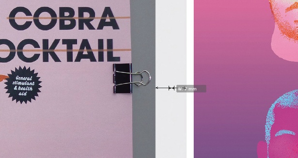
You can use the Gap tool to adjust the space between two or more objects without having to individually size the elements on the page. Select the Gap tool. Hover it between the frames you’d like to adjust and a highlight appears with two directional arrows. By dragging the highlighted space left, right, up and down, you can simultaneously manipulate the spaces between the objects.
Get the Creative Bloq Newsletter
Daily design news, reviews, how-tos and more, as picked by the editors.
06. Tweak individual image placement
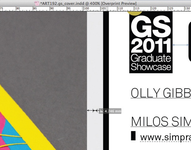
You’ll notice that by default the shared gap boundary is affected and therefore all images within the same row or column will scale together. If you’d like to select only two objects to be resized, hold the Shift key and drag between the two images.
Let’s say that you want to change the size of the gap between the objects. Hit Ctrl/Cmd and drag to make the gap bigger or smaller.
07. Measure gaps between items
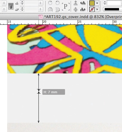
The Gap tool can also easily be used to measure the gap between two objects. Place the Gap tool between the objects, and then click and hold. The Smart Dimensions feature displays the width and height of the gap.
08. Change the shape of the frames

Now that you have a grid of images positioned the way you want, let’s make the layout more dynamic by changing the shape of the frames. Switch back to the Selection tool and click on one of the images. You’ll notice a yellow square on the right edge of the frame. Click on this square and all four corners now have yellow diamonds.
09. Curve your corners
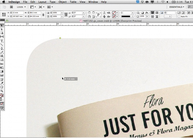
Press Shift and start dragging one of the yellow diamonds on the corner to change the radius dynamically to 15pt. In order to adjust all four corners at the same time, simply click on one of the yellow diamonds and drag until you have your desired radius on all four corners.
Liked this? Read these!
- Free Photoshop brushes every creative must have
- Free Photoshop actions to create stunning effects
- The best Photoshop plugins

Thank you for reading 5 articles this month* Join now for unlimited access
Enjoy your first month for just £1 / $1 / €1
*Read 5 free articles per month without a subscription

Join now for unlimited access
Try first month for just £1 / $1 / €1

The Creative Bloq team is made up of a group of art and design enthusiasts, and has changed and evolved since Creative Bloq began back in 2012. The current website team consists of eight full-time members of staff: Editor Georgia Coggan, Deputy Editor Rosie Hilder, Ecommerce Editor Beren Neale, Senior News Editor Daniel Piper, Editor, Digital Art and 3D Ian Dean, Tech Reviews Editor Erlingur Einarsson, Ecommerce Writer Beth Nicholls and Staff Writer Natalie Fear, as well as a roster of freelancers from around the world. The ImagineFX magazine team also pitch in, ensuring that content from leading digital art publication ImagineFX is represented on Creative Bloq.
