Simulate screenprint effects
Steven Acres shows you how to replicate manual silk-screening techniques in a digital environment, with the help of bitmaps.
- Software: InDesign and Photoshop CS2 or later
- Project time: 1 hour
- Skills: Clean up images in Photoshop, convert raster images to bitmap, digitally create a silkscreened aesthetic
A great way to add a screenprint effect to your design work – be it a complex album cover or a simple magazine spread – is to overlay different elements and allow their colours to blend. This technique has been implemented in silk-screening for many years to get the most out of two or three-colour prints, and it’s also effective when applied correctly within a digital environment using an application such as InDesign.
This project will show you how to simulate overprinting within InDesign using raster imagery – and, even better, your own scanned artwork – while being able to change the colour of your artwork on-the-fly. A secondary benefit is that you can have one PSD/TIFF file, but it can be repeated as many times as you want in the document and each one can have a completely different colour, reducing the amount of files required to print.
Step 01
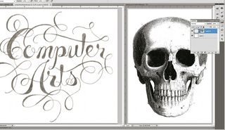
First gather two images that you want to use in your final composition, making sure they’re fairly high resolution. In this case, I’m going to be making a relatively simple poster by overlaying some type drawn in a sketchbook on an old engraving of a skull. Nothing works better in posters than cryptic, mysterious superimpositions! Open the images in a new Photoshop document and clean them up a bit, getting rid of stray pixels and dirty areas. In the end they’ll be flattened, so whatever method you choose will work.
Step 02
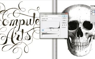
In this step we’ll be increasing the contrast – via Levels, Curves or however you choose – to make sure there’s a full range of whites to blacks. When we convert the images to bitmap, having a full range will give the image real pop. Since I chose to use hand-drawn type instead of vector, I want to maintain the imperfect edges and sketched feel, so I won’t push it too far. The amount of adjustment will vary depending on what kind of bitmap you go with.
Step 03
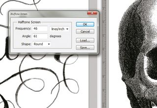
This step requires the most time and experimentation. Convert the images to grayscale and then to bitmap (only black and white pixels) by clicking Image>Mode. There are many different ways for Photoshop to draw the bitmap, so experiment until you find your desired aesthetic. Line art should be above 600dpi for best printing quality (1,000-1,200dpi is recommended). For the lettering I went with a Round Halftone Screen, and since the skull is already a line drawing, it’s at 50% Threshold.
Step 04
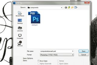
When you’ve flattened the images and converted them to bitmap, save them into a folder with the other images you’ll be using. You can save files as either TIFFs or PSDs. PSDs usually end up being smaller files and InDesign gets along better with Adobe-native file formats, so I’ve gone for PSDs.
Step 05
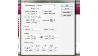
After preparing the files, open a new document in InDesign. I set up a file with no facing pages (since this project is just a poster) at A2 size. Everything else is at zero because we won’t be needing any gutters or margins.
Step 06
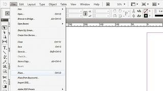
Place the images InDesign (Ctrl/Cmd+D). Play around with the image and give it a rough position. You don’t need to embed the images in the ID doc (using the Links panel menu) but you can if you want.
Get the Creative Bloq Newsletter
Daily design news, reviews, how-tos and more, as picked by the editors.
Step 07

Select the image with the Direct Selection tool (or double-click on it) and open the Swatches palette. Make sure you’re changing the fill colour and not the border colour, and select the colour you want.
Step 08
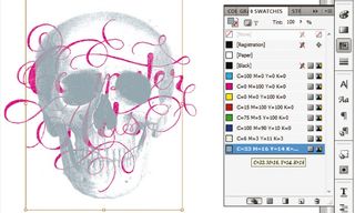
Now repeat steps six and seven to get your secondary image in the composition. Superimpose the second image on the first image at some point (even if it’s just a corner), thus preparing it to simulate the overprinting process. The lighter the colours, the more evident the mixture will be. Dark colours can become pretty muddy and you won’t be able to see the overprint.
Step 09
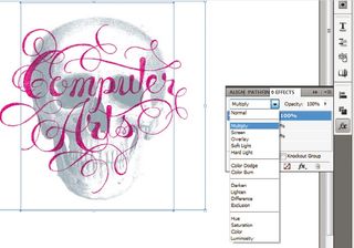
Select both images, and in the Effects palette set them to Multiply. You’ll then see the colours blend. Only the image on top actually has to be set to Multiply, but if you’re going to print on coloured paper or a background (as we are in our final step), it’s best to set them all to Multiply.
Step 10
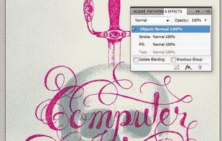
I’ve added a tan background, a pirate’s sword piercing the skull and a light halftone texture (all on Multiply) to flesh out the poster. Of course, before you send it to print make sure all your colours are set up correctly and, if necessary, any images you have going over the edge are set to bleed.
Liked this? Read these!
- Download the best free fonts
- Adobe Photoshop CS6 hands-on review
- Free Photoshop brushes every creative must have
- Free Photoshop actions to create stunning effects
- The best Photoshop plugins

Thank you for reading 5 articles this month* Join now for unlimited access
Enjoy your first month for just £1 / $1 / €1
*Read 5 free articles per month without a subscription

Join now for unlimited access
Try first month for just £1 / $1 / €1
The Creative Bloq team is made up of a group of design fans, and has changed and evolved since Creative Bloq began back in 2012. The current website team consists of eight full-time members of staff: Editor Georgia Coggan, Deputy Editor Rosie Hilder, Ecommerce Editor Beren Neale, Senior News Editor Daniel Piper, Editor, Digital Art and 3D Ian Dean, Tech Reviews Editor Erlingur Einarsson, Ecommerce Writer Beth Nicholls and Staff Writer Natalie Fear, as well as a roster of freelancers from around the world. The ImagineFX magazine team also pitch in, ensuring that content from leading digital art publication ImagineFX is represented on Creative Bloq.
