How to design a poster using Adobe InDesign
T3 art editor Luke O'Neill guides you through the process of designing a striking event poster.
09. Integrate Typography
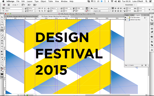
Now to start adding our key elements of information, starting with the main headline. I want to keep my font choices clean and utilitarian so opt for the sans-serif Gotham for the main headline. Start by drawing a large text box that stretches from the left hand margin to the right hand side page bound. Adjust the size of the typography so that it sits within the margins of the page.
10. Leading and Tracking
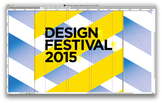
Gotham is tracked a bit wide for my liking and this application so needs adjusting. Select all of your type and adjust the tracking to -50 and the leading to 160. Now go in and correct the kerning between the individual letters by placing the cursor between the letters you want to adjust, holding Alt and using the left and right arrow keys. Adjust and tweak until our headline sits flush between the two margins.
11. Outline text
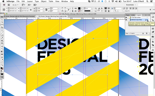
Now we want to turn our main headline into a graphic so that we can create some interplay between the diagonals. Copy and paste the headline and move it onto the pasteboard so that we still have the live text should we need to edit it later.
Select the headline on the page and navigate to Type>Create Outlines. In the layers panel move the little square on the right hand side to the layer below so that the headline sits below the yellow diagonals.
12. Contrasting elements
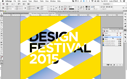
Next copy the headline and select the overlapping yellow diagonal and navigate to Edit>Paste Into or use the keyboard shortcut Alt+Cmd+V. Now use the direct selection tool to select the type within the diagonal and make it a contrasting colour, in this case white.
13. Branding and framing devices
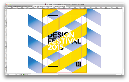
Next is to add any necessary logos, in this case the Creative Bloq marque. Place the logo where you think it sits best – in this case the bottom left – and ensure that you use the grid that we set up earlier so that all elements line up. Next add some black bars the same width as the headline typography and line them up to the top and bottom of the left-hand column of the grid.
14. Secondary typography
Now we need to add any necessary detail copy for the event. For this I have chosen to use the mono-spaced font TSTAR Mono for its technical qualities that works particularly well for detail copy such as dates and lists. Enter all the necessary information and then select the text box and enter 30 degrees as the rotation angle.
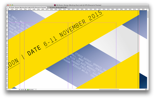
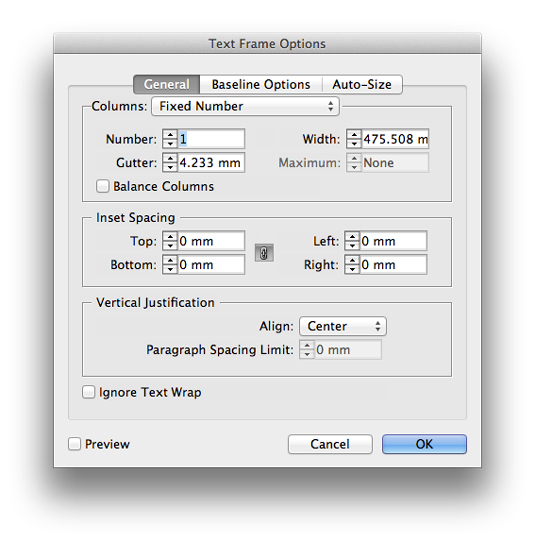
Now extend the text frame so that it lines up with the width of the yellow diagonal and hit Cmd+B to bring up the text frame options. Select centre as the alignment so that the typography sits in the centre of the yellow diagonal graphic. Add even smaller detail copy aligned to the background bars and set the text frame blending mode to overlay so that it blends with the gradient shadows.
15. Final tweaks
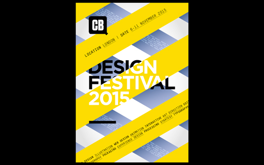
Now we have all the elements of the poster in place its time to take a final sweep of the document and tidy up or tweak elements that you're not completely satisfied with.
Above I decided to adjust the placement of the CB logo and the black bars and also tweak the colours ever so slightly increasing the depth of the shadow colour and also adding in a very subtle white radial gradient in the background to create a vignette effect.
Words: Luke O'Neill
Luke O'Neill is art editor at T3 magazine.
Like this? Read these...
- Free graphic design software available to you right now!
- Illustrator tutorials: amazing ideas to try today!
- Download the best free fonts

Thank you for reading 5 articles this month* Join now for unlimited access
Enjoy your first month for just £1 / $1 / €1
*Read 5 free articles per month without a subscription

Join now for unlimited access
Try first month for just £1 / $1 / €1
Get the Creative Bloq Newsletter
Daily design news, reviews, how-tos and more, as picked by the editors.

The Creative Bloq team is made up of a group of art and design enthusiasts, and has changed and evolved since Creative Bloq began back in 2012. The current website team consists of eight full-time members of staff: Editor Georgia Coggan, Deputy Editor Rosie Hilder, Ecommerce Editor Beren Neale, Senior News Editor Daniel Piper, Editor, Digital Art and 3D Ian Dean, Tech Reviews Editor Erlingur Einarsson, Ecommerce Writer Beth Nicholls and Staff Writer Natalie Fear, as well as a roster of freelancers from around the world. The ImagineFX magazine team also pitch in, ensuring that content from leading digital art publication ImagineFX is represented on Creative Bloq.
