How to design a poster using Adobe InDesign
T3 art editor Luke O'Neill guides you through the process of designing a striking event poster.

Although often seen as primarily a page layout tool, Adobe InDesign is a great program to use when designing a poster. It's true that Illustrator can also be used, but the image, grid and type handling capabilities of InDesign will always give it the edge for me.
Through the next 15 steps I'll run through the process of creating a striking exhibition poster in InDesign, including the use of grids and creating and editing graphics and typography. I've used InDesign CS6 for my poster design but the tools and processes I've employed are universal across all recent iterations of InDesign.
01. Set up document

Launch InDesign and create a new document. In the new document dialog box set the page size to 420x594mm (A2), the number of columns to 3 with a 10mm gutter, and the margins to 50mm. Hit the 'More Options' button in the top right and add 3mm bleed as this is a print document.

02. Create bar
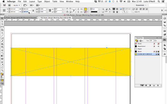
Turn on smart guides found under View>Grids & Guides so that objects will snap to the grid. Now select the rectangle frame tool and draw an oblong shape that stretches the full width and bleed of the document. With the shape still selected, adjust the height to 100mm in the top bar and select a colour for it in the swatches panel, in this case a mixed yellow, Y:100 M:10.
03. Rotate and Shear
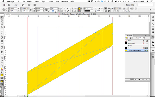
With the shape still selected navigate to the top bar again and enter 30 degrees in the Rotate box and the same in the Shear X Angle box. Your diagonal shape will no longer fit the full width of the document so simply extend the shape to the bounds of the doc.
04. Step and repeat

Holding Shift, drag your diagonal object vertically to the top of the page so that only the bottom left corner is poking onto the page. Now hold Alt+Cmd+U to bring up the Step and Repeat dialog box. Enter 4 as the count and 200mm as the vertical offset. Select preview to see how it will look and then hit OK.
05. Duplicate and Flip

Now select all your diagonals and holding shift drag them vertically until a line appears to indicate that they're centralised on the page. Bring up the layers panel and drag the layer to the 'Create new layer' button at the bottom to duplicate it. Lock the top layer and name it something appropriate.
Hit Cmd+A to select all the diagonals on the duplicated layer and use the 'Flip Horizontal' command in the top bar to flip them. Now colour them up in a contrasting but light colour and name the layer up.
06. Creating shadows
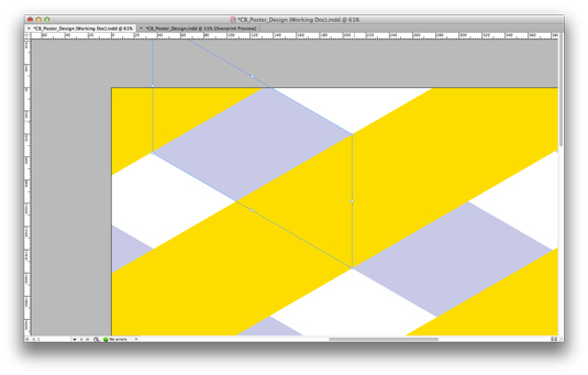
Now we want to add depth to the piece so it appears as though the yellow diagonals are above the violet ones. We don't want to use a simple drop shadow on the yellow bars as this will affect the the white background as well and is a bit clumsy, so we'll use gradients instead.
Start by selecting one of the background bars, copy it and use the Paste in Place command to paste it directly above the original bar. Now adjust the width so that it lines up with the edges of the yellow bars as shown above.
07. Working with gradients (i)
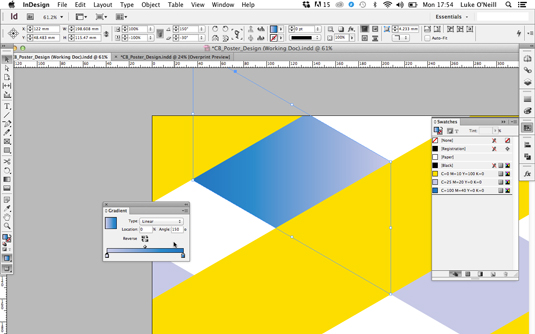
Now to create the gradient. Set up a new darker swatch colour based on the colour of your background diagonals and then double click on the gradient icon in the toolbar and click on the square gradient to apply a default linear gradient. Now drag your darker tint onto the black gradient slider and your original colour onto the white gradient slider.
08. Working with gradients (ii)

Our gradient isn't looking like a shadow yet so we need to tweak it to get it working right. Use the arrow keys to adjust the angle of the gradient until it aligns with the yellow diagonals on the top layer and then adjust the sliders until you're satisfied with the shadow effect. Repeat this process throughout the doc until you're satisfied and have something that resembles the above image.
Next page: the poster tutorial concludes…

Thank you for reading 5 articles this month* Join now for unlimited access
Enjoy your first month for just £1 / $1 / €1
*Read 5 free articles per month without a subscription

Join now for unlimited access
Try first month for just £1 / $1 / €1
Get the Creative Bloq Newsletter
Daily design news, reviews, how-tos and more, as picked by the editors.

The Creative Bloq team is made up of a group of art and design enthusiasts, and has changed and evolved since Creative Bloq began back in 2012. The current website team consists of eight full-time members of staff: Editor Georgia Coggan, Deputy Editor Rosie Hilder, Ecommerce Editor Beren Neale, Senior News Editor Daniel Piper, Editor, Digital Art and 3D Ian Dean, Tech Reviews Editor Erlingur Einarsson, Ecommerce Writer Beth Nicholls and Staff Writer Natalie Fear, as well as a roster of freelancers from around the world. The ImagineFX magazine team also pitch in, ensuring that content from leading digital art publication ImagineFX is represented on Creative Bloq.
