Create a 2017 calendar in just 10 steps
Design and edit a calendar using InDesign in 10 simple steps.

Even with the help of InDesign tutorials, it can be a very time-consuming task to create a calendar in InDesign, thanks to the constant need to cross-reference your dates to make sure they're right. But it doesn't have to be like this: Scott Selberg has created a great piece of JavaScript compatible with InDesign that automatically creates basic calendar designs for you.
By using this script you can eradicate the possibility of getting your days and dates wrong, and add a number of different holiday options. In this tutorial I'm going to show you how to use Selberg’s script to create a calendar, and then walk you through how to edit it from a grid-based format to list format.
The first thing you need to do is download the script and follow the instructions file found in the README folder to add it to your scripting files in InDesign. (Don't forget to make a donation.) Now, let's create a calendar...
01. Select the Calendar Wizard
Open a new document in InDesign CS5 or above. I’m working with an A3 page, with a five-column grid, 10mm gutter, 15mm borders and the 'Facing Pages' box has been deselected. Open your Script panel (Window>Utilities>Scripts or Cmd/Ctrl+Opt/Atl+F11). Open the 'Calendar Wizard' folder and double-click on 'calendarWizard.js' to open the dialog panel.
02. Set up your calendar
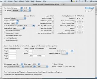
The Calendar Wizard dialog box has a number of different options for creating and styling your calendar. I’m going to keep mine quite simple as I plan to edit it from a grid into a list format. Select the first and last months you want for your calendar from the drop-down menus. In the 'Count Work Week on' drop-down menu I’ve selected 'First Full Week'. Deselect the 'Add Text Layer' box and for 'Page' select 'Current Document', with 'Calendars per Page' set to 1. Now hit OK.
03. Adjust style elements
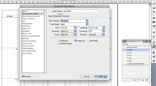
You’ll see that the Calendar Wizard has automatically created a page for each month of the year. It also automatically creates paragraph styles, which make it super easy to edit text styles. Open 'Paragraph Styles Options' (Window>Type and Tables>Paragraph) and double-click on the cal_base style to open the dialog box.
Select 'Basic Character Formats' from the menu on the left and select your font family from the drop-down menu. Editing the cal_base paragraph style will change the font used on all the text throughout your calendar. Continue to customise your calendar, editing the font size and colour, and justifying all the text left.
Get the Creative Bloq Newsletter
Daily design news, reviews, how-tos and more, as picked by the editors.
04. Edit the text
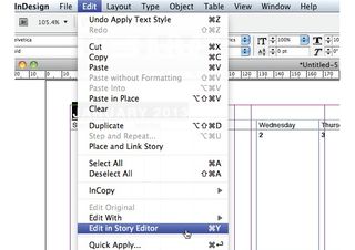
I've decided to adjust my calendar to work in a list format. The first thing to do is add the correct day of the week to each date in the table as they will no longer appear in a column format. To do this you'll need to edit the text via the Story Editor. To open it, select the Type tool and click on the calendar text, then under the Edit menu select 'Edit in Story Editor' (Cmd/Ctrl+Y).
05. Arrange by columns
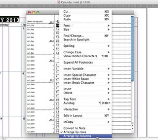
Ctrl+click on the grid icon in the top-left corner of the Story Editor and select 'Arrange by columns'. This makes it much easier to add the correct day to the correct date, as the day appears above the relevant dates. To maintain the applied paragraph style, copy the day and paste it next to the relevant dates.
- Illustrator tutorials: amazing ideas to try today!
06. Change to a single-column table
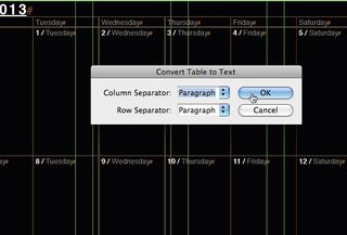
To change the format from a multiple-column table to a single-column table, use the Type tool to select the table. In the Table menu choose ‘Convert table to text’, then open the Column Separator drop-down menu, select Paragraph and hit OK. The text now appears as a long list. Turn on your hidden characters (Cmd/Ctrl+Opt/Alt+I), and delete the unwanted paragraphs left behind by the empty fields of the table and the original days of the week. Leave an extra paragraph below the bottom row of copy.
07. Convert the text
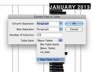
Now you need to convert the text back to a single-column table. First align the text frame to the width of two columns. Select all the copy and in the Table menu choose 'Convert text to table'. Change the Table Style drop-down menu to 'New Table Style', and from the new panel select Table Setup. Change the borders and table spacing to 0 and click OK.
08. Adjust the height of your cells
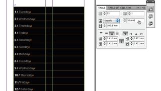
Your table should appear as a long list with strokes on the horizontal lines of the cells. The extra paragraph created in step 06 supplies the bottom stroke. Open the Table panel (Window>Type & Tables) and, with just the dates selected, adjust the height measurement to 10mm and select Exactly from the drop-down menu.
09. Duplicate for other months
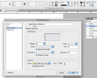
Repeat the process from Step 04 to all the pages of the calendar, applying the table style that you previously set up. I decided to create a cell style to apply to the weekends, to highlight them from the rest of the dates. In the 'Cell Styles' panel select 'New Cell Style' from the drop-down menu. Name your style, and in the 'Stroke and Fills' menu option select a colour from the dropdown menu. Lastly, choose a tint percentage and click OK.
10. Apply styles
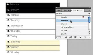
Apply the style by selecting the weekend days from the calendar and choosing the style from the Cell Styles panel. Once you are happy with how the calendar dates are working, you can start adding images to your calendar.
Related articles:

Thank you for reading 5 articles this month* Join now for unlimited access
Enjoy your first month for just £1 / $1 / €1
*Read 5 free articles per month without a subscription

Join now for unlimited access
Try first month for just £1 / $1 / €1
Jo is group art director on the events team at Future and has worked on a number of magazines and brands, including Computer Arts, What Hi-Fi? and T3. She recently led the redesign of Creative Bloq's sister site, TechRadar.
