The quick and dirty guide to building websites in InDesign
Yes, you can use InDesign's HTML export options to build a website. Although the results may not be what you expect, says Lance Evans.
We all know that to build an all-singing, all-dancing website with Adobe software, you'll need Muse, Dreamweaver or Edge Reflow. But when it comes to a quick and dirty website, what about InDesign? Ater all, InDesign has had HTML export capabilities for some years now, right?
Off the top, I can think of a nice range of appropriate projects for just such a workflow. I've no doubt you can as well. First off, any mock-up and presentation work could more easily be produced in ID by a designer who uses that as their main day-to-day application.
Plus, while complexity gets all the attention, the fact is there are many sites on the web are simple, containing some headlines and art and body text - these would be another good match. And who hasn't had a client ask you to create marketing material where the contents are destined for both print and the web?
And if you've been paying attention, Adobe has been progressively adding more and more multimedia and interactivity capabilities to ID over the last few years. Granted, these additions have been overtly targeted at their other export options - EPUB, Flash, SWF - but it does lead one to think InDesign was probably becoming more capable in its HTML output, right?
Well, maybe not. I gave it a try and here's what happened...
Setting up
I booted up ID with a big smile on my face and a hot cup of coffee by my side one morning this week. I was all ready to play with these export HTML tools I had seen before, but never had time to play with. Yes, I was excited. Plus, I naively assumed, this was going to be a snap because these options had been around so long, they must be nicely polished by now, right? Yes, well... maybe not.
I opened InDesign CC and choose File>New...>Document (Ctrl/Cmd+N), and right there you will see an option under the 'Intent' pop-up menu for 'Web' use.
Get the Creative Bloq Newsletter
Daily design news, reviews, how-tos and more, as picked by the editors.
Choose it and it gives us some basic webpage criteria filled in for us, and an option for other standard-ish web page dimensions. Though the default of 800x600 feels very circa 2007, I went with that for this test in hopes it somewhat eases the burden of creating multiple format versions. Life is a compromise, right?

I then began laying out a test page that would never win me any design awards, but I just wanted to throw some basic page elements on a page and export to see what I would get.
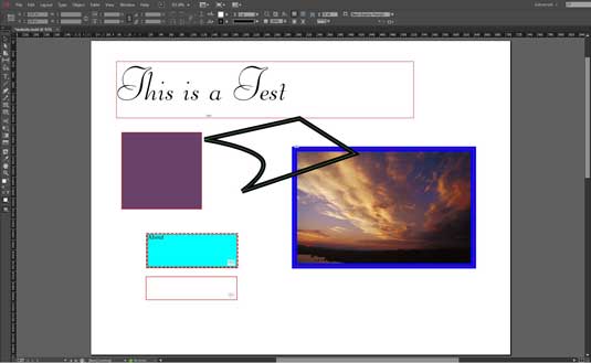
As you can see in the image, I plopped on a line of non-system text, two boxes, one with an image and the other with a solid fill color, and a pen-tool shape. I also included a couple of navigation control buttons, just to see if they would work.
First time unlucky
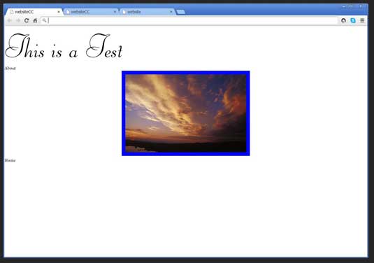
What I got was a mess (and I'm not talking about the design right now). You can see in the first webpage sample image that the filled box and the pen tool element didn't even show up. But it takes more than that to deter me. I tried again. Hmmm... and again.
I reasoned that if the box with the JPEG image was showing up, that putting one in the pen tool element might do the same thing, so I created a 1-pixel square JPEG in Photoshop and drag/dropped it in. Success! This worked and in the next image of the rendered website, you can see this.
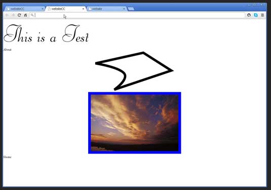
Unfortunately, you can now also now see how the elements were not in the right positions. Tried as I might, noting I could think of made any significant improvement.
I then tried it in the just-released InDesign CC 2014.
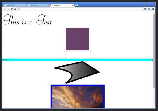
You can see in that image that the export option in this version had some improvement. It rendered the solid fill box, and a gradient fill in the other pen tool element. But the layout was still very wrong.
Wrong direction
I realized I was not going about this right, and it certainly was not going to be as easy and painless as I had first assumed. So I sought out some expert advice in this narrow area. Again to my surprise, there was scant information on the subject to be found on the web, until I came across a very talented designer with serious technical chops named Michael Murphy.
Murphy was kind enough to make time to speak with me about this subject he may know more about than anyone else. In fact it is probably safe to say he had brought this to a high art, as with his other visual creations. He was able to shed a lot of light on this subject, and shares it all in great detail in a series of two courses on the subject published by lynda.com.
The courses are InDesign CS6 to HTML and InDesign for Web Design.
How to do it right
Murphy explained: "When repurposing InDesign content as HTML, there are two built-in export paths: EPUB (either Fixed Layout or Reflowable in CC 2014) or HTML. Both destinations require consistent use of styles (Character, Paragraph, and Object) throughout your project, and that all styles be connected to an HTML equivalent (e.g., the p tag for paragraphs, h1, h2, h3, and so on for headings, and em or strong for italic or bold, respectively). These let you maintain the structure and organization of your content, but not its appearance.
"For appearance, InDesign can generate CSS for both EPUB and HTML. However, the CSS InDesign generates strives to preserve the settings you've applied to a print layout (e.g., a book or a magazine article) and there are too many differences between the print- and screen-based reading experiences for that to produce optimal results.
"Because of this, it's unlikely that you'll get from start to finish without tinkering under the hood and getting into at least the CSS, if not the HTML markup itself."
He went on to explain that typically, the HTML you'll get out of InDesign will be most useful if you have an existing CSS you're targeting (eg, a boilerplate CSS you use for EPUB projects, or a CSS used by your site or its content mangement system).
In that situation, you can simply make the necessary connections between your InDesign styles and their respective HTML tags and CSS classes. Those options are found in the Export Tagging areas of the Paragraph, Character, and Object Style Options dialogs. In the case of Object Styles, think of each object to which a style is applied as a DIV within your HTML and tag it accordingly.
Cold, hard truths
While EPUB export is more predictable, web export is always trying to hit a moving target. Thus, InDesign's HTML export just won't give you easy web-ready output of your print layout. It's only going to give you your content - text and images, in the desired order - with appropriate HTML markup for repurposing on the web. Even with that limitation however, it's a faster path and far less repetitive than doing it manually, especially when you've already established the formatting and hierarchy in InDesign.
"For example," Michael explains "every month I export a full month's worth of magazine articles from their InDesign layouts to HTML for posting on the magazine's web site. With export tagging built into the styles in my templates, the process is fast, relatively clean, and eliminates repetitive work and potential human error from the equation. So taking full advantage of the feature ultimately comes down to realistic expectations and the willingness to do the necessary up-front prep in your documents, templates, and styles."
So, yes it can be done, and done well. It's just that one needs to approach it in a systematic way and set up a good workflow. All of which means we are not talking about a simple one-off project. This is best suited for those that have reasonable amounts of recurring content that needs to be brought to the web, and a content management system or workflow that will support it.
Using a plugin
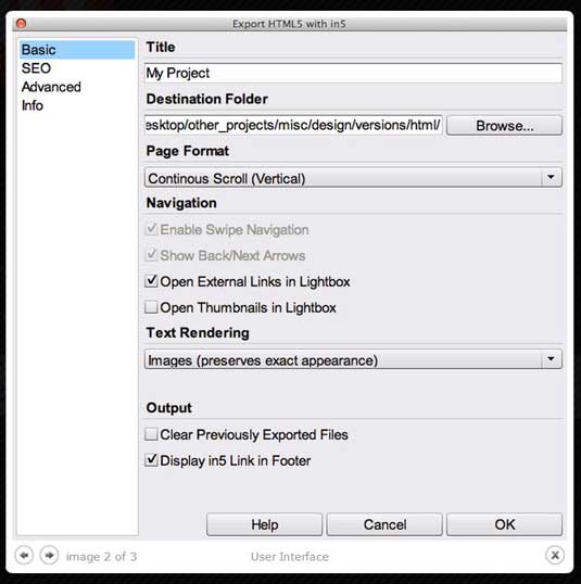
So what about a plugin? Glad you asked! If all of that information above has your head spinning a bit, you aren't alone. For the non-technical there is the alternative of using a plugin called In5, made by Ajar Productions. In5 adds an additional export option, called "Export HTML with In5..." right below the export that is natively in ID.
The options in In5's dialog box have those of the native version, plus additional sections like SEO. The results, when all goes well, are a very useable webpages and site. This is a great option to have, especially in an niche area that has scant few options.
The bottom line: it would be nice if InDesign was the publishing Swiss Army knife I was hoping it was. To Adobe's credit, they are working hard to bring us these tools. But as Michael Murphy pointed out to me, the differences between the two formats, print and web, is so great bridging that gap is hard.
Words: Lance Evans
Lance Evans is creative director of Graphlink Media. He has written books on 3D, and produced the 3DNY Seminars for Apple and Alias.

Thank you for reading 5 articles this month* Join now for unlimited access
Enjoy your first month for just £1 / $1 / €1
*Read 5 free articles per month without a subscription

Join now for unlimited access
Try first month for just £1 / $1 / €1

The Creative Bloq team is made up of a group of art and design enthusiasts, and has changed and evolved since Creative Bloq began back in 2012. The current website team consists of eight full-time members of staff: Editor Georgia Coggan, Deputy Editor Rosie Hilder, Ecommerce Editor Beren Neale, Senior News Editor Daniel Piper, Editor, Digital Art and 3D Ian Dean, Tech Reviews Editor Erlingur Einarsson, Ecommerce Writer Beth Nicholls and Staff Writer Natalie Fear, as well as a roster of freelancers from around the world. The ImagineFX magazine team also pitch in, ensuring that content from leading digital art publication ImagineFX is represented on Creative Bloq.
