Master the perspective grid tool in Adobe Illustrator
Discover how to add an extra dimension to your vector work using the perspective tool.
The perspective tool, much like anything in Adobe Illustrator, can seem a little complicated and daunting at first. Fortunately, once you understand the basics it's pretty easy to get to grips with and you'll end up wondering why you've never used it before.
Through the next five steps I'll run through the basics of setting up a perspective grid, and demonstrate how you can draw directly onto the grid or apply existing vectors to it. I'll also demonstrate a couple of basic applications for its use, which can be applied to a variety of different projects.
For help on perspective in general, see our how to draw perspective guide.
01. Setting up the perspective grid
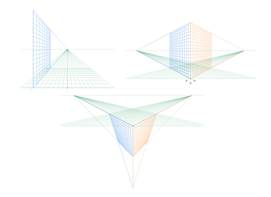
First up, simply click on the perspective tool icon in the toolbar to bring up the standard two-point perspective grid. There are three grid presets: 1-point, 2-point and 3-point perspective. You can switch between these by navigating to 'View > Perspective grid' and choosing the grid you wish to work on. You can only have one grid active per Ai document so bear this in mind before you begin applying anything to the grid.
02. Drawing objects directly onto the grid
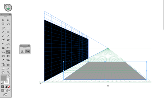
You can adjust the grid easily by hovering over the widgets on it. A move icon will appear, indicating which direction you can adjust the grid.
Drawing directly onto the grid in perspective is easy. Simply select one of the shape tools – in this case the rectangle tool – and begin drawing directly onto the grid. To switch the perspective plane you wish to draw on, just click the relevant plane on the cube icon in the top left.
To adjust the shapes you've drawn on the grid, whilst maintaining their correct perspective, then make sure you use the perspective selection tool and not the normal selection tools.
Get the Creative Bloq Newsletter
Daily design news, reviews, how-tos and more, as picked by the editors.
03. Applying existing vectors to the grid

Drawing directly onto the perspective grid can be a little clumsy if you're creating anything other than simple flat planes. For more detailed graphics its best to draw them flat, off-grid, and then apply them to the perspective grid later.
To do this simply select the plane you wish to apply the graphic to and then use the perspective selection tool to drag it onto your perspective grid. You can adjust the size and position in the same way you would any other object, whilst maintaing the correct perspective.
04. Creating a tunnel effect
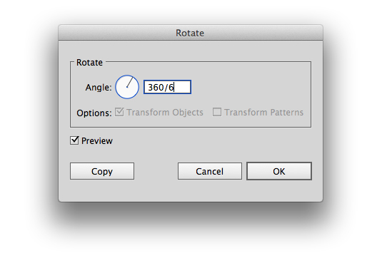
You don't have to rely entirely on the perspective grid to achieve some quick perspective effects. To create a tunnel effect then simply drag the perspective graphic from the previous step using the direct selection tool, then hit R for rotate and select a central position.
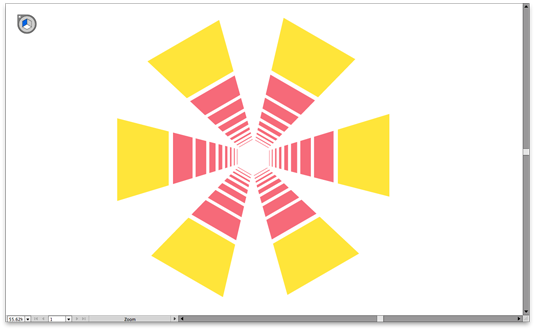
Use the radial effect tool to create a tunnel effect by entering a fraction (in this case 360/6). Then copy the graphic and hit cmd+D to duplicate it.
05. Applying graphics to walls
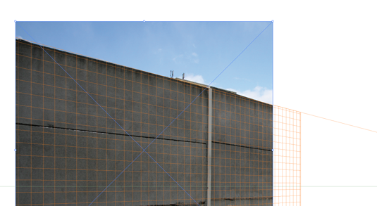
The perspective tool is also good for mocking up what a sign or graphic might look like on a wall. Simply use the 'File > Place' command to import a JPG that you'd like to use as your base.
Then move it under the grid, adjust the grid to the same perspective as the wall and drag your graphics onto the grid to see how they'll look in the real world. You can of course then paste the graphic into Photoshop to give it a more natural look whilst maintaining the same perspective.
Like this? Read these...
- Master Adobe shortcuts with new interactive tool
- The best collage maker tools – and most are free!
- How to build an app: try these great tutorials

Thank you for reading 5 articles this month* Join now for unlimited access
Enjoy your first month for just £1 / $1 / €1
*Read 5 free articles per month without a subscription

Join now for unlimited access
Try first month for just £1 / $1 / €1
Luke is a creative director, visual designer and digital artist, who works at THG Studios in Manchester as creative director of beauty. He previously worked for Future Publishing, where he was art editor of leading magazines such as Guitarist, T3 and Computer Arts.
