Create a drip-effect portrait in Illustrator
Tom Mac reveals how to create a drip-effect portrait using Illustrator's Pen tool and object layering techniques.
The portrait idea is as old as the hills, and in this competitive digital age it's vital to add your own unique styles and twists to grab attention.
In this tutorial I’ll walk you through how to create an unusual multi-layered, drip-effect portrait. We’ll cover the basics of the Pen tool, using a limited colour palette and effective layering techniques to create an original portrait. Once you've got the basics nailed, you can apply them to create complex, in-depth and individual-looking imagery.
- Software: Illustrator CS3 or later
- Project time: 3-6 hours
- Skills: Manipulate the Pen tool, Use strokes to produce unique results, Work with a limited palette
Step 01
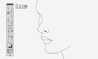
First, create an outline for your portrait. Use the Pen tool to mark out the individual points, and the Convert Anchor Point tool to get your curves as smooth as you can. I’m working on an A3 document with the Stroke Weight at 0.5. Don’t feel as though your outline has to be perfect straight away - each object can be tweaked or manipulated at any time.
Step 02
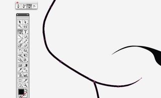
Once you’re happy with the general positioning of the outline, it’s important to make sure the strokes are expanded to avoid distortion if any size changes are made during the process. You can do this by selecting the stroke, then going to Object>Expand. When this is done, get rid of the unattractive flat ends by removing points with the Delete Anchor Point tool.
Step 03
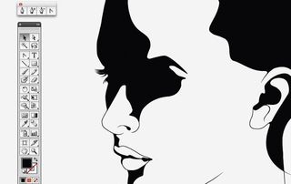
What the image needs now is some darker areas. Using the Pen tool, create solid fills of colour, adding details such as eyelashes. Try not to go too over the top with this by keeping an even balance of light and dark areas - you don’t want to swamp your image either way. Don’t forget that you can come back to these at any point to add, take away or manipulate as you please.
Step 04
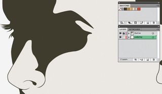
Now that the basic design is complete, it’s time to choose a colour palette. I’d suggest keeping this minimal. I’ve gone for one dark colour and four lighter variations of it. I’ve also chosen one bright colour to complement the duller ones. Once these are selected, lock the layer you’ve been working on. Create a new layer and, using the Pen tool, create a colour fill underneath the image. It always helps to name your layers.
Step 05
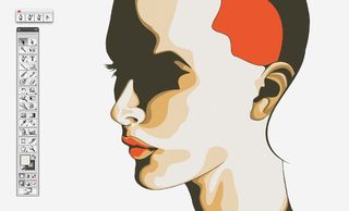
It’s now time to start adding more detailed shading, using the remaining tones of colour. Lock off the layer you’re on and create a new one in-between the two. From here you’re free to really build up your shading without interrupting anything else on the canvas. Try to keep the shapes fluid with those that already exist. You can position the blocks of colour above and below each other by Arrange>Send Backward/Bring Forward (or Ctrl/Cmd+/).
Step 06
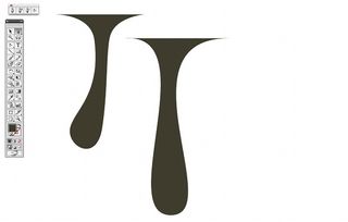
The drips are very simple to create. With the Pen tool, make a three-point triangle, then pull the middle point out with the Convert Anchor Point tool and push the remaining two points inwards to create the curves. Be as experimental as you want with this, adding more points to manipulate the shape. Alternatively, use a tablet - this will give a more freehand feel. I’ve used a combination of the two here.
Get the Creative Bloq Newsletter
Daily design news, reviews, how-tos and more, as picked by the editors.
Step 07
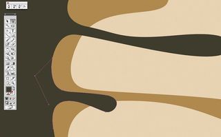
To keep a fluid feel, the drips must work with the shading perfectly, creating a smooth joining curve. Add more Bezier points to the base of each drip to achieve this, if you have to.
Step 08
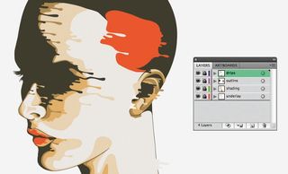
Now it’s time to go crazy with the drips. Create a new top layer and begin to overlay them onto the different shades. For the best results, each drip should be created individually. However, you can duplicate each one if you wish, making sure you merge them correctly with the line they’ll be sitting on.
Step 09
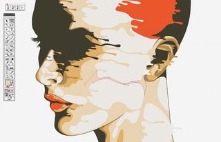
Once all the drips are in place, it’s a good idea to start connecting some of the shading together in the same direction as the drips, making it look more like a flowing liquid. This also clears up some of the large areas of space. Start to think about finalising the face, making sure the drips are evenly spread and there are no large areas of blank space to attract attention.
Step 10
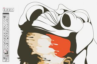
Now start thinking about the hair. Make an outline using the same stroke weight you began with on the face. It’s a good idea to begin with a single outline and then work in some further areas of detail, creating sections within that space. Try to stay consistent with your use of filled and blank areas.
Step 11
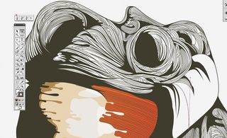
Once the hair structure is in place, it’s time to fill it with lots of detail. Using the Pen tool - this should be set to No Fill and a light stroke - begin to add two-point lines, flowing in the direction you feel the hair going. Try to mix it up a bit by switching direction every so often or intertwining lines. This is a time-consuming process, but the result makes it worthwhile.
Step 12
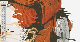
Now the hair needs to be coloured. With the same layering technique you used to colour the face, start to add blocks of the brighter hue into each large section of hair. Once this is complete, turn each block into a colour gradient using two variations of the shade. This isn’t vital, but the two tones coming through the mesh of hair add a nice feel to the overall image.
Step 13
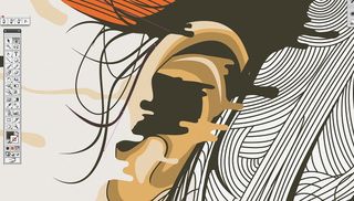
It’s a good idea to work your way around the outline of the hair, adding extra detail as you go. Create individual strands of hair using the Pen tool and curve them around the structure. Use a mixture of solid fills and fine strokes.
Step 14
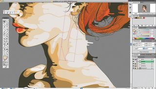
The portrait is almost complete, so sit back and have a critical look. If there are any areas that don’t match the overall style, amend them. Try to look for areas with less detail or lots of blank space that might stick out, then begin to think about a solid fill backdrop that will complement your image.
Step 15
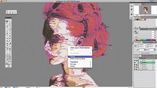
Once you're happy with your image, I would recommend unlocking all the layers and selecting the entire picture. From here, expand it as you did at the start and group it. When this is done you can take it into Photoshop as a smart object to finalise your composition.
Words: Tom Mac

Thank you for reading 5 articles this month* Join now for unlimited access
Enjoy your first month for just £1 / $1 / €1
*Read 5 free articles per month without a subscription

Join now for unlimited access
Try first month for just £1 / $1 / €1
The Creative Bloq team is made up of a group of design fans, and has changed and evolved since Creative Bloq began back in 2012. The current website team consists of eight full-time members of staff: Editor Georgia Coggan, Deputy Editor Rosie Hilder, Ecommerce Editor Beren Neale, Senior News Editor Daniel Piper, Editor, Digital Art and 3D Ian Dean, Tech Reviews Editor Erlingur Einarsson and Ecommerce Writer Beth Nicholls and Staff Writer Natalie Fear, as well as a roster of freelancers from around the world. The 3D World and ImagineFX magazine teams also pitch in, ensuring that content from 3D World and ImagineFX is represented on Creative Bloq.
