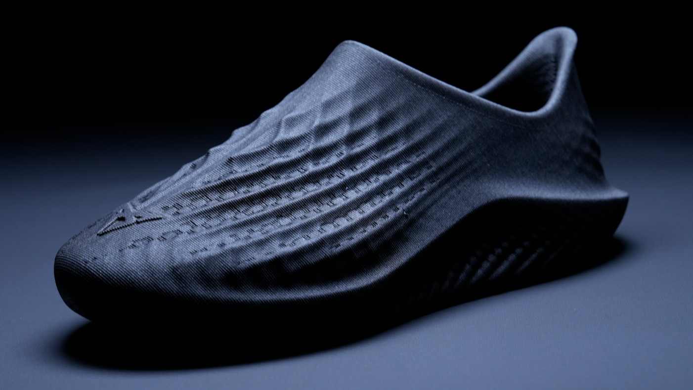
Bring a fluorescent transparency to life in Illustrator
Ben the Illustrator explains how to use transparency and gradient tools to bring a dynamic creative edge to your work.
- Software: Illustrator CS5 or later
- Project time: 2 hours
- Skills: Use the Gradient Mesh tool, Make opacity masks, Work with colours and transparency
Although a lot of Illustrator tools are fairly simple to grasp, using them with finesse and perfecting the finer details can take further practice. In this tutorial we’ll look at a selection of transparency and gradient tools that aren’t always used as subtly and beautifully as they can be. We’ll create a lifelike but contemporary animal study here, but the techniques covered can be applied to any subject matter that requires a striking dynamic look or an elegant subtle shine, from branding to character design.
In my opinion, technical tricks should be secondary to the subject matter: there is no need to overemphasise a glow or a gradient when the natural form of your subject can stand up for itself. In this tutorial you’ll learn subtler tricks that, in the end, will result in higher-quality artwork.
Discover the designer's guide to Giclée printing at Creative Bloq.
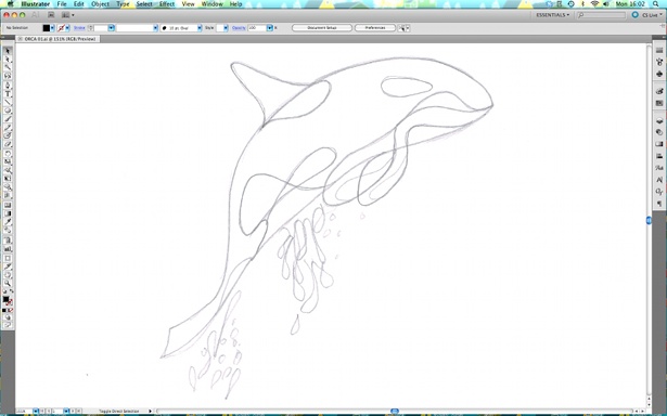
Step 01
Start with a pencil drawing: you can produce this freehand or using a photo for reference. However you create your line drawing, keep the shapes as simple as possible while still achieving the look of your chosen subject matter. It’s just shape-making: there’s no need for sketchy lines or shading.
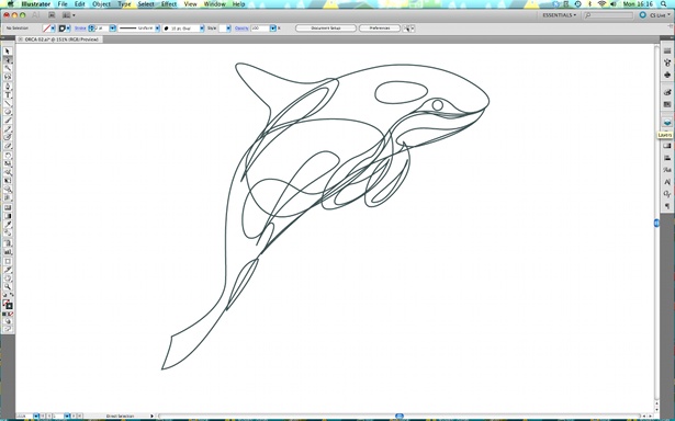
Step 02
Trace your artwork using the Pen tool. remember that every shape you create is going to be semi-transparent, so even if it’s behind another shape it’ll still be visible – every line of every shape has to be perfect and fit with the overall flow of the illustration.
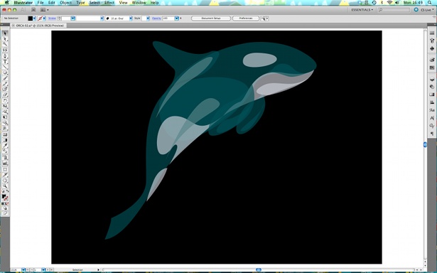
Step 03
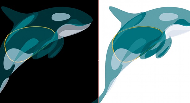
Change your shapes to block colours without outlines (losing the outlines makes for a more realistic look). Next, select all your shapes and, in the Transparency panel, change the opacity to 65%. Feel free to play with this value.
Step 04
Colours work very differently when they’re semi-transparent. If you look at the highlighted block, which is where two shapes overlap, on the black background it appears lighter than its neighbouring blocks, whereas on the white background it’s darker. Experiment with how light and dark colours change once they’re semi-transparent and layered.

Step 05
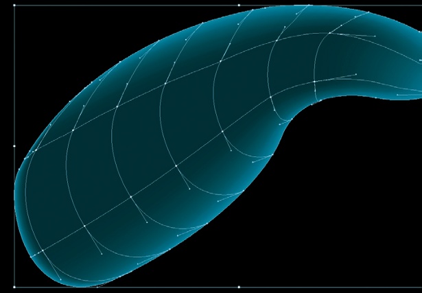
To create a glow on a shape, select the shape then choose the Gradient Mesh tool. Tap the Gradient Mesh cursor on an outline: you’ll see that it slices your shape and starts to make a 3D form. Tap on any line and it will split in half, forming more gradient lines.
Get the Creative Bloq Newsletter
Daily design news, reviews, how-tos and more, as picked by the editors.
Step 06
Continue creating a mesh. The more mesh lines you create, the more form your shape will have. Hold down Opt/Alt to delete a mesh line. To add a gradient, use the Direct Selection tool to pick all the points you want colour added to, then choose a colour from the palette.
Step 07
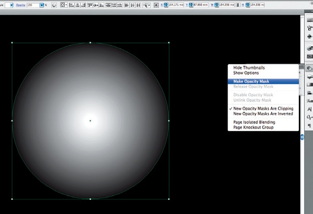
The colours will vary depending on whether they’re layered over dark or light colours. To add more dynamism, try a circular opacity mask. First, create a circle and duplicate it in the Layers panel. Next, using the Gradient panel, add a radial gradient from white in the centre out to black.
Step 08
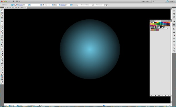
With both circles selected, choose Make Opacity Mask from the Transparency panel menu, and select a colour. Everything that was white in the radial gradient will take that colour; everything that was black will now be 100% transparent. Experiment with placing this circle, in various colours, behind your artwork.
Step 09
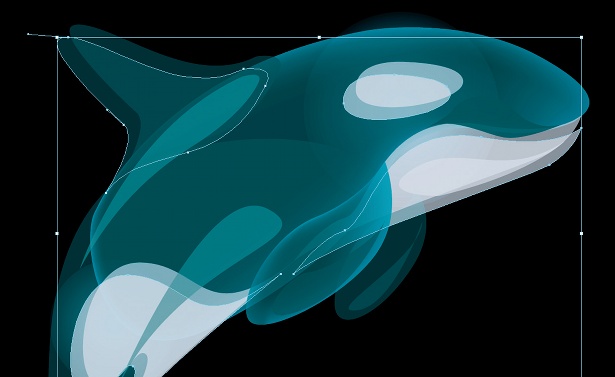
Here’s one final technique that adds a simple but effective fluid fluorescence. Select various shapes, then, holding down the Shift and Opt/Alt keys, hit an arrow key. Your shape will be duplicated and offset. As we’re working with semi-transparent shapes, you’ll start to create a nice movement effect.

Step 10
Even with simple illustrated shapes you’ll find that it really is worth taking your time with transparencies. The smallest alteration can make a big difference, and subtle gradients and transparencies can really bring an unbeatable finesse to your illustration work.

Thank you for reading 5 articles this month* Join now for unlimited access
Enjoy your first month for just £1 / $1 / €1
*Read 5 free articles per month without a subscription

Join now for unlimited access
Try first month for just £1 / $1 / €1

The Creative Bloq team is made up of a group of art and design enthusiasts, and has changed and evolved since Creative Bloq began back in 2012. The current website team consists of eight full-time members of staff: Editor Georgia Coggan, Deputy Editor Rosie Hilder, Ecommerce Editor Beren Neale, Senior News Editor Daniel Piper, Editor, Digital Art and 3D Ian Dean, Tech Reviews Editor Erlingur Einarsson, Ecommerce Writer Beth Nicholls and Staff Writer Natalie Fear, as well as a roster of freelancers from around the world. The ImagineFX magazine team also pitch in, ensuring that content from leading digital art publication ImagineFX is represented on Creative Bloq.
