Paint perfect watercolour portraits every time: 11 key tips
Professional tips to painting stunning watercolour portraits.

Painting watercolour portraits can be incredibly challenging, but also very rewarding. We've asked the award-winning fine artist Jean Sebastien Rossbach to share his 11 tips for painting better portraits using watercolours. In his tutorial he covers the basics for better watercolour paintings, as well as some of his own unique ways of working.
Before you jump in to Jean Sebastien Rossbach's training, get up to speed on some of the essential watercolour techniques you may need to get the most from Jean Sebastien Rossbach's tutorial. Now, in his words, the artist shares his techniques…
Painting watercolour portraits: Introduction
Watercolour is my preferred painting medium. It’s easy to work with, and safe because it requires neither solvents nor mediums. But as with many things in life, simple can also be hard, and achieving the art goals you have in mind can be challenging if you’re not aware of a few techniques and tools, which we’ll review together here.
I often make the analogy between watercolours and dance, because the colours somehow have their own life and flow. When working on a new painting, you enter a game of suggesting and reacting. And this is what I like about the medium. You have to stay open to how watercolours interact with pigments and the paper, and readjust all the time. Over time I’ve found it’s become a philosophy of letting go.
As I’ll explain in this article, the amount of water you use, the type of paper and the granularity of your pigments are all important factors when helping to take your colours where you want them to go.
01. What paper should you use?
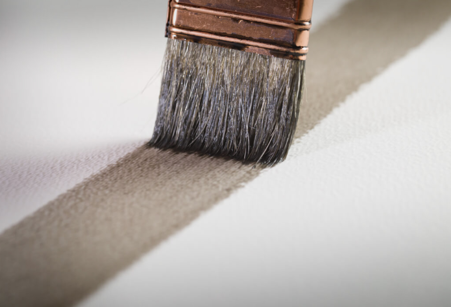
The answer depends on your personality and the result you want to achieve. There are papers with grain, there are permissive papers, there are smooth papers, papers with tooth, and so on. As an illustrator who likes precision and details, I prefer cold press paper with no grain. I rarely go under 300g/m2, and my big paintings (which are over a meter tall) are 600g/m2.
My advice is to begin with the best paper and avoid those designed for students: the quality is poor and you never achieve good results with them. My preference is Arches and Fabriano. Arches accepts no compromises. Select it if you’re a fiery artist who likes sharp results. Fabriano is a smoother paper, but you can still be precise. It’s also more forgiving, which means you can erase mistakes more easily than with the Arches papers.
02. Consider calligraphy brushes
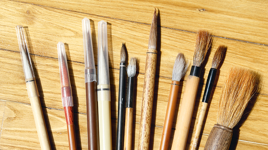
I’m the first to say that good tools make good artists. Yet while you can buy $20 brushes made with luxurious animal hair, I tend to find them unnecessary. After using watercolour brushes for a decade, I’ve started using Asian calligraphy brushes. They’re affordable, durable and have a big reserve, which means you don’t have to reload them all the time. You can make washes and then switch to detailing in the same movement, without having to change brushes. I’ve found that they’re also ideal for creating dry effects and gradients. However, I still use spalters when I want to cover large surfaces quickly, because I like to paint on large format sheets.
03. Work on an inclined plane
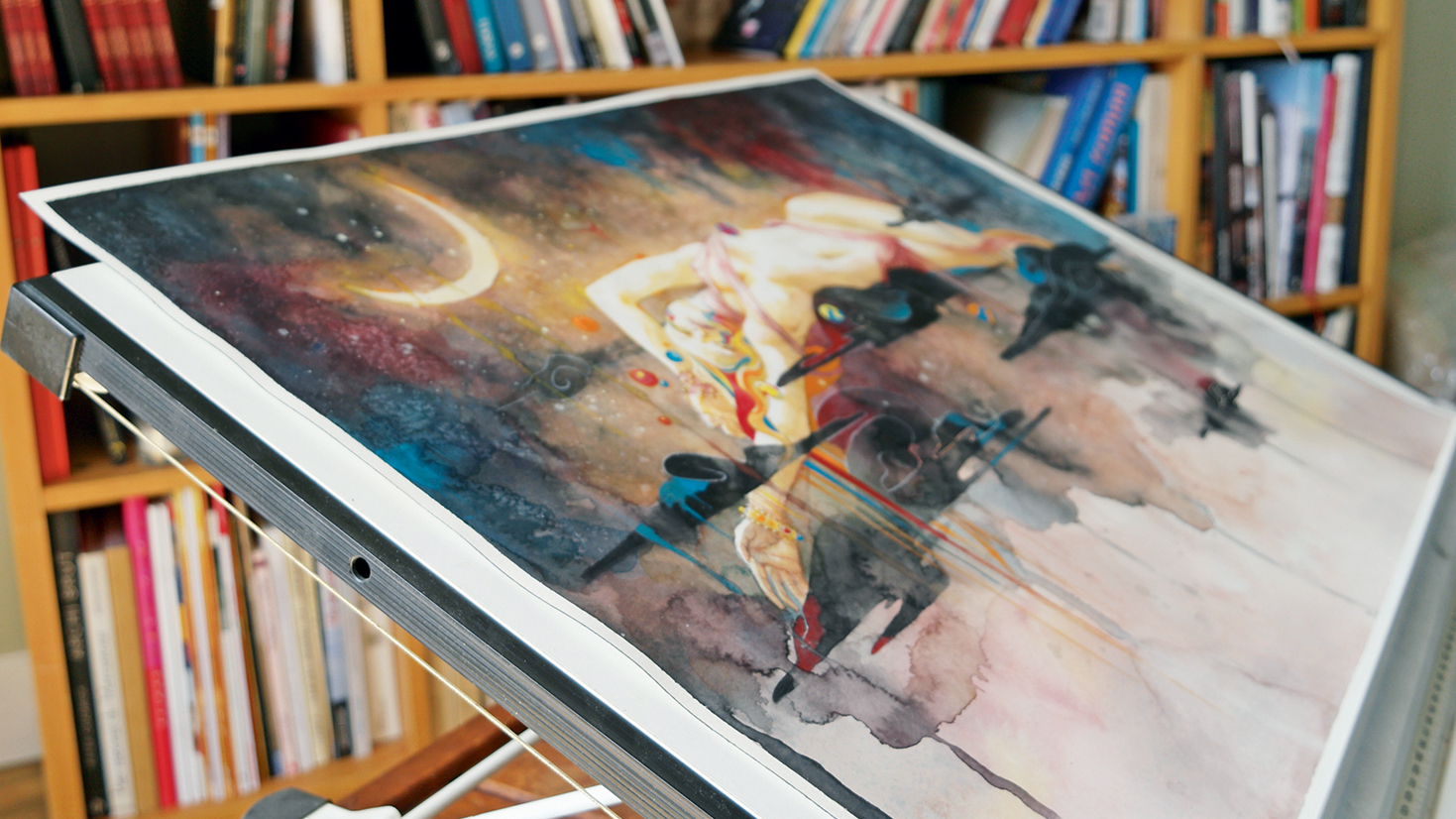
I paint on a slightly inclined plane. When attending watercolour events I discovered that many professional artists do this, especially those who paint portraits. The reason is that it leads the pigments down the paper, which reinforces the illusion that the sun in the sky is illuminating the portrait. Letting the pigments settle down when applying watercolour makes it easier to paint volumes and gradients. It results in your portraits looking more natural because the viewer is used to seeing a face with the source of the light coming from above (in other words, sunlight).
04. Staining, granulation and transparency
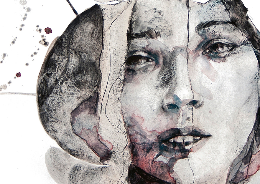
Depending on the pigment used, each colour has different properties. For example, Turquoise blue stains easily, which means it’s hard to lift up with water if you make a mistake. It’s also very transparent. Burnt sienna is easier to wash away and it’s granulated and more opaque. Granulation is something I look for when painting backgrounds or non-organic elements because it adds texture and a mineral aspect. For painting the skin I prefer a smoother colour that’s less prone to staining, such as Alizarin crimson. This information is usually provided directly on the watercolour tubes, or on colour charts available from the brand’s website.
05. When to use coloured pencils
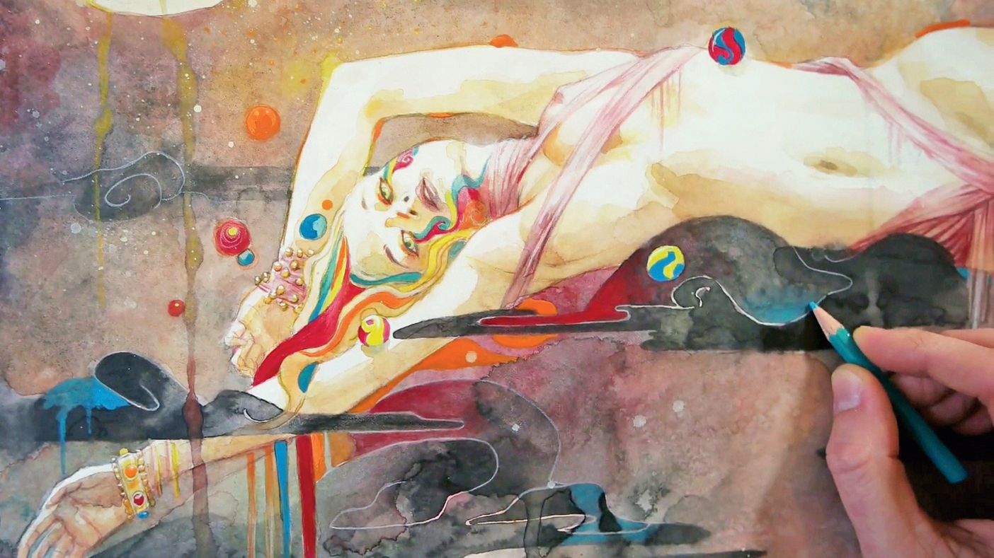
When making those finishing touches, I use coloured pencils. They are ideal for highlighting certain areas or creating precise edges. There are different kinds of pencils. Some are very hard and precise (Prismacolor), but not really good at coverage, while others are thick and loose (Derwent), but more pigmented.
06. Alternating dry and wet layers
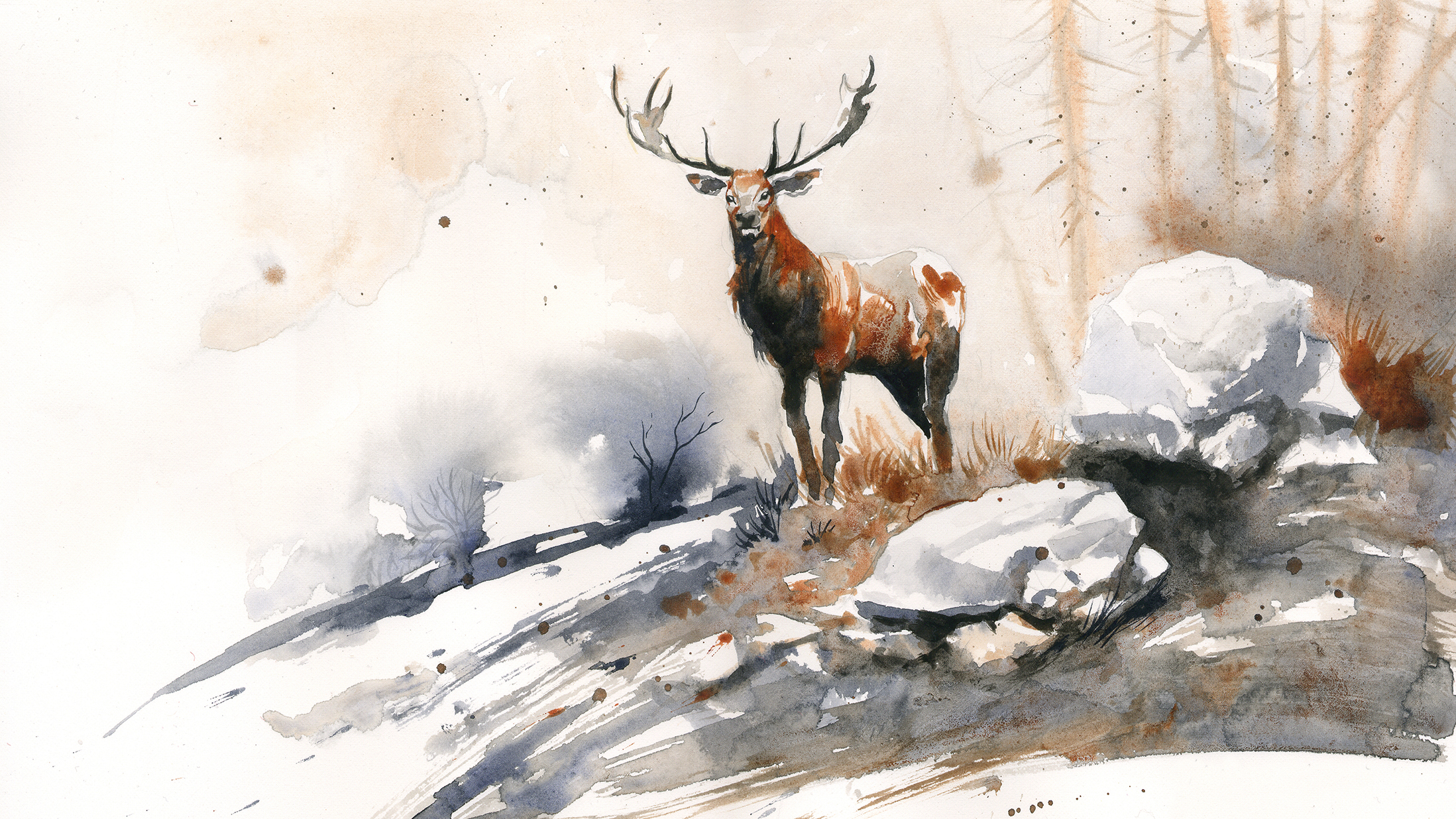
The magic of watercolour resides in one’s ability to make it dance between wet and dry areas. Working wet on wet means you paint on a wet surface. The colours can then mix and create abstract shapes that you can barely control. This is my favourite bit: the moment when you’re the co-creator of the painting, the other one being the water itself. Don’t be afraid to make bold, confident marks and see what happens. Then react to the actions of the water.
Working on a dry surface is for blocking shapes. I try to connect dry and wet areas all the time because it brings a painting to life. It’s not important that the blue of a fabric enters and mixes with the pink of a person’s belly. The colours aren’t as important as the values.
07. The secret to painting volumes
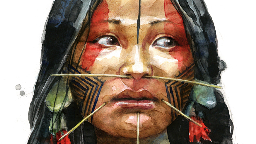
Painting accurate volumes can trip up artists, whatever their experience level. One’s attention is taken up by the style and the splashes of overflowing colours, but the volumes are neglected and the finished portrait looks flat. This is mainly due to the desaturated nature of this medium. If I want to convey the illusion of a realistic portrait, I need to focus on tones, not colours. Good tones leads to good volumes, which results in a good portrait. Unlike oil paint, I’ll go from very light washes to strokes that are gradually more loaded with pigment in order to build up the volumes. It’s exactly like adding Multiply layers on top of each others in Photoshop!
08. Painting expressive backgrounds
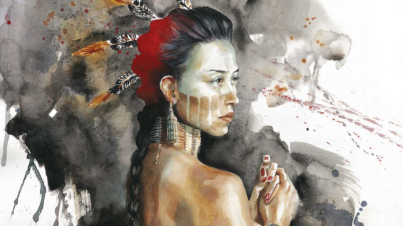
When I paint lively portraits, I don’t want to overdo the background. Details are unnecessary here and can even be counterproductive. The most important element in a portrait are the eyes. This is where I want to concentrate the viewer’s attention. So this is where all the details, the smooth gradients and transitions need to go. On the other hand, what will make my piece stand out is its painterly feel – its expressiveness. I’ll put all this in the background, like an abstract case that stores the beautiful figure I spent so much time and effort on. The background is the playground where I experiment with water effects. I use salt to create texture, and let the water drip and make stains.
09. Preserving white areas
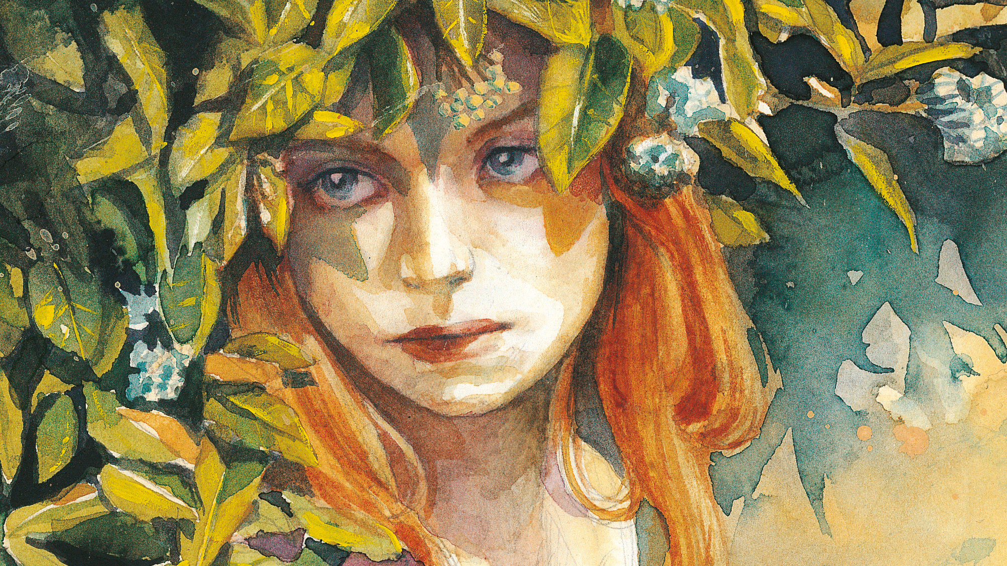
The natural white colour of the paper is the purest white I’ll ever get. Before applying any paint on the surface I identify all white areas I need to preserve. I try not to apply any water there, and use masking fluid if required. I try to avoid the use of white paint because it always ends up looking greyish and dirty.
10. Using salt to create textures
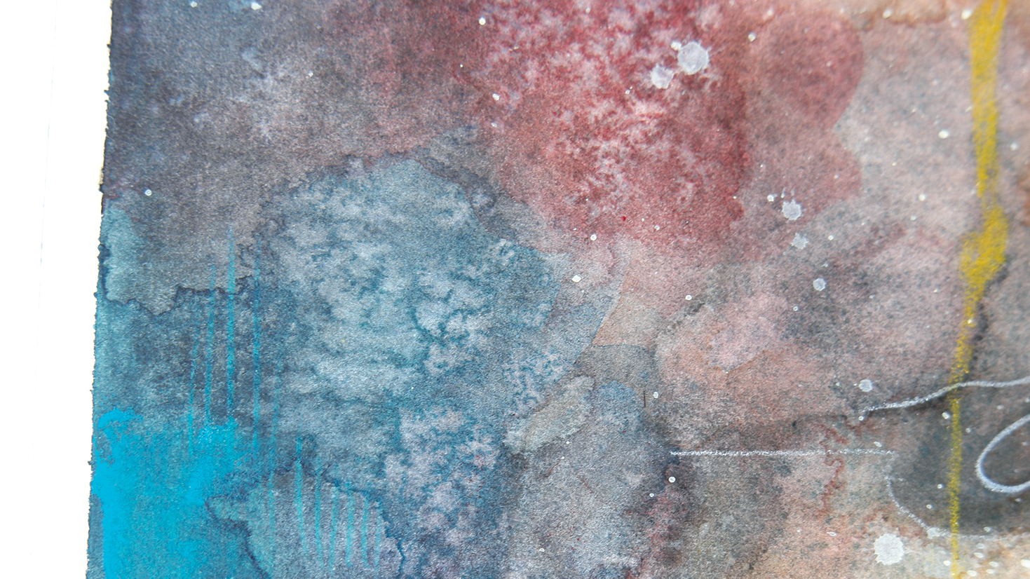
I recommend trying this simple and fun watercolour technique: prepare a wash with lots of water and a fair amount of pigment, then apply it and spread kitchen salt over it. Let the paper dry. The results may be a pleasant surprise!
11. Create contrast in your watercolour art
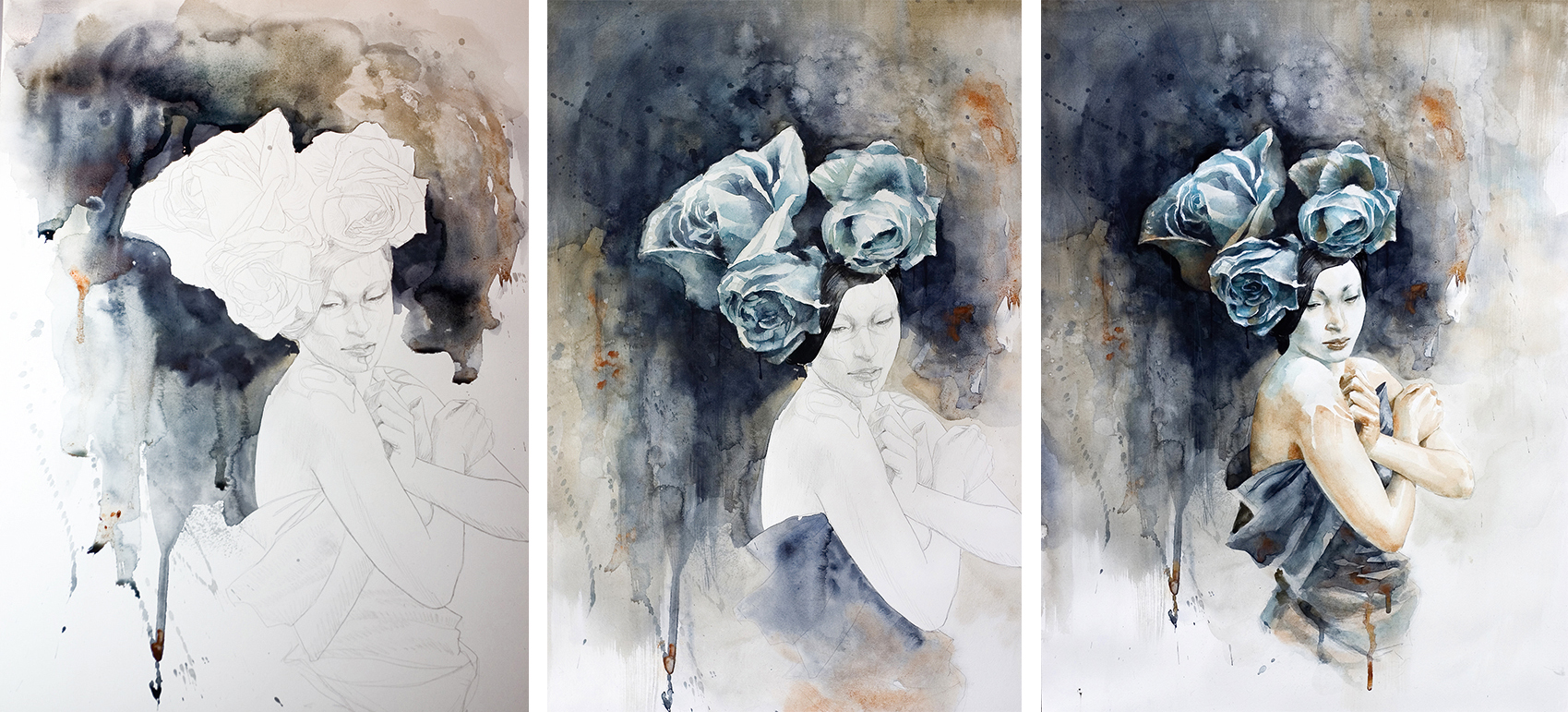
To fire up my motivation I begin this portrait of a geisha with the fun part: the background. It’s a wash of Payne’s grey, Raw umber and touches of Burnt sienna loosely applied wet on wet to encourage granulation and staining effects. This is also the stage when I block in my composition.
I place the darkest colours all around the character’s face because I’ve decided that I’ll keep her face completely white. Watercolour is very often a matter of finding a way to create contrast, because the medium itself is rather pale and desaturated. By putting all the darker tones around her white face I’ll make it stand out from the rest of the composition.
Her face is the last thing I paint – or should I say I actually don’t paint, because I keep the white of the paper preserved to convey the white make-up on her skin. Even the bottom of the composition is covered with a light grey wash so that the only pure white is that of the geisha’s make-up.
Never miss an issue of ImagineFX

If you liked this piece, you'll love ImagineFX. The world's favourite digital art magazine is on sale in the UK, Europe, United States, Canada, Australia and more. Limited numbers of ImagineFX print editions are available for delivery to over 120 countries from our online store (the shipping costs are included in all prices).
Read more:
Daily design news, reviews, how-tos and more, as picked by the editors.
- Discover the best watercolour pencils
- Core skills: Canvas painting for beginners
- Learn the 7 essential painting techniques for artists

Jean-Sébastien has been painting for over 20 years. His art has been displayed in galleries worldwide, and sold at auction. He is the author and illustrator of the illustrated storybook Chamanes, Les Chants de la Déesse.
