14 tips for nailing composition like a pro
Artist James Gurney explains why composition isn’t about forcing elements into a grid.
08. Create secondary readings
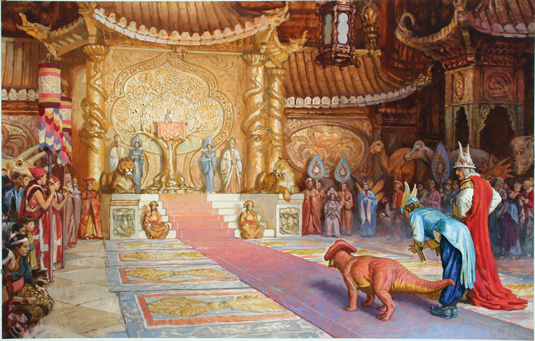
Here's the finished painting. The boldest contrasts and brightest colours are in the main characters on the right. Everything else is a second reading.
In the context of this story, I want the throne area to be mysterious, lost in a golden aura. There are lots of subordinate figures, but I don't want any of them to attract too much attention.
09. Push extremes
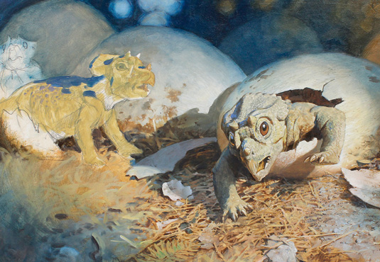
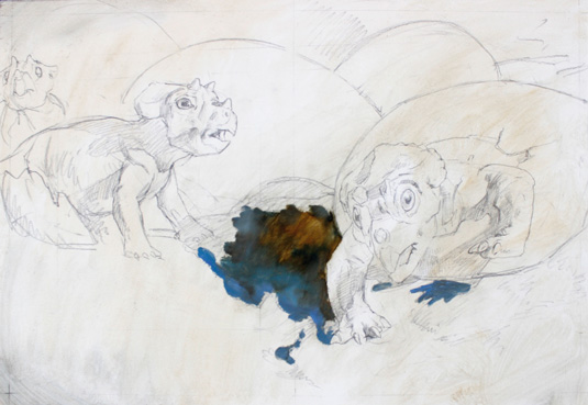
Whatever forces you unleash in your painting should be exaggerated in any way you can. In this painting of a hatching Triceratops, I keep redesigning the picture to bring the viewpoint closer to the baby emerging into the light.
It is the dramatic emergence into the world of a new life finally escaping confinement. I push the contrast of light and shadow, lightening the light areas and deepening and grouping the darks in shadow.
10. Eliminate the inessential
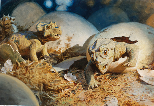
From the earliest stages, all the way through the execution of the painting, try to delete or conceal whatever doesn't add to the central idea. In the hatchling scene, I limit the colours to yellow ochre and a dull slate blue, leaving out greens, reds and pinks.
Because I'm designing the painting for a double-page spread, I allow space for the gutter and for a type area on the left. The whole composition includes a wider shot of the nest, with shell fragments and mud caked on the eggs.
11. Add photorealistic focus to the focal point

Composition is not just about 2D considerations; it's also about the Z dimension of depth and focus. Even though I’m painting a scene that could never be photographed, I try to compose the scene with a photographer's sensibility.
I use shallow focus to evoke the impression of wildlife photography, since this painting is to be published in a magazine that's mostly illustrated with wildlife photos. The background is dark and cool and way out of focus, and the crushed plants and the egg in the foreground are also blurred.
12. Create contrasts
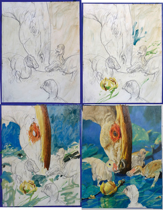
This painting shows an adult Parasaurolophus grazing amid water lilies, while several juveniles hunt insects nearby. Modelling the behaviour on that of living birds, I imagine the scene as a crèche of young dinosaurs sticking close to the adult for safety.
There are many kinds of contrasts in this painting: warm versus cool colours, and soft versus hard textures. I'm also conscious of creating a tight cluster of the faces of the little hatchlings around the tiny insect, while keeping big, empty, blurry, uncluttered spaces in the upper areas.
13. Make the colour suit the scene's emotion
The core idea of the painting should determine the colour scheme. A sombre, dramatic mood calls for sombre, dramatic lighting and colour.
I could have painted the hatching scene in sweet pastel colours and bright morning light, but I imagine it more as an urgent moment of crisis, where life hangs in the balance.
So I stage the scene at night, as if dazzled by the intrusion of a photographer's flash. By contrast, the Parasaurolophus painting is colourful and cheerful as the young dinosaurs explore their world.
14. Vary the composition
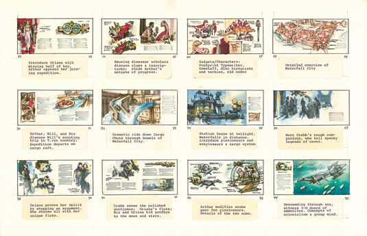
If you're doing a sequential work, such as storyboarding or scene planning for comics or film, vary the composition from one sequence to another.
Stiff, formal compositions take on even more power before or after dynamic ones. In these storyboard panels, I think as much about what goes on between scenes as what goes on in a single composition.
Words: James Gurney
James is the author and illustrator of Dinotopia. He wrote the bestselling books Imaginative Realism and Color and Light, both of which grew out of his popular daily art blog GurneyJourney.
This article originally appeared in ImagineFX magazine issue 114.
Liked this? Try these...
- How to paint a female face (video)
- How to create an awesome alien scene on an iPad
- Free graphic design software available to you right now!

Thank you for reading 5 articles this month* Join now for unlimited access
Enjoy your first month for just £1 / $1 / €1
*Read 5 free articles per month without a subscription

Join now for unlimited access
Try first month for just £1 / $1 / €1
Get the Creative Bloq Newsletter
Daily design news, reviews, how-tos and more, as picked by the editors.

The Creative Bloq team is made up of a group of art and design enthusiasts, and has changed and evolved since Creative Bloq began back in 2012. The current website team consists of eight full-time members of staff: Editor Georgia Coggan, Deputy Editor Rosie Hilder, Ecommerce Editor Beren Neale, Senior News Editor Daniel Piper, Editor, Digital Art and 3D Ian Dean, Tech Reviews Editor Erlingur Einarsson, Ecommerce Writer Beth Nicholls and Staff Writer Natalie Fear, as well as a roster of freelancers from around the world. The ImagineFX magazine team also pitch in, ensuring that content from leading digital art publication ImagineFX is represented on Creative Bloq.
