The theory behind lost and found edges explained
We reveal how to use shadows to create a visual personality.

An edge can disappear when a foreground object has the same value as the background, and can become sharper by strengthening the contrast between those two values. On an illustration we can play with different lighting scenarios and create parts with disappearing edges in the shadows or lights. Here I'll show you how to draw strong contrasts.
It's always useful to vary your edges between soft and hard. This helps to direct the focus of your image, and makes it more interesting and painterly. You can define differences between forms with hard edges more clearly and you can create a resting point for your viewer by applying soft edges. The trick is to find a balance that supports the story.
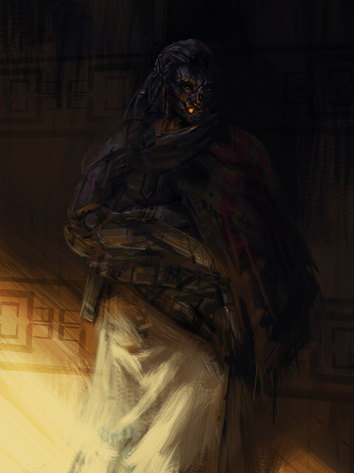
Sometimes it's enough to paint only a small part of an edge and leave the rest to dissolve into the background. The most important thing is to describe the dynamics and direction of the edge, but we can leave the rest to the viewer's imagination.
The face or the cape of this character is a great example for this. Because I've already painted one side of the character's face, it's fine to leave the other half fully in the shadows – the viewer's imagination fills in the missing details.
The same thing happens with the cape on the right side. It's not necessary to depict its silhouette all the way. Instead, painting the bottom edge and hinting at the shoulder part is enough to describe the whole form.
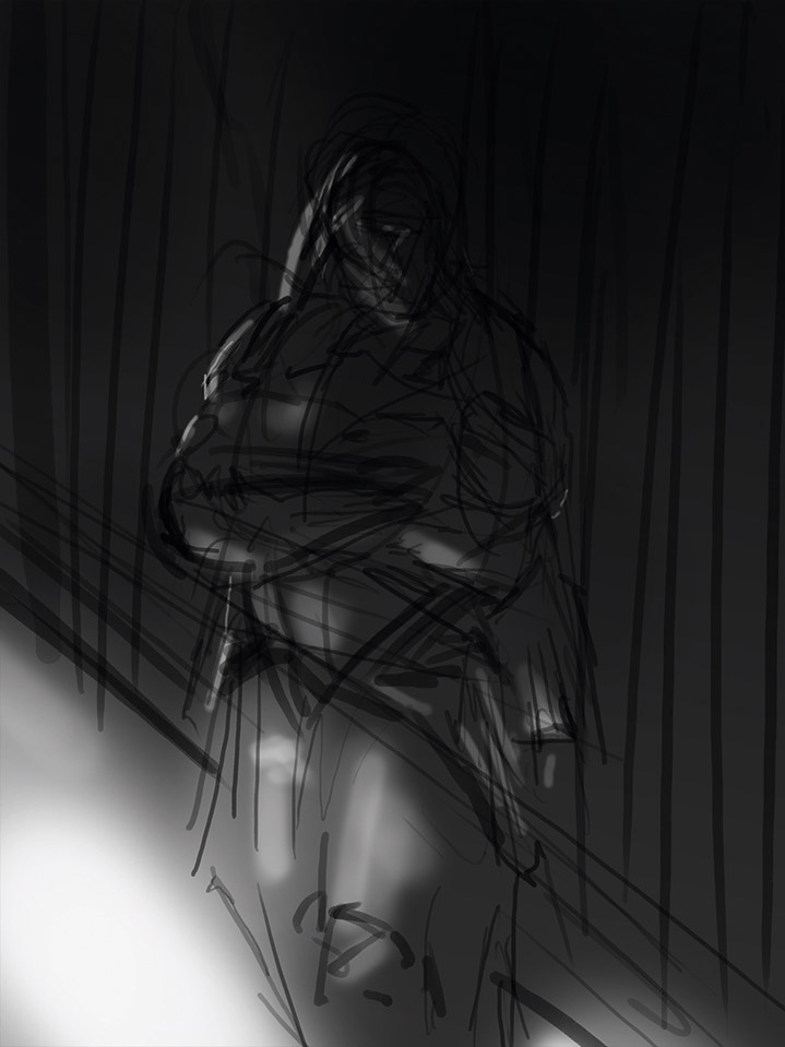
01. Block in light

I want to break up the composition into a smaller lit area and a bigger one in shadow, making my character almost disappear. After a quick line drawing I quickly block in the lights and shadows, and also lay down the small reflected light patches in the dark, which will give shape to my character in the shadows.
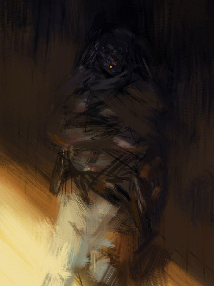
02. Colour overlay

After a quick colour overlay, where I block in the darker cold and the brighter warm hues, I start to paint everything on top. I wanted to keep this step loose, so I use large brush strokes and almost smudge my forms into each other. I avoid defining shapes and adding hard edges, so that the figure is ghost-like.
03. Placing contrasts

For detailing my character I use the desaturated cold bounce light of the sky above, which contrasts with the warm tones in the piece. I place the most contrast around the face to create a natural focal area and leave more lost edges on the silhouette, to keep the figure mysterious and to inspire the viewer's imagination.
This article was originally published in ImagineFX magazine issue 133. Buy it here.

Thank you for reading 5 articles this month* Join now for unlimited access
Enjoy your first month for just £1 / $1 / €1
*Read 5 free articles per month without a subscription

Join now for unlimited access
Try first month for just £1 / $1 / €1
Get the Creative Bloq Newsletter
Daily design news, reviews, how-tos and more, as picked by the editors.

Mark is a concept artist / art director specialised on the visual development, pre-production design and project art direction of film, animation and game projects. His past clients include Lucasfilm, Time Warner, Weta Workshop, Eidos, Applibot and Fantasy Flight Games.
