With fashion so prominent in today's design industry, more and more people are applying their illustrations skills to T-shirts. This article will share advice from an experienced illustrator on how to get the best from your design on garments.
So whether you're either looking to produce and sell their own clothing, or are illustrating as part of a commission for a client who is looking to produce and sell the clothing, read on. You might also want to see our 10 pro tips for better T-shirt designs.
01. Do your research
Before you even begin illustrating it is so important to take the time to research things such as; the method of printing you are going to use, the garment you'll be printing on (if you're having your own cut of T-shirt made for example you should have that covered by this stage) and which company you will be using to produce the printed clothing.
Making sure all of these things have been confirmed and signed off at the very beginning of the process will save a lot of potential headaches and problems later on. In the case of choosing a company/printer to work with; try and stay fairly local if possible.
This means that you are not paying unneeded delivery costs for samples and products and that you can actually meet your printer to discuss exactly what you're looking for which, if you're looking to produce a lot of different garments, can be extremely helpful.
Printing options
For printing, there are a multitude of methods that are available to use. The most common are screen printing and DTG (Direct To Garment) printing. For basic information and some pros and cons for each method, you can refer to this post on t-shirtforums.com.
As a side note I would highly recommend joining forums such as this and getting to know the community as it can be extremely helpful, especially if the experience is completely new to you.
Get the Creative Bloq Newsletter
Daily design news, reviews, how-tos and more, as picked by the editors.
02. Know your audience

If you're only planning on using your garments as merchandise for your band or your art following on Facebook, then this isn't as important, because you should already know your audience. However, if you are creating a clothing brand, or designing for a client, it is important to completely understand who you are illustrating for.
If you don't know what your audience wants then chances are your design is going to fall flat, and that of course is generally not good when you are trying to make money, or impress a client.
Ask and you shall receive
What's the best way to know what your audience wants? Ask them. If you're at the stage where you are trying to build a customer base think about your style, and what you think looks good, and develop from there.
Go out and ask people you identify with why they wear what they wear. Post it on social media, message friends, show people samples of the type of work you want to produce on garments.
The feedback you will receive here is invaluable and without it, you run the risk of wasting your money producing a design that is completely irrelevant to the people who are looking at it.
03. Keep it (relatively) simple

It's easy to get carried away with your design, we've all been there. As a rule of thumb, however, try to keep it as simple as you can without taking away from the overall design.
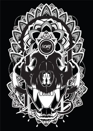
My design below is, some would say, extremely detailed in areas - but this is because I have been working with my printer for a while and I know what he can and can't do (I personally use the screen printing method).
This is important to know and another reason why it's good to have a face to face meeting with your printer - you don't want to do a killer design and then have it rejected because it is way too involved for the printing method you want to use, which can end up costing you more money, or just result in you binning the design altogether.
04. Clear your colours

I've seen many an illustrator complete an amazing piece of work for a garment and then get caught out when it comes to printing, receiving a design back that looks nothing like the original. It's of the utmost importance, first of all, that you clear your colours with your printer before sending the final design away.
When screen printing, the printer has to use inks, and chances are, your printer doesn't carry every possible ink colour there is. Therefore, if you're using obscure colours in your designs you may run into some problems and have to change some colours.
Also be careful to check that your colours are all the same before you save and send out. What I mean by this is, make sure that that strange orange colour you've used throughout your design in various different elements is actually the same orange throughout.
Do it in Illustrator
You can do this easily in Illustrator by selecting one of your shapes with the orange colour you want to check and going to Select>Same>Fill Colour. If one of your orange shapes is not selected it means you will need to check it and amend the colour.
Some printers will appreciate it if you use this method and Cut>Paste all the shapes of one colour onto separate layers so that it is easier for them to create the screens of each colour.
05. Be specific
Be specific with your printer about how you want the garment to look. It seems like an obvious point but a lot of people will just send a file away to a printer and expect their garments back exactly how they imagined them. It may seem obvious to you how you want the finished product to look, but it is not to your printer.
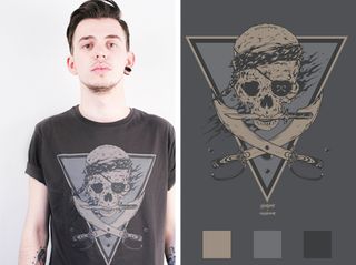
Always provide them with specific dimensions of the design on the shirt and mockups to best show the positioning (shown below). It doesn't have to be overly professional looking, unless of course this is work for a client, in which case presenting on neat mockups with specific measurements in a well laid-out presentation is the best course of action. You can find thousands of photo and vector garment templates on the internet free to download and use.
I hope this was helpful - whether you are starting a label of your own, or doing some work for a client. Remember, the design will make or break your product and therefore it is vital that you get all the details right so you can let your creativity flow with no worries about whether it will work or not.
Words and illustrations: Adam Cairns
Adam Cairns is a designer and illustrator from Scotland. He has been producing illustration work for three years and has worked previously in a studio setting.

Thank you for reading 5 articles this month* Join now for unlimited access
Enjoy your first month for just £1 / $1 / €1
*Read 5 free articles per month without a subscription

Join now for unlimited access
Try first month for just £1 / $1 / €1
Joe is a regular freelance journalist and editor at Creative Bloq. He writes news, features and buying guides and keeps track of the best equipment and software for creatives, from video editing programs to monitors and accessories. A veteran news writer and photographer, he now works as a project manager at the London and Buenos Aires-based design, production and branding agency Hermana Creatives. There he manages a team of designers, photographers and video editors who specialise in producing visual content and design assets for the hospitality sector. He also dances Argentine tango.
