20 essential sketching tips to help you elevate your skills
Professionals share top sketching tips for both beginners and advanced levels.
A few useful sketching tips and tricks can often generate rewarding results in your sketchbook. And whether you're a beginner or an experienced artist looking for new techniques, you should find something for you our collection of sketching tips below.
For beginners, even getting started can be a challenge – we know the pain of staring down at a blank page. But even those who have been sketching all their lives can often reach a point where they feel the need for new ideas. We've gathered sketching tips from a wealth of expert artists to help.
Our range of pointers will help you with everything from your pencils to shading, silhouettes to smudging and more. While covering the technical side of sketching, we've also included tips on how to get inspired, since this can sometimes be the hardest part. Either way, we should have a few tips to help everyone on their sketching journeys.
If you're new to the wonderful world of sketching or are just looking to update your current sketching kit, then have a look at our guide to the best pencils and best sketchbooks and treat yourself to some new gear.
20 essential sketching tips
Click the icons in the top right of the pictures to enlarge them.
01. Know your pencils
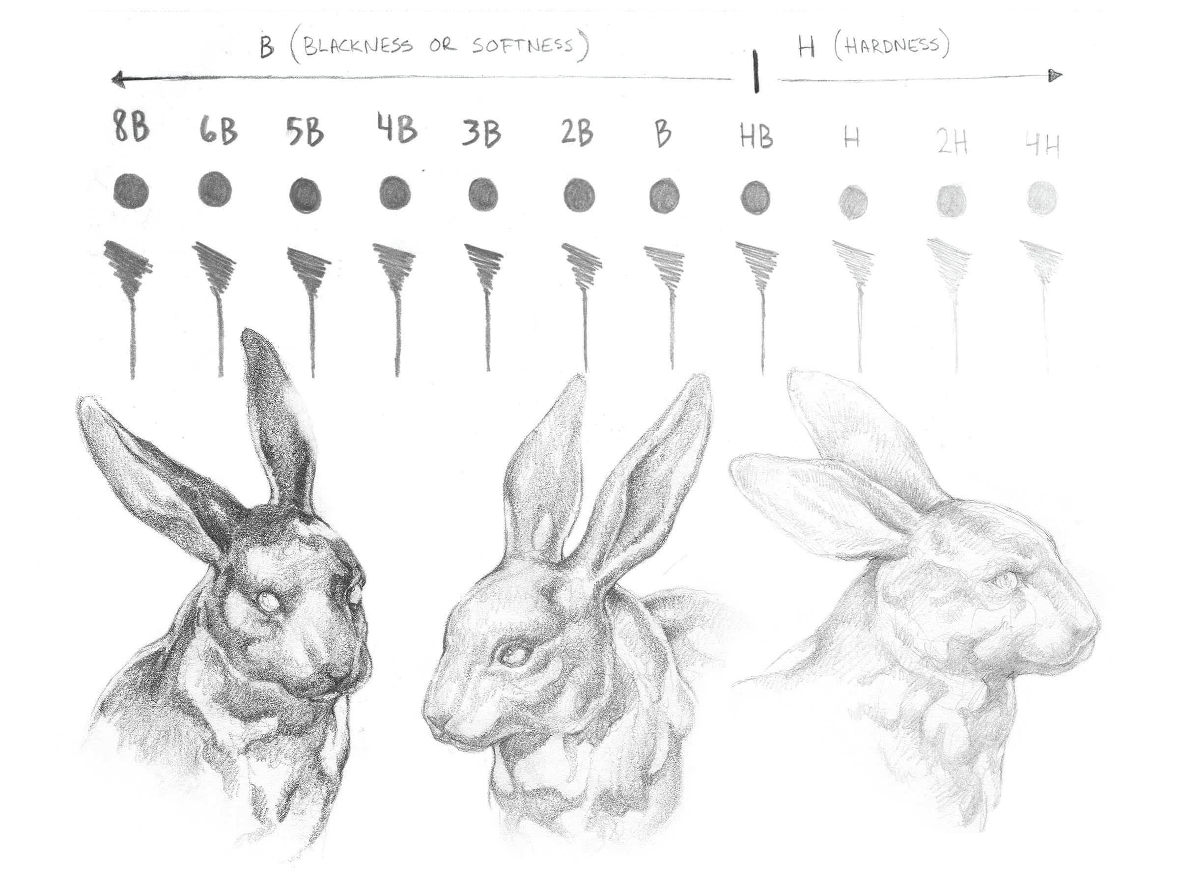
Having the right pencil to begin drawing your pencil sketch is one of the most essential sketching tips. The hardness of the graphite is indicated on the side of the pencil: 'B' pencils are softer, 'H' are harder, and 'HB' sits in the middle – there's a big difference between a 4H and a 4B. "I recommend starting somewhere on the H scale as a foundation and then finishing with the darker B scale," says travelling convention artist Tim Von Rueden.
When you're learning how to draw, it's also worth considering using mechanical pencils alongside traditional ones. "Mechanical pencils are usually better suited for precision, while traditional pencils are great for laying down large areas of texture," says Tim. "Keep in mind that most mechanical pencils come with HB pre-inserted, which gives you only the middle range to work with."
See the best mechanical pencils here.
02. Take control of your pencil
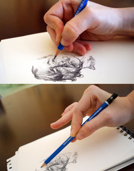
"If you position your hand closer to the end of the pencil, you have more control and precision, but heavier strokes (darker markings)," says illustrator Sylwia Bomba. "Gripping further up the pencil will give you less control and precision, but lighter strokes (lighter markings)."
For more advice, read our article on how to hold a pencil correctly.
03. Try different mark-making methods
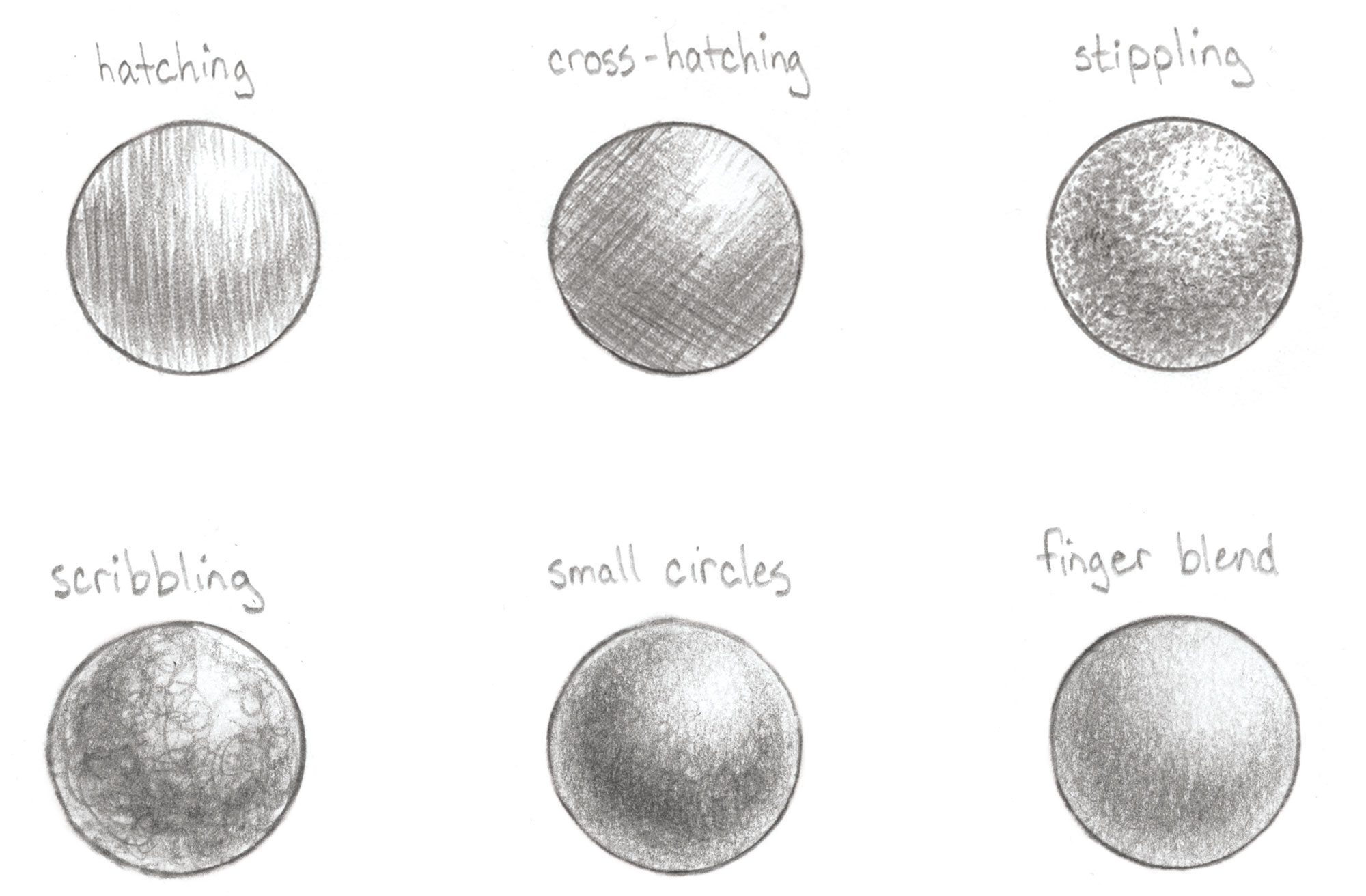
There are plenty of sketching tips and techniques to help you achieve different styles and effects. Above are some examples demonstrating different ways to create form and depth. "It’s important to experiment and find what works best for you, to not only complement but enhance your style," explains Tim. "While I prefer smoother value transitions with the pencil strokes blending in against a thin outline, you may be more partial to cross-hatching against a bold outline."
04. Vary your lines

Use varied lines, says illustrator Rovina Cai. "Not all lines are equal. Subtle shifts in the width and darkness of your lines will create a dynamic, visually interesting drawing. Controlling the kind of mark you put down can be tricky in the beginning, but with practice you will be able to create a variety of marks that work together to make a cohesive image. Experiment with different pencil grades (from 3H to 6B) and with holding the pencil at different angles."
05. Avoid smudging
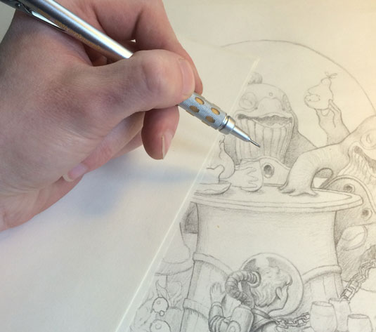
"When shading, use an extra piece of paper underneath your hand," advises artist Brun Croes. "This will minimise the amount your hand smudges your pencil lines. If you're right-handed, start shading from left to right; if you're left-handed, start at the right and move to the left.
"There's nothing more frustrating than trying to make a clean-looking drawing that loses its brilliance and value thanks to smudging. Instead, use smudging to your advantage every now and then to smooth out shading. You can do this with several tools. I use a simple piece of tissue paper to get the job done."
06. Control your edges

Tim uses four different sketching techniques to define object edges: thin, hard, lost and undefined. A thin and hard edges give objects solid borders. Lost edges occur when the object and background values start to blend together, so the edge is implied rather than defined. Undefined edges need to be deciphered by the viewer themselves. He suggests exploring all four types, and combining them to create interest within your work.
07. Use a blending stick for smooth shading
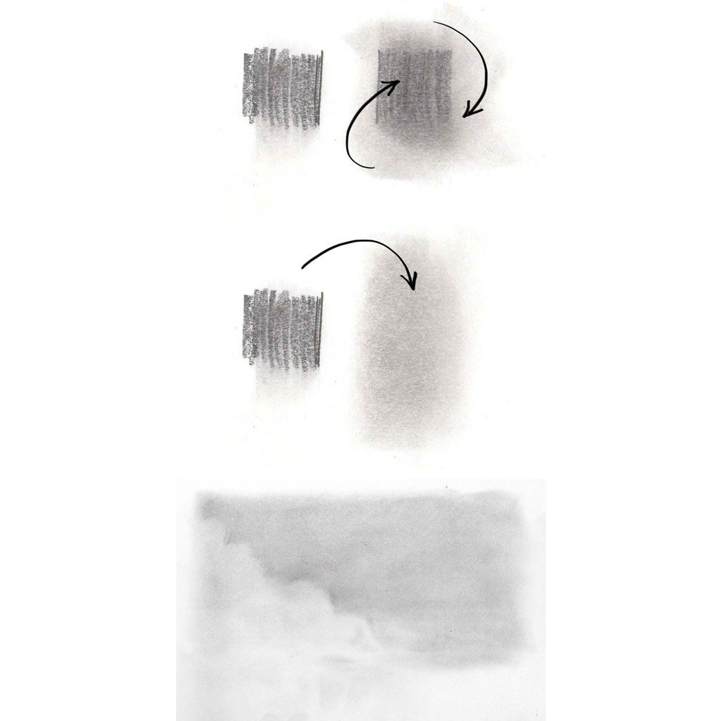
It is possible to create smooth, blended effects using pencils – for example, to capture a sky. "Sometimes it's preferable for your shading to be less sketchy and more smooth and subtle," says artist Marisa Lewis. "Pencil lines don't blend perfectly unless you're very careful."
To avoid your initial scribbles showing through, Marisa uses a particular technique – see more art techniques here. "Use spare paper to doodle a big swatch of soft graphite or charcoal pencil, then use a large blending stick to pick up the soft dust to use for your image," she explains. "Keep using the blending stick and adding more scribbles as you need more graphite." You can then build up darker areas to create definition.
08. Apply the 70/30 rule in your sketching
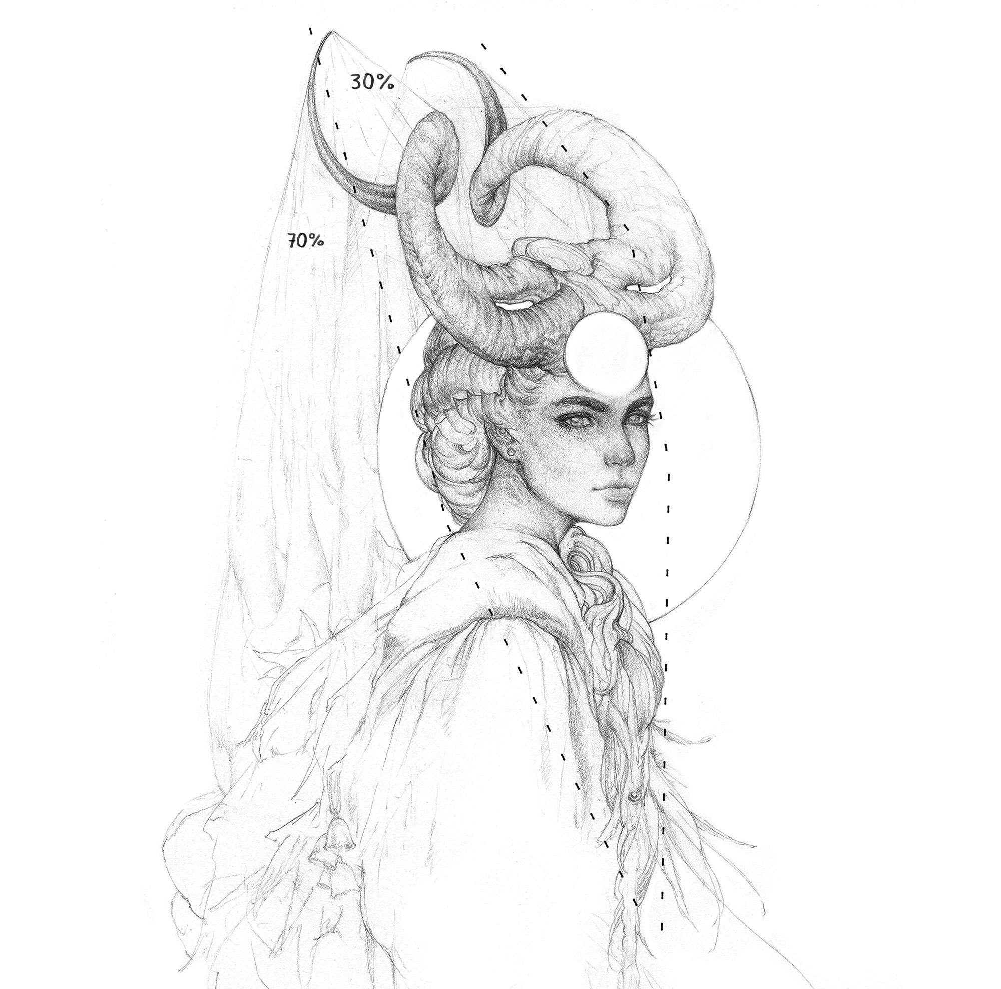
One of the most vital sketching tips is that less can be more! The 70/30 rule helps you create effective compositions. The idea is that 30 per cent of your sketch is filled with the main focus and detail, and the remaining 70 per cent is filler. This less interesting area helps direct attention towards the main subject of your artwork. You can see the rule in action in Tim's sketch above.
09. Make your sketches (almost) symmetrical
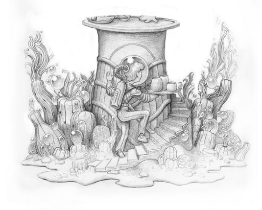
"I like symmetrical drawings, but they often look boring all too quickly," says Brun. "A good way to prevent this is to add some subtle changes and only keep the general lines symmetrical instead of mirroring every small part. Keeping some elements asymmetrical helps to avoid boring repetition."
10. Differentiate different textures
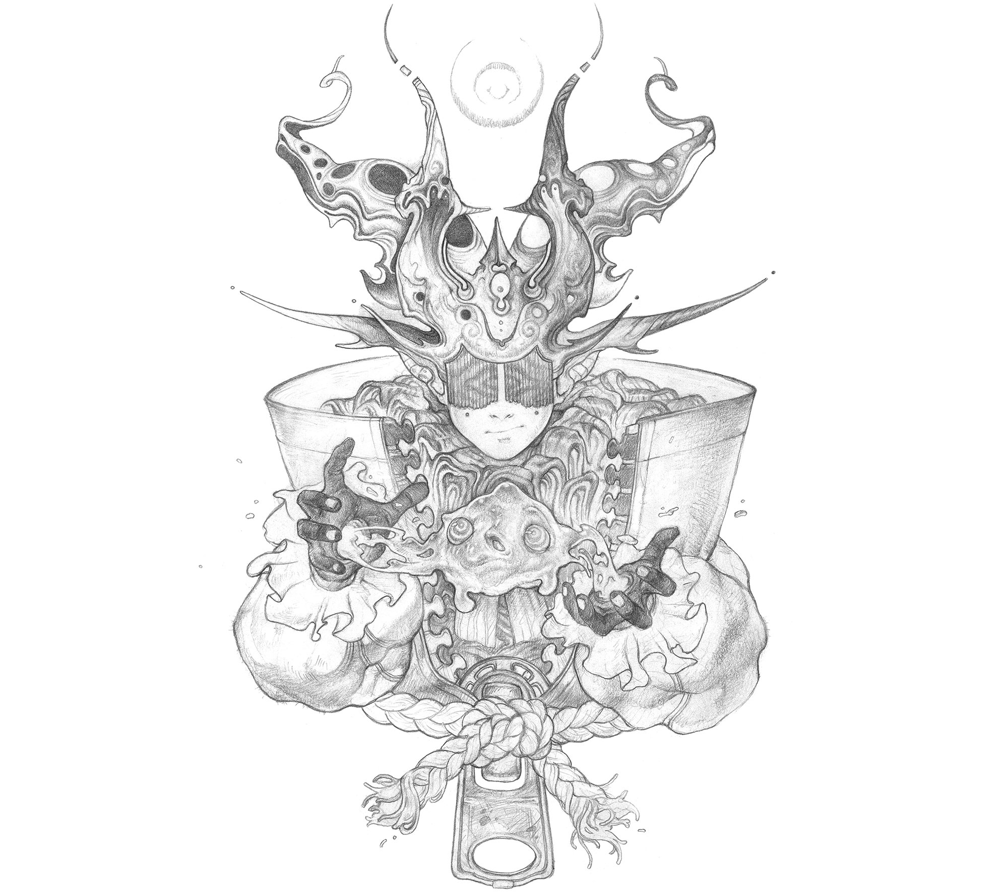
To show different textures within your sketch, you need to adjust your technique. "You wouldn’t want to shade skin the same way you shade metallics or fur. They each have unique properties and capturing that will elevate your drawings because of the accuracy depicted," says Tim.
A good starting point is to consider if the texture is rough or smooth, and then if it absorb or reflects light. "A reflecting and smooth texture, such as chrome, usually has higher contrasts and prominent highlights, while an absorbing and rough texture like cotton has low contrasts and little to no highlight present," he continues.
11. Master realism, then try something more stylised

Sketches don't have to be realistic. However, Tim believes it's vital to focus on creating realistic sketches first – considering elements such as lighting, values, proportions and anatomy – before trying something more stylised.
"Once you understand how to recreate something realistically, it becomes incredibly easy to then create a stylised version of the same object, especially for creatures and characters," he says. "Over time you’ll make seemingly small, personal preference choices on the actual execution of a piece (often straying from realism) and that’s what will help you to gradually build up your own style."
12. Make characters readable as silhouettes
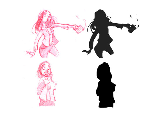
Character design is a whole discipline in itself, but this helpful sketching technique is a good place to start. "Have you ever noticed that every important character in an animation movie is recognisable from their shadow alone?" says artist Leonardo Sala. "This magic has a name: the silhouette. The purpose of finding a strong and interesting silhouette is to create an easily recognisable character that will remain clear in the visual memory of the viewer."
Another of the great sketching tips is to see if your characters are recognisable in silhouette form. To do this, place a piece of tracing paper on your sketch and trace around your character, filling it in with solid colour. Then show a friend or colleague, and ask what they see.
13. Create contrast in your sketches
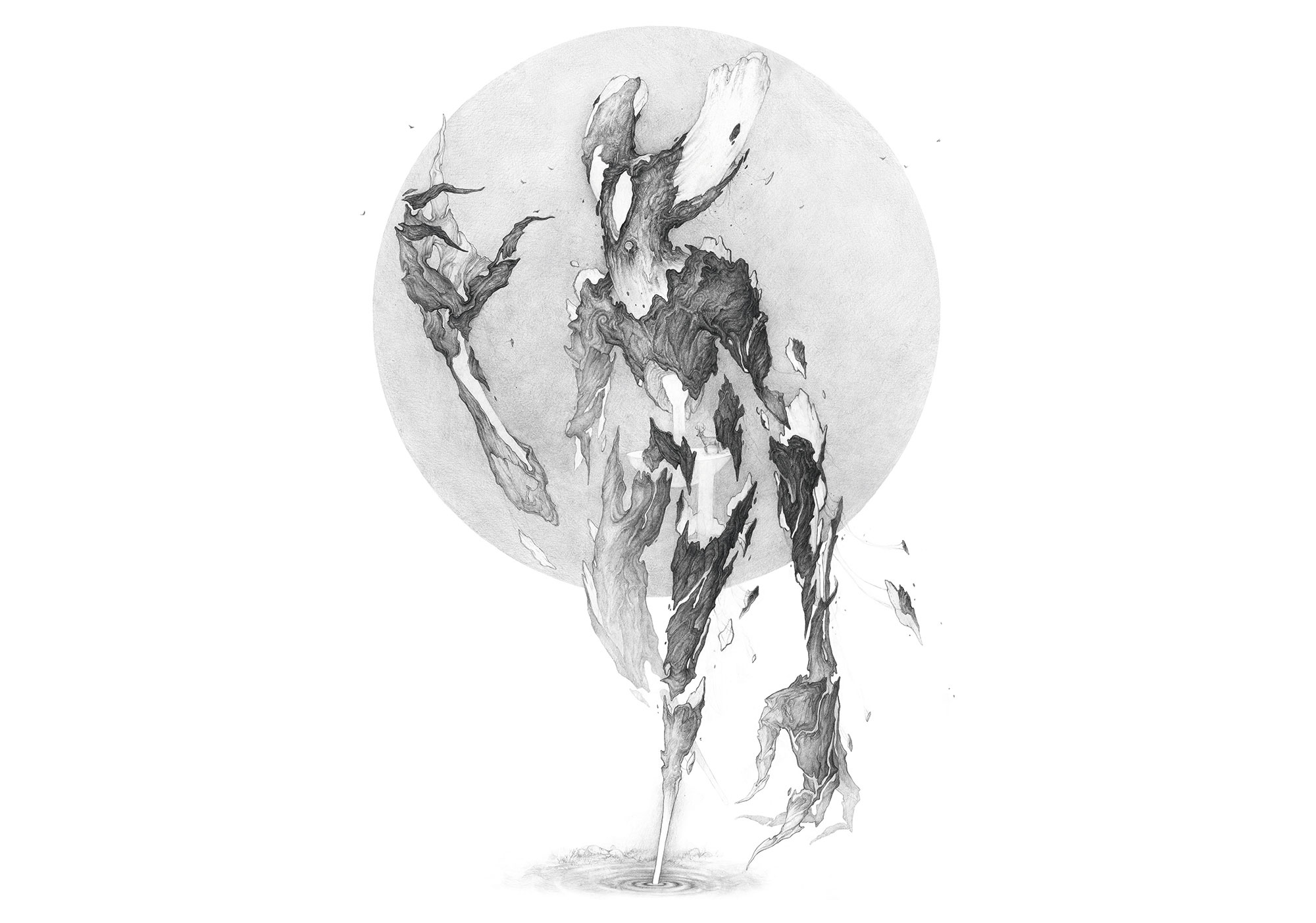
Contrast helps direct the viewer's eye within a sketch. When people talk about contrast they're usually referring to a difference in value, where light and dark areas are juxtaposed. However, you can also create contrast in hue, saturation, shape, texture, edges, proportion and so on.
"Heavy contrast will demand attention," emphasises Tim. "I recommend placing the highest value contrast in your area of intent focus. You can also add contrast to separate forms and distinguish different subject matter."
14. … but not everywhere
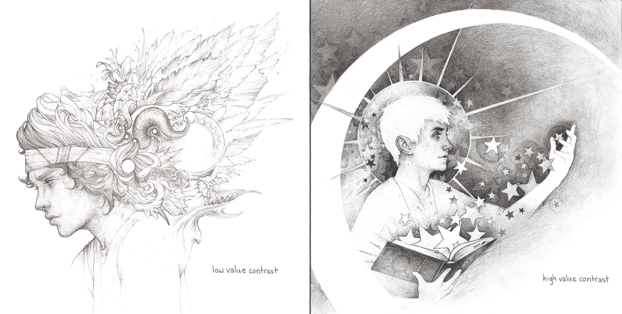
Contrast is a powerful tool – but don't be tempted to create high contrast everywhere in your drawing, says Tim. Subtle shading can be just as effective when it comes to showcasing form and detail.
"In these examples [above], you can see that the softer, low-value contrast piece enables the eye to wander and doesn’t define an area of focus," Tim adds. "While the area of focus in the high-value contrast piece rests on the darkest darks against the lightest lights."
15. Flip your image with tracing paper
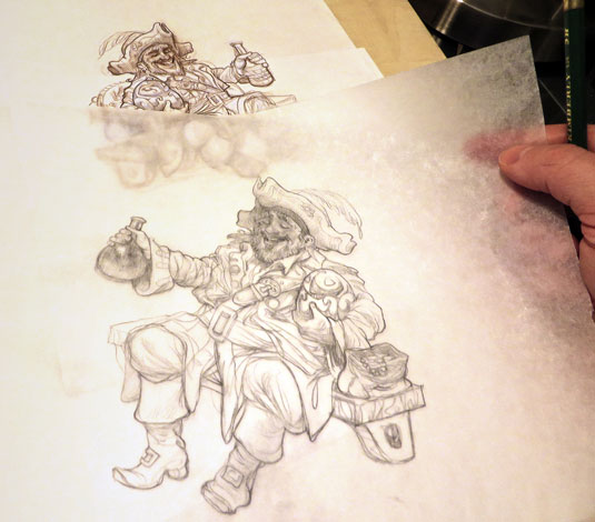
If you've spent a long time looking at a drawing, it can be difficult to see where the errors are and that's where these sketching tips come in. Artist Justin Gerard has a nifty sketching tip to help. "A benefit of tracing paper is that you can flip it over to see how your drawing looks from the reverse angle," he advises. "This can help reveal errors in proportion. As you work, take advantage of this in order to arrive at a more successful drawing."
16. Make gradients work for your sketching
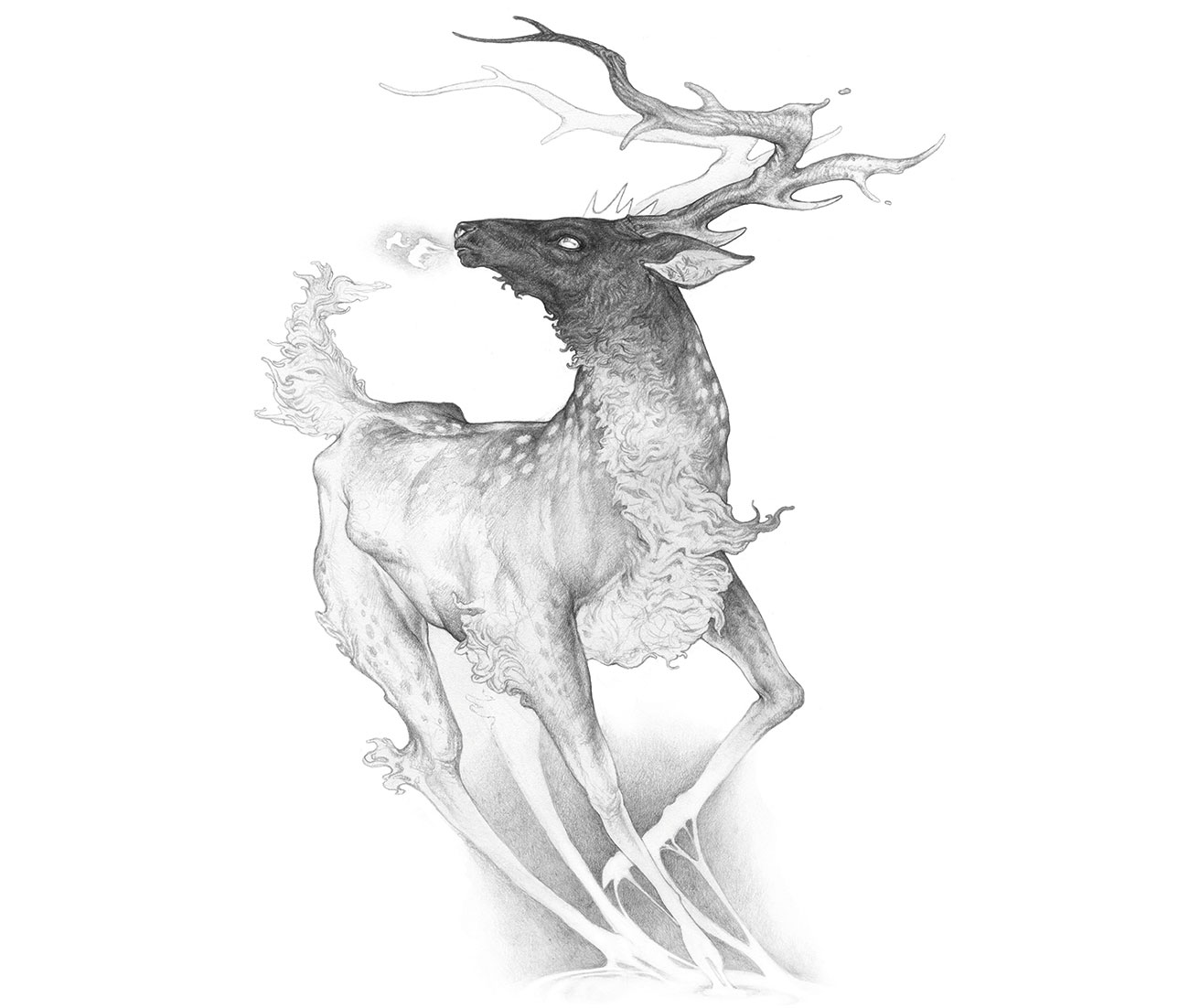
Tim is very fond of a well-placed gradient. "They are visually pleasant to the eye and can direct the viewer’s attention to an area of focus," he comments. "The scope of the gradient is important as well. A gradient that covers most of the drawing or subject matter will influence where the viewers look, and smaller gradients can add a pop of detail and contrast. If you feel your piece is looking flat or has lost focus, try adding a subtle gradient."
17. Explore abstract backgrounds
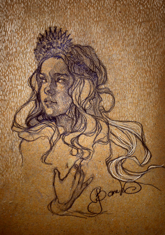
"The use of irregular lines when shading adds a lot of dynamism to your sketch," Sylwia says. "If you want to create a fresh and unique portrait, architecture sketch, or piece of concept art, you should definitely try this technique." Sylwia uses it to add interest to flat backgrounds.
18. Add imperfections

"Instead of just looking at what makes an object recognisable you should also consider how to make this object distinctive," says Tim. Quirks and imperfections add character to your sketch, and can suggest a story for the viewer to mentally explore.
In the example above, you can see three different carrots. The first one depicts what might come to mind when you think of a carrot. The second is based on an actual carrot, with its lumps and bumps emphasised to create interest. In the third, Tim has gone one step further. "Look to add [imperfections] to any given subject matter and try to have some fun pushing it into something fantastical," he suggests.
19. Rejoice in the details
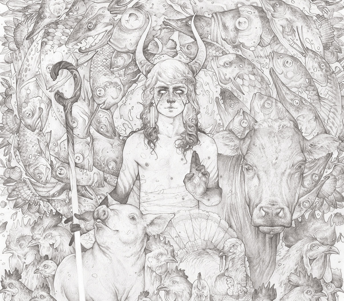
Tim believes an artist's heart and soul is revealed in a sketch's details. "The additional time put into adding elements that may go unnoticed are like treats for viewers who take the time to look for them," he says.
Putting extra care into the details can also teach you patience. "Great art should be nurtured, not manufactured," he adds. "Don’t overlook those details or let time be a deterrent. Embrace them!"
20. Trust your intuition

Finally, the last in our list of sketching tips might seem to negate some of the others, but at the end of the day, we often have a sense for what works and what we like, and sometimes we just need to be brave enough to go with it. "Creating art takes courage. To fully express who you are, what you’re interested in, how you’re feeling and what you stand for can be daunting. Too many artists play it safe. They find an appealing and marketable comfort zone, and then only create from that space," says Tim.
From experience, he's found that work that feels authentic will resonate more with people. "When you’re in your creative zone, trust your gut feelings and be expressive with your preliminary sketches and thumbnails," he continues. "Don’t worry about the reaction. Create without the fear of whether it will be 'good' or not."
This is an edited version of an article that originally appeared in ImagineFX, the world's best-selling magazine for digital artists. Subscribe now.
For more tips, see our guides to Art techniques and Pencil shading techniques. And for inspiration, check out our roundup of some of the best realistic pencil drawings.

Thank you for reading 5 articles this month* Join now for unlimited access
Enjoy your first month for just £1 / $1 / €1
*Read 5 free articles per month without a subscription

Join now for unlimited access
Try first month for just £1 / $1 / €1
Get the Creative Bloq Newsletter
Daily design news, reviews, how-tos and more, as picked by the editors.

ImagineFX is the No.1 selling digital art magazine for fantasy and sci-fi enthusiasts! Featuring digital and traditional drawing skills, game design, manga and film art each issue is crammed with training and inspiration from leading artists in their fields. Whether it's learning from comic art's Adam Hughes, fantasy art's John Howe, or digital painting's Loish, ImagineFX has you covered. ImagineFX has been inspiring artists for over 15 years!
