9 pop art tributes to Oscar-nominated movies
If Warhol had made movie posters for Gravity and American Hustle, what would they have looked like? Something like this, perhaps...
As huge movie fans, we're getting massively excited for the Oscars this weekend at Creative Bloq (check out who we think should win the special effects and animation gongs here). And we just happen to be big fans of Pop Art too.
So when we heard that stock image library Shutterstock had persuaded nine artists to create movie posters for each of the Best Picture Contenders in the style of the Pop Art movement, we had to take a look. What do you think of the results?
- Read all our poster-related articles here
01. Gravity
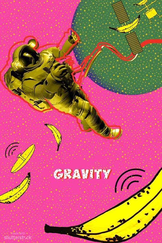
How to represent the game-changing 3D immersathon Gravity in Pop Art form? By paying tribute to another classic, the Warhol banana, as immortalised on The Velvet Underground's debut album cover. "To give it a humorous twist, I used bananas as missiles, striking and shattering the satellite," artist Lily Ou explains.
- Also read: How Gravity's visual effects were created
02. American Hustle
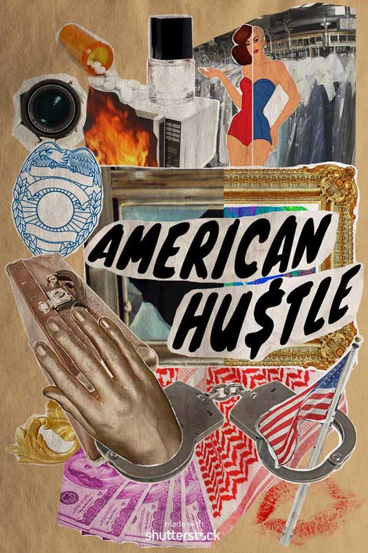
Seventiestastic con thriller American Hustle gets the Pop Art treatment here courtesy of artist Jami Miles. "Inspired by artist Eduardo Paolozzi's collage style, this poster particularly reflects the aesthetics of his 1948 work 'Dr. Pepper,' as well as his BUNK series, using popular imagery and elements of surrealism," Miles explains.
03. 12 Years A Slave
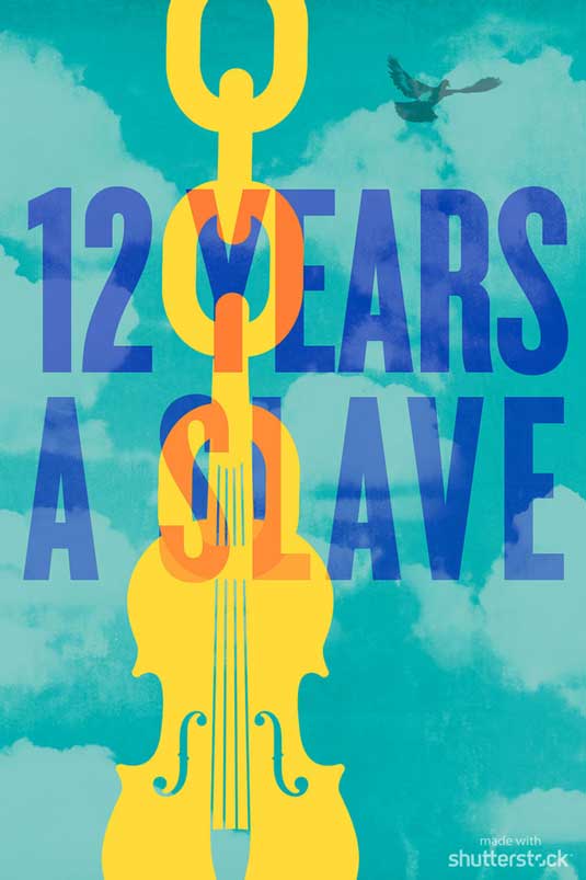
Kathy Cho takes on the most heavyweight of Oscar nominees here, striking the perfect balance between the seriousness of the subject matter and the frivolity of Pop Art. "I wanted to use vibrant, bold colours in an abstract but simple way, with imagery representing the idea of freedom that is so inherent in this film," she explains.
04. Nebraska
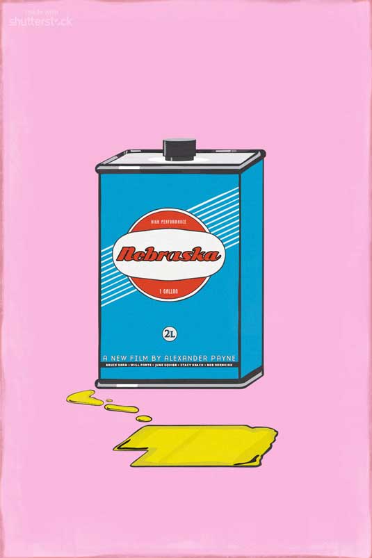
Nebraska is a movie that gets down and dirty with the stark mundanities of modern American life, and so it's fitting that Cristin Burton focuses here on motor oil - appropriate enough for a road movie about a retired mechanic - drawing the Pop Art movement's obsession with branded consumer goods. "This poster features a flat, simple illustration of a motor-oil can, which complements the flat tone of the movie," he explains.
05. The Wolf of Wall Street
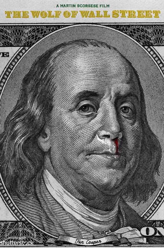
While The Wolf of Wall Street tells a complex story, Pop Art is all about bold, simple ideas - so for this poster Jordan Roland has distilled the movie down to its essence: money. "Stylistically, I looked to Robert Dowd and the pieces for which he painted currency with either simple alterations, or none at all," he says.
Daily design news, reviews, how-tos and more, as picked by the editors.
06. Dallas Buyers Club
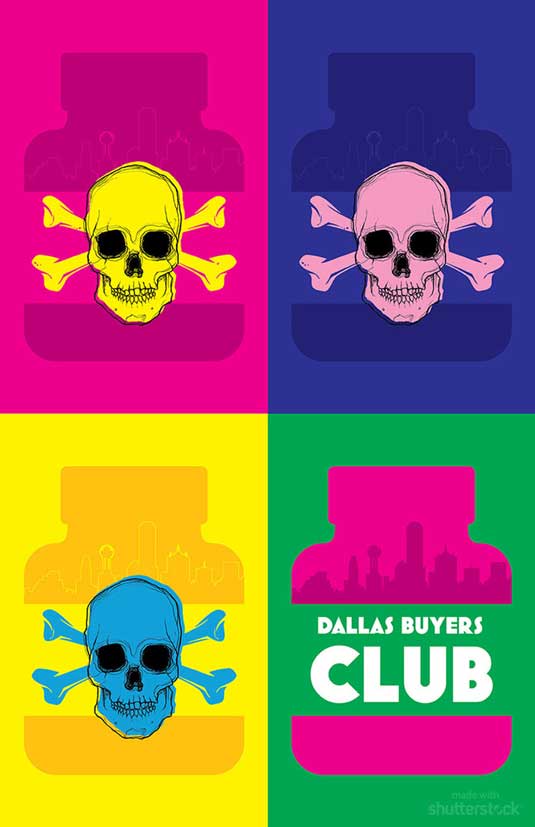
Low-budget Oscar nominee Dallas Buyers Club deals with another serious subject (medication for HIV sufferers), so Adriana Marin again had to steer a careful path in this poster pastiche. "The silhouettes of pill bottles with a skull and crossbones represent the ineffective and eventually toxic drugs used during clinical trials for HIV treatment," she explains. "They're contrasted by neon colours inspired by Jared Leto's vivacious portrayal of Rayon and Matthew McConaughey's equal gusto as Ron Woodroof."
07. Captain Phillips
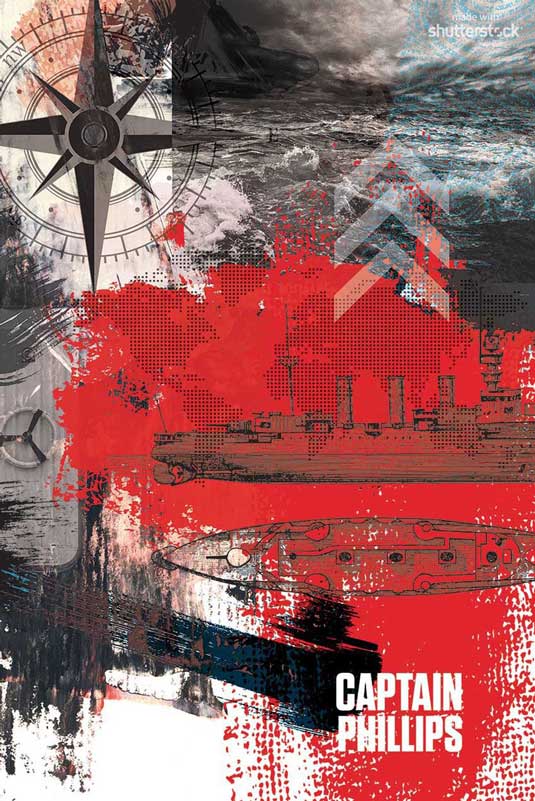
Pop Art wasn't all about gaudy cartoons and endlessly repeating soup cans. Here Rachael Polack draws on the work of Pop Artist Robert Rauschenberg, a true master of texture. ""Paint, overlays, and scrap imagery come together here to represent the complexity and gripping truth behind the story of Captain Phillips," she explains.
08. Her

Spike Jonze's Her deals with how sexuality is mediated by new technology, and this poster brilliantly harnesses the luridness of much Pop Art to explore the concept. "Aesthetically, the colours in Spike Jonze's unconventional love story are both encompassing and crucial to the storytelling," says the artist, Deanna Paquette. "I used Adobe Kuler to help capture the palette directly from the film and bring it into this design to translate the mood."
09. Philomena
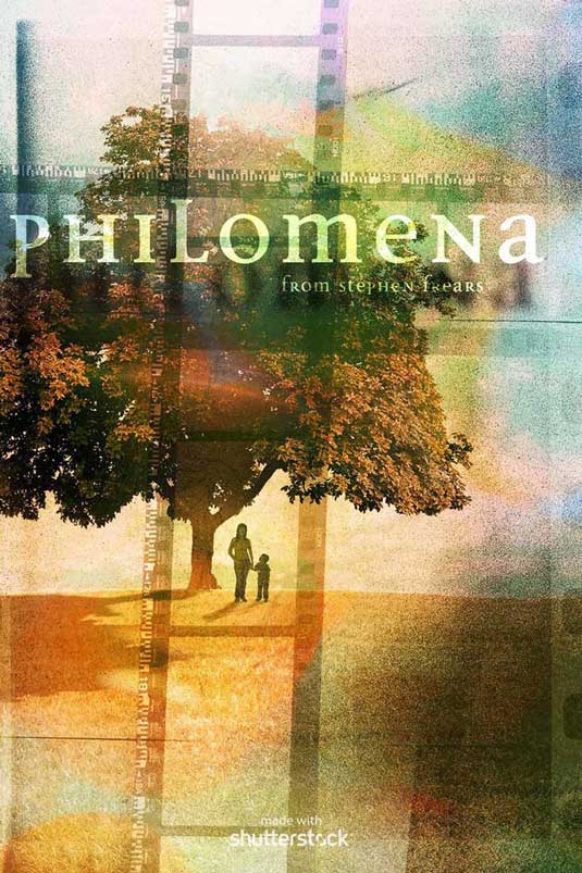
British flick Philomena is one of the more low-key nominees this year, and this poster created by Philippe Intraligi is suitably muted. "My spin [..] is based on the core aesthetic of the film, which plays with memories in the form of Super 8 snippets," Intraligi explains. "The design of the poster uses film snippets overlapping as a cross, framing the main character and her lost boy."
For more details of the project, head to the Shutterstock website.
Liked this? Read these!
- How Britain's movie awards were branded
- The best movie posters of 2013
- The ultimate guide to logo design
Have you seen an imaginative take on the movie poster genre? Let us know in the comments box below!

The Creative Bloq team is made up of a group of art and design enthusiasts, and has changed and evolved since Creative Bloq began back in 2012. The current website team consists of eight full-time members of staff: Editor Georgia Coggan, Deputy Editor Rosie Hilder, Ecommerce Editor Beren Neale, Senior News Editor Daniel Piper, Editor, Digital Art and 3D Ian Dean, Tech Reviews Editor Erlingur Einarsson, Ecommerce Writer Beth Nicholls and Staff Writer Natalie Fear, as well as a roster of freelancers from around the world. The ImagineFX magazine team also pitch in, ensuring that content from leading digital art publication ImagineFX is represented on Creative Bloq.
