Learning how to draw or paint and creating a picture isn't easy. There are so many things to consider: specific painting techniques, ideas, composition, storytelling, mood, colour and rendering, to name but a few. It can easily become overwhelming.
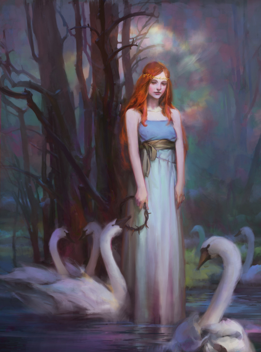
At least in this case I have the Brothers Grimm stories to take inspiration from. Wanting to paint a scene from a fairy tale, I choose The Six Swans, in which six brothers have to be released from their avian curse by their sister.
I don't have a set painting process, but I do follow a few guidelines. First, I plan ahead, and that means lots of research. Often there are going to be elements I'm not familiar with, and that means lots of sketching. I'd rather solve any problems at the start than leave them for the final stages. Furthermore, if it doesn't work as a sketch then it's not going to work as a detailed colour work.
Second, keeping it simple: design, colour, story... nice and simple! I often have to remind myself of this because it's probably the hardest one to stick to.
Finally, the great thing about digital media is how it's so forgiving of mistakes. So take advantage of it. When I get stuck I'll just go back and take a different route.
Oh, and have fun! For this workshop it's an opportunity to show a different side of fairy tales. There's something very dry, melancholy yet romantic about them. And it's these qualities that make them such an enjoyable subject to paint.
01. Sketch out your ideas
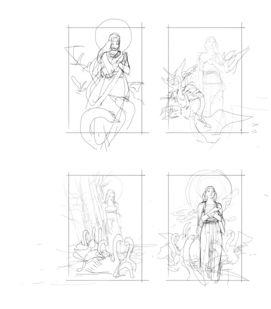
Every picture should start with a batch of sketches. It's the part where there's very little restriction and more free rein. For me this stage is very simple: I test out composition and design before things start to get heavy. If I can't work it out now then it won't work later. I try and keep it minimal and rhythmic, and only sketch the important elements.
Get the Creative Bloq Newsletter
Daily design news, reviews, how-tos and more, as picked by the editors.
02. More basic colour sketches
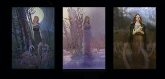
These are colour explorations, done prior to this version to test out how to develop from the sketches. I find things can get very different in colour, as opposed to just lines, and these help for previewing. But they're fun too. I've gone with the direction of the first version, but the large moon feels too obvious and may not enable me to try softer colours. Bye bye moon!
03. Setting up moods
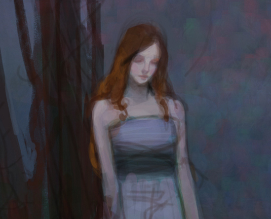
This stage is like keynotes in music: it suggests the overall mood and colours. I usually base my colours off the simple wash to determine the range, as atmosphere has a large impact on colours. I try and assign local colours to the important elements, making sure they have enough contrast to crest visual interest. I'm not too concerned with details here. Just shapes and colours.
04. Depicting the girl
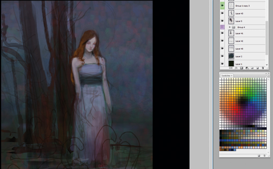
Of course, the character is a crucial element of the painting. She's going to tell the story, with a subtle tilt of her head, facial expression and posture. I reference Pre-Raphaelite painters to get the feel right. I don't want any direct lighting on her as it may create too much contrast. I want her to look a little more soft with very rosy cheeks.
05. Shaping the tree
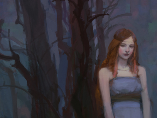
I love drawing and painting trees! There's something about finding a random yet organised rhythm to painting natural objects, and trees are probably a good example of that. The trees must complement the girl, without too much distraction. So I make their vertical flows contrast with the more rounder silhouette of the girl.
06. Adding colour
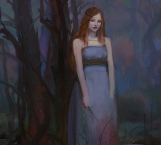
Here I decide to add bursts of colour patches to lighten up the background. I can also pick off other details such as silhouettes of the forest and define the location where she stands in the story. I find that a variation of cool colours work best here as elements recede into the background.
07. Adjustment layers
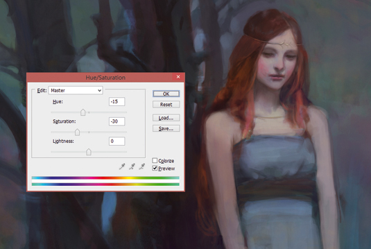
A great thing about digital painting is testing out variations, using simple adjustment layers. It also brings colours together. I mostly use Hue/Saturation and Color Balance adjustment layers, as they give most variation without affecting the picture too much. Color Balance can easily push a picture towards warm and cold tones, but is more experimental though.
08. The swans
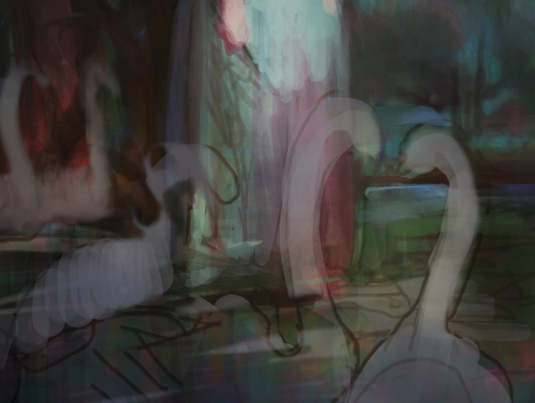
Swans! I've never painted one before, so I spend a few hours gathering references. I've got six to paint. I only go to rough in the patches of lighter colours that will soon be swans. I also add a bit of warmth towards the bottom of the painting, hoping it might help with shaping out the birds.
09. Detailing the character
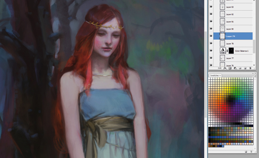
My princess looks a bit short, mostly because I want her to be ankle deep in water initially. But that hasn't really been obvious enough. So to solve this I simply extend her dress and then she won't look too short. I want her gestures and overall look to be sad but calm.
10. Swans again
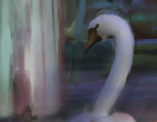
In the sketch I had the two swans in the foreground, but I realise there's too much white and it draws too much attention away from the princess. I move some of the swans to the back – I only need to suggest them. Even after doing this there's still too much white in the foreground. So I darken it a bit and reduce the contrast.
11. Add water
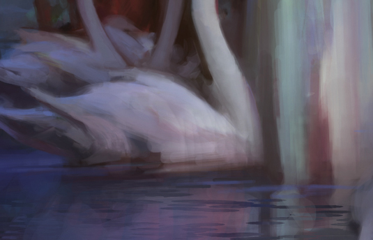
I know water's going to be tricky. I haven't given much thought to it until now. It's going to be very restricted because most elements are already in place, not to mention the contrast issue from the previous step. I find this stage the most difficult, because it's time to tidy up the loose ends while keeping the rendering consistent. With the water in place, it's almost there.
12. Loose ends - be gone!
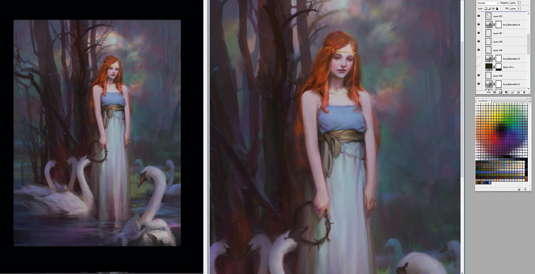
I'm undecided about the colour of the girl's hair – there's always going to be something that bothers you. The tree also seems too busy and chaotic. I go back, to almost the start, to bring back the simpler trees that are hopefully less distracting. I add a slight glow around the character's head and make more colour adjustments. Then I tidy up and finish.
This article was originally published in ImagineFX magazine issue 132.

Thank you for reading 5 articles this month* Join now for unlimited access
Enjoy your first month for just £1 / $1 / €1
*Read 5 free articles per month without a subscription

Join now for unlimited access
Try first month for just £1 / $1 / €1
Min is a freelance concept artist and illustrator from Sydney, Australia. He's worked in films and games for 10 years and currently teaches at Arteum in Seoul, Korea.
