Editorial illustrations pop from the printed page
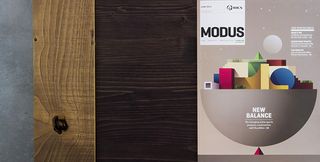
This impressive artwork for MODUS magazine is a great example of how to do editorial illustration.

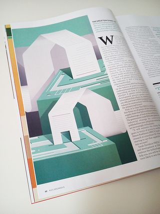
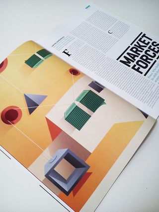
This gorgeous artwork by Ray Oranges for Modus, the magazine of the Royal Institute of Chartered Surveyors, is a great example of how to illustrate a magazine article.
Oranges has been commissioned some of the world's top magazines, and for good reason. Combining colour and simple shapes, his creations truly pop from the page.
These particular illustrations accompany an article about the changing status quo in property, construction and UK politics. Their abstract nature mean they successfully evoke the subject while allowing the reader's attention to focus on the words themselves.


What do you make of these illustrations? Let us know in the comments box below!

Thank you for reading 5 articles this month* Join now for unlimited access
Enjoy your first month for just £1 / $1 / €1
*Read 5 free articles per month without a subscription

Join now for unlimited access
Try first month for just £1 / $1 / €1
Get the Creative Bloq Newsletter
Daily design news, reviews, how-tos and more, as picked by the editors.
Sammy Maine was a founding member of the Creative Bloq team way back in the early 2010s, working as a Commissioning Editor. Her interests cover graphic design in music and film, illustration and animation. Since departing, Sammy has written for The Guardian, VICE, The Independent & Metro, and currently co-edits the quarterly music journal Gold Flake Paint.
