How to create portraits of iconic rock stars
Product designer and digital artist David Mahoney talks us through a self-initiated project in his own unique 'tradigital' style, paying homage to icons of British music.
My Paint It Black project takes its title from the song by the Rolling Stones. Over time, my work has become monochromatic, with a strong contrast between black and white. I decided to communicate this use of harsh black on white, which has become my signature style, with a collection of illustrations celebrating British music.
I focused the project on British icons primarily because they're very recognisable figures, but also because I'm very interested in musicians and what they and their music say about society.

I'm currently an official artist for Major League Baseball, working with the New York Yankees. My client list also includes Kendrick Lamar, Saucony and Vivienne Westwood, but it's always important for me to have a personal project on the back-burner. They afford me the opportunity to try new materials, experiment with techniques and generally just be creative.
The biggest challenge I faced with this project was trying to unify the musicians visually. Because each artist has a different musical style and visual identity, creating coherence was a significant issue. To solve this, I chose to simply illustrate their clothing as pure black, with ornamentation in the form of expressive quill strokes and ink splatters.
Project evolution
Generating ideas
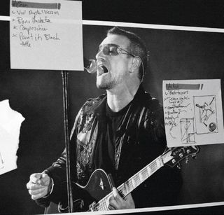
The first stage, as with most of my work, is laying out the composition. I usually pin up a design on my chalkboard, along with some Post-It notes, to help me generate ideas. The picture is then colour-corrected, sharpened and made monochromatic before being positioned on a canvas.
Using layers
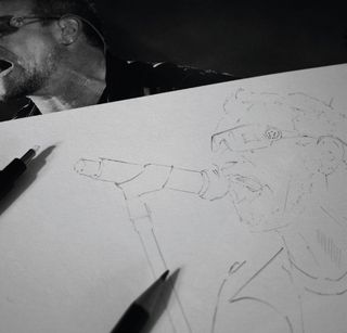
I began each piece in the Paint It Black series by creating a master layer. As my work is constructed using a variety of texture layers and sections, I start by producing a stylised master sketch of the piece. I'm then able to use this to help me to align each of the separate layers within Photoshop.
Face time
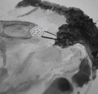
I produce layers by hand, each increasing in detail. Working from my reference image, I begin inking up each layer with watercolour, squid ink and pen to build up the illustration. The main detail work on the face starts with a roughing of the features, working on areas of contrast, shadows and hair texture.
Unique textures
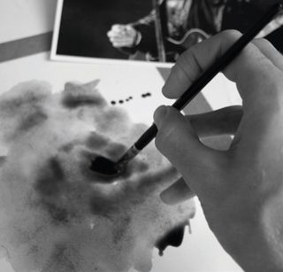
Large texture files, for detail and backgrounds, are created separately on stretched watercolour paper. For these illustrations it's important to create interesting texture and brush work as these are the largest features of the composition. This layer is applied using the Multiply Layer tool in Photoshop.
Black and white

The layers are scanned in and work begins on colour correction. Smaller layers are not stretched, as they're easier to handle. However, where the paper warps from saturation, shadows are created. I have to colour-correct the white background and change the Curves (CTRL+M) to create rich blacks and crisp whites.
The perfect overlay
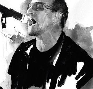
Each layer is then piled on top of the other in an assembly file. To achieve the perfect overlay of each texture file, I again use the Layers tool and Multiply. At this stage, detail and stylisation is yet to be applied. Furthermore, I need to digitally add highlights and other detail using my Wacom tablet.
Print and refine
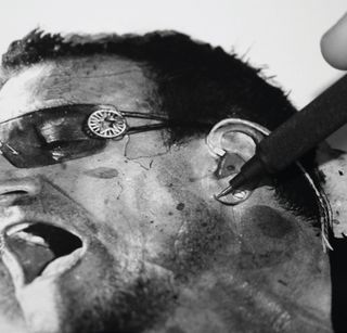
Finally, I print out the image to enable me to look at detail, work on grading and then begin working out the overall composition when the piece is stylised. The illustration is drawn on using a red marker and a pencil, which I use to highlight errors and sketch out the overall composition.
Words: David Mahoney
This article originally appeared in Computer Arts issue 219
Liked this? Read these!
- Free graphic design software available to you right now!
- Photoshop tips, tricks and fixes to try today
- Download free textures: high resolution and ready to use now
Seen an exciting art project? Tell us about it in the comments!

Thank you for reading 5 articles this month* Join now for unlimited access
Enjoy your first month for just £1 / $1 / €1
*Read 5 free articles per month without a subscription

Join now for unlimited access
Try first month for just £1 / $1 / €1
Get the Creative Bloq Newsletter
Daily design news, reviews, how-tos and more, as picked by the editors.
The Creative Bloq team is made up of a group of design fans, and has changed and evolved since Creative Bloq began back in 2012. The current website team consists of eight full-time members of staff: Editor Georgia Coggan, Deputy Editor Rosie Hilder, Ecommerce Editor Beren Neale, Senior News Editor Daniel Piper, Editor, Digital Art and 3D Ian Dean, Tech Reviews Editor Erlingur Einarsson and Ecommerce Writer Beth Nicholls and Staff Writer Natalie Fear, as well as a roster of freelancers from around the world. The 3D World and ImagineFX magazine teams also pitch in, ensuring that content from 3D World and ImagineFX is represented on Creative Bloq.
