7 steps for illustrating luxury print collateral
Leading UK artist explains how to create a striking illustration system that works across different surfaces.
London-based graphic artist Emily Forgot was commissioned to illustrate collateral in the opulent Rumpus Room bar at the new Mondrian at Sea Containers hotel. The brief asked her to reference the art deco period, but in a contemporary take. Here's how she approached the project…
Design consultancy Magpie Studio approached me directly to create some illustrations for the Rumpus Room bar in the Mondrian Group's new Sea Containers hotel. They were aware of my work and felt it fitted the brief they had developed.
The brief required referencing art deco with a twist, to work alongside the decadent 1920s-inspired interior of the bar.
The master illustration I produced had to contain elements that could be used as individual illustrations on different objects, such as coasters and matchboxes.
It also had to work in one colour, which was actually pretty easy as I will often start an illustration in black and white. If it doesn't work in black and white, you'll be hard pushed to make it work in colour. Apart from that I was given pretty much free reign.
It was nice because the brief was quite open. Although, I had links to the work Magpie liked, so I had quite a strong sense of the stylistic outcome.
I also got to visit the hotel as it was being finished, so I could take inspiration from the fixtures and fittings for the Rumpus Room bar. That was a dream, as I am a complete interior design nerd.
Daily design news, reviews, how-tos and more, as picked by the editors.
01. Research period
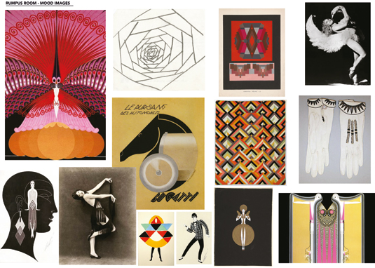
I did a lot of research into the art deco period, looking at shapes, patterns and icons from that era. I was inspired by the surreal designs of Elsa Schiaparelli and the artwork of A.M. Cassandre as well as Erté.
The shape that underpins the master illustration is from a 1930s dresser that I found on an auction site.
02. First sketch
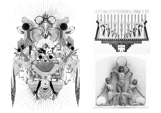
I did a rough sketch, and scanned and collaged in a few more elements. It was about getting the ideas from my head onto paper, to have something I was happy to share with Magpie and the Mondrian.
It indicated the composition and elements I wanted to include. Once I got sign off on the sketch, I developed the illustration.
03. Finalise the motif
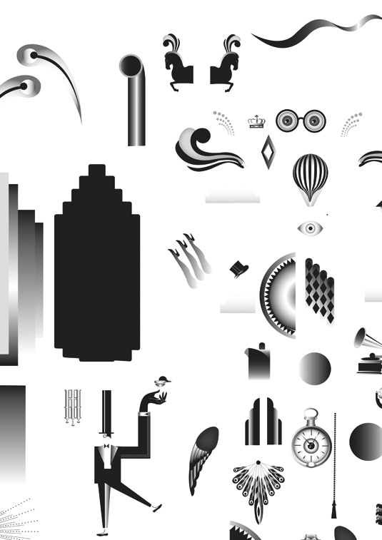
There weren't any initial ideas that I had to discard. I had a clear vision from the start, so it was pretty difficult to veer off course. I finalised the motifs and drew them in Illustrator.
I then imported the individual elements into Photoshop to collage together, following my initial rough as a composition guide.
04. De-cluttering
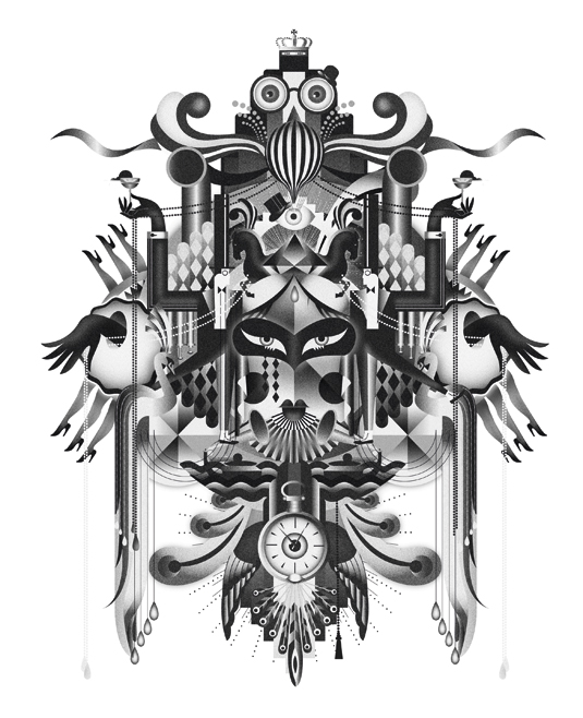
The second sketch was a little over-complicated, so I stripped it down slightly. I feel it's an easier process to overdo it and strip it back than the reverse.
The final illustration benefits from being less busy; it has more of a focal point. The petrol blue was inspired by the interior – an interesting, almost metallic material.
05. Adding a contemporary feel
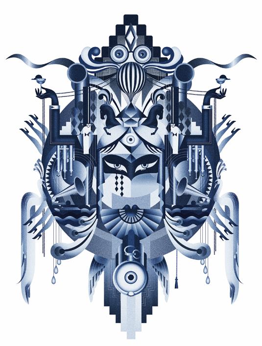
There weren't any huge challenges, but just because I was referencing a certain era I didn't want it to feel pastiche, so one of the challenges was to keep it contemporary.
I made sure to do this by including my own personal visual language that I have developed over time, not just copying the style of a certain era.
06. In motion
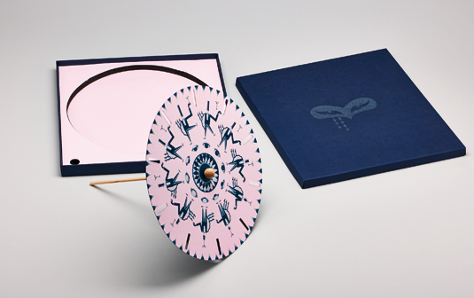
I was also asked to create a phenakistoscope animation device as an invite for the Rumpus Room launch. I used existing elements from the master illustration and just played with 12-frame animated GIFs to make sure each frame would work in the format. It was just like creating a stop-frame animation.
07. Patience

I spent just under two weeks on the project, then Magpie implemented the illustration into the designs. With the production period, it was a few months later that the hotel launched and the artwork went live.
I'm very pleased with the final outcome, but am yet to see the designs alongside the beautiful interior.
Words: Emily Forgot
London-based graphic artist Emily Alston works under the moniker of Emily Forgot for a diverse range of international clients. The full version of this article first appeared inside Computer Arts issue 240. Get up to 55 per cent off a subscription to CA here.
Liked this? Try these...
- Golden rules for talking about your design work
- Pro tips for being perfect in print
- Illustrator tutorials: amazing ideas to try today!

The Creative Bloq team is made up of a group of art and design enthusiasts, and has changed and evolved since Creative Bloq began back in 2012. The current website team consists of eight full-time members of staff: Editor Georgia Coggan, Deputy Editor Rosie Hilder, Ecommerce Editor Beren Neale, Senior News Editor Daniel Piper, Editor, Digital Art and 3D Ian Dean, Tech Reviews Editor Erlingur Einarsson, Ecommerce Writer Beth Nicholls and Staff Writer Natalie Fear, as well as a roster of freelancers from around the world. The ImagineFX magazine team also pitch in, ensuring that content from leading digital art publication ImagineFX is represented on Creative Bloq.
