Does illustration need a 'kick up the arse'?
Gordon Reid defends the London Illustration Fair from a recent critical article and examines the state of the discipline today.

Like many practicing illustrators out there I am an avid reader of design press – soaking up visual inspiration and taking the opportunity to read articles that discuss issues we deal with every day. One such article that I recently came across sparked a furore amongst illustrators.
Written by Liv Siddall, 'Isn't it time the world of illustration had a bit of a kick up the arse?' bemoaned the state of the illustration industry, taking the view that for those outside the industry, illustration is a bit of a joke.
"People hear the word 'illustration' and think of naff murals in cafes, screen printed pictures of bears wearing beanies, or t-shirts with wistful flocks of birds across them." - Liv Siddall
What struck me most was how generalised her viewpoint was - and like many of my peers who felt compelled to throw in their views, I too felt motivated to offer my opinion.
Instant gratification
For a start, I feel there is too much emphasis on finding the 'new thing' and with the huge accessibility the internet provides to countless websites and blogs, the industry has changed somewhat from an appreciation of craft to a constant quest for instant gratification.
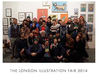
Events like the London Illustration Fair (the target of Siddall's article) are certainly not the root cause of the fundamental problems in the illustration world. Not even close, and to insinuate so is a little misguided.

I'd argue that any event like this is similar music festival in that you need big names to sell tickets and get people through the door. If, for example, Latitude Festival announced an entire bill of bands that hadn't yet released an album or were unsigned, the amount of people buying tickets would dramatically fall. The same applies here.
If London Illustration Fair focused on solely student talent or as yet unheard of recent graduates would the fair attract as many people through the door?
Surely the inclusion of a few hand picked established artists assures ticket sales, serving to popularise an event like this and provide a platform for new talent to get seen by the right people? It's all about balance.
Quest for talent
My career began a couple of years after the boom of the blog and I've witnessed first hand the constant quest for 'fresh talent' which has persisted and skewed the industry. Illustrators are not given the time they need (often several years) to develop and establish their style and voice before their work is to be considered passé.
Rob Lowe summed things up very well in his response to Liv Siddall and I wholeheartedly agree with his view point.
"For an illustrator to have a cohesive and critical outlook on life normally takes time, a lot longer than the four years given here from made-it-to-past-it."
Our industry has changed dramatically since I started out, with many of my talented peers cutting their losses and joining agencies and studios where their talents have been reduced to designing dreadful direct mail outs or awful email banners – instead of utilising their craft skills to create work that truly showcases their unique ability.
Style over substance
I think the need for illustration has decreased somewhat over the last few years and the emphasis on style over substance has been dramatically clear from the sort of conversations I have with clients and peers on a daily basis.
Arguably art buyers and directors can't always justify a tailored, customised illustration for a sizeable fee when their in house mid weight designer can knock it out for a fraction of the price. Having seen so many illustrators style replicated and ripped by agencies and even been in meetings where creative teams have confessed to their attempts to replicate my work, this is quite a serious problem.
Illustration can be such a powerful tool that can be hugely expressive and used to raise awareness of problems all over the world and I feel that we have a responsibility to utilise our skills for this very purpose.

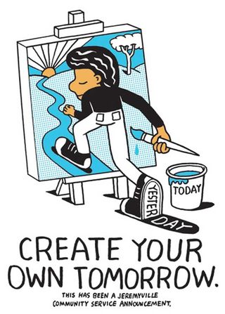
Jeremyville's Community Service Announcements are a prime example as to just how touching and beautiful a simple illustration can be. Ian Stevenson's often frank illustrations and the darkly humorous political work of David Foldvari serve to remind us how illustration can be used to engage with an audience and deliver poignant messages.
For many, the need to secure that next commission has made us complacent. We've lost sight as to just how powerful a tool illustration can be.
Words: Gordon Reid
Illustrator and designer Gordon Reid, aka Middle Boop, has clients including BBC, Red Bull, Bombay Bicycle Club, Starbucks and American Express. He's also the editor of Middle Boop Mag, a website dedicated to music and design. Follow him on Twitter.
Like this? Read these!
- Illustrator tutorials: amazing ideas to try today!
- Create a perfect mood board with these pro tips and tools
- The ultimate guide to logo design

Thank you for reading 5 articles this month* Join now for unlimited access
Enjoy your first month for just £1 / $1 / €1
*Read 5 free articles per month without a subscription

Join now for unlimited access
Try first month for just £1 / $1 / €1
Get the Creative Bloq Newsletter
Daily design news, reviews, how-tos and more, as picked by the editors.
The Creative Bloq team is made up of a group of design fans, and has changed and evolved since Creative Bloq began back in 2012. The current website team consists of eight full-time members of staff: Editor Georgia Coggan, Deputy Editor Rosie Hilder, Ecommerce Editor Beren Neale, Senior News Editor Daniel Piper, Editor, Digital Art and 3D Ian Dean, Tech Reviews Editor Erlingur Einarsson and Ecommerce Writer Beth Nicholls and Staff Writer Natalie Fear, as well as a roster of freelancers from around the world. The 3D World and ImagineFX magazine teams also pitch in, ensuring that content from 3D World and ImagineFX is represented on Creative Bloq.
