How this intricate mural of underwater legends was brought to life
Illustration duo Good Wives and Warriors reveal how they created an incredible piece of wall art for a new pop-up restaurant.
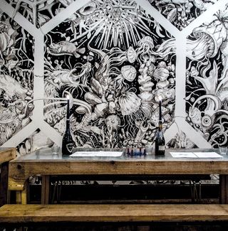
Seafood specialist Mussel Men commissioned Good Wives and Warriors to transform a 24-foot wall in its latest pop up restaurant into a blackboard paint mural inspired by sea myths and legends.
We first got to know Robin Dunlop, Mussel Men's founder, through connections we made at Glasgow School of Art, so we had a good relationship with him before this project. He was setting up a pop-up restaurant in Dalston, London – the latest in a series of Mussel Men pop-ups – and wanted to transform one of the inside walls.
Initially, Robin had envisaged having someone paint a single image of a sea monster onto the wall. Once we'd discussed the idea, it became clear that there was potential for something on a much larger scale. The space was a really nice, long wall and we were keen to do a big, intricate fill because they look spectacular and are really satisfying to do. The last few paintings we had worked on were the opposite scenario – we'd been working within very specific parameters – so for this one we jumped at the chance to create a big mass of imagery.
Robin trusted us, so we had lots of creative freedom and were able to determine the composition ourselves. Our approach is to print out lots of research imagery and then go in with a basic plan, rather than sketching and plotting everything out beforehand.
01. Fishing for research
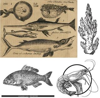
To start with, we spent a couple of hours researching the theme by gathering different images together. We had lots on file already because we've done several projects on sea creatures in the past. We also own some books by the German biologist and artist Ernst Haeckel, who we find really inspiring.
02. Black on white
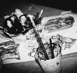
Once we'd printed some reference images we were ready to start painting – we don't tend to sketch everything out first. We asked Mussel Men to ensure the wall was clean and white, and we painted straight onto it using the same water-based blackboard paint that we use for most of our projects.
03. Netting the layout
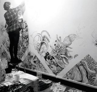
We started by dividing the wall up into quarters so we could get an idea of layout. Geometric shapes are a useful way to break up a space and give it some form and shape. We wanted to reference fishing nets, so we used diamond shapes to give the sense that you're looking through a net to the scene behind.
04. Creature features
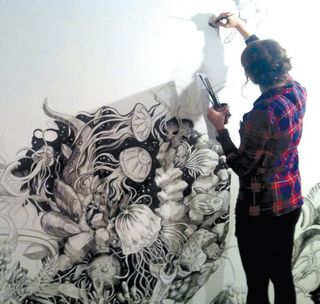
Working in an imaginative style makes things more relaxed. Any mistakes are much easier to cover up, or simply aren't noticeable – especially with a complex scene like this. We illustrated a mix of real and imaginary creatures, ranging from Japanese spider crabs and Madagascan lobsters to the mythical Kraken.
05. Organic process
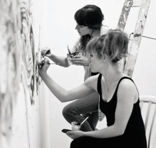
The way we work is very fluid and organic. We tend to talk as we work – we'll discuss what we're doing and ask each other's advice, so there's no overlap or repetition within the design. We're drawn to different things and had each picked out different reference images, which brought some variety to the work.
06. Artistic rhythm
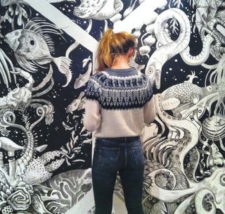
The process tends to be better and easier if we don't over-think what we're doing – we'll get into a rhythm where we're not consciously thinking about the painting as we're doing it. Often, we can't actually remember what it is that we've just painted. It helps that we're so comfortable working with that particular medium.
07. Back to black
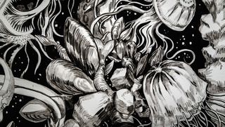
We painted the Mussel Men mural over the space of one weekend – the restaurant was opening the following Wednesday. Having finished the bulk of the painting, we went back to the restaurant later to touch up a few bits of black as the light wasn't so good when we were painting at the end of the day.
Words: Louise Chappell and Becky Bolton
This article originally appeared in Computer Arts issue 223
Liked this? Read these!
- Illustrator tutorials: amazing ideas to try today!
- Create a perfect mood board with these pro tips and tools
- Inspiring examples of vintage posters

Thank you for reading 5 articles this month* Join now for unlimited access
Enjoy your first month for just £1 / $1 / €1
*Read 5 free articles per month without a subscription

Join now for unlimited access
Try first month for just £1 / $1 / €1
Get the Creative Bloq Newsletter
Daily design news, reviews, how-tos and more, as picked by the editors.
The Creative Bloq team is made up of a group of design fans, and has changed and evolved since Creative Bloq began back in 2012. The current website team consists of eight full-time members of staff: Editor Georgia Coggan, Deputy Editor Rosie Hilder, Ecommerce Editor Beren Neale, Senior News Editor Daniel Piper, Editor, Digital Art and 3D Ian Dean, Tech Reviews Editor Erlingur Einarsson, Ecommerce Writer Beth Nicholls and Staff Writer Natalie Fear, as well as a roster of freelancers from around the world. The ImagineFX magazine team also pitch in, ensuring that content from leading digital art publication ImagineFX is represented on Creative Bloq.
