Industry expert reveals what the future holds for illustration
Varoom’s John O’Reilly reveals the emerging illustration trends you need to know.
There was probably a time when an institution like the Connaught Hotel in London, a venue marinated for generations in establishment values, would have commissioned an artist to fill a prominent space in its hotel.
Yet when brand consultancy The Partners was asked to rebrand the premises, they used the work of illustrator Kristjana S Williams to visually anchor the project. The large-scale illustration featuring images of the Connaught's history was played out in other touchpoints in the hotel – from the in-room menu to complementary bags and 150 other pieces of collateral.
However, what makes Williams' work so telling as an emerging trend is not simply the growing appreciation of such clients for their illustrative versatility. It's the fact that the centerpiece of the project was originally a 3D handmade collage. The continually evolving process of making the work emphasises the hotel's heritage, which on this evidence is one of the Connaught Hotel's subliminal pitches to its clients.
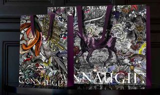
If there is an underlying direction in illustration, it's that the practice is getting more physical, more craft-like and more 3D, while also becoming more immaterial in exploring the creative opportunities of movement in digital channels on the internet and on tablets.
You could call it Divergence Culture – an extension of Henry Jenkins' idea of Convergence Culture, or the flow of content across media platforms and the migratory behaviour of audiences.
Technologies are continually converging, and so clients' marketing has had to converge differing communication channels and platforms. But consumers are increasingly interested in unique forms of content across their media, not just different media-appropriate iterations.
As Handsome Frank co-founder Jon Cockley notes, social media followers don't want to see re-hashed content, they want bespoke content that's purposely made for a smaller screen. The past 12 months, for example, have seen some cracking work where traditional illustration has got subtly mobile.
Get the Creative Bloq Newsletter
Daily design news, reviews, how-tos and more, as picked by the editors.
Illustration in motion
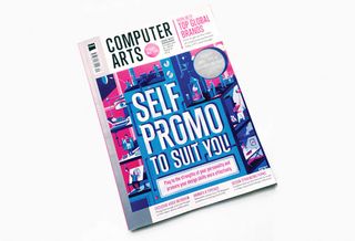
The cover of Computer Arts 231 is a case in point: it was originally illustrated by Jack Hudson, then tweaked for mobility by animator Joe Sparkes. This mobility is neither animation nor illustration – the context for movement is not the frame or border of the screen, but the image itself.
At this year's VaroomLab conference in Bournemouth (a network of colleges researching illustration with Varoom), illustrator Roderick Mills, who is also course leader at Brighton, showed a 2012 interactive from The New York Times by Jon Huang, multimedia editor at the paper. It was a piece about the popularity of Farmville and Angry Birds-type games.
The lead image had a small white triangle in a black surround, reminiscent of the triangle at the centre of classic arcade game Asteroids. But what made this slightly anarchic was that you could move the triangle down and across the column of text and fire stuff at a column of game characters on the left-hand column.
Removing the fourth wall
It's where the art director uses movement to break down the 'fourth wall', the imaginary barrier between audience and screen. The New York Times, whose nickname is the Gray Lady because of the amount of copy it features compared to graphics or images, had suddenly been taken down by a graphic as the triangle swooped down the copy, shooting the fruit, angry birds and farm animals.
This year The New York Times did a slightly more conventional illustration/animation by the ever-innovative Christoph Niemann, for an online version of their feature on the Brazil World Cup.'My Travels With The Curse of the Maracana' (again developed with Jon Huang) features a mix of illustration and animation on photographic backgrounds – if nothing else, it's worth watching for the kick-about between Niemann and the statue of Christ the Redeemer.
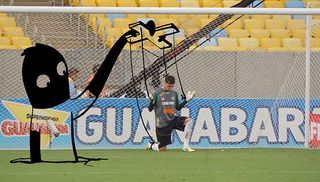
The mix of illustration, animation and photography makes you consider the hold football has on Brazilian life. It's a great example of illustration going for a walk across different media. Niemann draws over photographs, it feels live and delivers a narrative journalistic experience.
One missed opportunity for the marketing department to have a play on social media was with the most uncanny illustration I saw this year.
While chairing the judging of the Association of Illustrators Awards, barely visible on the table surrounded by colourful, contemporary editorial work vying for attention, was an old black-and-white image of what looked like a dragon flying in the foreground with an old castle or stately home in the background.

It looked like something found in an old shoebox, stored away in someone's loft from the 1950s. Its visual language – the engraving, the sculpted visual information of the subject matter – was so unfamiliar and so not-at-home in the second decade of the 20th Century.
It turned out to be an image by illustrator Andrew Davidson for an adult edition of the Harry Potter series. In a recent interview, Davidson explained that he wanted the illustration to look like the books were taken from the library at Hogwarts – my original instinct that these were 'found' images wasn't too far wrong.
Licence to play
It's partly down to illustration's warmth as a medium, and how we are socialised as children through children's books. We all remember the magic of drawing when we were kids, inventing characters and worlds, which means there are opportunities for design and marketing to be playful in merging fiction and reality in campaigns and communications.
Take for example Mireille Fauchon's images for The Prisoner of Zenda, designed by the consistently innovative John Morgan Studio for Four Corners Press. The studio created objects and artefacts that weren't actually in the book, but looked like part of the universe of late 19th century Ruritania. Illustration has a visual charm – is a charm in that magical sense – that enables it to be playful with consumers.
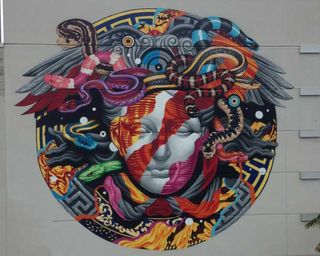
Confident brands take advantage of illustration's licence to play – such as the mural Tristan Eaton created for Versace around the opening of their new flagship store in Honolulu, where he got to play with the company logo.
Most of all, the magic of drawing still has an immense cultural aura around it, and that's why brands have been increasingly engaging in live drawing events whether in shop window displays or more remarkably, Lindsey Spinks' project for Novartis pharmaceuticals.
Novartis is known for commissioning high-end editorial photographers such as James Nachtwey, Mary Ellen Mark and Stephanie Sinclair for their annual reports. Spinks did a live drawing for the company on a large-scale Moleskin notebook, illustrating the stories of patients whose lives had changed for the better after being given medication produced by the company.
Adding authenticity
This impressive project highlights the craft of illustration as a signifier of 'authenticity' – in some ways a burden for such a playful art form. In The Dove Real Beauty Sketches, the drawings became the instrument of the authentic image, more real, more telling than a photo for the viewer.
The popularity of illustration among commissioners over the last decade has been driven by the digital age. While our contact via the internet with companies and people often feels remote, illustration signals something familiar, emotionally warm, and most of all tangible. For brands, it's a signifier of provenance, made-by-hand and trustworthy.
This driver is accelerating and illustration is becoming divergent – both more digital and more animated. It's becoming less like the illustration we are familiar with, as art directors and designers explore the boundaries of various editorial and advertising contexts. At the same time it's becoming more three-dimensional and more about delivering a tangible experience through its physicality.
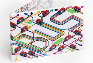
Just look at the Year of the Bus Sculpture Trail in London, featuring work from 40 illustrators and artists such as Rod Hunt, Edward Carvalho-Monaghan and Fiona Stewart. Or the 30-metre-long illustration in London's Eurostar ticket hall designed by Christopher Jenner, narrating the journey from London to Paris. The image isn't wallpaper, it's not even collage, it's photo-etched on stainless steel.
Then there's Joe Wilson and Helen Friel's pop-up cocktail book for The Savoy Hotel, which embodies the idea of illustration as an experience. Joseph Pine II and James H Gilmore's The Experience Economy was published in 1998 and has been the subject of much debate, but in an ever more digital age it has increased resonance.
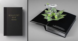
Even digital tools like smartphones make us scroll, swipe and pinch, echoing the original Latin meaning of digital – referring to the 'digits' on our hands. When guests at the Savoy choose their cocktail they experience it through the magic of Wilson and Friel's pop-up book. But we've always known that illustration can open doors to other worlds. At its best, it has always been a medium of wonder.
We live in a post-advertising age, the age of the attention economy, the age of 'content marketing' – all phrases that touch on the fact that consumers constantly filter out unwanted noise. We need to return to illustration's roots as a source of magical interaction with the world.
Visually rewarding
Noma Bar's style for example is coolly graphic, but what he delivers is the experience of working out a visual puzzle, and the pleasure and amazement in figuring it out.
One of the smartest and funniest books I read this year was Chris Haughton's Shh! We Have A Plan, a children's story that doubles up as a book about mindless leadership and doing the same thing over and over again as a recipe for failure. We need to move on and think differently about illustration as more than simply the visual support.
Whether it's the tactile craft of collage, where we put together the fragmented storytelling of the illustrator, or the enchantment we experience in great narrative image-making, or the unexpected movement of a detail in an image online, in 2015 illustrators and art directors have a big opportunity to get more playful, to transport us somewhere magical. This will happen when clients understand that illustration is no longer the support act, it's the headliner.
Words: John O'Reilly
John is editor of Varoom, a magazine produced by the Association of Illustrators. A journalist, writer and consultant, his clients have included The Guardian, The British Council and Nike.
You can read the full version of this special report inside Computer Arts issue 235: Make 2015 your best year ever.
Liked this? Try these...
- 8 things you didn't know about design for film
- 6 tips for crafting a spell-binding animation
- Download free textures: high resolution and ready to use now

Thank you for reading 5 articles this month* Join now for unlimited access
Enjoy your first month for just £1 / $1 / €1
*Read 5 free articles per month without a subscription

Join now for unlimited access
Try first month for just £1 / $1 / €1
The Creative Bloq team is made up of a group of design fans, and has changed and evolved since Creative Bloq began back in 2012. The current website team consists of eight full-time members of staff: Editor Georgia Coggan, Deputy Editor Rosie Hilder, Ecommerce Editor Beren Neale, Senior News Editor Daniel Piper, Editor, Digital Art and 3D Ian Dean, Tech Reviews Editor Erlingur Einarsson, Ecommerce Writer Beth Nicholls and Staff Writer Natalie Fear, as well as a roster of freelancers from around the world. The ImagineFX magazine team also pitch in, ensuring that content from leading digital art publication ImagineFX is represented on Creative Bloq.
