7 ways to push your creative boundaries
Discover how to step outside your comfort zone during a client brief.
When Scottish agency Leith turned to French illustrator Thomas Danthony to create a stylish set of images for a new drink-drive campaign for the Scottish government, he happily found himself outside of his comfort zone. He explains how he used the opportunity to develop his skill set…

The Scottish government got in touch via Leith agency in Edinburgh about their new summer campaign for road safety. The punchline for the campaign was 'Every two minutes a driver gets pulled over. Don't spoil summer. Don't drink and drive'.
Along with a radio ad, they needed three different posters, which were to be used for billboards, newspapers and magazines.
The agency wanted the poster to be 'a contemporary version of the brilliant old travel posters we used to get' and they thought my style could create the right atmosphere.
It needed to be very summery, with bright and vibrant colors. They already had precise ideas for each poster regarding the composition and the scenarios: 'a guy in a cell, looking like he is resting on a lounge chair on the beach, except that he's in jail', for example.
I usually work with a limited palette of colours, so the brief was also pushing me slightly outside of my comfort zone, which is always something interesting in a project.
With a bit more than a week for the whole project, it was a tight deadline, so quite a challenge for me to complete the posters in time. Here are seven stages for pushing your creative style while working to a tight deadline...
01. Get solid reference material
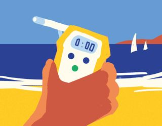
I try to start sketching before doing research, which gives me an untainted basis for my image. Then if I need to draw specific things I look them up online, more for accuracy really.
For example, I had to draw a specific police car for the Don't Drink and Drive project, so I had to reference the right type of car.
02. Show the client alternative ideas
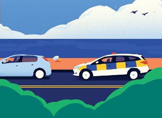
The agency already had precise ideas for the compositions, so even if I played around a little to try to find a better view – for example, trying out a front view for the car scene, or a different viewpoint in the cell – most of the time we stuck to their original ideas. Still, it's always good to explore other options for better solutions.
03. Keep initial sketches rough
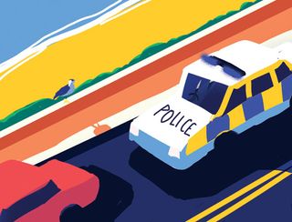
Due to the short project timeframe I kept the sketches very rough. Once my three colour sketches had been signed off, I started drawing the final pictures using mainly Photoshop and simple tools like the Pen, Brush and Eraser.
Working on all three posters at the same time helped me to keep the consistency throughout.
04. Collaborate to find the best solution
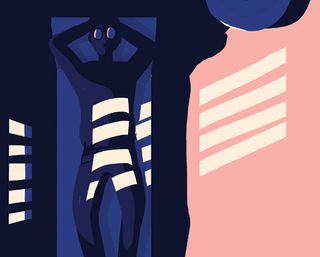
It took a while to get the colours right. For example, in the cell scene, the feeling wasn't summery enough.
As it was a prison, my first instinct was to go for darker colours, but the agency wanted to keep the outside summer feeling. It was a bit tricky to achieve, but eventually I found a solution to get the right atmosphere.
05. Get serious
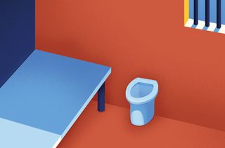
Once the sketches are locked down, the proper drawing process starts. I'll polish the composition and colours, but also draw every element and detail.
This stage takes a while as I am quite a perfectionist. I also correct the perspectives from my first drafts, so the final image displays the right angles, depth, lighting and shadows.
06. Make some changes
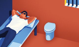
I had to make a few changes; some were easily fixable, others not so much. For example, we realised the cars were on the wrong side of the road.
I'm French, so I naturally drew them on the right side. I also had to remove the toilet lid in the prison cell as "it could cause injuries", and gave the man a shirt instead of a T-shirt.
07. Ensure final images work alone too
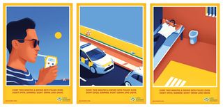
I think the reaction has been good so far. People seem to really like it. For me the process was a bit complicated with a very short turnaround time.
In the end and after some doubt in the process I think they look good. I really like the picture of the cars, because even outside of the campaign, the image can stand for itself.
The full version of this article first appeared inside Computer Arts issue 244: Earn More as a Designer – packed full of financial tips for creatives – on sale now.
Liked this? Try these...
- The designer's guide to making budgets work
- How to set every design project budget in 4 steps
- Download the best free fonts

Thank you for reading 5 articles this month* Join now for unlimited access
Enjoy your first month for just £1 / $1 / €1
*Read 5 free articles per month without a subscription

Join now for unlimited access
Try first month for just £1 / $1 / €1
Get the Creative Bloq Newsletter
Daily design news, reviews, how-tos and more, as picked by the editors.
The Creative Bloq team is made up of a group of design fans, and has changed and evolved since Creative Bloq began back in 2012. The current website team consists of eight full-time members of staff: Editor Georgia Coggan, Deputy Editor Rosie Hilder, Ecommerce Editor Beren Neale, Senior News Editor Daniel Piper, Editor, Digital Art and 3D Ian Dean, Tech Reviews Editor Erlingur Einarsson and Ecommerce Writer Beth Nicholls and Staff Writer Natalie Fear, as well as a roster of freelancers from around the world. The 3D World and ImagineFX magazine teams also pitch in, ensuring that content from 3D World and ImagineFX is represented on Creative Bloq.
