How painting in black and white can improve your art
Painting in black and white can offer a number of benefits. Follow these pro tips to see how it's done.
Painting in black and white is great, because it makes you concentrate on elements such as composition, value, lighting and form. Of course, colour is a vital step, but the benefit of black and white is that you can focus on the image as a whole.
Most of the time I opt for a black and white process. Here, I'm going to use the example of a character design, and run through some simple painting techniques you can use to get your black and white designs up to scratch.
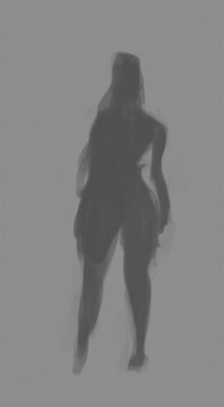
I start out with a simple silhouette and then build up to a refined design. This technique also makes creating any variations on the character very simple too, because there's no need to worry about interfering with any colours you've painted.
01. Block out the silhouette

First things first – I block out the character's basic silhouette. I always try and keep things fairly rough at this point and avoid going into any detail too soon. Whether your character is a little kid or a hulking great giant, this is the time to focus on their shape and try and emphasise their character. Experiment with silhouettes until you find one you like.
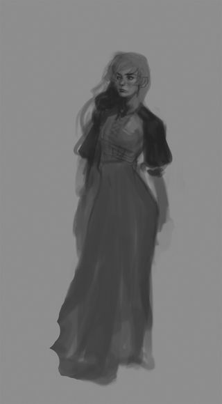
02. Add some values

Once you've painted a shape that you're pretty happy with, it's time to start adding in some values. When doing this I don't tend to use any values that are too bright or too dark, I like to keep things subtle while I'm building up the shape. I keep things pretty sketchy and gently add in some subtle shadows and highlights to find the structure of the body.
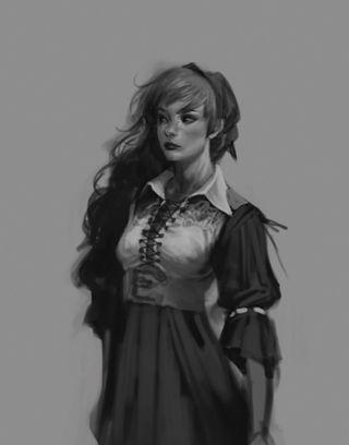
03. Add some details

I'm happy with the shape and structure so it's time to add in details. This is one of my favourite stages and I could happily detail characters all day long. I start to add in those dark shadows and bright highlights to really bring out the form of the character. I stick with a fairly small soft brush, sketch in and then build up those details, refining as I go.
Remember to try and vary the values you're choosing. You can use bright white highlights right through to dark greys and black. If you just stick to the middle ground and only use grey it can make things look a little flat.
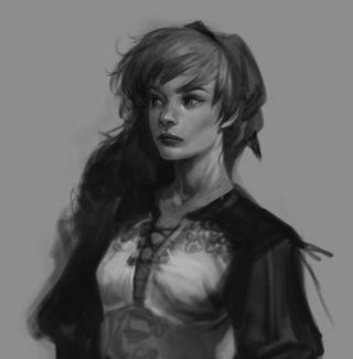
04. Build and build

Painting in black and white means you can focus on the image as a whole and resolve any glaring issues before you get to the colour stage. From here it's pretty easy to just keep building up the detail until you're ready to either go to colour or simply leave it as black and white.
This article originally appeared in ImagineFX magazine issue 100.
Like this? Read these!
- Is Adobe's Ink & Slide an artist's necessity or novelty?
- Make 3D prints using your own photos for free
- The art book that gives artists a piece of the pie

Thank you for reading 5 articles this month* Join now for unlimited access
Enjoy your first month for just £1 / $1 / €1
*Read 5 free articles per month without a subscription

Join now for unlimited access
Try first month for just £1 / $1 / €1
Get the Creative Bloq Newsletter
Daily design news, reviews, how-tos and more, as picked by the editors.
