How to give your pencil art rhythm and shape
Create fantastical pencil images that feel truly spontaneous.
Drawing, for me, has been a long and crooked path. I can remember drawing as a child, copying images from comic books well before I could read. My family travelled as I grew up. Comic books, pencil and paper are very portable, so that's what I usually had with me.
For a long time, my work was mostly concerned with the female form, and to this day anatomy still plays a huge part in my work, sometimes even in the more abstract work that I do. I put a lot of effort into chasing styles and techniques that I would emulate, integrate or disregard.
About 13 years ago, around the time my first child was born, I had the growing feeling I was overlooking something crucial. I came to realise that I hadn't spent much time exploring what I loved to do.
This was a dramatic turning point for me. I started paying close attention to what it was that most excited me to look at. I had reached a point where, for whatever reason, I couldn't find a frame of reference for the images that I wanted to make. I took this as a good sign that I was on a more personal track, and that's what led me to the manner and content of the work I do today. Hopefully, this workshop will inspire you have faith in your own vision.
For more advice, don't miss these how to draw tutorials.
Click on the top right corner of each image to enlarge it.
01. Choose your own path
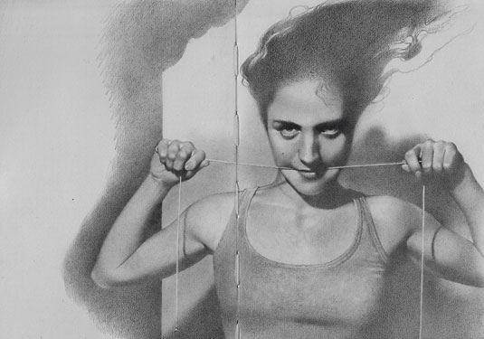
Before you pick up your best pencils or favourite brush, decide what is the purpose of your work: conceptual, personal, narrative, abstract, expressive? This decision – and often it's made on a piece-by-piece basis – can determine how you should proceed.
02. Have tool options
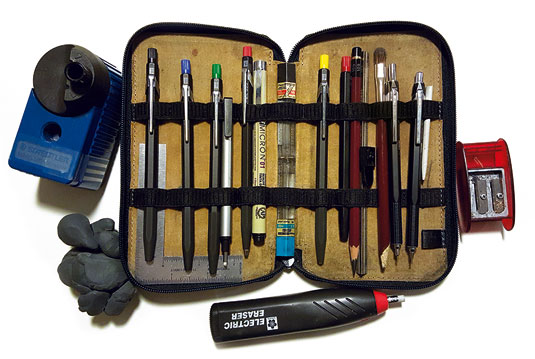
I have to say that you can make do with the most basic materials if you understand them thoroughly. At a pinch there's nothing wrong with a No.2 pencil and a ream of plain white copy paper, but different tools have different qualities. Having a number of options can help keep your work fresh.
03. Choose your working surface
What kind of media do you want to work on? Digital or paper? If paper suits you most then, like me, bear in mind that you don't have to settle for one type or brand. In my opinion, you should have a variety of papers with different qualities that you've come to understand through your own experimentation. Smooth papers aid smooth renders. Rough papers aid textural renders. Sounds basic I know, but you'd be surprised at how many professionals struggle against their own media.
04. Use references to suit the piece
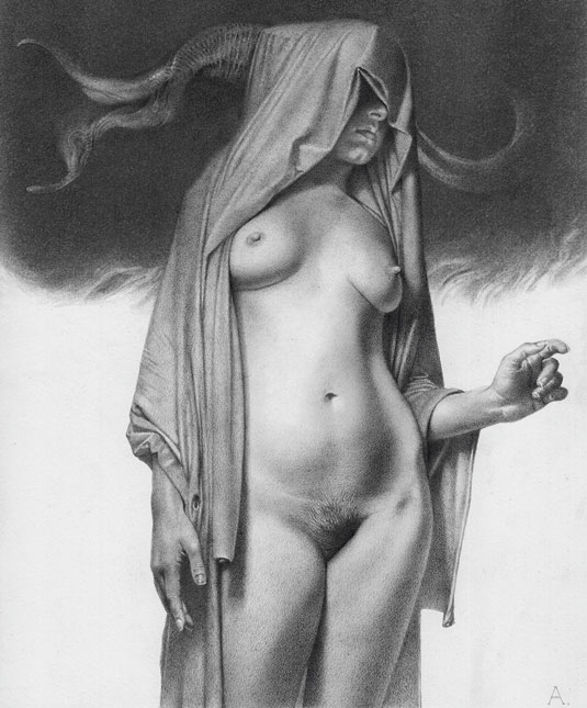
Reference can be models, nature or even out of the brain. I try to photograph all of my own reference, but I occasionally piece together (or ‘Frankenstein') reference that I've found online. For figures I try to have the best reference I can afford.
For natural reference, such as rocks and trees, I tend to shoot reference, study it and then put it away and work from the impressions left in my mind. Of course, all of that reference combines in my brain and that's what causes the almost abstract quality of some of my art.
See this how to use reference images post for more info.
05. Take different approaches
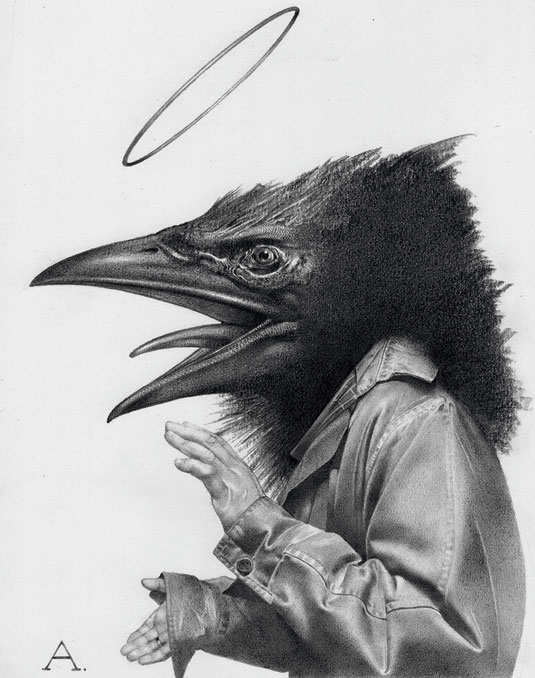
If I'm doing concept work for a client, I tend to follow a more formal process: sketch, line art, rendered drawing. It saves time in the initial concept phase if the sketches can be assessed before you waste time on an inappropriate rendering. When I do personal work I'll begin drawing with the end result in mind. I'll grow the creature out of a striking detail.
That direction isn't for everyone and you have to be sure of your ability to ‘find' the form. It's a fun way to work, and with practice can help you find shapes, forms and textures that you wouldn't have necessarily thought of in the beginning.
06. Be aware of your shape hierarchy
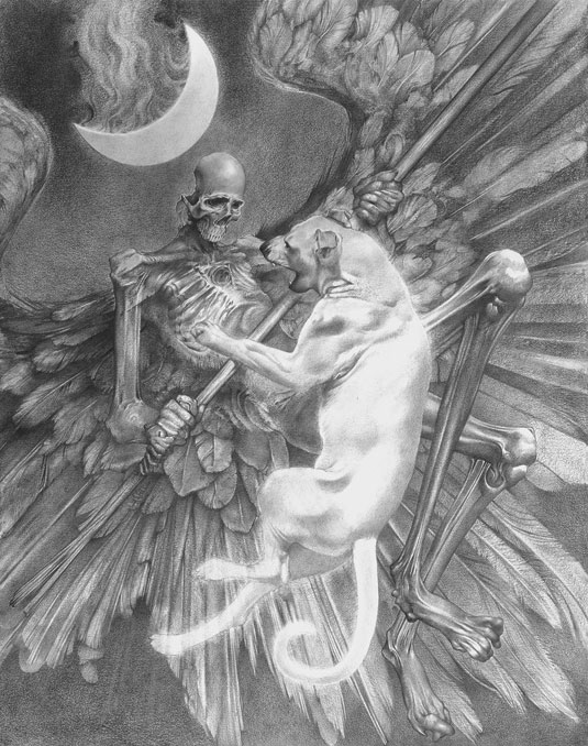
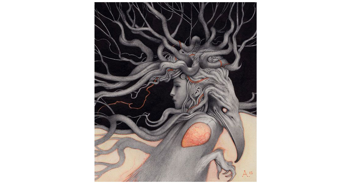
No matter what direction you take your art in, it's important to keep in mind the rhythm of the shapes within the work. This directly relates to shape hierarchy. It's really just another way of thinking about composition. Building interesting patterns of light and dark is a good skill to have. You don't want everything to be too similar in shape and size in your work because it can lead to an uninteresting or awkward rhythm (unless, of course, you knowingly deviate from that guideline).
07. Avoid designing around eyes
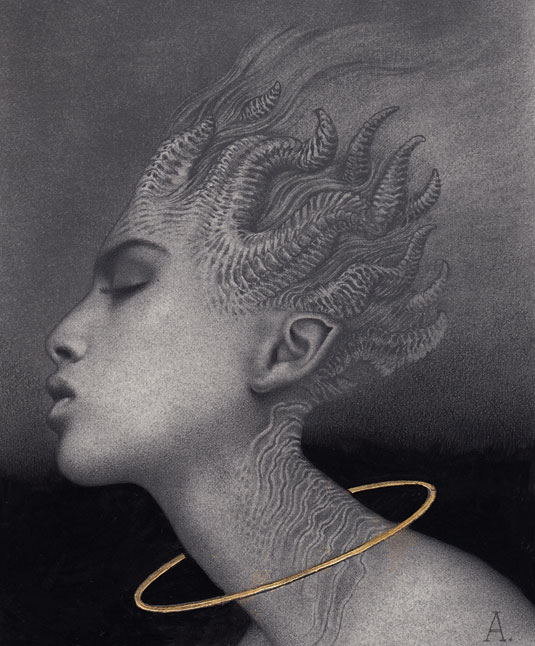
That's a rough and ready summary of something that Iain McCaig mentioned in one of his instructional videos. I'd like to give it a broader meaning here: try not to either design or conceive your creature, character or composition from the same starting place all the time. This is especially applicable if you find yourself producing images that feel like you've done them before.
08. Use edges wisely
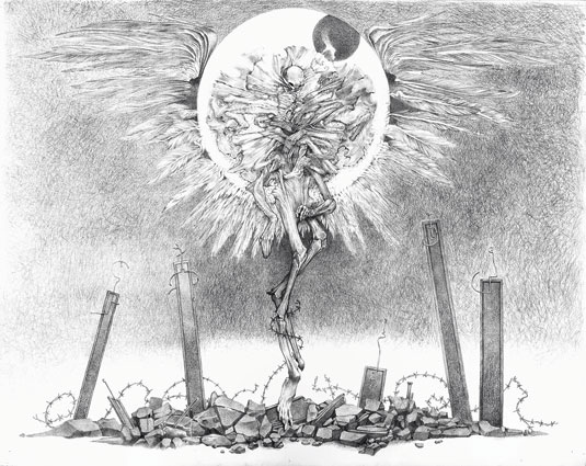
It's very important to understand how edges create depth, resolve elements and imply dimensionality. With concept work, lost edges aren't always an issue. A clearly defined silhouette is often what's required but in illustration, personal work and so on, it tends to make an impression.
09. Add matte fixative
After a graphite piece reaches a certain point and everything is in place, I'll spray it with a matte fixative. When it's dry I use a broad soft brush and apply ultra-matte medium mixed with a bit of water (use a thick paper for this to work without buckling). This kills the graphite gloss but it also lightens the values a bit. You can now punch the value range if you tweak your image with a darker drawing tool, such as Nero black extra soft pencil or even Prismacolor black. The image will also scan better because it's all matte.
10. Don't be afraid to get dirty
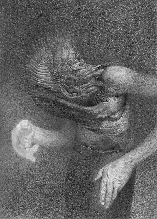
As long as you clearly understand what your lightest value in a piece will be, light smudges and erased values that leave a grey ghost aren't any cause for alarm. Very many beginner artists' drawings are less successful because they leave too much white on the paper. In other words, there's not enough drawing in their drawing. I'm a very pale person, but the lightest areas of my skin are still darker in value than a white or even a cream-coloured piece of drawing paper.
11. Use your eraser wisely
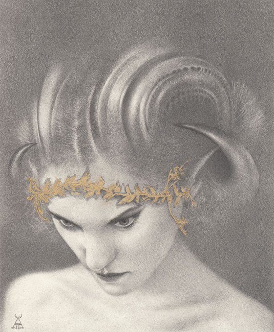
Draw as much with an eraser as with a pencil. It's often much easier to find shapes and textures with the broad stroke of a kneaded eraser than with a pencil. I often discover my best accidents with the eraser.
This article originally appeared in ImagineFX magazine; subscribe here.
Related articles:
- How to draw a bear
- How to choose the right drawing tools
- How to improve your character drawing

Thank you for reading 5 articles this month* Join now for unlimited access
Enjoy your first month for just £1 / $1 / €1
*Read 5 free articles per month without a subscription

Join now for unlimited access
Try first month for just £1 / $1 / €1
Get the Creative Bloq Newsletter
Daily design news, reviews, how-tos and more, as picked by the editors.
