How to fulfil a creative brief for Red Bull
Illustrator Scott Martin explains how he squeezed famous landmarks into a beautiful jam-packed map.
To promote three new flavours of Red Bull launching in the Canadian market, Scott Martin – aka Burnt Toast Creative – illustrated a map of Canada filled with Red Bull-sponsored events. This would form an online game where players had to find cans hidden among the scene. Martin explains…
Toronto-based agency Trevor/Peter contacted me after finding my portfolio on Behance. They were interested in the fun, colourful flavour that my work has. They commissioned me on behalf of Red Bull Canada to create a drawing loosely based on a map of Canada.
It needed to have a happy-go-lucky character and feature Canadian landmarks and also some of the Red Bull activities that take place here.
The agency did a lot of the research in terms of the icons and events that Red Bull wanted included. Some of them are pretty underground: there's a travelling bus in the Quebec region that has a fold-out DJ booth where they hold mixing contests.
Red Bull also runs yacht competitions on the West Coast and they have Flugtag too – a sort of boxcar derby where the cars all have wings and participants launch themselves off a huge ramp to see whose homemade car can fly the furthest.
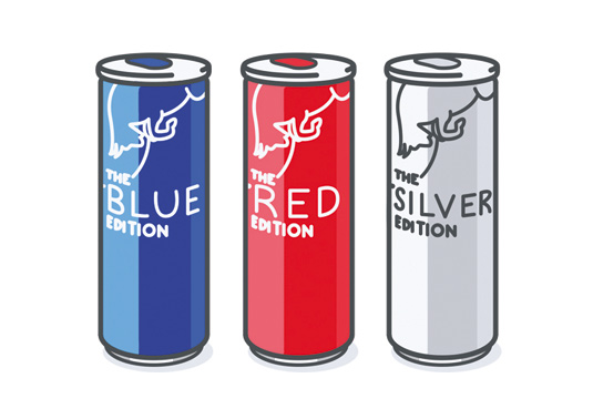
The drive behind the project was the launch of three new Red Bull flavours in Canada. They wanted to use the drawing for an online version of 'Where's Wally?', where if users found three cans hidden in the busy scene, they'd win a voucher for a free Red Bull.
01. Character design

I sketched out the characters, landmarks and Red Bull activities first, then used a light table to do a few passes and imported them into Photoshop. I drew each icon separately from an angle looking down. Scale wasn't important at this stage, so I ignored it. I then sent the designs to Red Bull for approval.
02. Sketching the landscape
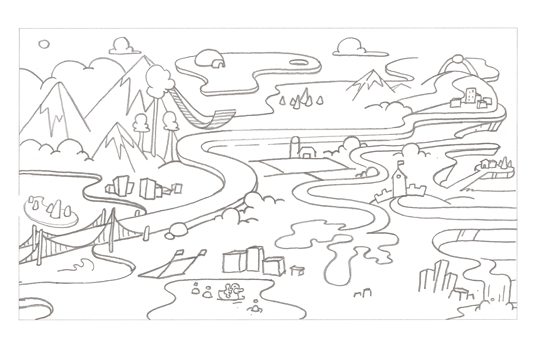
The illustration was based on Canadian geography except it had to fit within a rectangular aspect ratio. I had to give each province the right amount of space and make sure each city was in the right location. I drew the aspect ratio on paper and found rough positions, then used tracing paper to develop the environment.
03. Fine-tuning composition
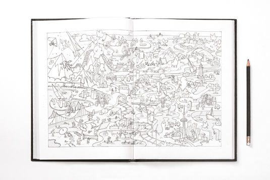
I then scanned both of these elements into Photoshop and, using the environment as the background layer, I roughly placed and scaled the icons. I felt out which parts of the image looked too bare or too dense and decided what to add. It still had to be relatively geographically accurate though.
04. Creating vectors
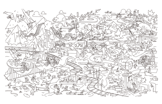
I took this rough mash-up of pencil drawings and made sense of it in vector form using Illustrator. Organising such a mass of drawings was a challenge. Some had lost image quality when scaled up. I started with the background and drew the icons onto two separate layers, useful for repositioning later on.
05. Adding colour
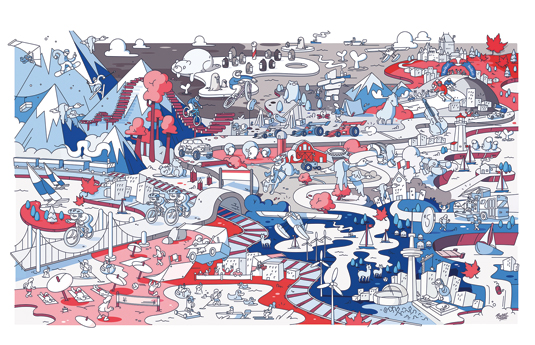
I coloured everything with flat tones first then added a light source and shading in Photoshop. The palette was quite restrictive, as I could only use the three brand colours and I'm used to working with the whole spectrum of colours. Red Bull wanted an even spread of all three brand colours so it had to be just right.
06. Hide and seek
I went back and added more objects as Red Bull kept stressing that the busier the illustration, the more fun it would be to play. I hid the cans, creating three versions with different hiding places. I prioritised spots near Red Bull activities as that was another side to their promotional activity. I also really wanted it to be a challenge.
Words: Laura Snoad
This article first appeared inside Computer Arts 236: the freelance issue – which you'll find inside the Computer Arts app. It's packed with advice for supercharging your freelance career, and comes with a free 115-page supplement, The Freelance Handbook.
- Stunning projection-mapped Fabergé Egg is visible in daylight
- 13 fantastic logo fonts for 2015
- The best collage maker tools – and most are free!

Thank you for reading 5 articles this month* Join now for unlimited access
Enjoy your first month for just £1 / $1 / €1
*Read 5 free articles per month without a subscription

Join now for unlimited access
Try first month for just £1 / $1 / €1
Get the Creative Bloq Newsletter
Daily design news, reviews, how-tos and more, as picked by the editors.

The Creative Bloq team is made up of a group of art and design enthusiasts, and has changed and evolved since Creative Bloq began back in 2012. The current website team consists of eight full-time members of staff: Editor Georgia Coggan, Deputy Editor Rosie Hilder, Ecommerce Editor Beren Neale, Senior News Editor Daniel Piper, Editor, Digital Art and 3D Ian Dean, Tech Reviews Editor Erlingur Einarsson, Ecommerce Writer Beth Nicholls and Staff Writer Natalie Fear, as well as a roster of freelancers from around the world. The ImagineFX magazine team also pitch in, ensuring that content from leading digital art publication ImagineFX is represented on Creative Bloq.
