Horror artist takes on Zombie Flesh Eaters
Evil Dead poster artist Graham Humphreys reveals the process of a new zombie piece.
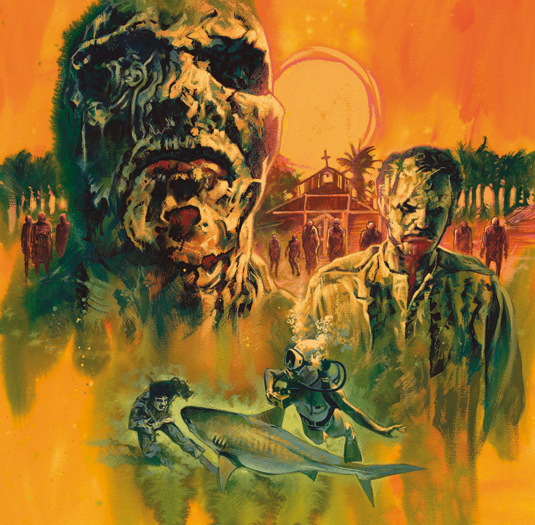
Graham Humphreys made a name for himself by painting the poster art for films like The Evil Dead and Basket Case. So who better to create the cover of the Zombie Flesh Eaters soundtrack. Here the English artist explains his thinking…
The Death Waltz Recording Company commissioned this artwork for its launch release of the Zombie Flesh Eaters Original Soundtrack. The film remains a firm fan favourite and features one of the most bizarre zombie moments ever filmed: a zombie shark attack.
My intention is to create an atmosphere through colour and texture – something fetid and uncomfortable. I want it to feel humid and rotten. There's almost a hint of the Spaghetti Western about the film, and the stylised sun is a nod to the films of Sergio Leone.
I begin the process by taking screen grabs from a DVD, to collate a library of reference and inspire the layouts. I enlarge my selected sketch via a printout on a couple of A3 sheets and trace it on to the watercolour paper. I'm now ready to bring the idea to life.
01. Prepare for colour
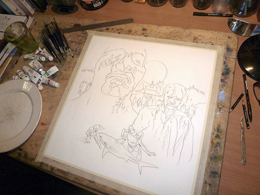
As with all my work, I begin with brushing water on to the surface. The gouache, although traditionally used for opacity, nevertheless provides a good, though basic, watercolour effect.
02. Set the focal points
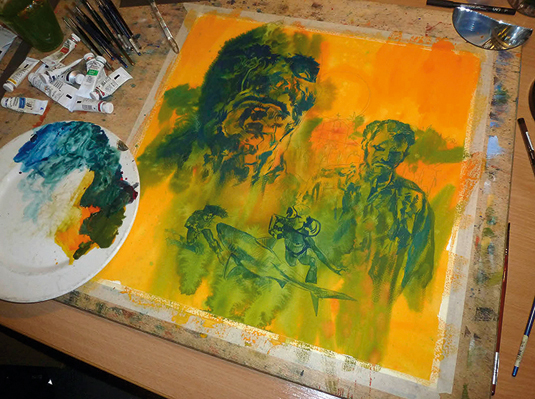
Referring to the DVD screen grabs enables me to give form to my shapes, and I can now begin to make further decisions about the palette and focal points, using contrast and colour.
03. Bubble device
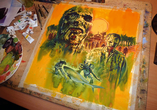
Notice how I use the bubbles from the diving figure to link the two scenarios. They float towards the sun and help create a strong visual spine. Finally, I add highlights to boost the contrast and dimension.
04. Setting sun
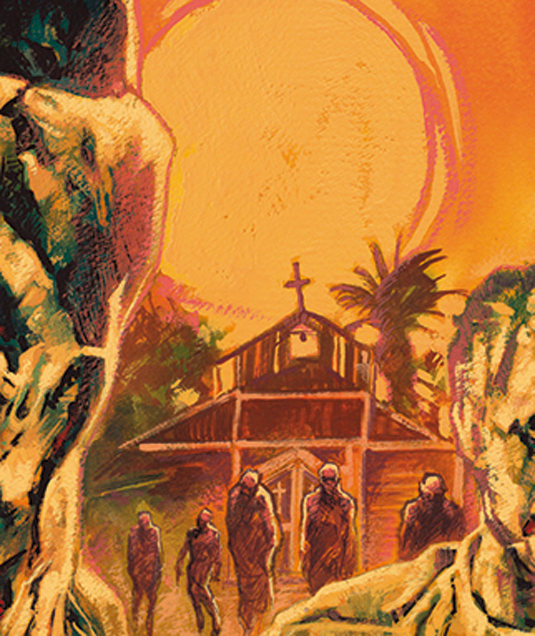
I convey flare and heat from the light source by warming the edges of the two heads.
05. Hint at detail
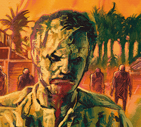
Although I intend the background zombies to be silhouetted, there's a suggestion of faces that's enough to offer the suggestion of detail.
06. Use of marks
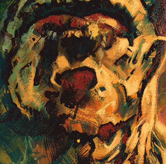
Look closer and you'll see that my marks are building the suggestion of form and surfaces.
07. Goddam shark attack!!
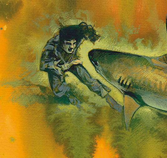
My crude marks are intended to convey the sense rather than the literal image. I'm aiming to keep a fluid, shifting illusion – something that's more akin to life than photorealism.
I also use the original wash as part of the design and work within and alongside the random marks.
Words: Graham Humphreys
Graham Humphreys is an illustrator and graphic designer based in London, United Kingdom. This article originally appeared in ImagineFX magazine issue 111.
Like this? Read these:
- Learn new painting skills with the new ImagineFX
- These mind-bending sketches will stay with you
- Great examples of doodle art

Thank you for reading 5 articles this month* Join now for unlimited access
Enjoy your first month for just £1 / $1 / €1
*Read 5 free articles per month without a subscription

Join now for unlimited access
Try first month for just £1 / $1 / €1
Get the Creative Bloq Newsletter
Daily design news, reviews, how-tos and more, as picked by the editors.

The Creative Bloq team is made up of a group of art and design enthusiasts, and has changed and evolved since Creative Bloq began back in 2012. The current website team consists of eight full-time members of staff: Editor Georgia Coggan, Deputy Editor Rosie Hilder, Ecommerce Editor Beren Neale, Senior News Editor Daniel Piper, Editor, Digital Art and 3D Ian Dean, Tech Reviews Editor Erlingur Einarsson, Ecommerce Writer Beth Nicholls and Staff Writer Natalie Fear, as well as a roster of freelancers from around the world. The ImagineFX magazine team also pitch in, ensuring that content from leading digital art publication ImagineFX is represented on Creative Bloq.
