Ink drawing: Expert tips to get you started
Professional artists share their best ink drawing techniques.
Ink drawing is a particular skill. This is one of the most unforgiving mediums – make a mistake in ink and it's very difficult to cover up. You can no longer rely on your eraser, you'll have to find another way to rectify the error. Ink drawing also requires particular techniques when it comes to creating texture and conveying light and shadow.
Don't let that put you off, though. Ink drawing can be an incredibly creative process. your work can be as delicate or bold as your temperament dictates: it's all about trying things out. In this article, we asked professional artists to share their advice for getting started with ink drawing. We'll cover everything from how to choosing the right equipment and materials, to how to tackle different techniques.
For more art advice, take a look at our roundup of how to draw tutorials, or our guide to the most important art techniques to master.
- Thinking of joining Inktober 2019? Explore our top tips
01. Choose your pen
First things first, you need a pen to ink with. Different artists have different preferences, and it will likely take a bit of trial and error to figure out what works for you. For some ideas to get you started, take a look at our guide to the best pens for artists.
"I recommend exploring everything you can get your hands on, from fountain pens to Japanese calligraphy brushes," says comic artist and illustrator Tess Fowler. "You want to look for a tool that enables you to produce the effect you want, be it feathering, splatter or clean fluid lines."
02. Get your grip right
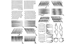
There are a few techniques that will help you keep control of your pen stroke. Terese Nielsen advises gripping the pen close to the tip and keeping the angle between pen and paper at about 45 degrees.
"Strokes generally start close to your body and move outward. Use your arm and shoulder, not just your wrist," she says.
Get the Creative Bloq Newsletter
Daily design news, reviews, how-tos and more, as picked by the editors.
There are also some exercises you can do to start to develop your dexterity in pen handling. "Practise creating sweeping strokes, bold lines, crisp dashes, delicate dots, curves and straight lines," explains Nielsen. "Make sure you're able to do each of these vertically, horizontally and on a diagonal."
03. Start with pencil sketches
If you make an error in ink, it's very difficult to cover it up. For that reason, many artists will start by sketching out their design in pencil. The pencil drawing can then be erased after the ink is dry.
There are a few different pencil options here. You can go for a classic HB or B, comic book and manga artists will typically opt for non-photo blue pencils – take a look at our guide to the best pencils for artists for out favourite options.
Nielsen also suggests lightly sketching with a light-warm, grey PITT pen, or using light washes of watered-down ink.
04. Pay attention to eyes
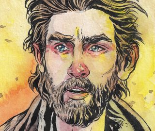
There is a danger that when you add ink, a lively pencil drawing will start to look a little flat, warns Fowler. The reason is because you're being much more controlled and streamlining those first, instinctual lines. As a result, you're going to need to work harder to keep that energy.
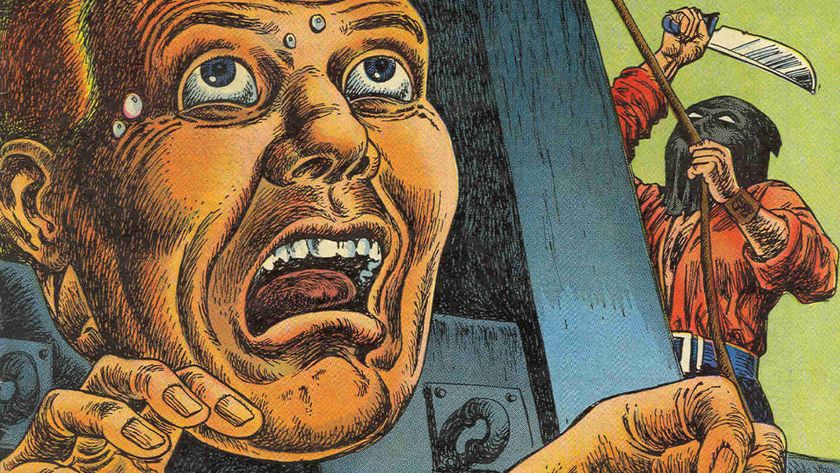
"Inking is more than tracing, and nowhere is this more important to remember than when inking eyes," she explains. "Is the flesh below the eyes puckered from crying? Are the eyebrows furrowed in frustration? Are the eyes glassy and shiny? Add some gel pen highlights in there. Some heavy black eyelashes. Some emotion!"
05. Explore different textures
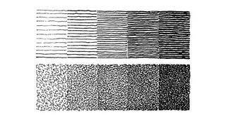
Tone and texture in ink drawings is all captured through the strokes you use. "Different types of stroke will each have their own peculiar feel, and varying the weight, direction, and density (whether wider apart or broken up) of strokes can have a big impact," says Nielsen.
Exploring different textures – stones, thatched roofs, wood – is a great way to enrich your ink scenes and heighten the storytelling. "Contrasting textures are visually interesting," says Fowler. "Have you ever felt tree bark? Cold, unyielding stone? Fuel your work with that mental library of sensations. Different tools can help. Dip your finger in ink and smoosh it on to the walls of your building. Boom! New texture."
06. Get abstract with natural forms
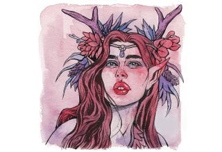
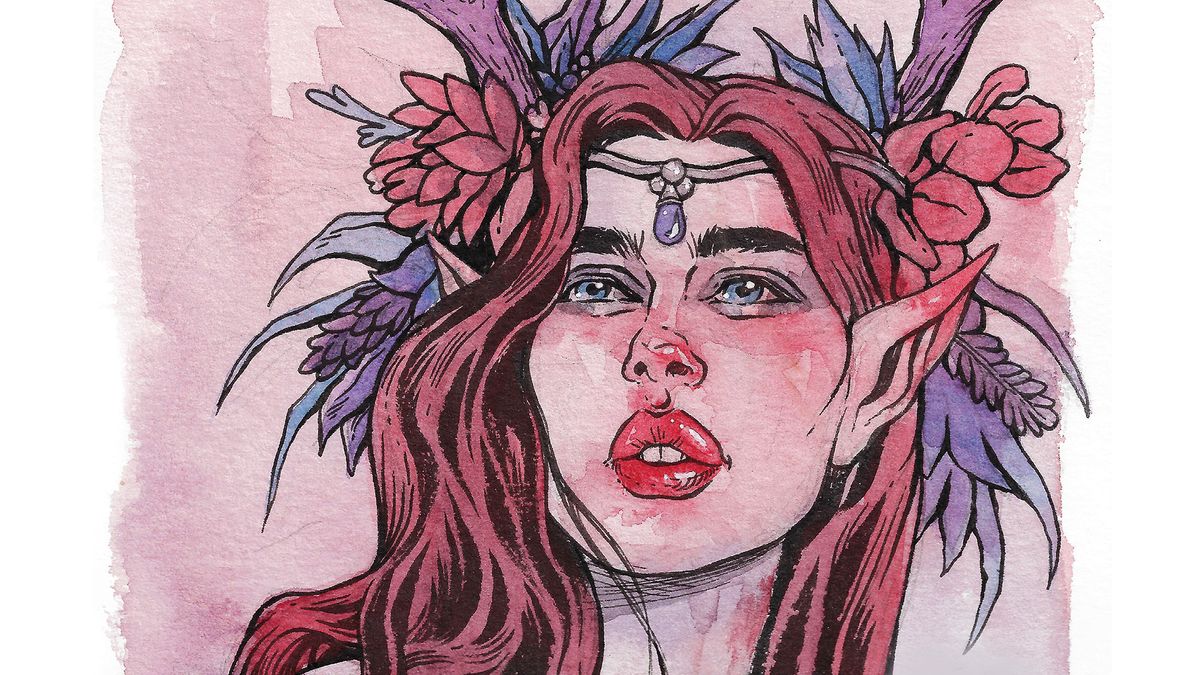
Plants and flowers can make great details within ink drawings, and offer scope to get a little more abstract in your rendering. "Look out in the garden under your window. What shapes do the flowers and leaves take? Triangles? Wavy ovals? Diamonds? Just as when you were a little kid first learning to draw shapes, so too now can you allow the natural world to inspire you to make shapes again," enthuses Fowler.
She especially enjoys drawing Critical Role’s Keyleth – shown above. "Her flowery wreaths give me the opportunity to draw piles of flowers and leaves. Just bunches of distorted shapes all clinging to each other. Springing up and dangling down. Shapely sunbursts," she says.
07. Clump your hair
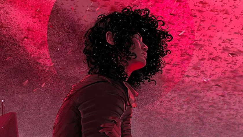
'Hair is what seems to trip people up the most," says Fowler. She suggests sectioning it into 'clumps', as picking out individual hairs can confuse the eye. It's also important to keep your wrist loose and your lines playful, to give the hair energy.
"Have you ever seen someone outside on a breezy day? You see the hair lift and move and dance," she says. "That’s what you’re trying to capture. Joyful hair. Action. Energy."
08. Experiment with silhouettes
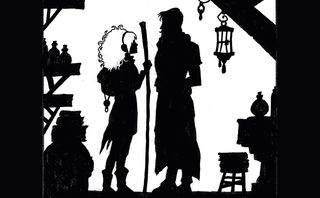
Simplicity can be incredibly powerful. "Black ink shaped into recognisable figures and objects can tell a story just as easily as the densely detailed stuff," says Fowler.
Fowler suggests trying to tell a story with nothing but silhouettes. "This is a wonderful way to test whether or not your storytelling is clear in comics," she adds. "If your figures’ body language holds up in silhouette you’re on the right path."
09. Have fun with fur
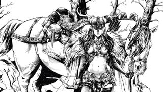
Fur – whether attached to an animal or a detail on a character's costume – can be a great way to bring energy and expression into your ink drawings. As with hair, you want to clump fur strands together rather than drawing each individual hair.
"I like inking fur because I can use a brush to make playful shapes," says Fowler. "Search for some photos of different animals. How does their hair spring up out of their skin? What direction does it flow? Has the fur been wet before? Does the fur droop now?"
10. Try crow quills
Want to try something different? Crow quills can be used to create a variety of different lines, from extremely fine to quite wide marks. However, they do need to be used with a separate ink well, making them a slightly messier choice. "If you do go for this option, you want to fill your inkwell up so that when the nib touches the bottom of the well, three-quarters of it is covered with ink," advises Nielsen. "Wipe the nib off every 10 minutes to keep a clean ink flow."
11. Use clean lines for faces
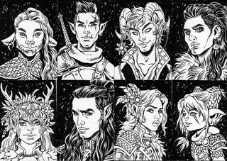
If you're drawing characters, one of the most important things to get right is the face. Fowler designed the adventurer characters above. "I used clean lines in the faces so that the emotion is clear," she explains. "Varying your line weights brings energy to an inked expression." She also suggests adding details such as beards, scars, tattoos and wrinkles to hint at a character back story.
12. Choose between brush and fine point pens
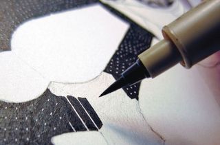
While your mind might immediately go to pens for ink drawing, many artists actually prefer to use brushes. These are great for soft, curved, expressive lines, and can be used to create a variety of line widths depending on how much they are pressed into the page. For a brush effect with no messy ink dipping, there's also the option of a brush pen.
Fine point pens, in contrast, produce hard, solid lines. These are easy to control and are good for precise drawings, but don't offer any variation in line, and can be less expressive than alternatives.
13. Be careful with colour
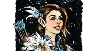
Some ink drawings will remain in black and white. Others you might want to add colour to. If that's your intention, there are a few rules to follow, says Fowler. First, you might want to pare back your inkwork so that it doesn't overpower the colour when it's added. Second, make sure you don't smear your inks when you come to add colour – the ink outlines should act like a frame for the colour.
This advice comes from ImagineFX, the world's best-selling magazine for digital artists. Subscribe here.
Read more:

Thank you for reading 5 articles this month* Join now for unlimited access
Enjoy your first month for just £1 / $1 / €1
*Read 5 free articles per month without a subscription

Join now for unlimited access
Try first month for just £1 / $1 / €1
The Creative Bloq team is made up of a group of design fans, and has changed and evolved since Creative Bloq began back in 2012. The current website team consists of eight full-time members of staff: Editor Georgia Coggan, Deputy Editor Rosie Hilder, Ecommerce Editor Beren Neale, Senior News Editor Daniel Piper, Editor, Digital Art and 3D Ian Dean, Tech Reviews Editor Erlingur Einarsson and Ecommerce Writer Beth Nicholls and Staff Writer Natalie Fear, as well as a roster of freelancers from around the world. The 3D World and ImagineFX magazine teams also pitch in, ensuring that content from 3D World and ImagineFX is represented on Creative Bloq.
