Drawing a terrifying insect being
This walkthrough shows how human anatomy and insect features are blended to create a curious fruit fly creature.
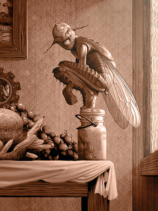
Creating a blended human and insect is one of my favourite things to do. Depicting animals with human characteristics (anthropomorphism), from your imagination can be fun, and deciding how to draw anatomy from two very different species is a fascinating challenge.
But there are surprising similarities across species that can be played with, and you'll find you can take advantage of fascinating mixtures by allowing happy accidents and other creative opportunities as they present themselves to you.
There are plenty of examples of great artists who explore these cross-species inventions. Arthur Rackham, Edmund Dulac and contemporary illustrators Olga Dugina and Chris Beatrice are masters of anthropomorphised woodland creatures – birds, insects and a variety of small mammals who've taken on human features and personalities.
The work of Travis Louie, HR Giger and a generation of concept artists has gone in a different direction, not only devising creepy hybrids from multiple species, but challenging our perception of the natural order or the traditional food chain.
Here we'll look at some of the challenges, technical and narrative, such a combination presents. I'll demonstrate some setup and organisational practices, some techniques I use to create the illusion of depth, lighting and texture, and we'll explore the unending, fun question: how much human and how much insect?
The illustration's background is not part of this workshop, but the objects in it were created using nearly identical techniques demonstrated here.
01. Initial figure study
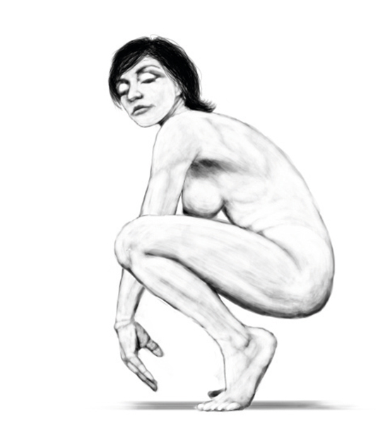
After my art director approves the initial rough, I hire a model to mimic the pose from the sketch. I know of a female model who has the thinner, elongated limbs I need to get me a long way towards the insect form I envision. I work digitally even on figure studies so I can easily correct proportion problems, and I can even alter the pose later when the model isn't there.
02. Converting to silhouettes
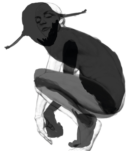
I redraw all the body sections as solid black silhouettes, or sils. Then I repose them quickly and free-transform to distort them toward insect-like proportions, while maintaining familiar human shapes. Then I refine the sils to create fully detailed edges. I usually start an object with silhouettes, then draw lighter values over the black to create surface form and texture.
03. Block in major form
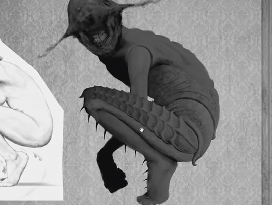
Using my figure study as a guide, I block in primary forms with a dark value (about 70 per cent grey) and a large brush. This is to establish light/dark divisions and larger human anatomy features. I'm careful not to get pulled into details for now. I'm also beginning to think about possible insect features and watching for any accidental hints of them in looser sketching.
04. Looking for personality
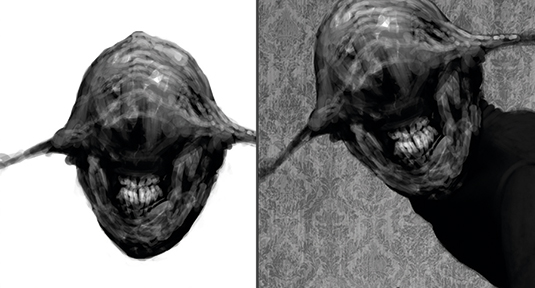
I tend to jump fairly quickly to the head and face on most creatures, to establish personality. One of my early head sketches came out nicely, so I superimpose it here and enhance it on additional layers. Layers can make you courageous – the worst that can happen in an experiment is you won't like it, so you toss it and try again. It's a tremendously free and creative feeling.
05. Multi-pass values
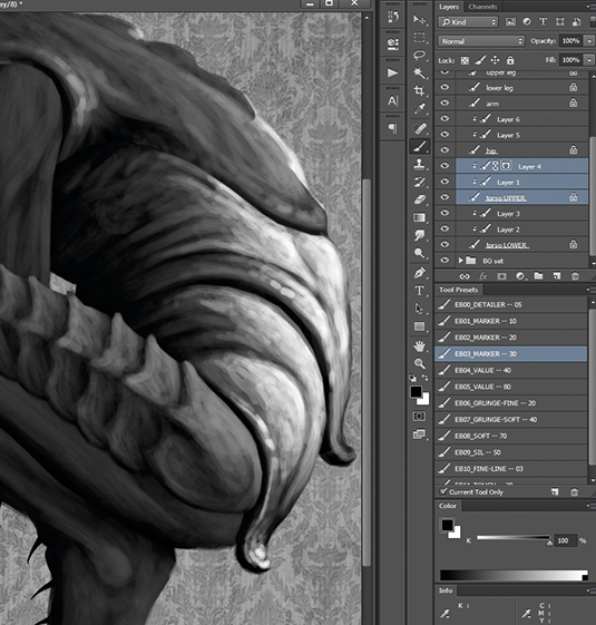
To build form, I work dark-to-medium-to-light, each value on its own layer, until I arrive at a final light and shadow structure. I use 70 per cent grey, then 50 per cent, then 30 or 20 per cent, sometimes with a final pass of pure white. I clip each layer to its underlying silhouette so it stays within the sil shape. This approach is nondestructive and editable.
06. Human or insect?
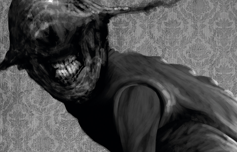
In the last step I try to stay loose and sketchy, which simultaneously creates texture and lets in occasional accidents. This is great, because those accidents of texture and surface form can suggest unplanned creative ideas. I frequently scribble and then play the Rorschach test – the 1920s ink-blot psychoanalysis trial – to see what feature or texture the scribble suggests to me.
07. Fine details and texture
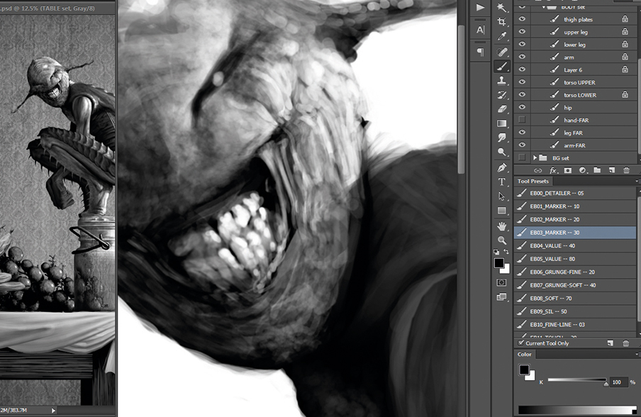
Final passes are lighter value and with a small brush, when I dive into whatever level of detail and finish I need. (If I want fine detail in a shadow area, I go with a medium value and its matching lower layer, and a small brush.) I match detail brush size to resolution: at 300dpi, a 10-pixel brush is 1/30th of an inch – tiny. There's no need for details smaller than that.
08. Layer consolidation
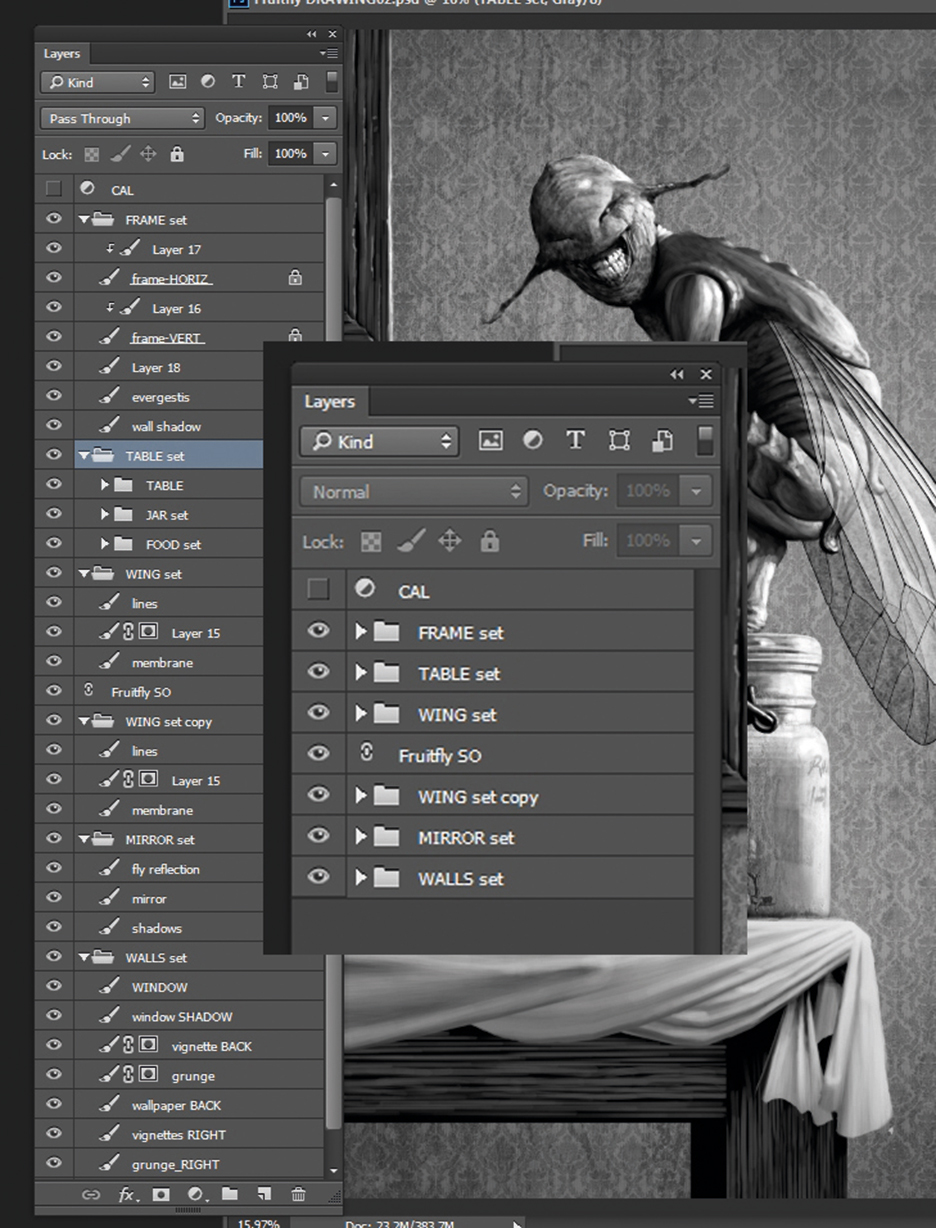
For the sake of efficiency, I merge and consolidate layers once I make a final decision. Art directors vary in terms of their likelihood to make late changes, so if I'm worried about that I can always save an increment of my file. But I keep my current in-progress file as efficient as possible by using layer groups, Smart Objects and merging when possible.
09. Masking to make repairs
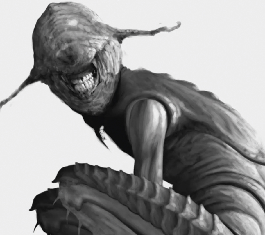
The silhouette approach I use also allows for fast, nondestructive repairs, even very late in the illustration. Add a mask to the sil and draw on the mask to experiment with changes (you can Shift-click the mask icon to hide or show its effect). You can also add a mask to a layer group folder, so the entire contents of that group folder will be masked at once.
10. Liquifying the creature
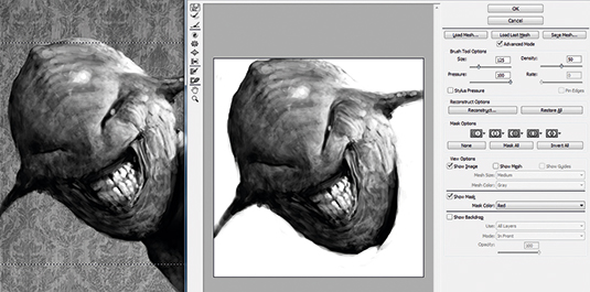
The Liquify filter is a marvellous tool for making minor repairs and shifts in surface features and details. First of all I Marquee-select a local area to work on, then open Liquify (Ctrl-Shift-X or Cmd-Shift-X). Once there, navigation and brush size shortcuts are identical to the main Photoshop viewport. I don't try to achieve too much in a single Liquify pass, though. I find it's much better to carry out multiple subtle passes, then use the History palette to decide how far I want to commit.
11. Avoiding tangents
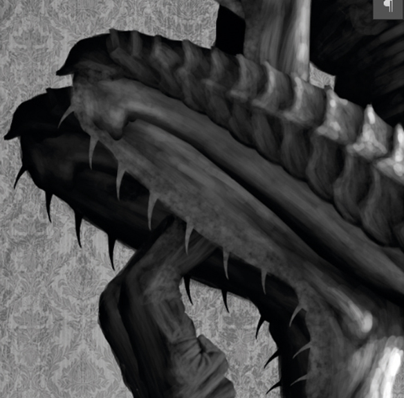
Tangents happen when two edges touch or align without either overlapping or allowing space between. An overlap tells us which mass is in front, while an open space relieves our need to know. Tangents can kill depth and create tension in the viewer's mind because we naturally want to perceive depth clearly. Rearrange elements, even body parts, to avoid them.
12. Maintaining depth
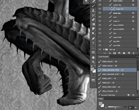
Spend some time late in the illustration adjusting values along edges, to make sure they lift forward from their immediate background. Darker edges can become lost against a dark background, with a resulting loss of depth. It usually doesn't take much to achieve that separation, so judge it with your peripheral vision (look slightly away) and make the changes gradually.
13. Drawing hands
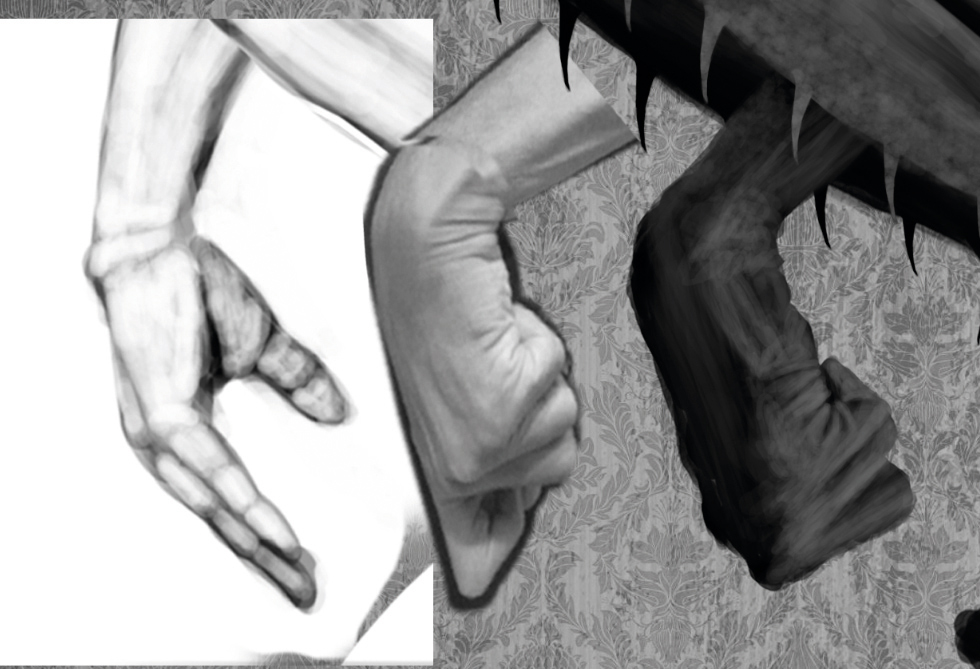
Hands are intimidating because of their complexity, and because they are second only to the face in expressing emotion and mood. A combination of study, practice and good references is the key to graceful hands. Study hand anatomy and gesture so you can quickly proportion and pose them. Always find or create good, relevant reference images for every hand you illustrate.
14. The overall composition
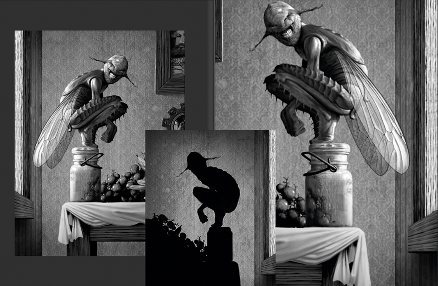
The figure in any illustration is part of the overall composition, so pose it accordingly and adjust other elements to create a cohesive design. Make sure light direction and intensity are unified, that the figure isn't creating any tangents, and that negative spaces serve the overall design. Use frequent horizontal flips to reveal problems you may have become accustomed to.
This article was originally published in ImagineFX magazine issue 135. Buy it here.

Thank you for reading 5 articles this month* Join now for unlimited access
Enjoy your first month for just £1 / $1 / €1
*Read 5 free articles per month without a subscription

Join now for unlimited access
Try first month for just £1 / $1 / €1
Get the Creative Bloq Newsletter
Daily design news, reviews, how-tos and more, as picked by the editors.
