How to design an abstract collage-style pattern
Illustrator Matt Lyon explains how to design and colour an abstract pattern composition that bursts off the page with colour, style and visual panache.
Working in Adobe Illustrator can dictate a workflow that demands pre-planning. Vector artwork is clean and exact by nature, though it can be interesting to approach work from alternative directions to arrive at unexpected results.
Here, we will be working from a handful of drawn image elements that will form a composition, which will be created without prior vision of its outcome.
This creative process allows for plenty of spontaneity and flexibility, as well as the freedom to arrive at a number of possible outcomes. This approach is more akin to traditional methods of image-making, inspired by collage and, in a broader sense, drawing.
It will feel most comfortable to designers familiar with the layered structure of working, such as that seen in Adobe Photoshop...
01. Load your drawings in Illustrator
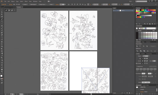
Scan the drawings you're working from and place them on the Artboard. Dim them to to 25 per cent, create a new layer above and select the Pen. I use a stroke weight of 0.5–1.0pt and set the Limit to 100. Redraw the shapes with as few anchor points as possible. Use the Scissors to remove ugly overlaps.
02. Group your paths
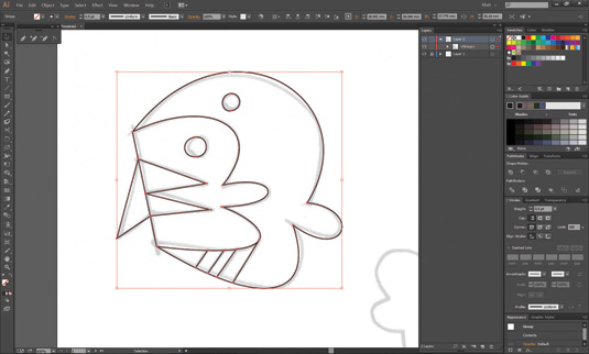
As you work, group each element's paths together. In the Layers panel, all the image elements are shown as a list of groups. Keep saving as you go along. Once all the tracing has been completed, delete Layer 1, which contains the drawing scans – it won’t be needed again and it's good to remove clutter.
03. Prepare for colour
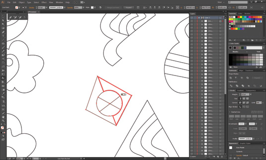
In preparation for colouring, select a group and then use the Bucket to convert it to a Live Paint group. Do this to all of them, then fill in the groups with a base colour. The next step is to check to see if there are any gaps in the Live Paint groups. To make this easier, the Artboard can be temporarily hidden.
Get the Creative Bloq Newsletter
Daily design news, reviews, how-tos and more, as picked by the editors.
04. Choose your colours
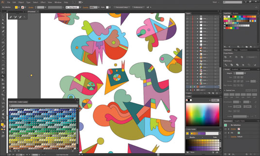
The next stage is to choose colours. It can help to have images to act as inspiration, or to use a deliberately limited palette. Make use of the Colour Guide panel to choose combinations of hue, tone and saturation. It is possible to work with a range of colours and yet still have them blend well together.
05. Create the composition
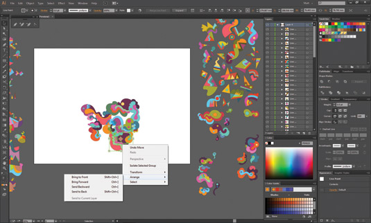
The next step is to start creating the composition of the design. Using the image elements, the design is built and pieced together. Elements can be arranged either above or below each other, as long as you remain aware of their placement within the overall composition.
06. Transform your elements

The experimenting stage is next. Each placed element can be transformed in terms of scale, rotation, reflection and so on. Contrasts of shape and colour, as well as being aware of the space in-between, are all important when creating a balanced design.
07. Fill beyond the frame
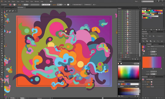
Push the design outside the Artboard so it doesn’t 'hang' in the middle. Group all the Live Paint groups and click Expand to make regular groups, then use Trim or Merge to remove stroke lines and form one group. A background with a gradient of three colours from the design will further unite the elements.
08. Create foreground composition
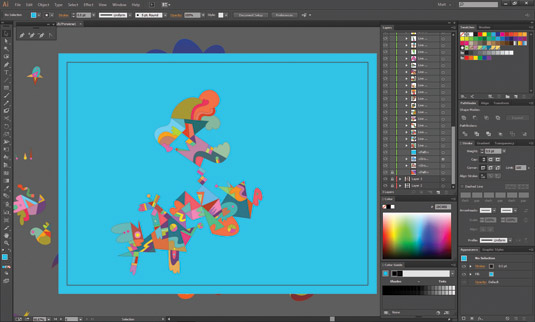
Before creating the foreground design, drag a filled rectangle shape over everything to obscure the background from view. Next, in the Layers panel, both this rectangle and the groups containing both the design and gradient should be positioned at the bottom of the layer.
09. Build the foreground
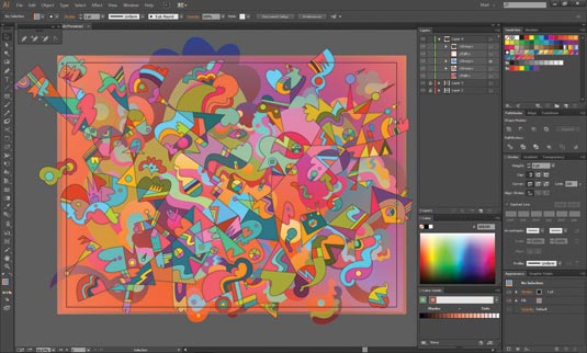
Using the remaining image elements start creating the foreground composition. As before, balance and variety is key to a successful design. This time, avoid overlaying and resizing things so you have an almost equal balance of space in between. This is essential to allow the background to show through.
10. Add an Opacity Mask
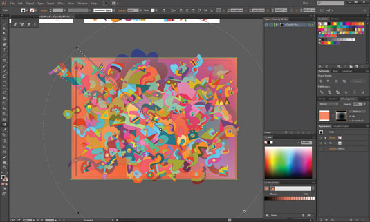
Working on the blue rectangle shape that separates the foreground and background designs, change the fill colour to orange. In the Transparency panel, add an Opacity Mask that is filled with a black and white radial gradient. The opacity can be controlled using the Gradient tool.
11. Add an extra filled rectangle
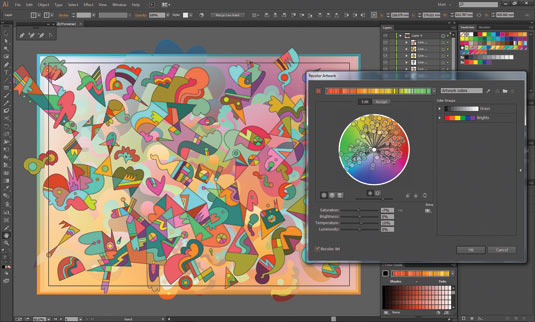
To continue balancing the foreground and background, the next stage is to add another filled rectangle shape between the two areas (this time filled with a blue/orange gradient). Similar to before, use an Opacity Mask filled with a black and white gradient to control the transparency of the shape.
12. Recolour and differentiate!
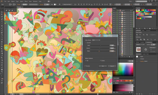
Select some or all elements and, using the Recolour Artwork tool, explore global adjustments of colour as well as replacements of whole palettes or colour schemes. Differentiate between the foreground and background elements by boosting the weight of the strokes in the foreground design.
Words: Matt Lyon
Matt Lyon, aka C86, is a London-based artist and illustrator whose work is often laced with wild shapes, colours and patterns. He’s worked for the likes of Nike, AOL, AT&T and Microsoft.
This article first appeared in Computer Arts issue 231, Self-Promo to Suit You – 100 pages on how to win more design work by playing to the strengths of your personality, and more.
Get 10 free issues of Computer Arts
Take out a two-year subscription to Computer Arts before the end of October, and you'll get an incredible 10 free issues of the world’s leading design magazine.
Simply head over to the CA subs page, select Europe or Rest of World from the Delivery Region menu, and choose 'Credit/Debit Card or PayPal 2 Year' from the three options.

Thank you for reading 5 articles this month* Join now for unlimited access
Enjoy your first month for just £1 / $1 / €1
*Read 5 free articles per month without a subscription

Join now for unlimited access
Try first month for just £1 / $1 / €1

The Creative Bloq team is made up of a group of art and design enthusiasts, and has changed and evolved since Creative Bloq began back in 2012. The current website team consists of eight full-time members of staff: Editor Georgia Coggan, Deputy Editor Rosie Hilder, Ecommerce Editor Beren Neale, Senior News Editor Daniel Piper, Editor, Digital Art and 3D Ian Dean, Tech Reviews Editor Erlingur Einarsson, Ecommerce Writer Beth Nicholls and Staff Writer Natalie Fear, as well as a roster of freelancers from around the world. The ImagineFX magazine team also pitch in, ensuring that content from leading digital art publication ImagineFX is represented on Creative Bloq.
