Create an abstract liquid effect in Photoshop
Mix 2D, 3D and photographic elements to create an illustrated backdrop. Per Gustafsson shows you how.
- Software: Photoshop CS3 or later
- Project time: 1-2 hours
- Skills: Create colour effects on photos and compositions, Control layer effects, Master filters and tools
In this walkthrough, I’ll show you how to use a photograph, some 2D elements and a 3D render to create an abstract liquid effect with a real sense of motion. I got into abstract digital art through experimentation. My background is in art and graffiti, and I’m giving a nod to those pre-digital days in this image by using paper and pen mixed with photographs.
I’ll walk through a number of expert tips and techniques using some basic tools in Photoshop. Experiment with these and you’ll be able to improve your skill set with just a few tricks.
Step 01
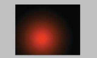
Starting with an empty canvas in Photoshop, first add some gradient radial lights to the base in a new layer. This is to get all the elements above to be visible, no matter what layer effect you might apply to them. Just some light is enough at this stage. It can be painted or drawn, but use some blur on this layer to get it really smooth and subtle.
Step 02
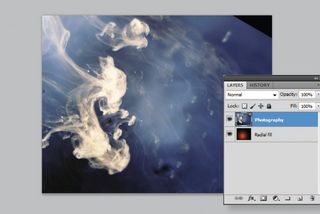
Now add a photograph of oil droplets in water – I took mine earlier. If you want to add more detail from the photo, play around with the levels (Image>Adjustments> Levels). Also, make it black and white if you overexpose the colours – as this will just be used as a texture.
Step 03
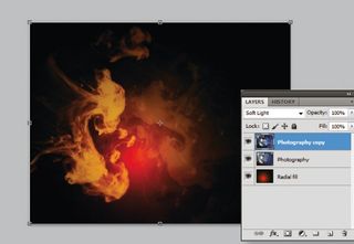
Duplicate the image and transform the copied layer. Adding a blending mode like Soft Light or Overlay creates nice effects. Adjust the opacity or positioning, but don’t merge the layers as you’ll lose the blending effects you’ve added.
Step 04
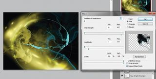
On a new layer add some lighting effects using a brush and a bit of blur. Use the Shear filter (Filter>Distort>Shear) to create a sense of motion.
Step 05
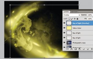
Add a flat colour layer with a Color blending mode at 80% opacity. Next, duplicate the layer with the ray of light (you created in step 4) and change the blending mode to Color Dodge or Hard Light, to get more of a glow. Also, increase the brightness (Image>Adjustments>Brightness/Contrast).
Step 06
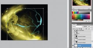
Now add a 2D layer over the top of everything. Mine was drawn with the Pen tool in Photoshop – I used a blue colour to create contrast and depth, and help it stand out, and created a circle form for the eye to follow, helping to produce a focal point. This layer will almost act as a guide when you’re transforming and adding objects later on. Twist the 2D elements with the Transform tool and let them play above the lights (Ctrl/ right-click on the object on the canvas with the Marquee tool and choose Free Transform).
Get the Creative Bloq Newsletter
Daily design news, reviews, how-tos and more, as picked by the editors.
Step 07
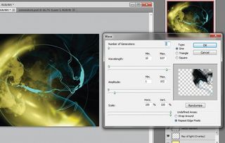
Next, duplicate the object, and on a new layer add some wave and blur to the 2D object (Filter>Distort>Wave), playing with the opacity and colours. When combined, the wave and blur (Filter>Blur>Motion Blur) effects create a feeling of motion that is easy to control. Try different variations by going back in the History panel.
Step 08
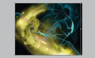
Duplicate the object and experiment with making more waves to add interest to the piece. The object should have many different levels of depth, achieved by using different opacities on different parts. In this way, it’s easy to transform and shape the object into something bigger. Introducing another shade is also a good trick for adding depth of field to the image. This is always a useful technique, whether working with illustration or photography.
Step 09
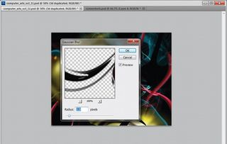
Here, I’ve brought in a simple 3D render with an alpha channel. First resize it to make it a little bigger, then place the layer at the top of the stack and go to Filter>Blur>Gaussian Blur to help make it seem as though it’s closer to the lens.
Step 10
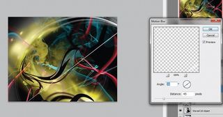
The Motion Blur filter can really add a sense of movement. Duplicate the thin, white lines and add some motion blur to them. Then duplicate them again and curve them with the Shear tool, adding more motion blur to make them fade into the glow. Experiment with moving this layer up and down the layer stack to see what looks best.
Step 11
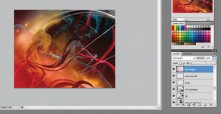
One technique that I use a lot is to add a Hard Light blending mode to a blurred layer with low opacity – this brings an overall colour tone to the image, creating a retro camera feel. It’s a really nice effect to apply at the end of a project.
Step 12
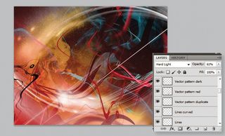
If you feel you need to add more to the image, select some of the layers making up the 2D and light objects, and duplicate them. Merge these into one and start transforming the new layer (Ctrl/rightclick on the object with the Marquee tool and choose Free Transform). I worked around the circle and focal point to form some oval shapes. Again, try rearranging the order of the layers, hiding some elements and bringing out others.
Step 13

I then added some circle shapes to help break the chaos. It’s such a simple technique and can make a nice background for type or a logo on top of the image.
Step 14
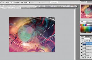
To set the colour scheme and help adjust the shades, add another flat colour layer (in this case blue) and clear the top half of it. Apply some motion blur vertically to even out the sharp edge, then lower the opacity and change the blending mode to Lighten to ease up the highlights and shadows.
Step 15
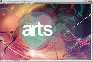
The final touch is to merge all layers and save the new image. Then go to Image>Adjustments>Hue/Saturation and adjust the colours a little.
Liked this? Read these!
- Free Photoshop brushes every creative must have
- Free Photoshop actions to create stunning effects
- The best Photoshop plugins
- Download free textures: high resolution and ready to use now

Thank you for reading 5 articles this month* Join now for unlimited access
Enjoy your first month for just £1 / $1 / €1
*Read 5 free articles per month without a subscription

Join now for unlimited access
Try first month for just £1 / $1 / €1
The Creative Bloq team is made up of a group of design fans, and has changed and evolved since Creative Bloq began back in 2012. The current website team consists of eight full-time members of staff: Editor Georgia Coggan, Deputy Editor Rosie Hilder, Ecommerce Editor Beren Neale, Senior News Editor Daniel Piper, Editor, Digital Art and 3D Ian Dean, Tech Reviews Editor Erlingur Einarsson and Ecommerce Writer Beth Nicholls and Staff Writer Natalie Fear, as well as a roster of freelancers from around the world. The 3D World and ImagineFX magazine teams also pitch in, ensuring that content from 3D World and ImagineFX is represented on Creative Bloq.
