Converse mural splashes NYC with colour
Designer Mago Dovjenko explains how he created an aggressively detailed mural for Converse and won round New York's taggers.
Russian-born designer Mago Dovjenko has been working in the fields of fashion, graphics, illustration and art direction for more than seven years. He'd always wanted to paint a mural, so when Converse asked him for an idea for its Made By You campaign, he got his chance, and headed to New York. Here, Dovjenko walks through how he approached the brief...
I have a long-standing relationship with Nike, which owns Converse. I was the youngest designer to ever work with the company, having done my first design for them at 14.
I had just taken part in the Converse 'Made by You' campaign, when Converse flew me to the HQ in Berlin. They said they wanted to do something else with me and asked me for ideas.
I wanted to do a mural in New York – it was always a dream to go there – so they said they would think about it. Two months later, they called and asked me to do a design because I would be flying to New York in a week. Quite short notice!
The brief was to go freestyle. They told me: 'It's your project, you can do it the way you want.'
I always say my style is aggressive and detailed. I put a lot of effort into details because I want people to see new things if they look at my artwork for longer. Sometimes, I put in some hidden messages.
Converse just had some restrictions. For example, in the 'making of' video, if there was a shot where I wore, for example, Dr Martens and you saw them clearly, they asked the production company to cut that out, but otherwise they were pretty cool about everything. Here's how we did it...
01. Start freestyling to music
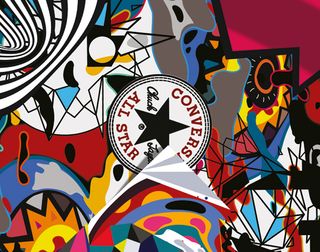
When I started the artwork I listened to Travis Scott, a rap hip hop artist whose beats feel trippy. That's why there's so much colour and psychedelic elements in the artwork. I started with Illustrator and then switched to Photoshop, because it has effects that you can't do in Illustrator, like adding textures.
02. Build a psychedelic landscape
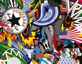
At first I created a face, then I built elements and shapes around it, to create a psychedelic landscape. At some point I got tired of the face, so I switched it for a Virgin Mary. I didn't have much notice to create the artwork, so I did it in seven hours. I then had to send it to Converse and everyone had to approve it.
03. Wall amends
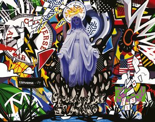
After it had been approved, the owner of the building that we had rented for the mural said they didn't want religious signage on the wall, so I had to change it back to the face. I was a bit mad, as it looked better with the Maria. I also had some branding in the artwork, but Converse said I should get rid of it too.
04. Trace to a grid
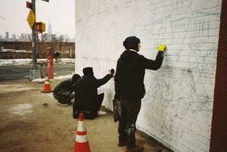
I didn't know how to create a mural at all. We worked with a mural agency, Overall Murals NY, and those guys had to teach me how to do it. You have to divide the image into a grid and then size it up. Then you paint that on the wall. We first drew the outlines onto the wall with pencil, which was such a pain. You can barely see what you're doing.
05. Add colour, then black
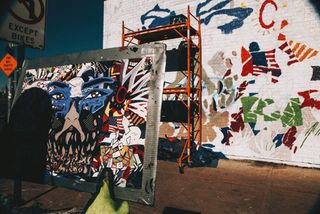
Once the outlines are done, you can put the colour in. You have to start with the colour, and then put the black on afterwards. When you have a bit of colour on the painting you know where everything's placed – although you're still confused as the black comes at the end, so the colour still goes a bit beyond the stroke.
06. Try to reason with taggers
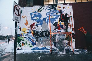
After three days, some graffiti artist tagged his name over the mural. It took us ages to clean it up the next day. We found him on Instagram and sent a note, but he came again and drew an even bigger tag. We said it was a commercial project; we didn't mean disrespect. Later, his friends apologised and he didn't do it again.
07. Wait out bad weather
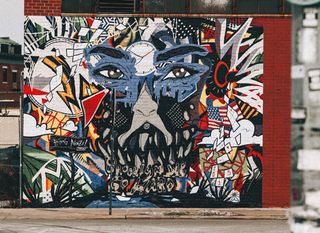
I never knew the process of creating a mural was so hard. We were there for seven days; then the weather got so bad that we asked Converse for more time. We stayed 12 days in total and finished it in 10. I didn't think it would come out the way it did. But the final piece looked just like the digital one – I couldn't believe it.
The full version of this article first appeared inside Computer Arts issue 241, a character design special. Get up to 55 per cent off a subscription to CA here.
Liked this? Try these...
- Free graffiti font selection
- Tokyo 2020 Olympics logo binned after plagiarism row
- Could you win the same award as Jonathan Ive?

Thank you for reading 5 articles this month* Join now for unlimited access
Enjoy your first month for just £1 / $1 / €1
*Read 5 free articles per month without a subscription

Join now for unlimited access
Try first month for just £1 / $1 / €1
Get the Creative Bloq Newsletter
Daily design news, reviews, how-tos and more, as picked by the editors.
The Creative Bloq team is made up of a group of design fans, and has changed and evolved since Creative Bloq began back in 2012. The current website team consists of eight full-time members of staff: Editor Georgia Coggan, Deputy Editor Rosie Hilder, Ecommerce Editor Beren Neale, Senior News Editor Daniel Piper, Editor, Digital Art and 3D Ian Dean, Tech Reviews Editor Erlingur Einarsson and Ecommerce Writer Beth Nicholls and Staff Writer Natalie Fear, as well as a roster of freelancers from around the world. The 3D World and ImagineFX magazine teams also pitch in, ensuring that content from 3D World and ImagineFX is represented on Creative Bloq.
