The 20 best album covers from the 70s
The album cover is art and design’s lost canvas. We pick 20 of the best from a vintage decade for album art.
In the past, every album you bought came with 12 square inches of artwork. Artwork that seemed every bit as important as the music contained inside.
Here, we celebrate a decade of amazing album covers from the split-personality 1970s. It was a decade that began without direction, the ash of the '60s waiting to fall off the spliff. Then, somewhere in the middle, it sobered up. Adrenalised and angry, the end of the '70s was mad as hell and wasn’t going to take it any more. We chart the ch-ch-changes through the decade’s best album covers.
01. McCartney: McCartney (1970)
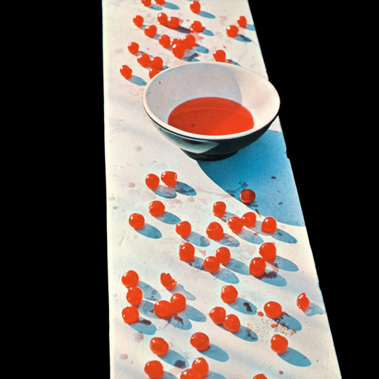
A few months after The Beatles split, Paul McCartney’s solo debut is a document of the bass player’s post-band breakdown. Flip it around and the back cover has Macca grinning, title set jauntily in Cooper Bold, but the front features an image that’s more difficult to decode. Then you realise you’re looking at cherries scattered around an empty bowl. Typical McCartney, mixing the sour with the sweet.
02. Frank Zappa and the Mothers of Invention: Weasels Ripped My Flesh (1970)

The edgy album cover of Weasels Ripped My Flesh was commissioned by Frank Zappa himself. He handed illustrator Neon Park a copy of 1950s proto-lad mag Man’s Life with the words, “What can you do that’s worse than this?”. The resulting parody prefigured punk’s anti-materialism by half a decade.
03. Enoch Light and the Light Brigade: Permissive Polyphonics (1970)
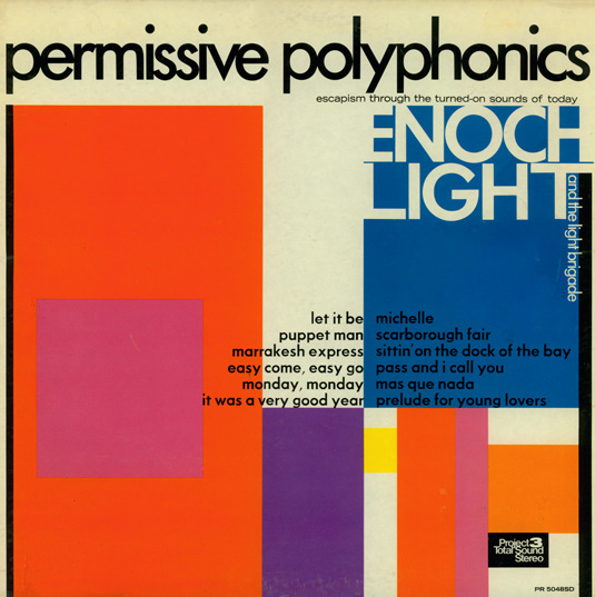
Big band leader and unlikely innovator Enoch Light pioneered the gatefold sleeve in the 1950s, a full decade before Sgt Pepper. Known for brassy versions of modern standards, this album cover reflected a progressive sensibility. This late career example updates Blue Note-style typography with a splash of modernist colour.
04. Rolling Stones: Sticky Fingers (1971)
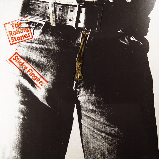
In a letter to Sticky Fingers' sleeve designer Andy Warhol, Mick Jagger wrote: “The more complicated the format of the album... the more agonising the delays”. Thankfully, Warhol ignored the advice and created a design with a real zip attached, revealing a tasteful glimpse of white cotton briefs when opened. A true icon by a true icon.
05. David Bowie: Hunky Dory (1971)
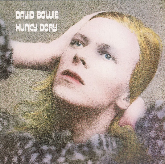
After years of desperate conformity, Bowie found success by embracing his weirdness. Like previous album The Man Who Sold the World, the album cover for Hunky Dory sees the future Thin White Duke stroking his long blonde locks and wearing a dress. Like a silent movie heroine in tinted daguerreotype, the typeface is the only real clue what decade we’re in.
Daily design news, reviews, how-tos and more, as picked by the editors.
06. Sly and the Family Stone: There’s a Riot Goin’ On (1971)
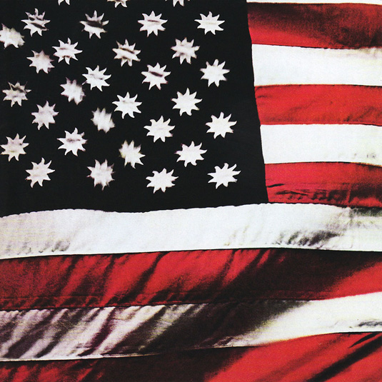
Sly Stone had the Stars and Stripes redesigned for the album cover of his apocalyptic funk classic. “I wanted the colour black because it is the absence of colour,” he told Miles Marshall Lewis in 2006. “I wanted the colour white because it is the combination of all colours. And I wanted the colour red because it represents the one thing that all people have in common: blood.”
07. The Imperials: Time to Get it Together (1971)
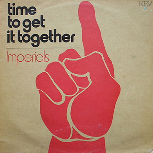
Flicking through their output, the album cover for Time to Get it Together seems like an anomaly for The Imperials, with design and typography that’s much more radical than the music inside. (If you’re unfamiliar with them, they sound a bit like a Christian version of the Bee Gees.)
08. Yes: Tales from Topographic Oceans (1972)
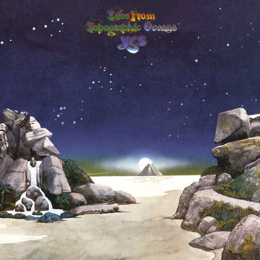
No marriage of music and image says more about the early '70s than Roger Dean’s Yes covers. Before their collaboration began, Yes were a post-Zeppelin bunch of noodlers looking for an image. Dean drew them a logo and they were transformed into fantastic synth wizards; prog pioneers floating through mushroom-peppered landscapes. An acquired taste, but undeniably influential.
09. Faust: IV (1973)

In a decade readily identified with flamboyance, the minimalist album cover for krautrock group Faust's fourth offering prepares you for the difficult, contrarian music inside. Several versions exist, but the key image is always the same; two columns of blank musical staves. A bold mission statement and a striking cover.
10. Ramones: Ramones (1976)
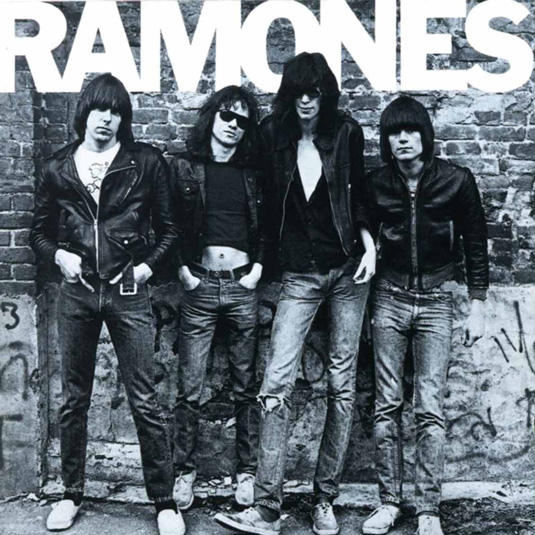
Proto-punk rockers Ramones didn’t need the frills of fancy illustration or arch design to sell their three-minute anthems: they just needed to be their snotty selves. It’s telling that this is the only album cover in the line-up with a shot of the band on the front. The clean, bold type completes the declaration of aggressive intent.
Next page: 10 more iconic 70s album covers

The Creative Bloq team is made up of a group of art and design enthusiasts, and has changed and evolved since Creative Bloq began back in 2012. The current website team consists of eight full-time members of staff: Editor Georgia Coggan, Deputy Editor Rosie Hilder, Ecommerce Editor Beren Neale, Senior News Editor Daniel Piper, Editor, Digital Art and 3D Ian Dean, Tech Reviews Editor Erlingur Einarsson, Ecommerce Writer Beth Nicholls and Staff Writer Natalie Fear, as well as a roster of freelancers from around the world. The ImagineFX magazine team also pitch in, ensuring that content from leading digital art publication ImagineFX is represented on Creative Bloq.
