10 brand-new cover designs for classic novels
Check out these inspiring new illustrations, aimed at reintroducing classic literature to a new generation, as we reveal the thinking behind them.
With thousands of new fiction titles hitting stores each year, it's easy for many of the classic novels that entertained and enlightened previous generations to be forgotten and discarded.
So it's good that companies like Random House are harnessing some exceptional design and illustration talents to rebrand and republish a repository of literary classics and bring them to the attention of new generations. Here we've selected 10 of our favourite covers from Random House's Vintage Classics imprint - and you can check out more of the company's new cover designs at the Vintage Classics Tumblr blog.
Also read:
- 14 new cover designs for James Bond books
- 20 inspirational Penguin book cover designs
- Art Deco cover design by La Boca
01. The Phantom of the Opera
- Design: Stephen Parker
- Illustration: La Boca
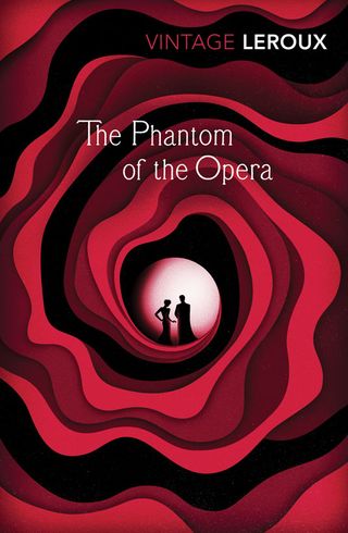
Gaston Leroux’s original gothic novel has in recent years, been largely overshadowed by the Lloyd-Webber musical. This cover steers away from the associated white mask and red rose imagery.
Vintage Classics wanted a strong, melodramatic feel in a style reminiscent of early theatre posters, but without resorting to the same old graphic elements.
La Boca was commissioned to come up with an contemporary illustration which suggests roses and fire, labyrinths and love. The type is based on a hand-drawn alphabet by John Vinycomb (1833-1928), which has just the right feel of that Belle Époque faded grandeur.
02. Confessions of an English Opium Eater
- Design: Julia Connolly
- Typography: Steven Bonner
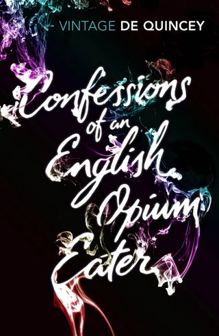
Confessions of an English Opium-Eater is the original substance abuse memoir. Written in 1821, Thomas De Quincey explores the pleasures and pains of opium in a time when it could legally be bought for a penny.
Vintage Classics wanted to have a typographic cover that reflected the hallucinogenic effects of opium. The lettering by Steven Bonner breaks down into swirls of smoke, with flashes of psychedelic colour, echoing how the user becomes detached from reality.
Get the Creative Bloq Newsletter
Daily design news, reviews, how-tos and more, as picked by the editors.
03. Picnic at Hanging Rock
- Design: Julia Connolly
- Photo research: Lily Richards
- Photograph: Millennium Images
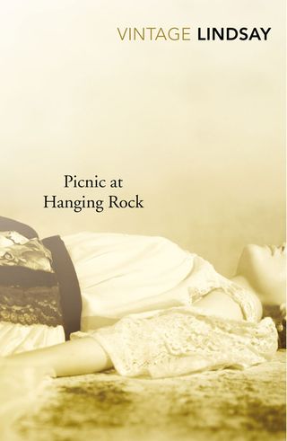
This contemporary and unsettling photograph by Bina Winkler was chosen for its hot, dreamy and slightly hallucinogenic quality appropriate for classic Australian mystery novel Picnic at Hanging Rock. Set in 1900, the story recounts the disappearance of a group of schoolgirls whilst on a picnic to Hanging Rock in a mountainous area of Victoria.
The photograph manages to feel both old and modern which is in keeping for when the novel is set and for when it was written (1967).
04. Dubliners
Design: Matthew Broughton
Illustration: Judit Ferencz
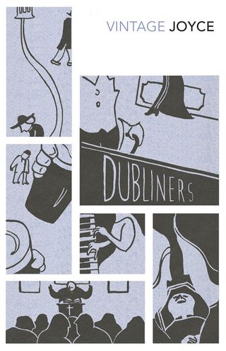
Vintage Books been aware of Judit Ferencz’s illustration work since seeing her piece The Scientist, so when the James Joyce briefs arrived she seemed perfect for the job. The idea was to create a storyboard that would offer an implied narrative, but stop at telling the full tale. Ferencz supplied a selection of cleverly-cropped images that played off each other suggesting stories within a story - the result being this wonderfully poetic design.
05. The Foundation Pit
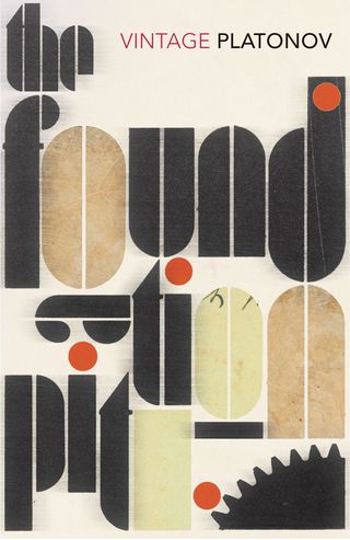
- Design: Matthew Broughton
Andrei Platonov’s The Foundation Pit is an early example of the dystopian novel. Soviet workers endlessly dig a pit, supposedly over which the house of the proletariat will be built – however, the ceasless grind causes the workers to forget the meaning of their work. This simple typographic approach aims to reflect the individuals’ soulless journey through a cruelly structured society.
06. To the Lighthouse
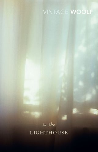
- Design: James Jones
- Photograph: Millennium Images
One of the great literary achievements of the 20th century, To The Lighthouse is Virginia Woolf’s most popular novel. For the new release, Vintage Classics wanted the abstract nature of the writing to be portrayed. The light in the images chosen needed that surreal quality to them, whilst working together as a whole across the many covers available. The titles sit simply at the bottom in an elegant font, allowing the space within the images to breathe.
07. Appointment in Samarra

- Design: Suzanne Dean
- Illustration: Tomer Hanuka
John Henry O’Hara (1905-1970) became a best-selling novelist with
Appointment in Samarra, which describes how over the course of three days, a man destroys himself with a series of impulsive acts, culminating in suicide.
Tomer Hanuka is an award winning illustrator based in New York City whose clients include The New Yorker, DC Comics, Nike and Microsoft. His elegant figures, bold colours and graphic use of space brilliantly conveys the atmosphere within O’Hara’s novels.
08. Alms for Oblivion
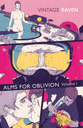
- Design: James Jones
- Illustration: Andrew Archer
Alms for Oblivion by Simon Raven is a series of 10 novels, all telling separate stories but at the same time linked together by the characters they have in common: schoolboys and businessmen, writers and
soldiers, prostitutes and patient wives, actresses and models.
For the covers, Vintage Books needed an illustrator whose work was both dangerous and sexual in its appearance to suit the subject
matter. Andrew Archer suited this perfectly, and together they decided upon a grid system across the series that would tie the covers together. Each panel represents one of the short stories to be found,
portraying the contrasting characters within the novels.
09. Byrne

- Design: Suzanne Dean
- Illustration: Isidro Ferrer
Byrne is the author Anthony Burgess’s last novel, published posthumously in 1995. Set in darkly comic verse, it tells of Michael Byrne, an Irish Don Juan – a composer, charmer, bigamist and thug.
Vintage Books commissioned Isidro Ferrer to create a stark graphic series, where several images combine on each cover, in a playful almost surreal way. The covers make the viewer work to understand their components. Each cover has an off white background with simple sans serif title.
10. The Glass Bead Game
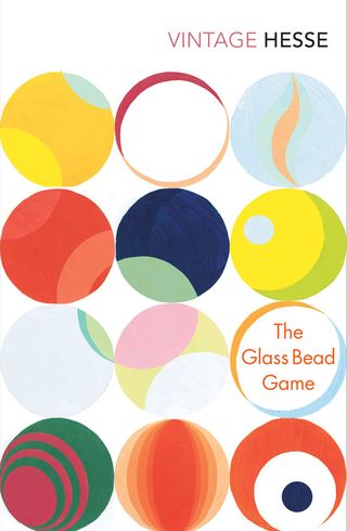
- Design: Matthew Broughton
Initially Vintage Books imagines the cover for The Glass Bead Game, the last full-length novel of the German author Hermann Hesse, as purely decorative - different coloured marbles in a simple, structured design. But after painting the component parts it became obvious the coloured circles could work in other ways.
By overlapping different sized shapes, further secondary circles appeared and the individual elements began to work as a whole image – as with the novel, enticing the viewer to look further for a deeper meaning.
Have you seen any book cover designs that have caught your eye? Let us know in the comments box below!

Thank you for reading 5 articles this month* Join now for unlimited access
Enjoy your first month for just £1 / $1 / €1
*Read 5 free articles per month without a subscription

Join now for unlimited access
Try first month for just £1 / $1 / €1
The Creative Bloq team is made up of a group of design fans, and has changed and evolved since Creative Bloq began back in 2012. The current website team consists of eight full-time members of staff: Editor Georgia Coggan, Deputy Editor Rosie Hilder, Ecommerce Editor Beren Neale, Senior News Editor Daniel Piper, Editor, Digital Art and 3D Ian Dean, Tech Reviews Editor Erlingur Einarsson, Ecommerce Writer Beth Nicholls and Staff Writer Natalie Fear, as well as a roster of freelancers from around the world. The ImagineFX magazine team also pitch in, ensuring that content from leading digital art publication ImagineFX is represented on Creative Bloq.
