Quickly build a prototype to test on any device
ZURB design lead Jonathan Smiley shows you how to use Foundation, a new, responsive open source framework, to quickly build a prototype you can test and build onto for any device
Sign up to Creative Bloq's daily newsletter, which brings you the latest news and inspiration from the worlds of art, design and technology.
You are now subscribed
Your newsletter sign-up was successful
Want to add more newsletters?
Hopefully you saw the November issue of .net, because it was a glimpse into the future of web design. Actually, that’s a lie: it was a glimpse into the lamentably poorly-realised present of web design. Let’s sum up where we are in a few simple truths:
- The number and type of devices people can use to get online is increasing every day
- Building a different interface for every device is impossible
- Not considering devices when you build is a death sentence for your site or app
Cheery, right? Don’t worry, we’ll get through this together. The reason we say this is ‘a poorly-realised present’ is that different devices and screens has always been a problem, we’ve just ignored it for years and kept building 960 grid system sites.
What we need now is a way to quickly build out prototypes that work on all devices, not just laptops and desktops. That’s why we developed Foundation, an open source front-end framework to help you rapidly prototype for any kind of device, and then take that prototype and extend it into a production-ready site. If you’re curious, you can check out foundation.zurb.com and see what the framework is all about. If you’re a total boss, though, follow along while we build a quick prototype that we can test out on whatever device we have at hand.
Off we go!
Getting started
To begin, download the code pack from foundation.zurb.com - it’s the big blue button right there on the homepage. That’ll give us a simple directory with a few pieces in it:
- index.html - We’ll be building our first page right here.
- javascripts/ and stylesheets/ - These are the main files for Foundation to work, including jQuery and a swath of handy global styles.
- humans.txt and robots.txt - Nice boilerplate elements you can use and peruse at your leisure.
For our purposes today don’t worry about the JavaScript. However, inside the stylesheets folder are some files we’re interested in:
- global.css - This is the meat of Foundation. It includes the styles for the grid, a 12-column, arbitrary width, nestable tool for quickly building complex layouts. It also includes typography, some layout tools, and various common elements.
- ui.css - We’ll be using this as well, as it includes a number of other elements useful for quickly putting together a prototype.
- mobile.css - Finally, this guy helps the prototype we build on our desktop adjust itself to mobile devices.
Load up the directory for the downloaded Foundation files in your editor of choice (we like Coda or Textmate, but your call) and go ahead and open up index.html, both there and in your browser. You’ll notice in your browser that the index file starts with a few elements already in place to get your feet wet: we’ll start by looking at the grid.
Sign up to Creative Bloq's daily newsletter, which brings you the latest news and inspiration from the worlds of art, design and technology.
The grid
We mentioned the grid when we talked about global.css: let’s look at how it works. If you’re familiar with a 960 grid system such as 960.gs or Blueprint, the Foundation grid syntax should feel pretty standard. Here’s an example:
<div class="container"> <div class="row"> <div class="eight columns"> ... </div> <div class="four columns"> ... </div> </div></div>The grid comprises three elements: containers, rows, and columns. The container element does nothing more than add left and right padding to the page, so as a window scales down your content doesn’t run into the edge.
Rows are made to contain columns, and they have an arbitrary max-width that prevents your layout from stretching all the way out on very large displays (you can, however, remove that constraint for a truly fluid layout).
Finally, columns hold your content, and there can be up to 12 of them in total in a row. In the example above we’ve created a simple thirds layout, two-thirds and then one-third content sections. We could reasonably title our sections above like so:
<div class="container"> <div class="row"> <div class="eight columns" id="mainContent"> ... </div> <div class="four columns" id="sidebarContent"> ... </div> </div></div>The grid can also be nested, which looks like this:
<div class="container"> <div class="row"> <div class="eight columns"> <div class="row"> <div class="four columns"> ... </div> <div class="four columns"> ... </div> <div class="four columns"> ... </div> </div></div> <div class="four columns"> ... </div> </div></div>You can see some more examples of the grid on the Foundation site, including this one: http://foundation.zurb.com/grid-example2.php. All set? Good; let’s spend the rest of our time together actually building something!
We do mean ‘rapid’ prototyping
For this example we’re going to put together two pages of a simple content site, a very basic news site. We’ll do the homepage and an article page so we can see not only how to use Foundation to do this crazy-fast, but also how to modify it for different devices.
We’ll base the homepage on this sketch we did for the desktop view of the site:
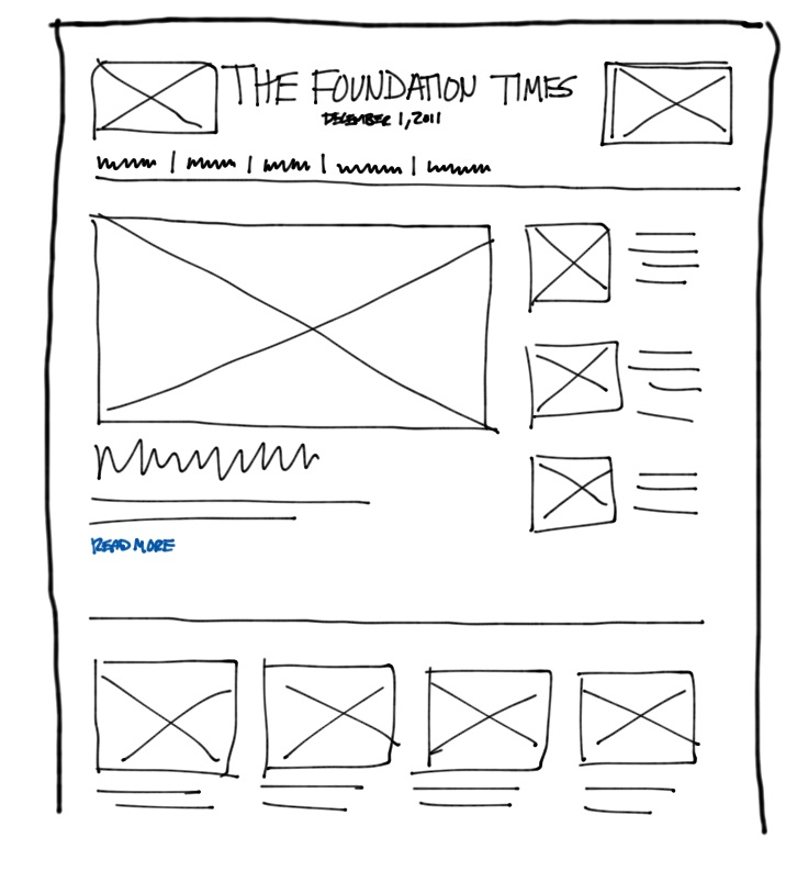
You can see we have a header area, a main article, several secondary articles, and then a row of featured content. For this page we’ll use several Foundation constructs and one nifty outside service:
- The layout will be created using the grid that we’ve already talked about
- The main nav will be created using Foundation’s built-in tabs
- The image placeholders we’ll fill in using placehold.it, a totally sweet service that returns filler blocks based on any dimensions. For our purposes the dimensions almost don’t matter, and we’ll talk about why.
Let’s do it! We’ll start with the header, and we’ll use the HTML5 header element (which Foundation manages for older browsers). We’ll give the header a class of ‘row’ so it can stand in for our row object, and inside that we’ll place a few columns.
<div class="container"> <header class="row"> <div class="two columns"> <img src="http://placehold.it/200x120" /> </div> <div class="eight columns"> <h1 class="centered">The Foundation Times</h1> <h5 class="centered">December 1, 2011</h5> </div> <div class="two columns"> <img src="http://placehold.it/200x120" /> </div> </header>You can see that we open the container, then place a row, and inside the row we place our columns. The columns can be any combination that doesn’t exceed 12. Inside our columns we’ll drop placeholders, and in the middle we’ll drop in an H1 element with a subtitle below it. We’re not going to style any of this now; we just want to see how it comes together.
After the header we want some nav for our desktop users, so they can find the sections we’ve devoted to various kinds of dromedary. Why llamas and such? Why not! For the nav we’ll use tabs, a construct built into Foundation. The nav will look like this:
<div class="row"><div class="twelve columns"> <dl class="tabs"> <dd><a href="#" class="active">All News</a></dd> <dd><a href="#">Llamas</a></dd> <dd><a href="#">Alpacas</a></dd> <dd><a href="#">Vicunas</a></dd> <dd><a href="#">Other Dromedaries</a></dd> </dl> </div></div>You’ll notice the nav goes in a row and column as well. This is necessary for the grid to maintain the layout correctly, and for this to work on mobile devices (as we’ll see later). With our simple nav in place it’s just a matter of blocking in the rest of our content. We’ll use the grid, basic elements, and a single other Foundation elements to build the remainder of the page.
<div class="row"> <div class="eight columns"> <img src="http://placehold.it/800x340" /> <h3><a href="#">Llamas: Great Pets or the Best Pets?</a></h3> <p>Intrepid reporter Jordan Humphreys went to Happy Time Llama Farm to investigate: are llamas merely great pets, or he best pets? Read the full article to find out!</p> <a href="#" class="small radius nice blue button">Read More →</a> </div> <div class="four columns"> <div class="row"> <div class="five columns"> <img src="http://placehold.it/120x100" /> </div> <div class="seven columns"> <h5><a href="">Alpaca Farm Closed</a></h5> <p>Anthony Tadina reports on this tragic closing.<br /><a href="#">Read More →</a></p> </div> </div> ... [repeat this row twice more] </div></div> <div class="row"> <div class="twelve columns"> <hr /> </div></div> <div class="row"> <div class="three columns"> <img src="http://placehold.it/260x190" /> <h5><a href="#">Feature 1</a></h5> <p>Description<br /><a href="#">Read More →</a></p> </div> ... [repeat this column 3 more times]</div> <footer class="row"> <div class="seven columns"> <p><strong>The Foundation Times</strong><br />© 2025 no rights reserved.</p> </div> <div class="five columns"> <p><a href="#">All News</a> | <a href="#">Llamas</a> | <a href="#">Alpacas</a> | <a href="#">Vicunas</a> | <a href="#">Other Dromedaries</a></p> </div></footer>As you can see, the markup is very simple. We have one new construct in here for buttons, which Foundation includes various versions of. Here you can see we’ve taken an anchor (could also be a button or input[type=”button”]) and added classes of small, radius, nice, blue and button to it. It breaks down like this:
- small - Could also be large, and if it’s not declared the button is a medium size.
- radius - This means apply a slight border radius to soften the button. Could also be ‘round’ or undeclared for square.
- nice - This adds a slight shine to the button and some other subtle visual affordances.
- blue - Could also be red, black, or grey (or whatever you create).
- button - This actually creates the structure and size, and is the only required class.
What we’ve achieved here very quickly is a page that’s almost ready for actual prototyping, but there are some considerations we need to make for other devices than the desktop.
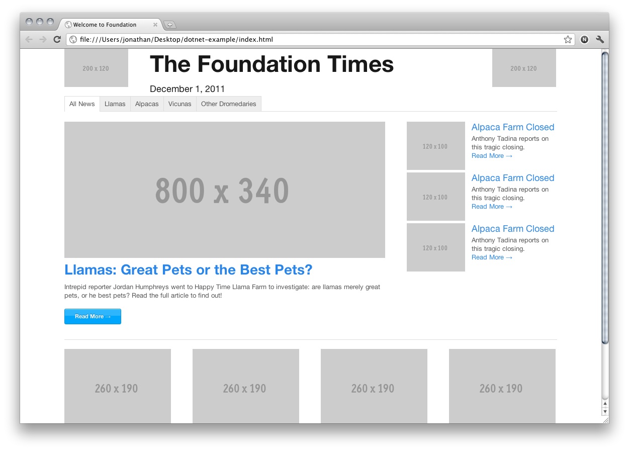
Think mobile
Users on mobile devices have different expectations when they come to a content site (or an app). In our case, we want users on a mobile device to immediately see our content so they can read it, then decide if they want to go somewhere else. Mobile users are more tolerant of scrolling below the fold, but less tolerant of having to endure a long load of titles and nav before they can read anything. Here’s what our site looks like on a small device right now:
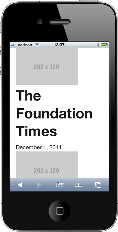
Not ideal, right? What Foundation is doing is making each of our columns 100% width, basically linearising the content. A lot of the time this will work great on mobile and we won’t need to do anything else, but in this case we want to make some changes. We’ll use Foundation’s mobile visibility classes to selectively show different content on a phone. Where before we had this as the header:
<header class="row"> <div class="two columns"> <img src="http://placehold.it/200x120" /> </div> <div class="eight columns"> <h1 class="centered">The Foundation Times</h1> <h5 class="centered">December 1, 2011</h5> </div> <div class="two columns"> <img src="http://placehold.it/200x120" /> </div></header>Now, we’ll have this:
<header class="row hide-on-phones"> <div class="two columns"> <img src="http://placehold.it/200x120" /> </div> <div class="eight columns"> <h1 class="centered">The Foundation Times</h1> <h5 class="centered">December 1, 2011</h5> </div> <div class="two columns"> <img src="http://placehold.it/200x120" /> </div></header><header class="row show-on-phones"> <div class="twelve columns"> <img src="http://placehold.it/480x100" /> <h1 class="centered">The Foundation Times</h1> <h5 class="centered">December 1, 2011</h5> </div></header>You’ll notice two classes in there: one called hide-on-phones, the other called show-on-phones. Foundation has several of these mobile visibility classes so you can rapidly prototype different layouts and interactions for different classes of device (you can also hide/show on desktops and tablets).
The syntax implies only, as in only show on phones, so the second header is what we’ll see on a phone. What we’ve done is create a different header for small devices that maintains one image above the title (for an ad, or similar) and simplifies our layout so we can get to content faster. With a little CSS...
h1.centered { text-align: center; margin-bottom: 0; }h5.centered { text-align: center; }.show-on-phones h1.centered { font-size: 24px; font-size: 2.4rem; }.show-on-phones h5.centered { font-size: 12px; font-size: 1.2rem; margin-bottom: 20px; padding-bottom: 10px; border-bottom: 1px solid #ddd; }...we can clean up the title on both large and small devices. Now what we see is this:
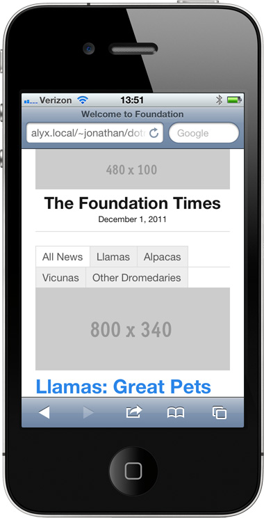
Much closer! Now our problem is that nav: too many tabs, and in the wrong place. For a device like this we’ll want the nav down on the bottom, so what we’ll do is hide the main nav on desktops, like this:
<div class="row hide-on-phones"> <div class="twelve columns"> <dl class="tabs"> <dd><a href="#" class="active">All News</a></dd> <dd><a href="#">Llamas</a></dd> <dd><a href="#">Alpacas</a></dd> <dd><a href="#">Vicunas</a></dd> <dd><a href="#">Other Dromedaries</a></dd> </dl> </div></div>Now at the bottom of the page, above the footer, we’ll drop that same block back in place, with two changes:
<div class="row show-on-phones"> <div class="twelve columns"> <dl class="tabs mobile"> <dd><a href="#" class="active">All News</a></dd> <dd><a href="#">Llamas</a></dd> <dd><a href="#">Alpacas</a></dd> <dd><a href="#">Vicunas</a></dd> <dd><a href="#">Other Dromedaries</a></dd> </dl> </div></div>We added a show-on-phones class to the nav above the footer, and a class of ‘mobile’ to the tabs, so they look like this:
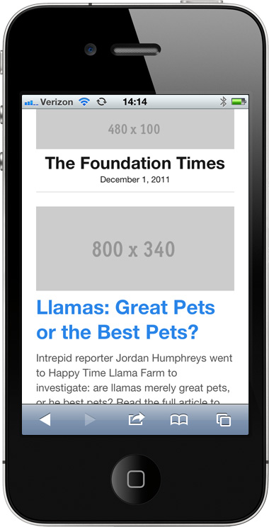
Now we’re really cooking. We’ve got a lot of code samples in here but remember: we’re mostly copying and pasting, and modifying some simple class names and structural elements. Since the hit on load for text like this is pretty low we could feasibly even move this into production, or we can do some server-side detection later to render only what we need. Our goal is to prototype our site quickly without getting hung up on tools, and that’s what Foundation is for.
Your turn!
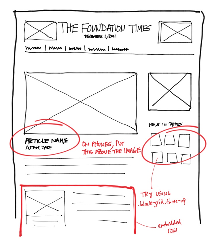
Try to create our second article page, seen in this sketch, from scratch. We’ve added a couple of notes so you can see where you might want to use certain elements, and you can view the code for a completed article prototype page here:
Does this actually work?
Well, yes. Building for multiple devices is a necessity now, and the best way to build a better product for different screens is to see how your design actually works on those devices. Iteration can’t happen any more just in Photoshop, at least not without doing a whole lot of different comps.
We used this approach recently for a 24-hour design marathon we did at ZURB for a local non-profit called Rebekah Children’s Services. After sketching out their new site we built the entire prototype (just like we did up above) in about two hours, and that was invaluable. We could not only see how it would work responsively, we were able to get engineering started on the back end and content teams starts on the copy while we kept working on the visual design and final implementation. You can check out the whole process here: www.zurb.net/zurbwired2011 or check out the prototype we built here: www.zurb.net/zurbwired2011/projects/zurbwired2011/frame/prototype.php. Again, the prototype was rough, but very useful.
We’ve also used Foundation to prototype and then build various client sites as well as most of our newer apps like axeapp.com, spurapp.com, and reelapp.com.
Get building!
Foundation is open source and completely free, so you can grab the entire site or just the starting framework and do whatever you’d like with it. We’ve found it very helpful for building sites in a future-friendly way, and hopefully you do too. If you have questions, find bugs, or just want to give feedback we’d love to hear from you at foundation@zurb.com or on the issues board on Github.

The Creative Bloq team is made up of a group of art and design enthusiasts, and has changed and evolved since Creative Bloq began back in 2012. The current website team consists of eight full-time members of staff: Editor Georgia Coggan, Deputy Editor Rosie Hilder, Ecommerce Editor Beren Neale, Senior News Editor Daniel Piper, Editor, Digital Art and 3D Ian Dean, Tech Reviews Editor Erlingur Einarsson, Ecommerce Writer Beth Nicholls and Staff Writer Natalie Fear, as well as a roster of freelancers from around the world. The ImagineFX magazine team also pitch in, ensuring that content from leading digital art publication ImagineFX is represented on Creative Bloq.
