Glimpse gives online shopping a Pinterest twist
Microsoft teamed up with TheFind to create a new kind of shopping experience. We chat to the designers about this innovative use of HTML5 and JavaScript.
Sign up to Creative Bloq's daily newsletter, which brings you the latest news and inspiration from the worlds of art, design and technology.
You are now subscribed
Your newsletter sign-up was successful
Want to add more newsletters?

Online shopping has been taken in a new direction following the launch of Glimpse Catalogs, developed as a partnership between Microsoft and TheFind.
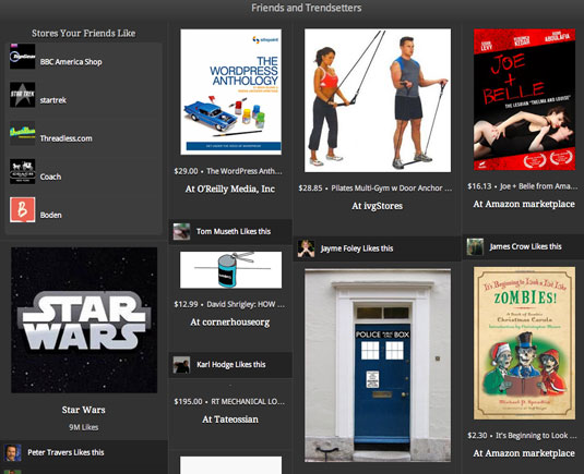
Items are displayed in a Pinterest-style layout, with the focus on image and minimal product details. Clicking the image provides a pop-up box containing full information.

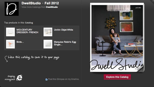
The site also enables you to explore catalogues from 90 retailers, including Tory Burch, Land's End, and Bebe.
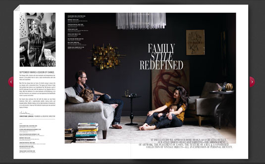
Clicking "Explore this catalog" lets you back and forth through the pages as you would a physical magazine, and save favourite items.

You can also sign in with Facebook to "like" or share an item on the social network, and Glimpse will curate options specifically for you based on those likes.
How they built it
Glimpse Catalogs is a merging of TheFind’s shopping search engine and its successful social shopping app on Facebook. As part of the project, the team released the framework created as part of the development, which relied heavily on Turn.js, a flipbook library for JavaScript.
"Our goal, from the start, was to implement Glimpse as a web app and not just as a plain website," TheFind’s co-founder and CTO Shashikant Khandelwal explains. “This resolution led us to explore the depths of both JavaScript and CSS while building Glimpse.
Sign up to Creative Bloq's daily newsletter, which brings you the latest news and inspiration from the worlds of art, design and technology.

"We employ a model-view-controller paradigm wherein both server-side and client-side templates render the model represented in Thrift or JSON, depending on the computational power of the client (desktop or tablet)," he continues. "We use both jQuery and custom-built JavaScript libraries in our application.”

Khandelwal also describes the usage of Turn.js. "While developing magazine-style catalogues, we used Turn.js, an open source jQuery plug-in flexible enough to be adapted to our needs. We also liked that it was managing the page turn effect entirely with DOM elements."
Complex CSS and JavaScript was used to transform plain 2D images into a more immersive experience. "We converted the static 2D images into a more dynamic 3D experience by including shadows and stacking pages, to give it the appearance of a magazine," Khandelwal adds.

"Additionally we integrated product highlighting and hotspotting overlays to make the pages more interactive. Both of these together helped create an HTML5 magazine with interactive markup. It also gave us a great deal of satisfaction to contribute some of our code back to the developer community."
Words: Jack Franklin
This showcase was originally published in .net magazine issue 233.
Now read these!
- 40 amazing examples of HTML5
- 30 web design secrets to boost your skills!
- 101 CSS and JavaScript tutorials to power up your skills

The Creative Bloq team is made up of a group of art and design enthusiasts, and has changed and evolved since Creative Bloq began back in 2012. The current website team consists of eight full-time members of staff: Editor Georgia Coggan, Deputy Editor Rosie Hilder, Ecommerce Editor Beren Neale, Senior News Editor Daniel Piper, Editor, Digital Art and 3D Ian Dean, Tech Reviews Editor Erlingur Einarsson, Ecommerce Writer Beth Nicholls and Staff Writer Natalie Fear, as well as a roster of freelancers from around the world. The ImagineFX magazine team also pitch in, ensuring that content from leading digital art publication ImagineFX is represented on Creative Bloq.
