Design with modular scale
Chris Michel explains how to create harmonious designs via ZURB’s Foundation framework by basing decisions such as font and grid size on a predefined scale of numbers
This article first appeared in issue 235 of .net magazine – the world's best-selling magazine for web designers and developers.
It’s important in web design to consider your decisions carefully. A good web designer always scrutinises code closely, constantly looking for ways to refactor or optimise. If we learn to make more of these decisions upfront, we won’t waste time later. The web is alive, and iteration and efficiency are key to this living process. We need to be able to create designs that hold up because of solid choices we made at the start.
One way to help constrain your design from the get-go is to rely on a modular scale for sizing key elements on the page. In this tutorial, we’ll look at how to use a modular scale from within the world of the Foundation responsive design framework that ZURB has put many hours into. We use a modular scale to create meaning and rhythm in our designs, and to construct a solid set of basic typography to use with any Foundation project.
I’ll take you through the process of choosing the numbers to create the modular scale used for many pieces of the design. Then we’ll look at how to create a stunning fictional marketing site for an exciting new app, BuzzApp, step-by-step. I’ll show you how to use Foundation to create your next masterpiece and make your web page shine on any screen size it encounters.

1. Scale Choose numbers for your modular scale. Go to www.modularscale.com, which provides you with an easy tool to create a simple scale. We used 16px for an ideal text size and 1000px for our important number. See our numbers here.
2. Grid We’re going to set up the grid, so go into Photoshop. To create our guidelines we used a tool called GuideGuide. The main reason we chose 1000px for our important number was because it created a good grid size. We decided to have 16 columns with a gutter of 16px.
3. Layout Before diving too deep, think about your page layout. What are you trying to get across? This page is about being bold, eye-catching and making a statement about the quality of the app it’s marketing. A header, value props and a testimony will do for the homepage.
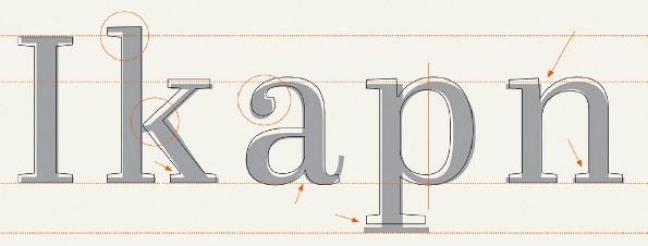
4. Typefaces To find typefaces that work for a bold marketing page, we scoured Google Web Fonts. I chose a font called Cabin for our main headlines because it looks strong and confident in all bold caps; for the body copy I picked Helvetica. Select a font that fits your design ideas.
5. Colour The next major part of the design will be colour. Choosing colours that are bold, yet contrast enough to hold up against each other, is important when trying for a visually arresting site. I settled on a simple black, white, yellow and purple. Sample these from the provided PSD.
Get the Creative Bloq Newsletter
Daily design news, reviews, how-tos and more, as picked by the editors.
6. Design One of the most fun parts of any web project is visual design. Use colours, type, balance and the rules of design to create a great page. The focus of this tutorial isn’t about creating an awesome layout in Photoshop, so feel free to download the PSD file if you’d like to use the one you see in this example.
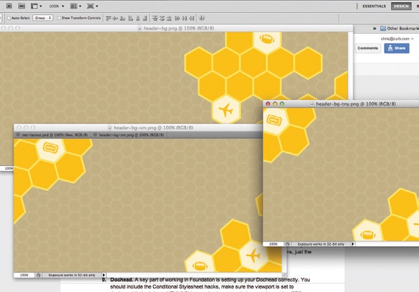
7. Assets Use the images provided for this design, or crack open the Photoshop file and slice them up yourself (it all depends how much torture you like!). You’ll get a large, small and tiny header image, a diamond pattern, and the necessary icons to implement this design in code.
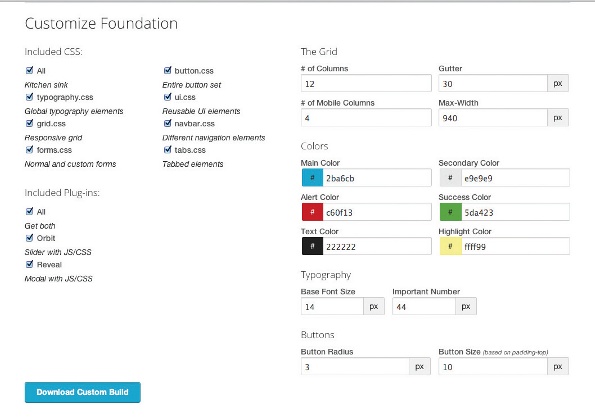
8. Foundation Download a fresh copy of Foundation, or start from the project files included with this tutorial. The grid settings should be 1000px row width, 16 columns, with 16px gutters. See our settings here.
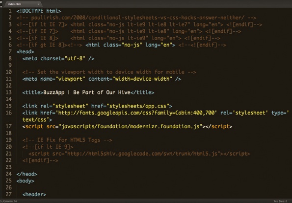
9. Dochead A key part of working in Foundation is setting up your dochead correctly. You should include the conditional style sheet hacks, make sure the viewport is set to device-width, include an HTML5 shiv to make those tags behave, and any other SEO you’d like to add.
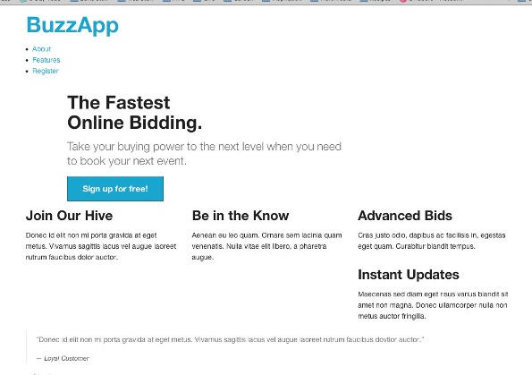
10. HTML Now it’s time to code the structure of the page. It’s always a good idea to think about your naming conventions as semantically as possible. Set up your code to include nav, header, feature section, testimony and a footer. To see how go here.
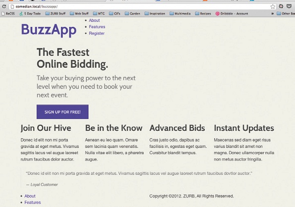
11. Global Now the HTML is ready, we’ll begin styling the main sections of the page. There aren’t many global styles here because we’re dealing with a single page. We’ll set up our background colour and button style. See our code here: https://gist.github.com/3423520.
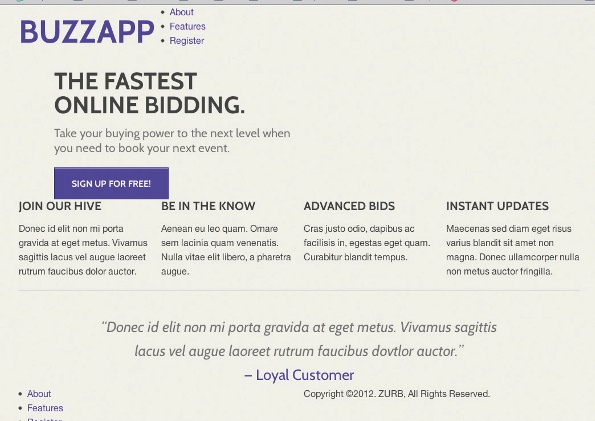
12. Typography The main area where we use modular scale is typography. This is the common place for the scale to shine. We set up our typography based on our scale (h1 = 56px, h2 = 42px, h3 = 21px). We also calculated new line heights and margins/paddings for specific areas.
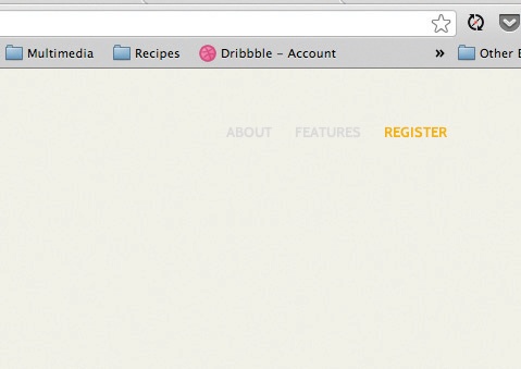
13. Navigation I like to start from the top of the page and work my way down. This navigation is made up of an unordered list that is floated, aligned right, given top-margin of 42px. Now is a good time to handle the hover effects as well. See the CSS: https://gist.github.com/3423551.

14. Header The most striking part of the page requires a few background images, text and a button. Our header is 1000x382px – both numbers are on scale. We set the image as a background and let the overflow:hidden property hide the excess. See how.
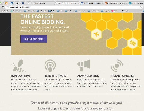
15. Features People need to know exactly what our app can do. Lay out the spacing of the features using the scale, with a margin of 42px. We’ll also use the scale to add enough padding above each article to allow room for the sweet icons! See the styles I’ve used.
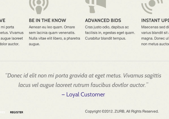
16. Testimony New sections require new layouts. That’s not a problem because we have a set of numbers to help us. We’ll create a space of 68px above our testimony to set it apart. The text size is 26px, the third number in our scale. See the style sheet.

17. Footer One of the last pieces is the footer. Give your element a top/bottom padding of 42px to give it height. Override a few of our nav styles for footer specifics like colours. Next make sure the hover styles work properly on your nav. See it here.

18. Medium Start thinking about the responsiveness. Look at the page on a smaller browser window or a tablet. These screens need a good experience too. Media queries make this simple – we set our first breakpoint to 1000px, see how.

19. Small Make sure people viewing the site on their mobile have a good viewing experience. Adjust font size, spacing and visual embellishments. The key breakpoint is 768px, which is the standard for small devices in Foundation. The code.
Discover 15 stunning examples of CSS3 animation at Creative Bloq.

Thank you for reading 5 articles this month* Join now for unlimited access
Enjoy your first month for just £1 / $1 / €1
*Read 5 free articles per month without a subscription

Join now for unlimited access
Try first month for just £1 / $1 / €1

The Creative Bloq team is made up of a group of art and design enthusiasts, and has changed and evolved since Creative Bloq began back in 2012. The current website team consists of eight full-time members of staff: Editor Georgia Coggan, Deputy Editor Rosie Hilder, Ecommerce Editor Beren Neale, Senior News Editor Daniel Piper, Editor, Digital Art and 3D Ian Dean, Tech Reviews Editor Erlingur Einarsson, Ecommerce Writer Beth Nicholls and Staff Writer Natalie Fear, as well as a roster of freelancers from around the world. The ImagineFX magazine team also pitch in, ensuring that content from leading digital art publication ImagineFX is represented on Creative Bloq.
