Create a mobile website with jQuery Mobile
In this exclusive excerpt of Murach's HTML5 and CSS3, Zak Ruvalcaba and Anne Boehm explain how to use jQuery Mobile to create a mobile web site
Sign up to Creative Bloq's daily newsletter, which brings you the latest news and inspiration from the worlds of art, design and technology.
You are now subscribed
Your newsletter sign-up was successful
Want to add more newsletters?
This is an edited excerpt from Chapter 15 of Murach's HTML5 and CSS3 by Zak Ruvalcaba and Anne Boehm.
jQuery Mobile is a free, open-source, cross-platform, JavaScript library that you can use for developing mobile websites. This library lets you create pages that look and feel like the pages of a native mobile application.
Although jQuery Mobile is currently available as a beta test version, this version already provides all of the features that you need for developing an excellent mobile website. As a result, you can start using it right away. You can also expect this version to be continually enhanced, so jQuery Mobile will only get better.
Article continues belowIn this article you’ll learn the basic techniques for creating the pages of a mobile website. That will include the use of dialog boxes, buttons, and navigation bars.
How to code multiple pages in a single HTML file
In contrast to the way you develop the web pages for a screen web site, jQuery Mobile lets you create multiple pages in a single HTML file. This is illustrated by figure 15-7. Here, you can see two pages of a site along with the HTML for these pages. What’s surprising is that both pages are coded within a single HTML file.
For each page, you code one div element with “page” as the value of the data-role attribute. Then, within each of those div elements, you code the div elements for the header, content, and footer of each page. Later, when the HTML file is loaded, the first page in the body of the file is displayed.
To link between the pages in the HTML file, you use placeholders as shown in figure 7-11 of chapter 7. For instance, the <a> element in the first page in this example goes to “#toobin” when the user taps on the h2 or img element that is coded as the content for this link. This refers to the div element with “toobin” as its id attribute, which means that tapping the link takes the reader to the second page in the file.
Sign up to Creative Bloq's daily newsletter, which brings you the latest news and inspiration from the worlds of art, design and technology.
Although this example shows only two pages, you can code many pages within a single HTML file. Remember, though, that all of the pages along with their images, JavaScript, and CSS files are loaded with the single HTML file. As a result, the load time will become excessive if you store too many pages in a single file. When that happens, you can divide your pages into more than one HTML file.
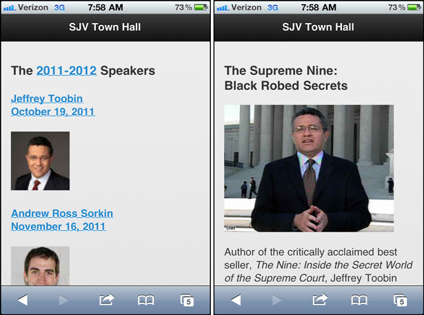
The HTML for the two pages in the body of one HTML file:
<div data-role="page"> <header data-role="header"><h1>SJV Town Hall</h1></header> <section data-role="content"> <h3>The 2011-2012 Speakers</h3> <a href="#toobin"> <h4>Jeffrey Toobin<br>October 19, 2011</h4> <img src="images/toobin75.jpg" alt="Jeffrey Toobin"></a> <!-- THE ELEMENTS FOR THE REST OF THE SPEAKERS --> </section> <footer data-role="footer"><h4>© 2011</h4></footer> </div><div data-role="page" id="toobin"> <header data-role="header"><h1>SJV Town Hall</h1></header> <section data-role="content"> <h3>The Supreme Nine:<br>Black Robed Secrets</h3> <img src="images/toobin_court.cnn.jpg" alt="Jeffrey Toobin"> <p>Author of the critically acclaimed best seller, <i>The Nine: <!-- THE COPY CONTINUES --> </section> <footer data-role="footer"><h4>© 2011</h4></footer> </div>Description
- When you use jQuery Mobile, you don’t have to develop a separate HTML file for each page. Instead, within the body element of a single HTML file, you code one div element for each page with its data-role attribute set to “page”.
- For each div element, you set the id attribute to a placeholder value that can be accessed by the href attributes in the <a> elements of other pages.
How to use dialog boxes and transitions
Figure 15-8 shows how to create a dialog box that opens when a link is tapped. To do that, you code the dialog box just as you would any page. But in the <a> element that goes to that page, you code a data-rel attribute with “dia- log” as its value.
As the examples in this figure show, the jQuery Mobile CSS file formats a dialog box differently than a normal web page. By default, a dialog box will have a dark background with white foreground text, and the header and footer won’t span the width of the page. A dialog box will also have an “X” in the header that the user must tap to return to the previous page.
When you code an <a> element that goes to another page or dialog box, you can also use the data-transition attribute to specify one of the six transitions that are summarised in the table in this figure. Each of these transitions is meant to mimic an effect that a mobile device like an iPhone uses.
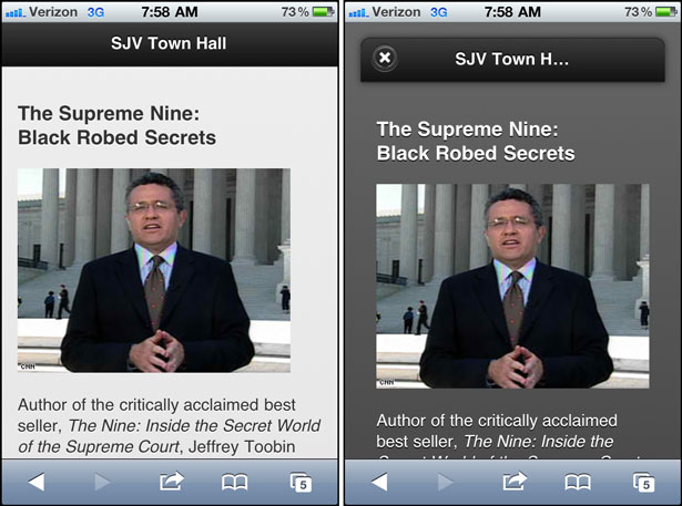
The transitions that can be used
| slide | The next page slides in from right to left. |
| slideup | The next page slides in from bottom to top. |
| slidedown | The next page slides in from top to bottom. |
| pop | The next page fades in from the middle of the screen. |
| fade | The next page fades into view. |
| flip | The next page flips from back to front similar to a playing card being flipped over. This transition isn’t supported on some device. |
HTML that opens the page as a dialog box with the “pop” transition:
<a href="#toobin" data-rel="dialog" data-transition="pop">HTML that opens the page with the “fade” transition:
<a href="#toobin" data-transition="fade">Description
- The HTML for a dialog box is coded the way any page is coded. However, the <a> element that links to the page includes the data-rel attribute with “dialog” as its value. To close the dialog box, the user taps the X in the header of the box.
- To specify the way a page or a dialog box is opened, you can use the data-transition attribute with one of the values in the table above. If a device doesn’t support the transition that you specify, the attribute is ignored.
- The styling for a dialog box is done by the jQuery Mobile CSS file.
How to create buttons
Figure 15-9 shows how to use buttons to navigate from one page to another. To do that, you just set the data-role attribute for an <a> element to “button”, and jQuery Mobile does the rest.
However, you can also set some other attributes for buttons. If, for example, you want two or more buttons to appear side by side, like the first two buttons in this figure, you can set the data-inline attribute to “true”.
If you want to add one of the 18 icons that are provided by jQuery Mobile to a button, you also code the data-icon attribute. For instance, the third button in this example uses the “delete” icon, and the fourth button uses the “home” icon. All of these icons look like the icons that you might see within a native mobile application. Incidentally, these icons are not separate files that the page must access. Instead, they are provided by the jQuery Mobile library.
If you want to group two or more buttons horizontally, like the Yes, No, and Maybe buttons in this figure, you can code the <a> elements for the buttons within a div element that has “controlgroup” as its data-role attribute and “horizontal” as its data-type attribute. Or, to group the buttons vertically, you can change the data-type attribute to “vertical”.
If you set the data-rel attribute for a button to “back” and the href attribute to the pound symbol (#), the button will return to the page that called it. In other words, the button works like a Back button. This is illustrated by the last button in the content for the page.
The last two buttons show how buttons appear in the footer for a page. Here, the icons and text are white against a black background. In this case, the class attribute for the footer is set to “ui-bar”, which tells jQuery Mobile that it should put a little more space around the contents of the footer. You’ll learn more about that in figure 15-12.
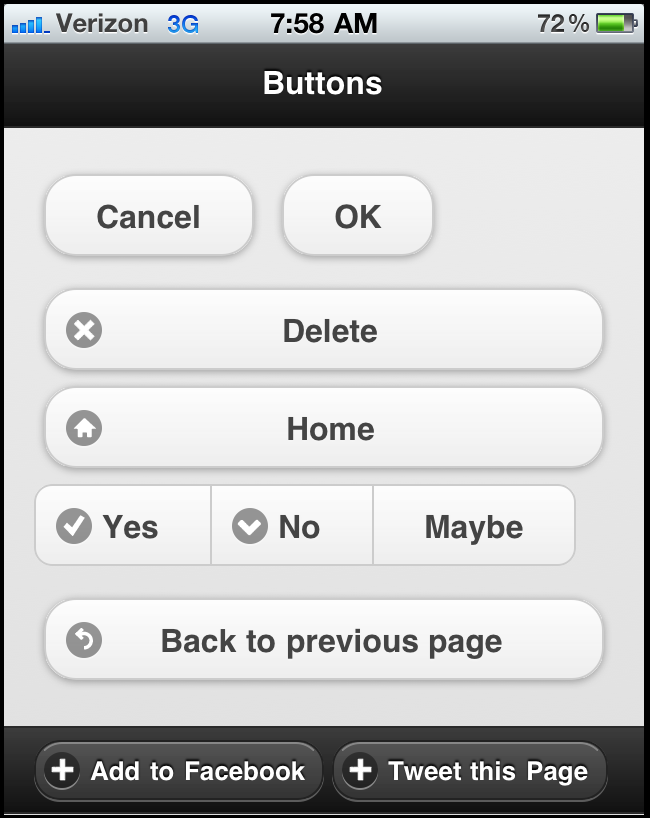
The HTML for the buttons in the section:
<!-- For inline buttons, set the data-line attribute to true --><a href="#" data-role="button" data-inline="true">Cancel</a> <a href="#" data-role="button" data-inline="true">OK</a><!-- To add an icon to a button, use the data-icon attribute --><a href="#" data-role="button" data-icon="delete">Delete</a> <a href="#" data-role="button" data-icon="home">Home</a><!-- To group buttons, use a div element with the attributes that follow --><div data-role="controlgroup" data-type="horizontal"> <a href="#" data-role="button" data-icon="check">Yes</a> <a href="#" data-role="button" data-icon="arrow-d">No</a> <a href="#" data-role="button">Maybe</a></div><!-- To code a Back button, set the data-rel attribute to back --><a href="#" data-role="button" dat-rel="back" data-icon="back"> Back to previous page</a>The HTML for the buttons in the footer:
<footer data-role="footer" class="ui-bar"> <a href="http://www.facebook.com" data-role="button" data-icon="plus">Add to Facebook</a> <a href="http://www.twitter.com" data-role="button" data-icon="plus">Tweet this Page</a> </footer>Description
- To add a button to a web page, you code an <a> element with its data-role attribute set to “button”.
How to create a navigation bar
Figure 15-10 shows how you can add a navigation bar to a web page. To do that, you code a div element with its data-role set to “navbar”. Within this element, you code a ul element that contains li elements that contain the <a> elements for the items in the navigation bar. Note, however, that you don’t code the data-role attribute for the <a> elements.
To change the color for the items in the navigation bar, the code in this example includes the data-theme-b attribute for each item. As a result, jQuery Mobile changes the background colour of each item from black, which is the default, to an attractive blue. In addition, this code sets the class attribute for the active button to “ui-btn-active” so jQuery Mobile changes the color for the active button to a lighter blue. This shows how you can change the formatting that’s used by jQuery Mobile, and you’ll learn more about that next.

The HTML for the navigation bar:
<header data-role="header"> <h1>SJV Town Hall</h1> <div data-role="navbar"> <ul> <li><a href="#home" class="ui-btn-active" data-icon="home" data-theme="b">Home</a></li> <li><a href="#speakers" data-icon="star" data-theme="b">Speakers</a></li> <li><a href="#contactus data-icon="grid" data-theme="b">Contact Us</a></li> </ul> </div></header>How to code the HTML for a navigation bar:
- Code a div element within the header element. Then, set the data-role attribute for the div element to “navbar”.
- Within the div element, code a ul element that contains one li element for each link.
- Within each li element, code an <a> element with an href attribute that uses a placeholder for the page that the link should go to. Then, set the data-icon attribute to the icon of your choosing.
- For the active item in the navigation bar, set the class attribute to “ui-btn-active”. Then, the color of this item will be lighter than the other items in the navigation bar.
- You should also use the data-theme attribute to apply a jQuery Mobile theme to each item in the navigation bar. Otherwise, the buttons in the bar will be the same color as the rest of the header. To learn more about applying themes, see figure 15-12.
How to format content with jQuery Mobile
As you’ve already seen, jQuery Mobile automatically formats the components of a web page based on its own style sheet. Now, you’ll learn more about that, as well as how to adjust the default styling that jQuery Mobile uses.
The default styles that jQuery Mobile uses
Figure 15-13 shows the default styles that jQuery Mobile uses for common HTML elements. For all of its styles, jQuery Mobile relies on the browser’s rendering engine so its own styling is minimal. This keeps load times fast and minimises the overhead that excessive CSS would impose on a page.
As you can see, jQuery Mobile’s styling is so effective that you shouldn’t need to modify its styling by providing your own CSS style sheet. For instance, the spacing between the items in the unordered list and the formatting of the table are both acceptable the way they are. Also, the black type on the gray background is consistent with the formatting for native mobile applications.
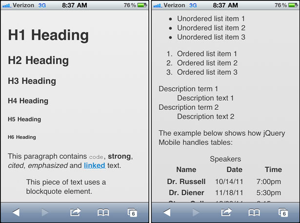
Description
- By default, jQuery Mobile automatically applies styles to the HTML elements for a page. These styles are not only attractive, but also mimic a browser’s native styles.
- By default, jQuery Mobile applies a small amount of padding to the left, right, top, and bottom of each mobile page.
- By default, links are slightly larger than normal text. This makes it easier for the user to tap the links.
- By default, links are underlined with blue as the font color.
How to apply themes to HTML elements
In some cases, you will want to change the default styles that jQuery Mobile uses. You’ve already seen that in the navigation bar of figure 15-10. To change the default styles, you can use the five themes that jQuery Mobile provides. These are summarised in figure 15-12. Here again, these themes are meant to mimic the appearance of a native mobile application.
One way to apply themes is to code a data-theme attribute with the theme letter as its value. You saw this in the navigation bar in figure 15-10, and you can see this in the code for the second navigation bar in this figure. Here, the data-theme attribute applies theme “e” to the header and theme “d” to the items in the navigation bar.
The other way to apply themes is to set the class attribute for an element to a class name that indicates a theme. This is illustrated by the first example after the table. Here, the class attribute is used to apply both the “ui-bar” and “ui-bar- b” classes to the div element. As a result, jQuery Mobile first applies its default styling for a bar to the element and then applies the b theme to that styling. In the pages that follow, you’ll see other examples of this type of styling.
Please note that the table in this figure says to use theme e sparingly. That’s because it uses an orange color that works okay for accenting an item, but isn’t attractive in large doses. This is illustrated by the second header and navigation bar in this figure, which tends to be jarring when you see it in colour.
In general, it’s best to stay with the default styles and the first three themes, which usually work well together. Then, you can experiment with themes d and e when you think you need something more.

The HTML for the second header and navigation bar:
<header data-role="header" data-theme="e"> <h1>SJV Town Hall</h1> <div data-role="navbar"> <ul> <li><a href="#home" data-icon="home" data-theme="d">Home</a></li> <li><a href="#speakers" data-icon="star" data-theme="d" class="ui-btn-active">Speakers</a></li> <li><a href="#news" id="news" data-icon="grid" data-theme="d">News</a></li> </ul> </div></header>The five jQuery Mobile themes:
| a | Black background with white foreground. This is the default. |
| b | Blue background with white foreground. |
| c | Light gray background with a black foreground. Text will appear in bold. |
| d | Dark gray background with black foreground. Text will not appear in bold. |
| e | Orange background with black foreground. Use for accents, and use sparingly. |
Two ways to apply a theme:
By using a data-theme attribute:
<li><a href="#home" class="ui-btn-active" data-icon="home" data-theme="b">Home</a></li>By using a class attribute that indicates the theme:
<div class="ui-bar ui-bar-b">Bar</div>Description
- By using the five themes that are included with jQuery Mobile, you can make appropriate adjustments to the default styles for the HTML elements.
- Although you can use your own CSS style sheet with a jQuery Mobile application, you should avoid doing that whenever possible.
Perspective
The use of mobile devices has increased dramatically over the past few years. Because of that, it has become increasingly important to design web sites that are easy to use from these devices. Although that usually means developing a separate web site, this can be a critical aspect of maintaining your presence on the Internet.
Fortunately, the task of building a mobile web site has become much easier with the advent of jQuery Mobile. No longer are mobile web pages limited to static pages that contain headings, paragraphs, links, and thumbnail images. With jQuery Mobile, web developers can now build feature-rich web sites that look and feel like native mobile applications.

The Creative Bloq team is made up of a group of art and design enthusiasts, and has changed and evolved since Creative Bloq began back in 2012. The current website team consists of eight full-time members of staff: Editor Georgia Coggan, Deputy Editor Rosie Hilder, Ecommerce Editor Beren Neale, Senior News Editor Daniel Piper, Editor, Digital Art and 3D Ian Dean, Tech Reviews Editor Erlingur Einarsson, Ecommerce Writer Beth Nicholls and Staff Writer Natalie Fear, as well as a roster of freelancers from around the world. The ImagineFX magazine team also pitch in, ensuring that content from leading digital art publication ImagineFX is represented on Creative Bloq.
