Work smart with your Zbrush UI
Customise your Zbrush tools to work for you.
Anything that stimulates our mind can affect our productivity, and it’s important to recognise factors that support our work, whether that be the right kind of background music or even our choice of lighting. Another consideration is a customised user interface. When we have become familiar with a software, we work faster and learn quicker. The trick is to surround ourselves with the tools we use most frequently, shortcuts (like these Photoshop shortcuts) to speed up our workflow, and even a favourite colour scheme.
If you want to speed up your workflow, ZBrush offers the option to customise the UI. Take advantage of those tools and turn it into your own canvas. If you don't want to remember multiple shortkeys, you can bring all the necessary brushes and buttons to the forefront, and make them available for quick switching at any point.
One of the biggest advantages of customising the UI is familiarity. Knowing your tools and feeling comfortable in your own little work zone increases your productivity, improves workflow and supports the learning process. The method of customisation in ZBrush is simple, but can still get a little frustrating. We'll show you the basics so you can apply them to your own requirements. Start up ZBrush and simply follow these four easy steps.
01. Dock buttons
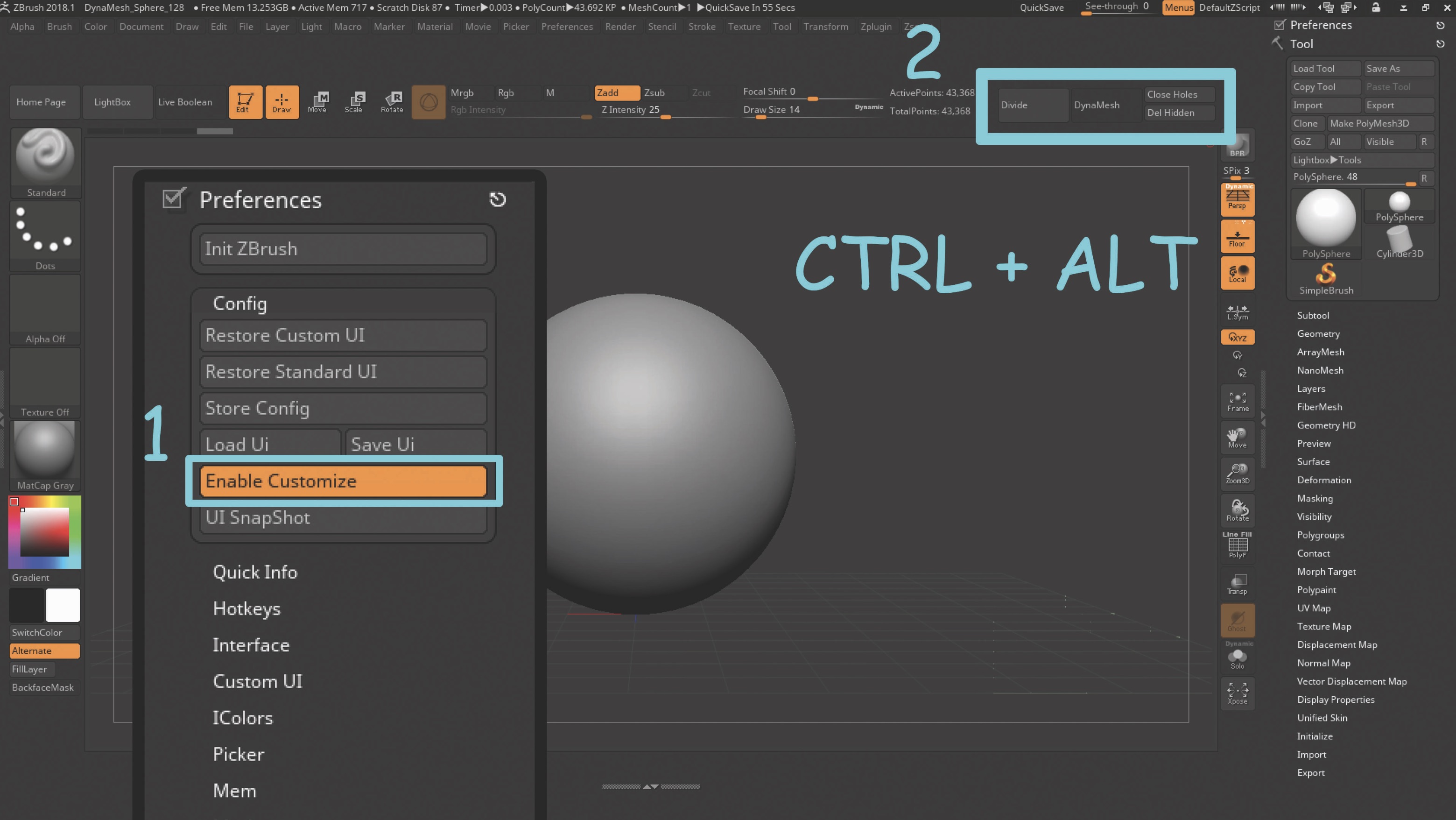
Navigate to the Preferences menu and open the Config ribbon. Activate the Enable Customize button to begin editing the UI. You can go to a menu and use any existing button to create your own menu, or dock them around the canvas by Ctrl+Alt-dragging onto the location.
02. Dock favourite brushes
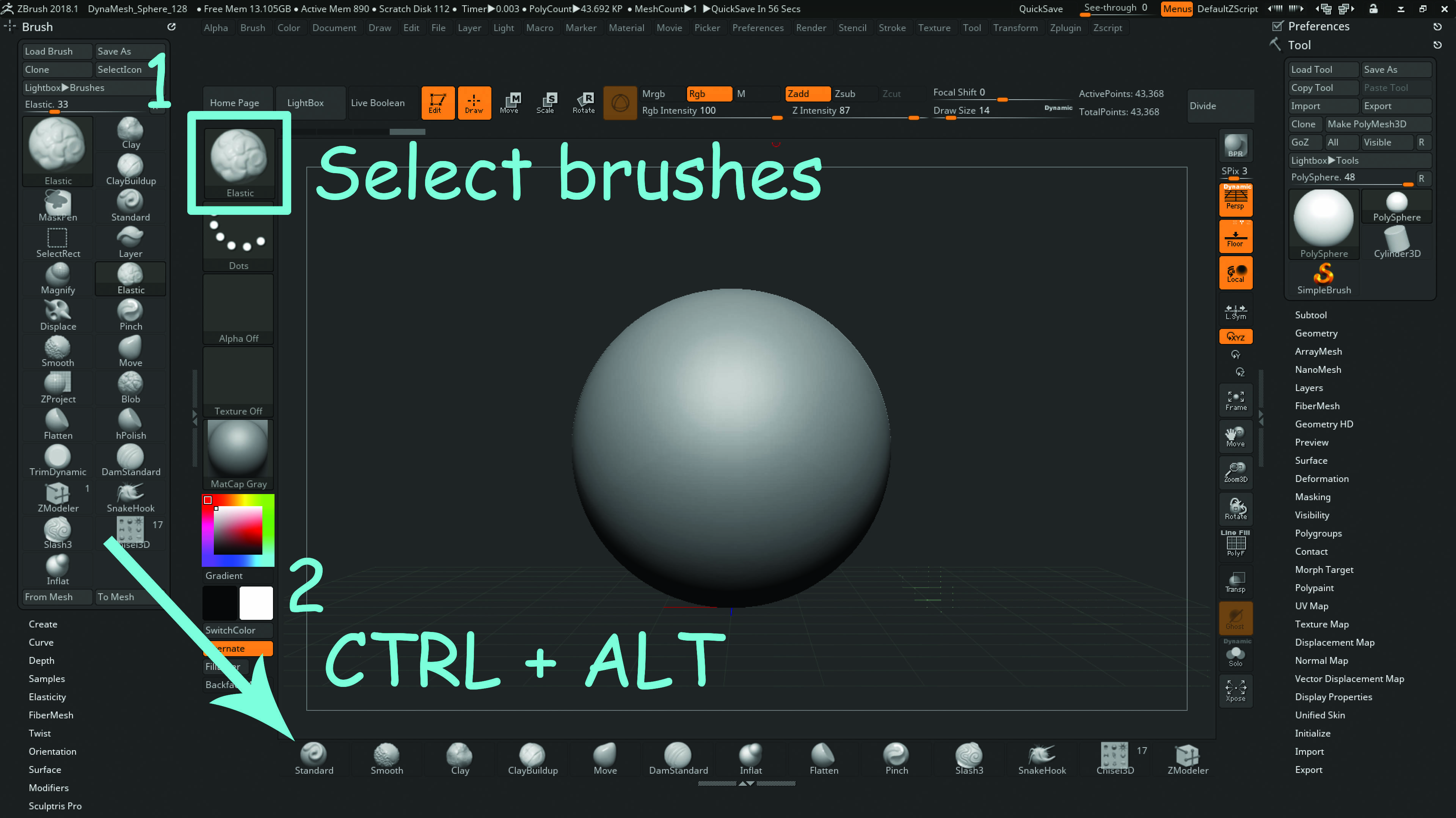
To dock favourite brushes, we have to go the long way around. First, open the brush menu in the sidebar, and choose your brushes from the menu to appear in the sidebar. Now you can Ctrl+Alt-drag and drop your chosen brushes anywhere on the screen.
03. Custom menu
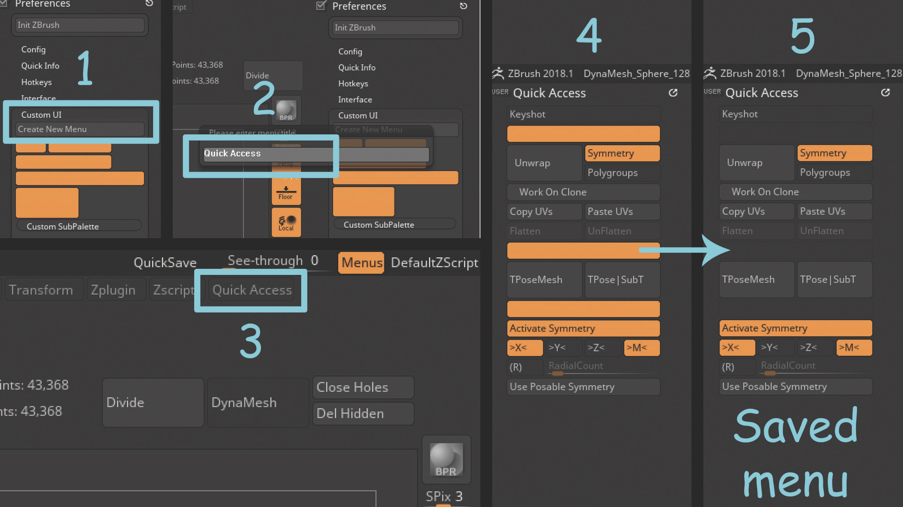
You can create custom menus containing your most-used tools. Navigate over to Preferences > Custom UI and Create New. Give it a title and it will show on top of the screen with other menus. Drag your blank menu to the side to customise it. The same way as placing buttons around the canvas, you can drag and drop buttons within that menu. The blank strips act as dividers between your buttons. You can also add a Submenu.
04. Play with colours
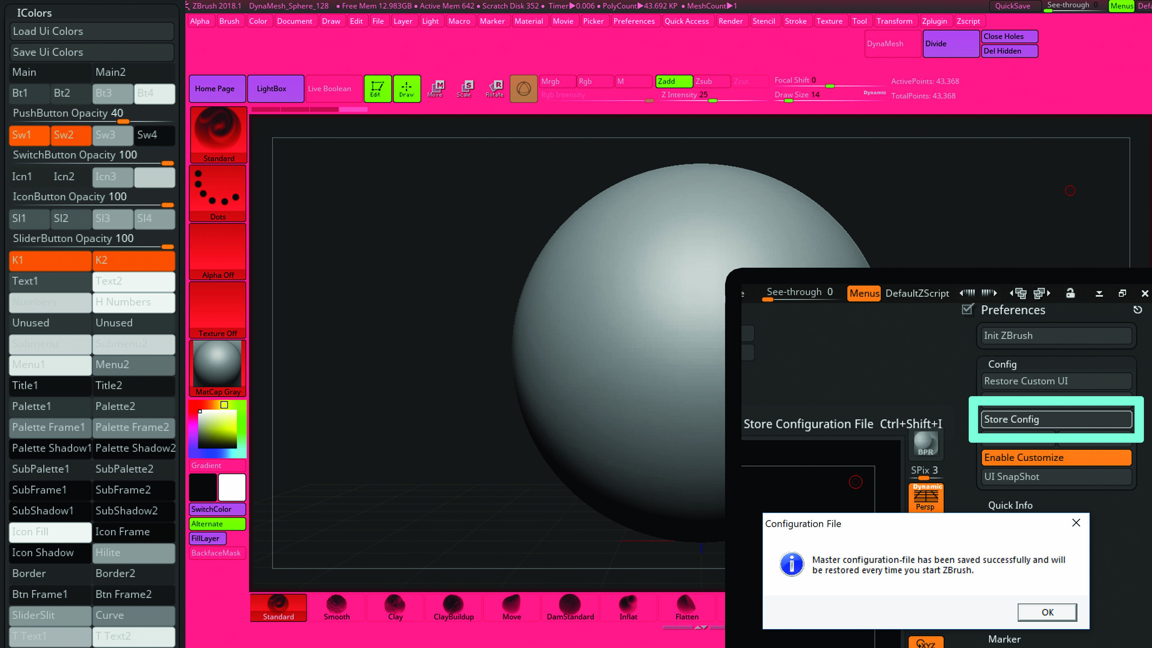
Colour scheme can be quite important to some artists. Some people like an extremely vibrant interface, others prefer to tone it down, while some stick with the default settings. With Enable Customize still on, navigate to Preferences > IColors. Click on any of the buttons and drag your cursor across the screen to sample the colours. Don’t forget to save your configuration in Preferences > Config > Store Config.
Get the Creative Bloq Newsletter
Daily design news, reviews, how-tos and more, as picked by the editors.
This article was originally published in issue 245 of 3D World, the world's best-selling magazine for CG artists. Buy issue 245 or subscribe to 3D World.
Related articles:

Thank you for reading 5 articles this month* Join now for unlimited access
Enjoy your first month for just £1 / $1 / €1
*Read 5 free articles per month without a subscription

Join now for unlimited access
Try first month for just £1 / $1 / €1

Rob Redman is the editor of ImagineFX magazines and former editor of 3D World magazine. Rob has a background in animation, visual effects, and photography.
